Hello the link to my Reading Assignment is here.
Author Archives: Kaolee Yang
Decoding Pop Charts
For the first example, I chose a pie chart that showed daily phone activities for smartphone owners. The breakdown of the activities are provided below in Figure 1.
Figure 1. 
Although this pie chart is visually appealing and shows us the overall distribution of smartphone owners’ time usage, it’s hard to identify patterns quickly. In Figure 2. below, I constructed a dot plot where phone activities were plotted against percentage in an increasing order.
Figure 2.
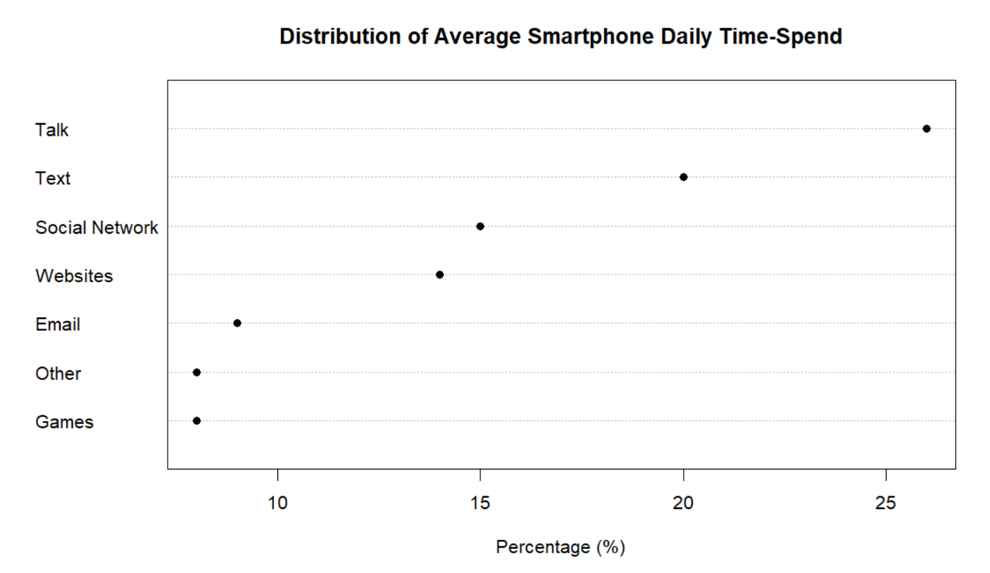
I believe that the dot plot is an improvement to the pie chart. The dot plot allows us to decode the information above and see patterns that we wouldn’t before. We can easily identify each point and match it to its percentage and phone activity. For instance, we can quickly observe that Games and Other have the smallest percentage. Following the trend from left to right, we can say with confidence that Talk is the phone activity with the largest percentage. This method of table look-up is far more efficient that trying to mentally order the pie slices from lowest to highest percentage.
For the second example of this assignment, I chose a divided bar chart. The divided bar chart shows the number of people of color (POC) in Congress from 2001 to 2017 (9 Congress terms). The people of color are classified by race and ethnicity. They include black, Hispanic, Asian and Native Americans. The divided bar chart is shown below.
Figure 3.
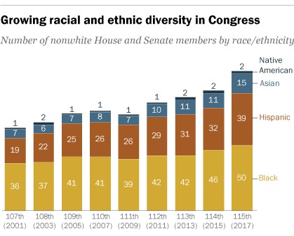
This graph is a good example of a divided bar chart but again, it’s hard to quickly note any patterns. In Figure 4., I constructed a multiway dot plot. The multiway dot plot was classified by race and ethnicity.
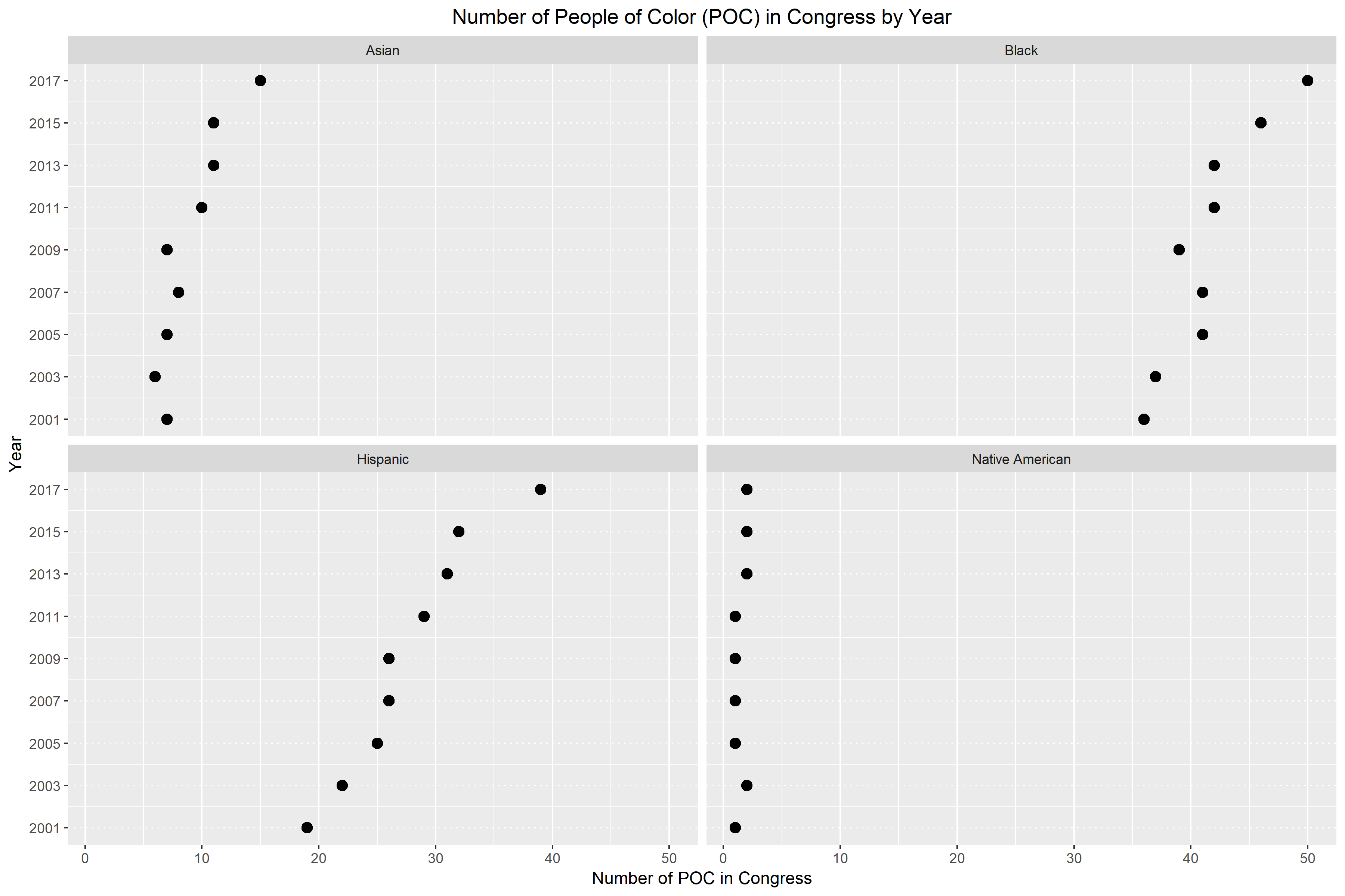
Again, I believe that the multiway dot plot is an improvement of the divided bar chart. In Figure 4., it becomes really obvious whether there is a pattern or not. For the most part, we can easily see that racial and ethnic diversity is growing in Congress. The only panel that doesn’t support this claim is the bottom right panel for Native Americans. For Native Americans, we see that they are still largely underrepresented in Congress. The number of Native Americans in Congress has been wavering between one and two for the last 17 years. Additionally, I believe that this multiway dot plot is an improvement because we can easily decode the information by table look-up. If the numbers were not on the divided bar chart, there would be no way of knowing how many people are represented by each chunk of color. However, the multiway dot plot allows us to navigate back and forth between the point and its corresponding year and number.
Multivariate Data
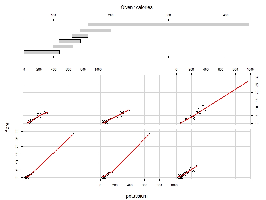
In this week’s blog assignment, I examined the relationship between calories, potassium and fibre using three different tools. They include a scatterplot matrix, coplot and spinning scatterplot.
Figure 1: Scatterplot matrix of potassium, calories and fibre with loess curve spanned at 0.8.
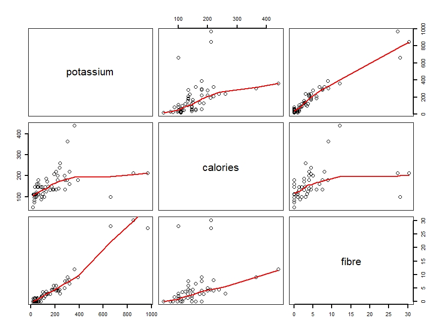
Figure 2: Coplot of fibre against potassium, conditioned on calories.
Figures 3 – 7: Snapshots of spinning scatterplot
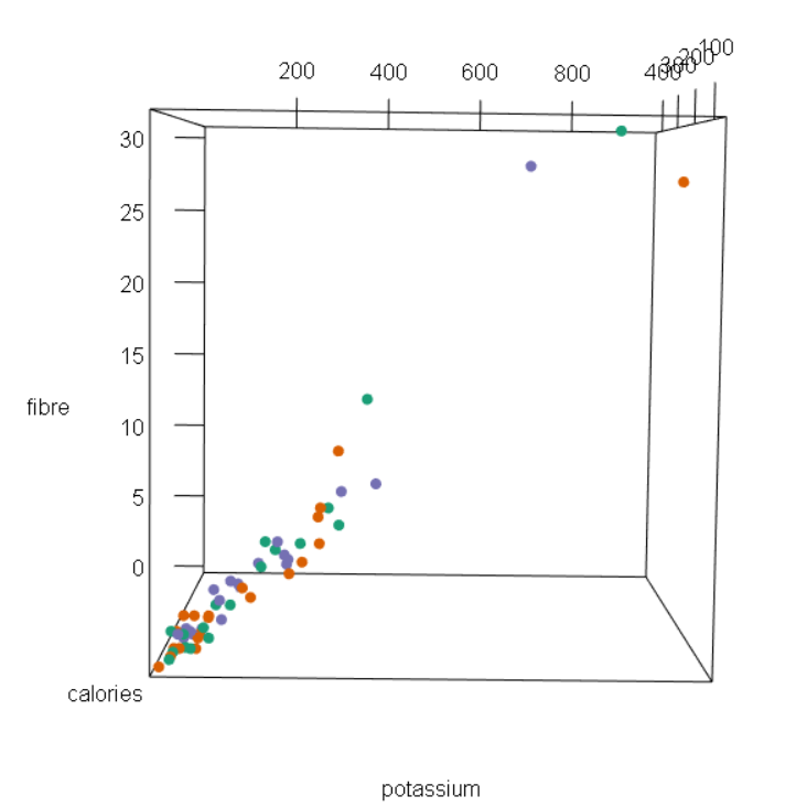
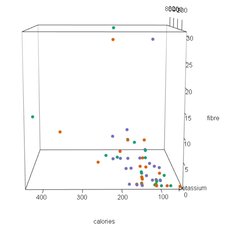
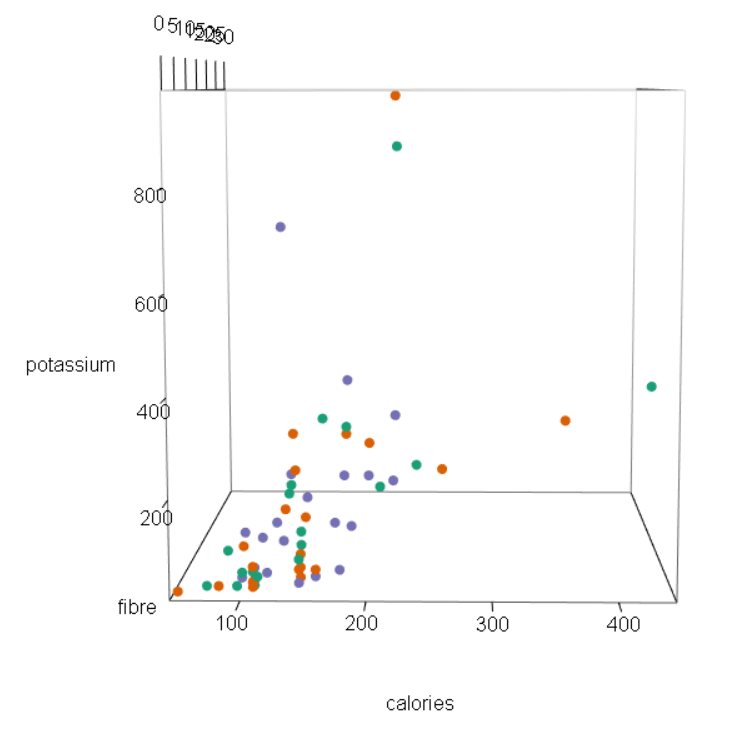
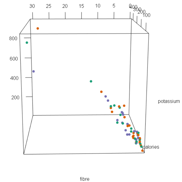
Using all three tools, we see that there is a positive, moderate and linear relationship potassium and calories. Generally, an increase in potassium includes an increase in calories as well. From the scatterplot matrix, we see that as potassium reaches 400 grams, the amount of calories gradually levels out. Clearly, we can see that there are outliers and a few possible cases of high leverage.
On the other hand, the relationship between potassium and fibre is strong, positive and linear. That is, small amounts of potassium tend to have small amounts of fibre. Likewise, large amounts of potassium generally have larger amounts of fibre as well. Again, there are three data points that can be considered influential points. In other words, it seems that these three points have potassium and fibre amounts that are far from the other points.
Lastly, the relationship between calories and fibre is weak, positive and linear. A small amount of calories tends to have less fibre, vice versa. From the plots, we can see that there are a couple of points that move away from the loess curve. Some of these points are outliers, meaning that their amount of fibre deviate from the pattern of other cereal brands. Furthermore, some of these points are high leverage cases, meaning that their amount of calories stray away from the pattern of other cereal brands.
Two cereal brands that deviate from the general pattern of the scatterplot are Grape Nuts and 100% Bran. Grape Nuts is a “special” brand because for the amount of potassium that it has (360 grams), the cereal has a really high level of calories (450 cal). Most brand with 360 grams of potassium only have between 150 to 300 calories. 100% Bran is also considered a “special” case because it has a very high amount of fiber (30 g) for having only 212 calories. Other cereal brands around 200 calories have 10 or less grams of fiber. However, 100% Bran’s fiber amount is considered very large compared to the patterns of other cereal brands.
Color
In the first figure, I plotted average capacity as a function of week and compared four different shows. These four shows (Jersey Boys, Lion King, Phantom of the Opera and Wicked) are significant because they were performed over 3000 times in the years 2009 to 2016. The colors I chose go from warm to cool as our eyes move down the graph. I decided to color it this way because the two connected and the two smooth time series in the bottom have larger vertical distance, while the ones on top don’t. I wanted to balance the attention, therefore I chose cooler tones for the bottom time series so that they don’t overpower the top ones. I chose warmer colors for the top four time series since their vertical spread is much smaller. With the choice of warmer colors, I hope that the top four time series won’t be overwhelmed by the large vertical distance of the bottom four.
Figure 1. 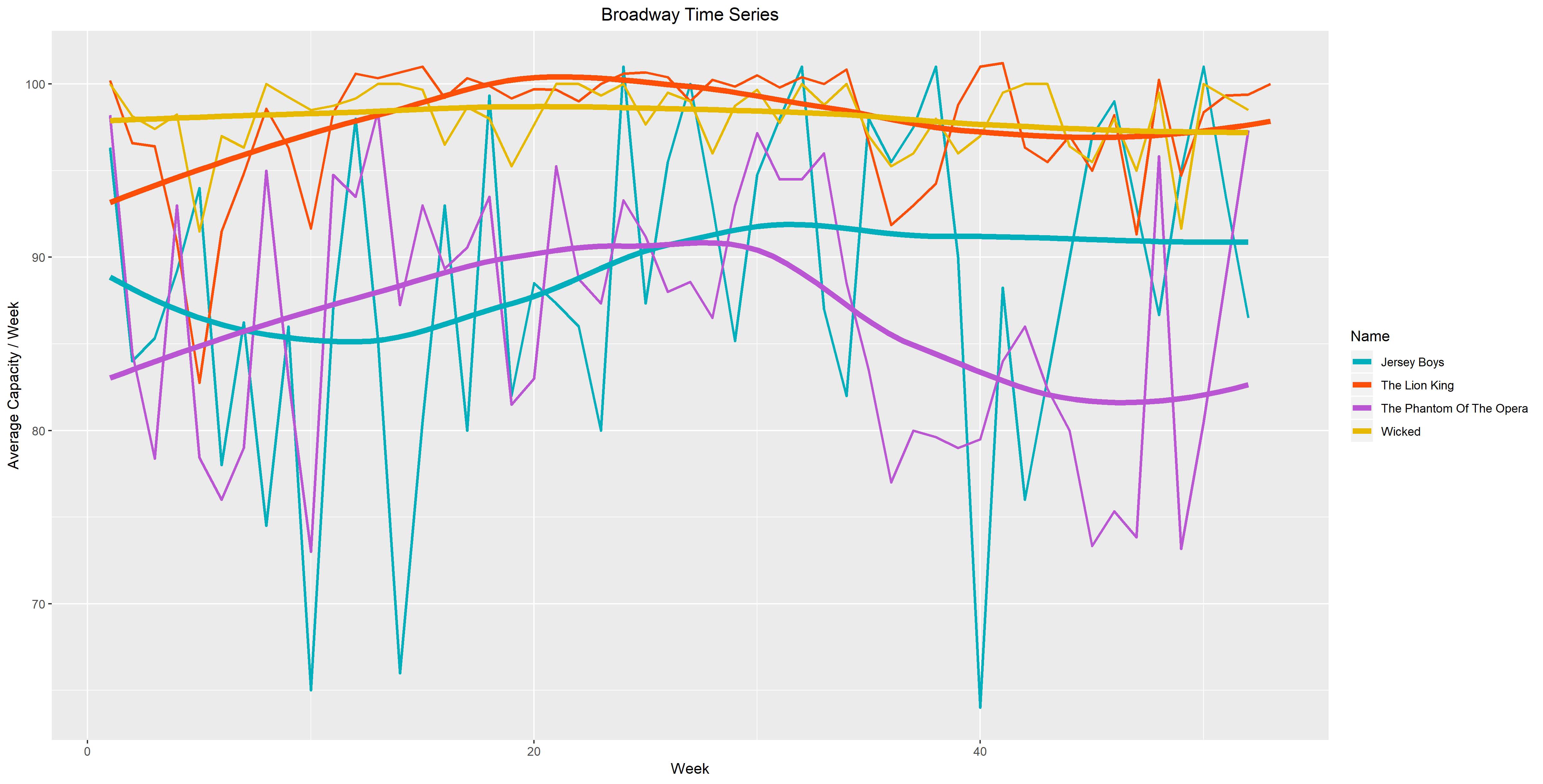
In Figure 2. I chose a sequential palette going from orange to red. I believe that these colors are more suitable because when we look at the key, we see that the level is ordered from high to low. To me, it’s easier to read the graph and understand that a lighter color indicates a lower level. Likewise, a darker color indicates a higher level. Just by observing the graph, it’s easy to identify that the brightest point has the highest levels. Although the Spectral palette is beautiful, the diverging colors don’t provide much information about the levels.
Figure 2.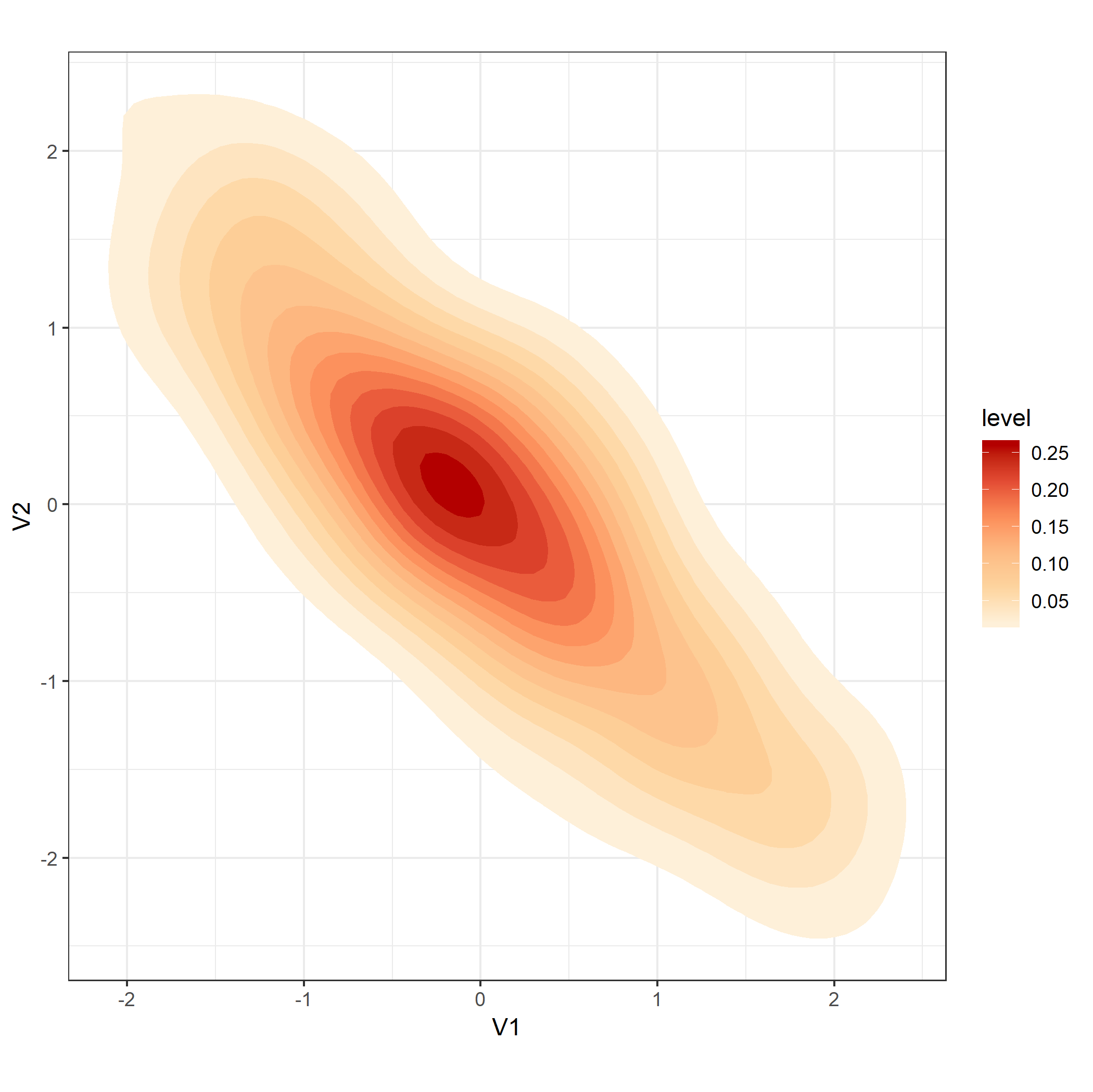
Loess Smoothing
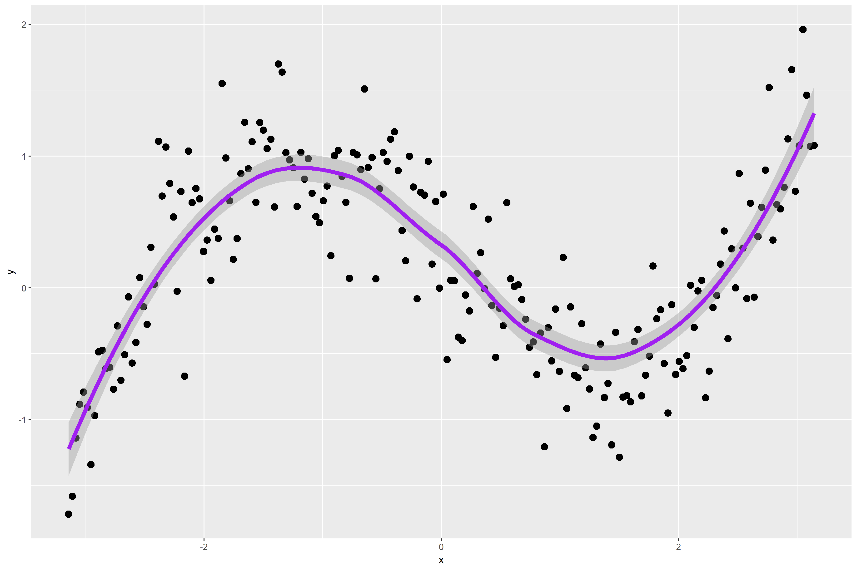
Figure 1. is a scatterplot of my randomly simulated data with a loess smooth overlay. The loess smooth overlay is set to its default value in ggplot2.
Figure 1.
The following graph plots the residuals for my data points. The default span for the lowess curve appears to have found the signal fairly well. For the most part, the residuals are pretty randomly distributed. However, some may argue that there is a bit of a wave-like pattern in the residual plot.
Figure 2.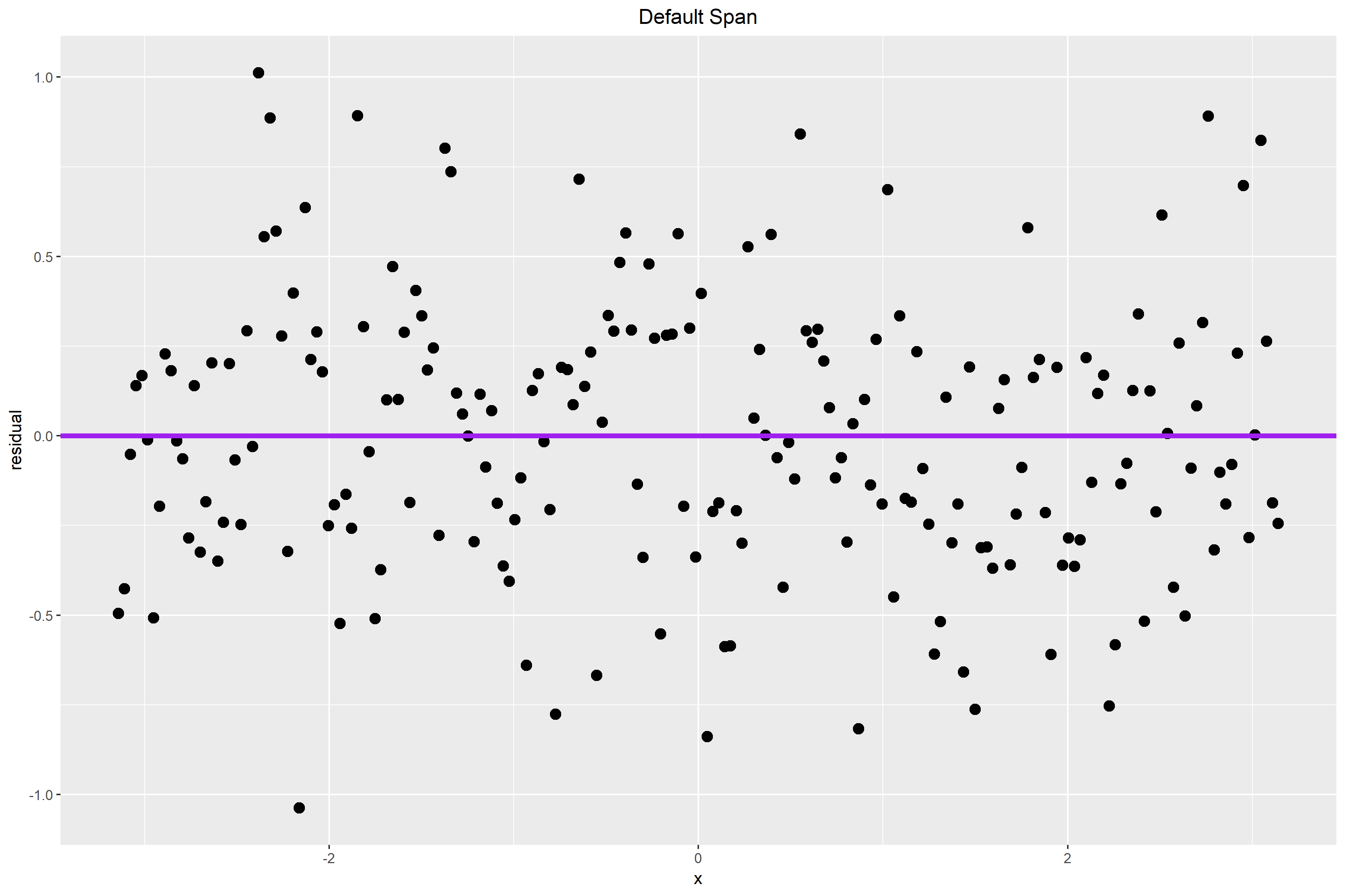
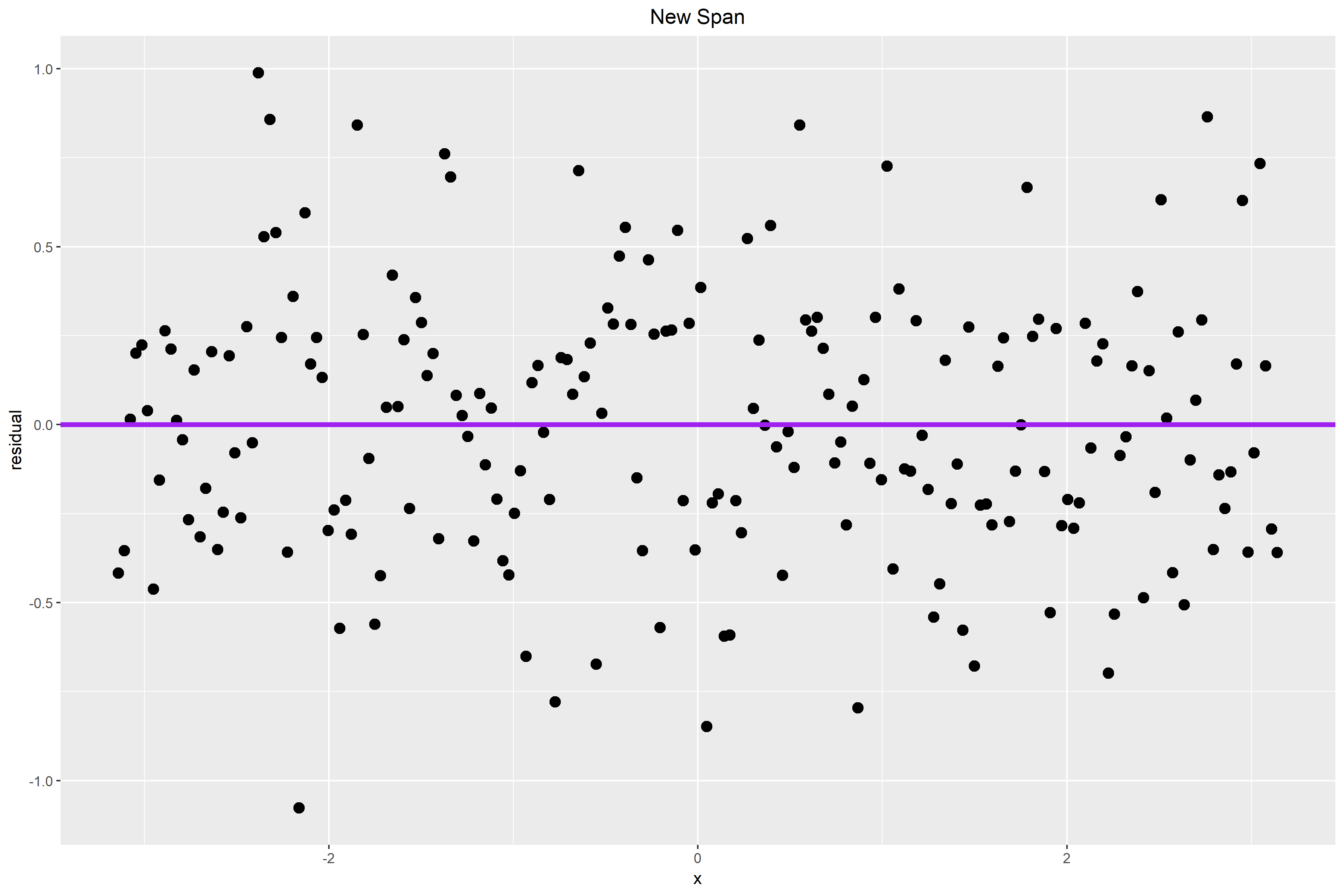
The plot below shows the residual plot after I changed the span from its default value to 0.65. The small pattern that we see in Figure 2. is probably caused by a larger alpha value. Therefore, I hope that by making alpha smaller, some of the pattern that we see in the residual plot above will be accounted for by the curve and new choice of the span.
In Figure 3. the residuals are closer to the horizontal line. The wave-like pattern that we see in Figure 2. also diminished slightly. The residuals appear to be more randomly distributed from before and there is less of a vertical spread. Thus, a span choice of 0.65 seems better than the default option.
Figure 3.
Dot Plots: Air Carrier Operations
In this week’s blog assignment, I collected data on air carrier operations for five airports, namely DTW, SEA, DEN, ORD, and ATL. The response is the number of air carrier operations. The rows are classified by airports and the columns are classified by the four months between April to July 2018. The data is presented in the table below.
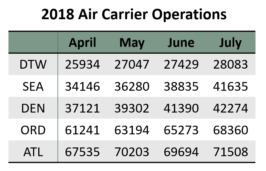
Figure 1. is a dot plot graphing the data. The horizontal scale measures the average number of air carrier operations in thousands. The vertical scale shows each airport and all four months. The mean number of operations is ordered from high to low as we read from left to right.
Figure 1.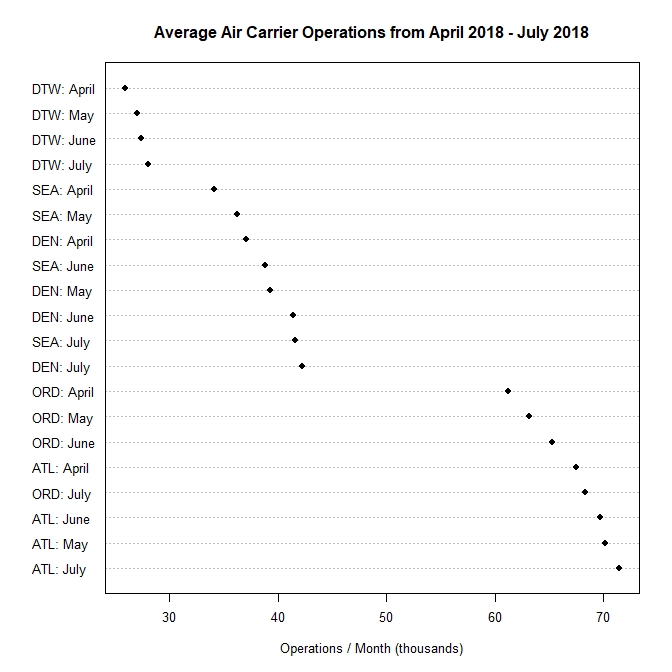
In Figure 2. I classified the multiway dot plot by rows. In this case, it was grouped by airports. I moved the panels so that it would show the airport with the largest number of operations at the top and smallest number of operations at the bottom. Clearly, we can see that there is a trend for each airport by month.
Figure 2.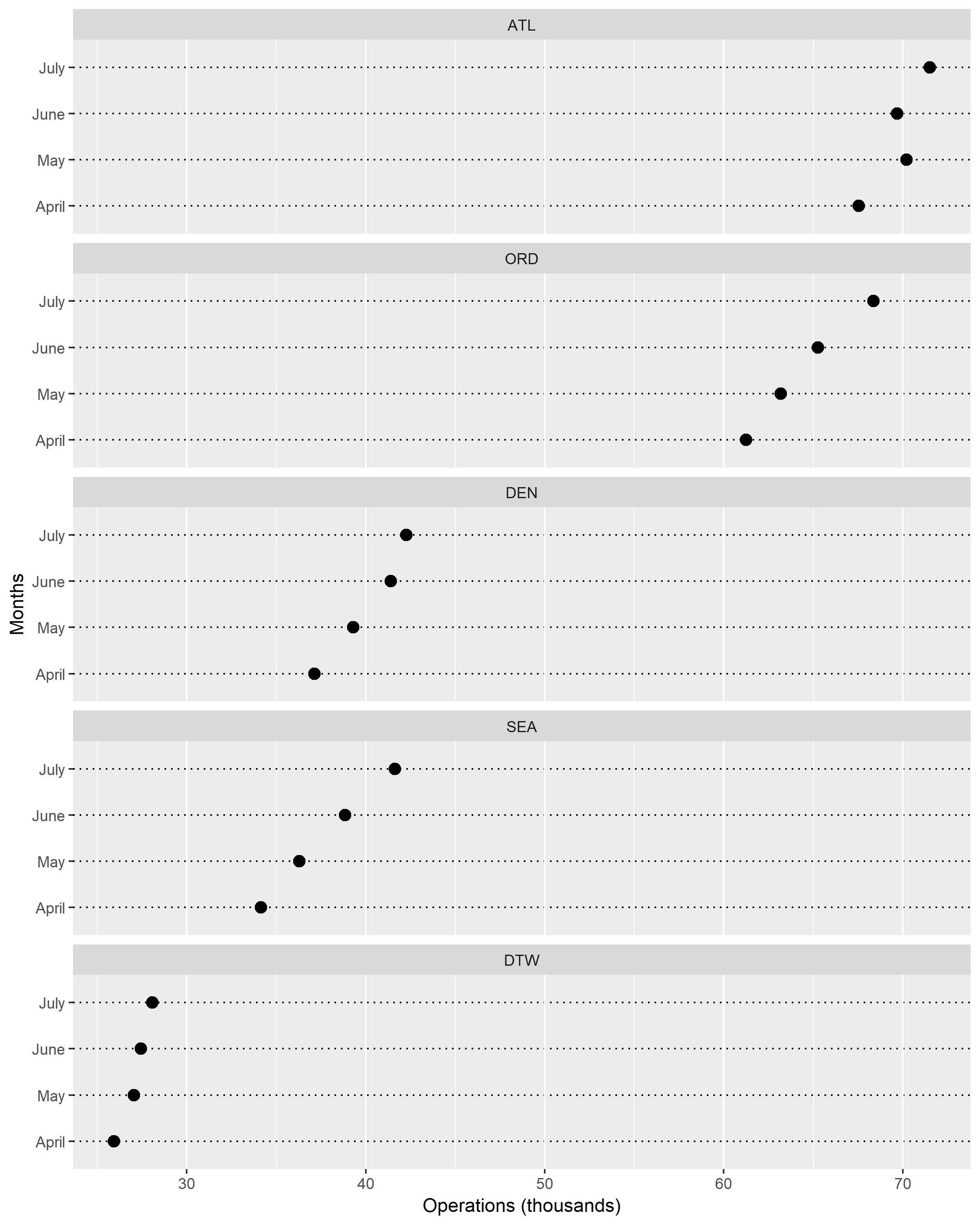
Figure 3. was grouped by columns, therefore by months. From this figure, it is also very clear that there is a trend for each airport. Throughout all four months, DTW has the smallest number of operations. In contrast, ATL remains as the airport with the most operations per month.
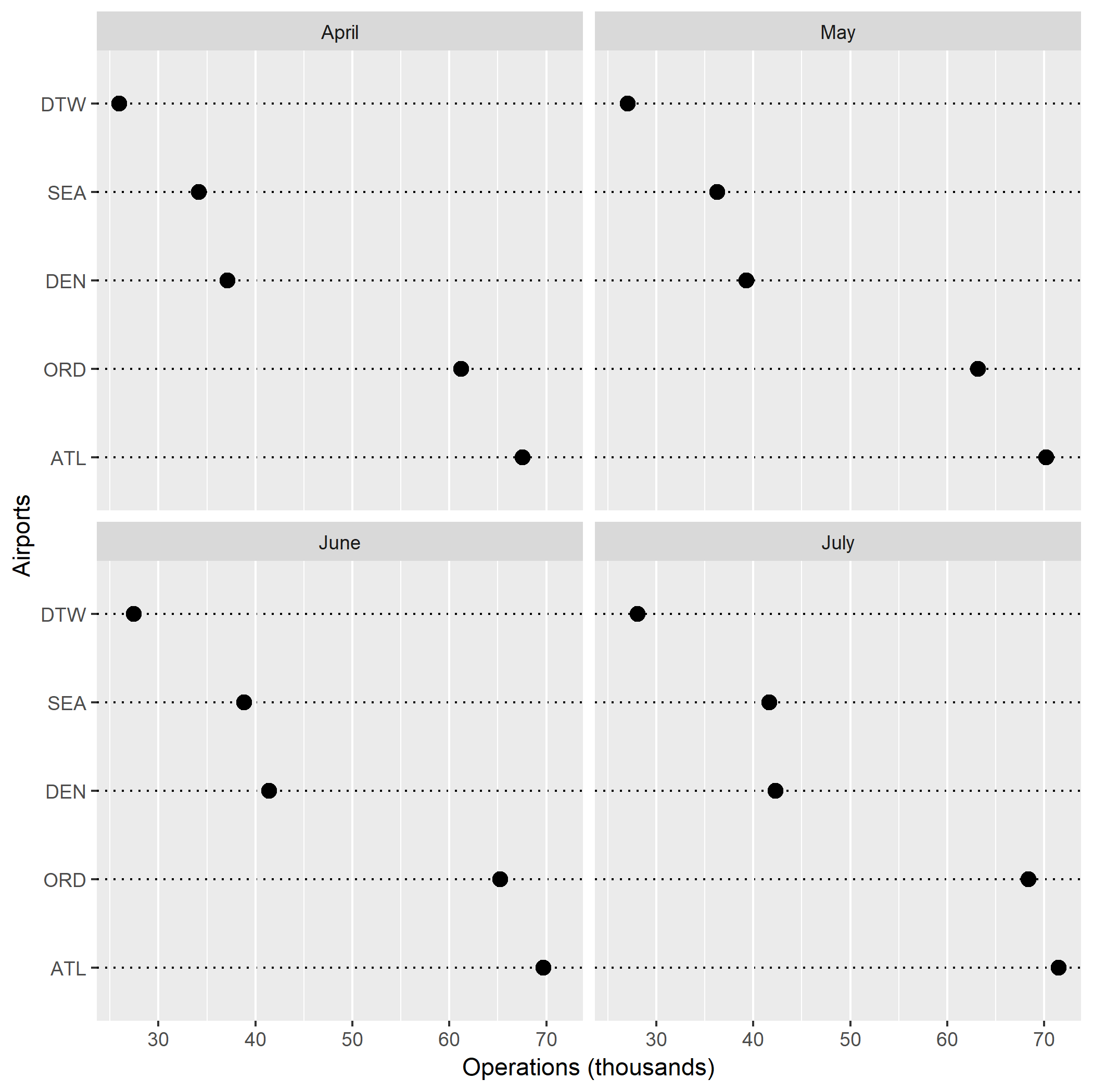
From these dot plots, I learned that the number of air carrier operations tend to increase as we move from the spring months into the summer months. This makes a lot of sense because more people are traveling during the summer, hence the jump in air traffic operations. The different types of dot plots that I generated taught me how each plot communicates information differently. Figure 1. gave me an overall glimpse at the trend of the data, but Figures 2. and 3. decoded the information in a more specific way. These two figures effectively graphed multiway data while retaining the labels.
I enjoyed grouping the data by rows (airports) more. Having all five panels on the same x-axis helped me to quickly and visually understand my data. Furthermore, grouping the data by airports just made more sense to me. I was able to look at the monthly trend and air carrier operations for each airport instead of looking at each month then comparing airports and their number of operations.
Comparing Distribution Graphs
In this assignment, I examined the number of shoes owned by men and women in an introductory statistics class. Using the the package LearnBayes, I took a random sample of 100 from the dataset studentdata. Figure 1. is a one-dimensional scatterplot with number of shoes on the horizontal scale. The vertical scale is categorized into two levels – male and female.
Figure 1.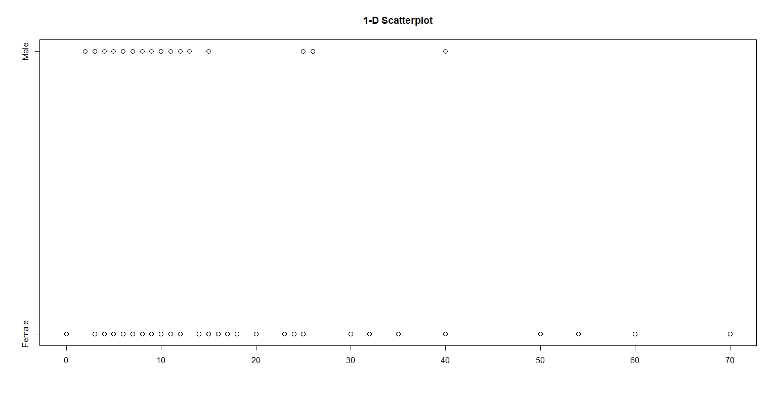
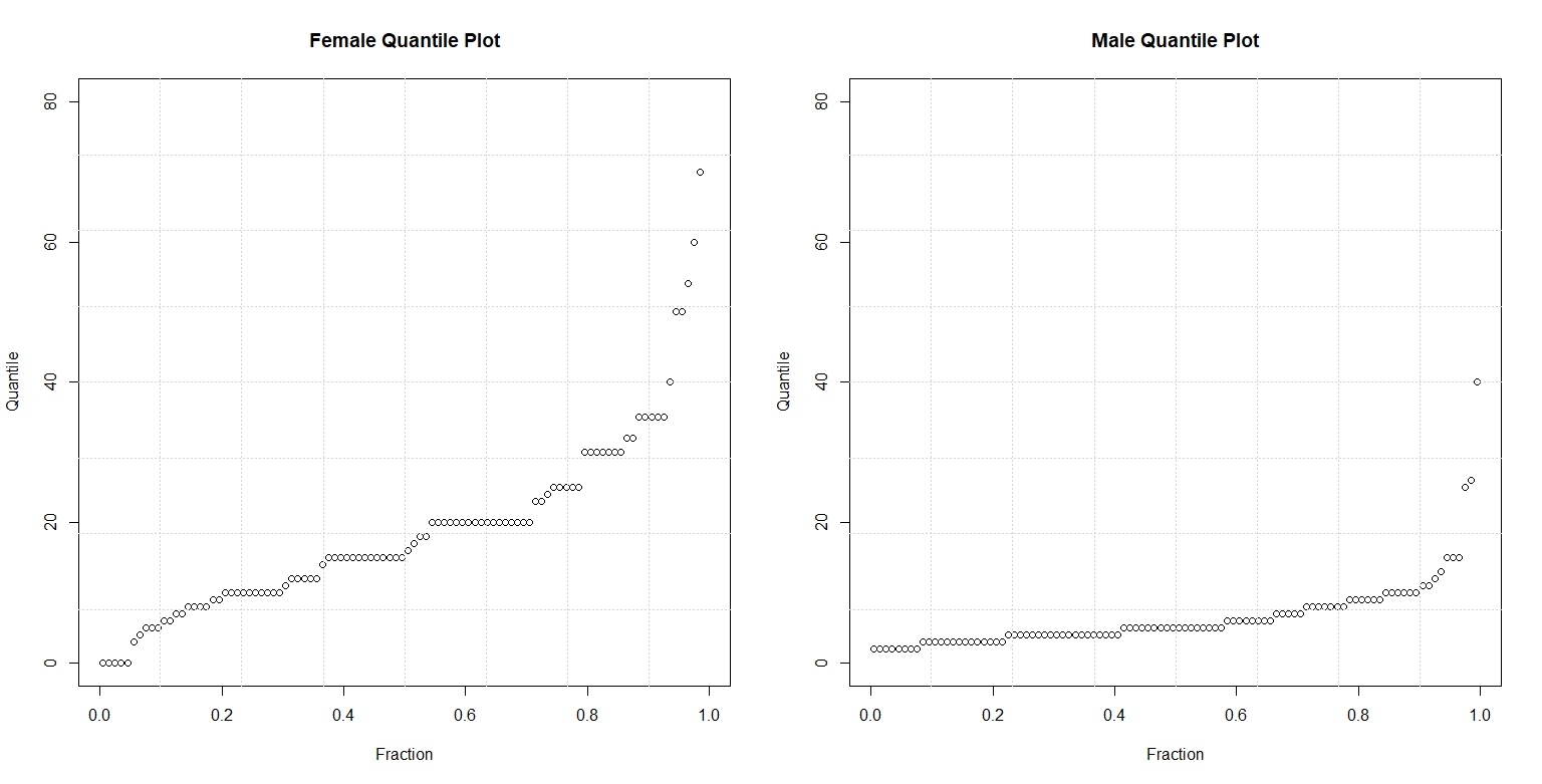
Figure 2. compares the quantile plots of the two gender and number of shoes. On each panel, the data is graphed against their respective f-values. On the left panel, we observe that the median number of shoes for women is almost 20. In contrast, we see on the right panel that the median number of shoes for men is short of ten. By looking at these parallel quantile plots, we can see that the median number of shoes owned by women doubles, more or less, that of men. Both quantile plots also reveal that the shape of the distribution of shoes is skewed. The majority number of shoes owned by males and females in this sample falls in the lower quartile, with a few in the upper quartile. Overall, the distribution of shoes for males and females is right-skewed with a few outliers near the 0.99 quartile.
Figure 2.
The following figure plots the quantiles of men against the corresponding quantiles of women.
Figure 3. 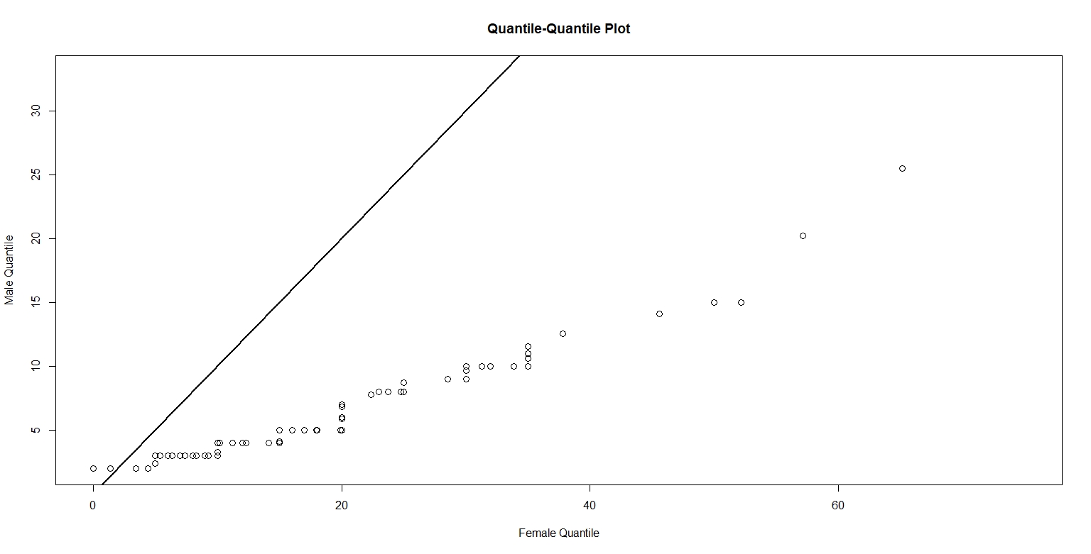
Figure 4. below plots the Tukey mean-difference for male and female number of shoes, with a horizontal reference line at -10. I chose to plot the horizontal line at -10 because the average of the difference is -10. The plot reveals that number of shoes for females is greater than men. On average, the increase in number of shoes for women is about 15. I believe the relationship between male and female values is pretty simple. That is, women tend to have more shoes than men.
Figure 4.
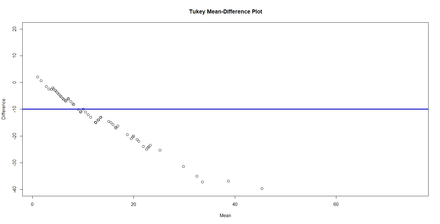
Between the four graphs, the Tukey Mean-Difference plot provides the best graphical comparison between the two sets. The Tukey Mean-Difference plot graphs the quantiles for the two sets together on one panel and lets us interpret the quantile difference on a horizontal line instead of a 45 degree diagonal line. Furthermore, we can easily and effectively compare the quantile differences to the average quantile. From this graph, we can deduce the number of shoes for men versus women. In short, the Tukey Mean-Difference plot is like a simple and meaningful summary of the other three graphs.
Pythagorean Theorem: An Application to 2016 NFL Data
The data that I collected was based on the 2016 NFL Standings for 10 teams. The data is provided in the table below, where PF (instead of P) represent “points for” the team.
Table 1.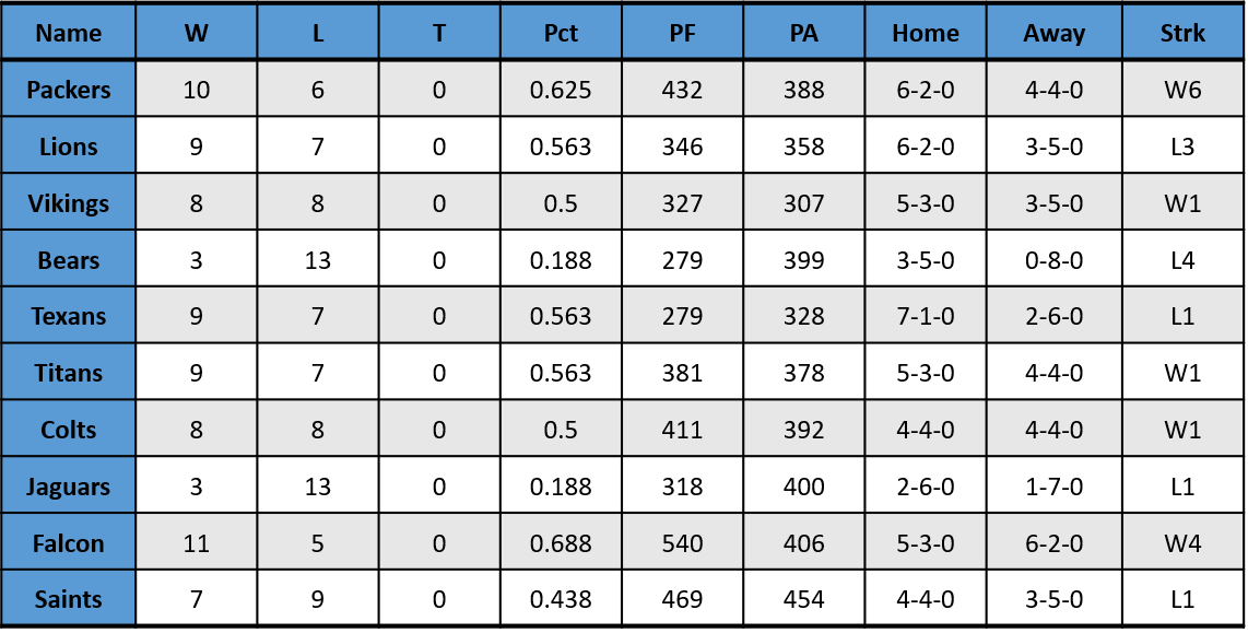
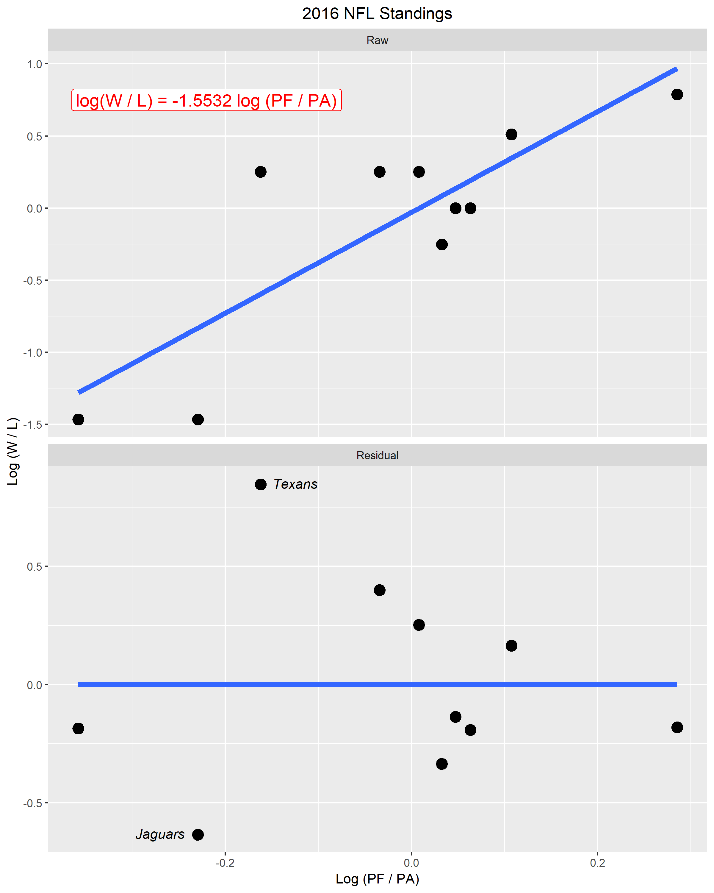
In the top panel of Figure 1., the horizontal scale measures the log ratio of total points scored for the team and total points scored against the team. The vertical scale graphs the log ratio of total wins and losses in the season. The best fitting line takes the form log (W / L) = k log (PF / PA), where k is taken to be -1.5532 in this particular data set. I chose -1.5532 to be the ideal exponent because when (PF / PA) is taken to the power of -1.5532, it returned the closest values for number of wins. Additionally, the k that I chose fit the data best.
The bottom panel of Figure 1. is a plot of residuals against log (PF / PA). In this figure, I labeled two points that seemed “unusual” compared to the rest of the data. I identified these two “unusual” points by labeling them with their respective team names, Texans and Jaguars. These two points seemed “unusual” because their residuals were much greater compared to the rest of the data points. Furthermore, due to these two data points, the residual was not evenly distributed vertically.
Figure 1.
Visualizing Amounts: Best Broadway Shows by Performances
Figure 1. 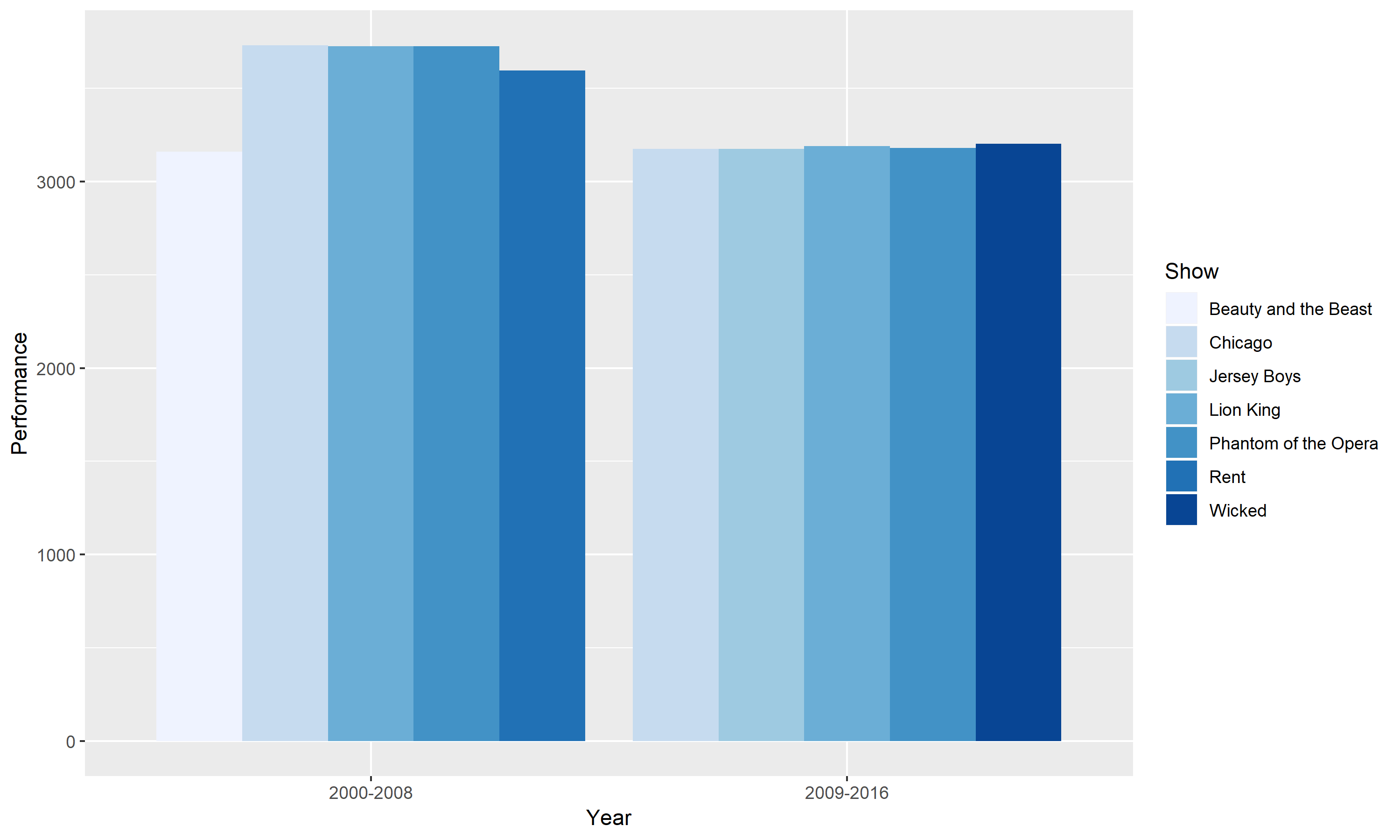
This graph compares the best Broadway shows for two time periods. The two time periods are between 2000 – 2008 and 2009 – 2016. The best Broadway shows are defined as having more than 3000 performances in each time range. The horizontal scale groups the two different period and the vertical axis shows the number of performances. From looking at this grouped bar chart, it is easy to identify that the 2000 – 2008 period had more performances. However, we also see an overlap of shows between the two periods. Chicago, Lion King and Phantom of the Opera appeared as three of the best Broadway shows for both periods.
Figure 2.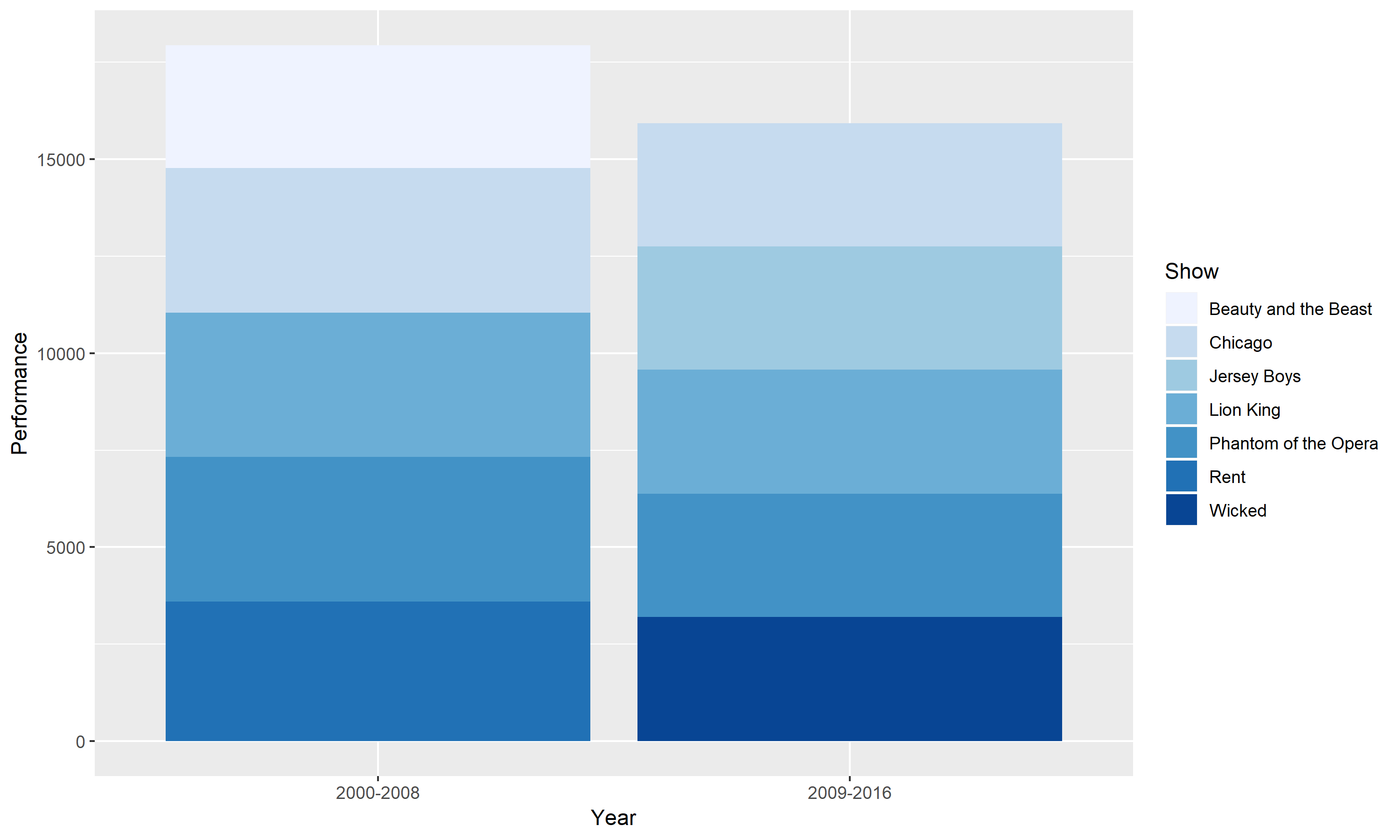
This chart is a stacked bar version of Figure 1. Instead of grouping the different shows, I stacked them on top of one another. The advantage to a stacked bar chart is it allows us to see how the best Broadway shows are divided into different show subcategories. However, a stacked bar chart may be harder to read especially when we want to compare each subcategory to another.
Figure 3.
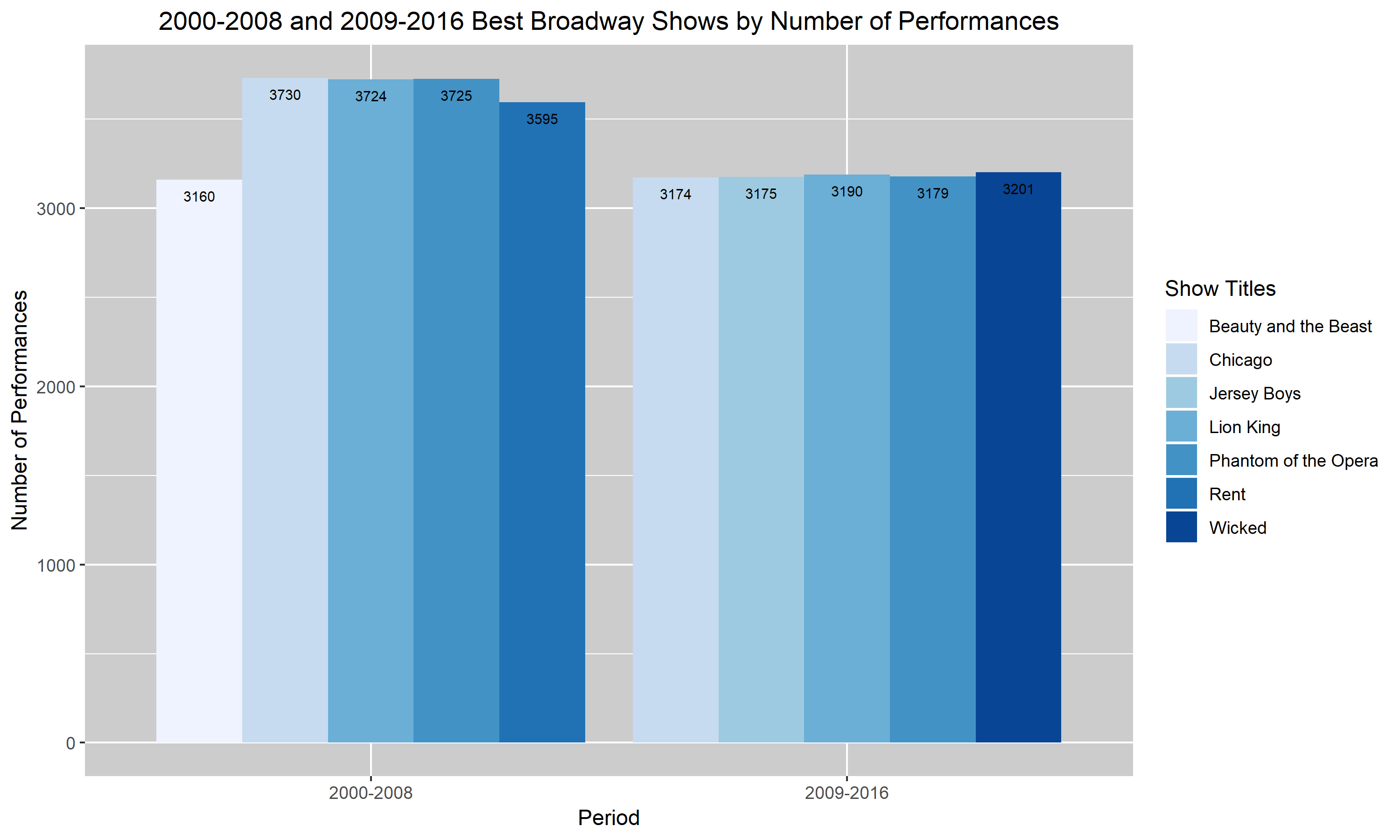
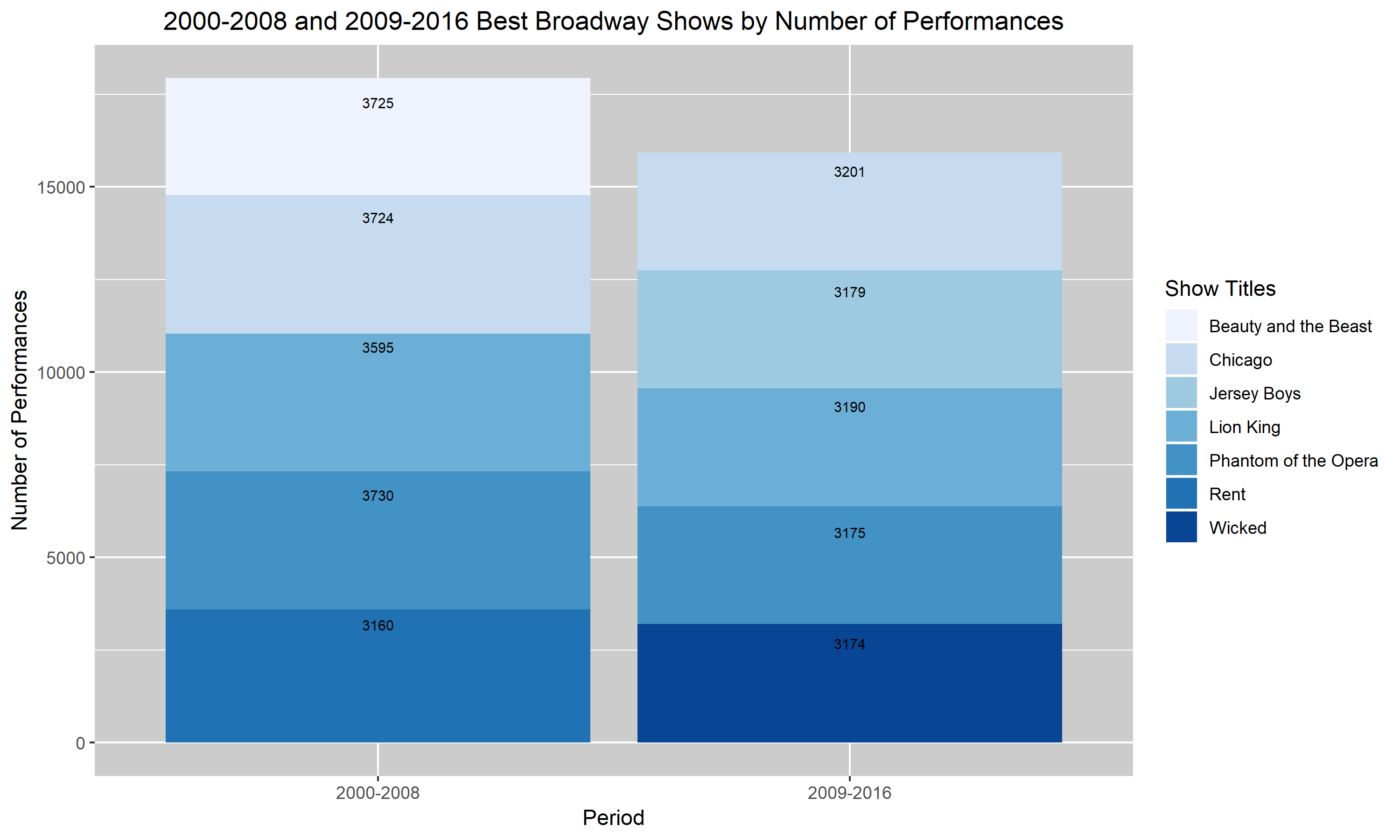
Figures 3. and 4. are my improved versions of Figures 1. and 2. I added a descriptive title to the figures so that my reader will have a rough idea of what my graph is trying to convey without having to read the caption. I also changed the labels to describe the scales more accurately. So, instead of saying “Year” and “Performances”, I changed it to “Period” and “Number of Performances”. Additionally, I darkened the background of my last two graphs. I realized that the very light blue bar in the first two graphs were almost hard to distinguish from the background. Hence, I darkened the background to help the bars pop up. Lastly, I added the values corresponding to each bar into my two final graphs. I felt like it was hard to compare each show and their number of performances in the top two graphs and so I decided that by having the values listed, it’ll help. Unfortunately for the darkest blue bar, the black font doesn’t pop up as well as I had hoped. I didn’t know how to choose a different color for that value specifically so I left it as is. I hope that with more research and assignments, I will learn how to distinguish that value through the use of color.
Two Scales and Comparison: Country Population Growth
Figure 1.
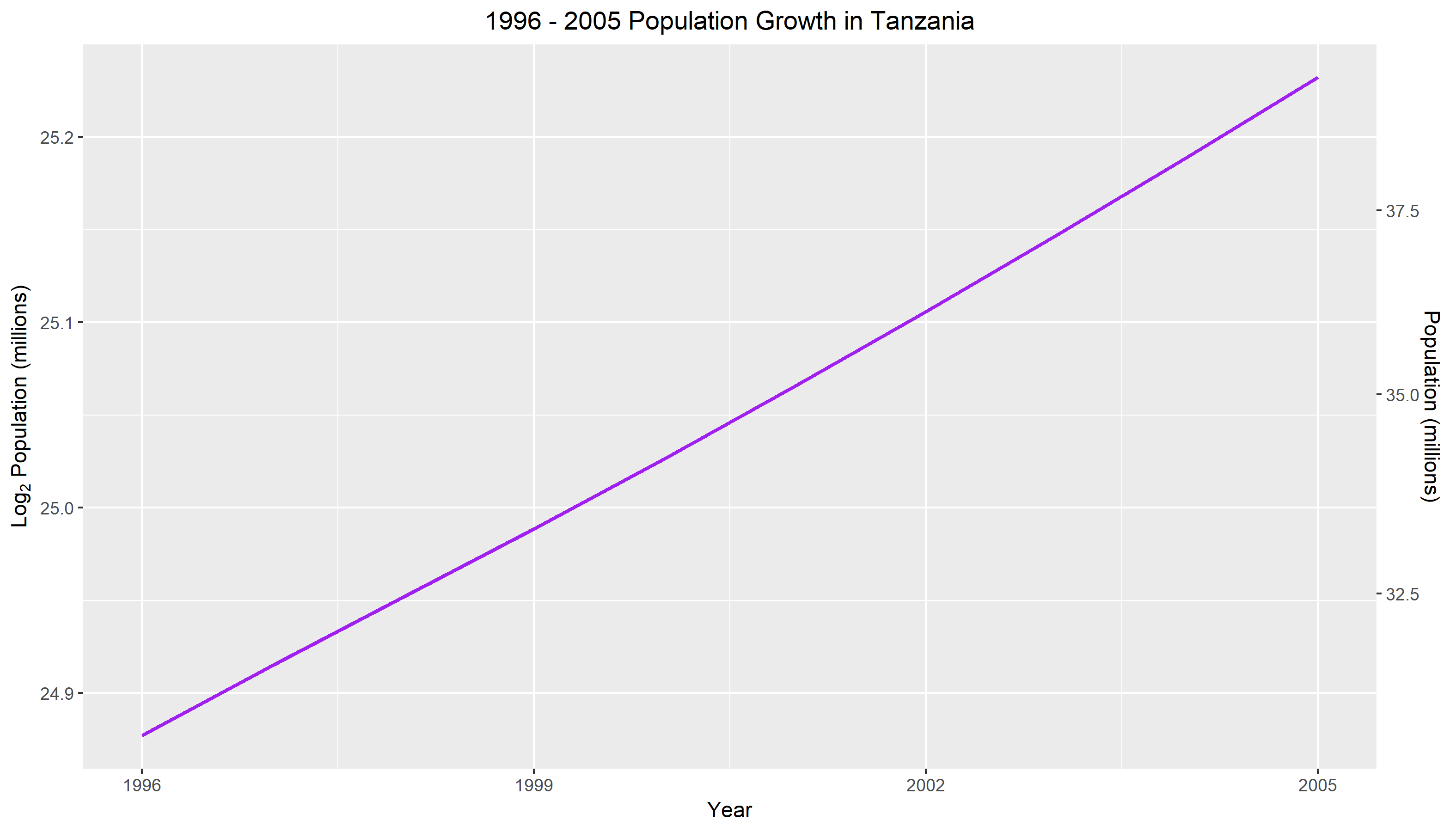
Figure 1. measures the population growth in Tanzania for a ten year frame. The horizontal scale is measured in years starting from 1996 to 2005. The left vertical axis uses a log base 2 scale and is measured in millions. The right vertical scale uses the original population units and is calculated in millions. From looking at the graph, we can see that there is an exponential relationship for population growth in Tanzania. That is, with each passing year, the population tends to increase. Comparing the year 1996 to 2005, we can see that the population has increased from less than 32.5 million to more than 37.5 million. Although the rate of change is minuscule, we can see that the slope is slowly getting steeper with each year.
Figure 2.
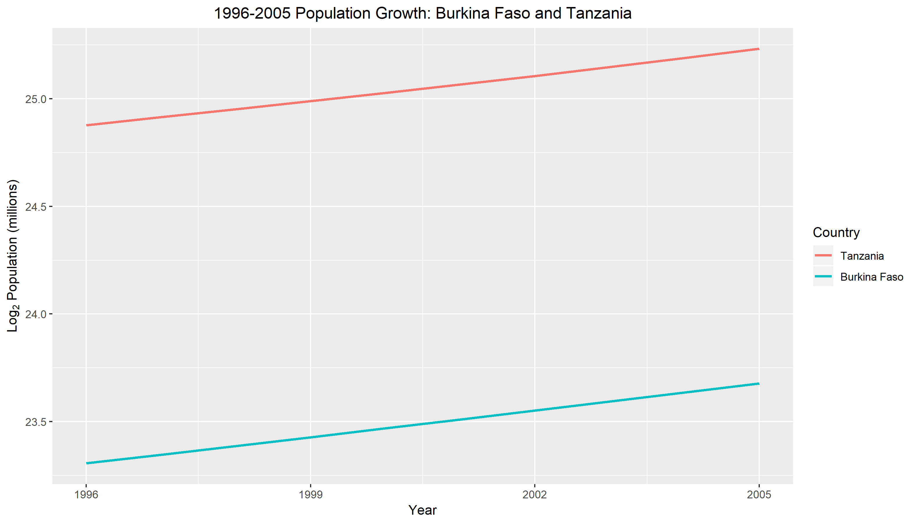
In Figure 2. we compare the log base 2 population growth against year for two countries. The two countries in this study are Burkina Faso and Tanzania. The horizontal scale is measured in years from 1996 to 2005. The vertical scale uses a log base 2 transformation and is given in millions. The graph reveals to us right away that Burkina Faso has a much smaller population size compared to Tanzania. This can be seen from the distance between the two connecting lines. Although their population sizes are different, both countries displays an exponential relationship between population and year. We can see from the graph that with each year that goes by, the population is increasing at a steady rate.
Elements of Clear Vision: An Application to U.S. Cereal Data
Figure 1.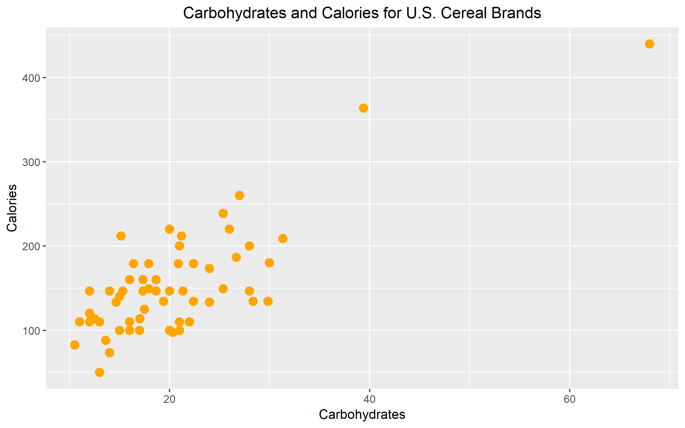
Figure 1 illustrates the nutritional relationship between carbohydrates and calories for a selection of U.S. cereal brands. The graph reveals a positive but moderately weak relationship between the carbohydrates and calories. The average carbohydrates for U.S. cereal brands ranges between 0 to 30. The average calorie count for U.S. cereal brands fall is between 0 to 250. The graph suggests that as the number of carbs increases, so does the number of calories.
Figure 2.
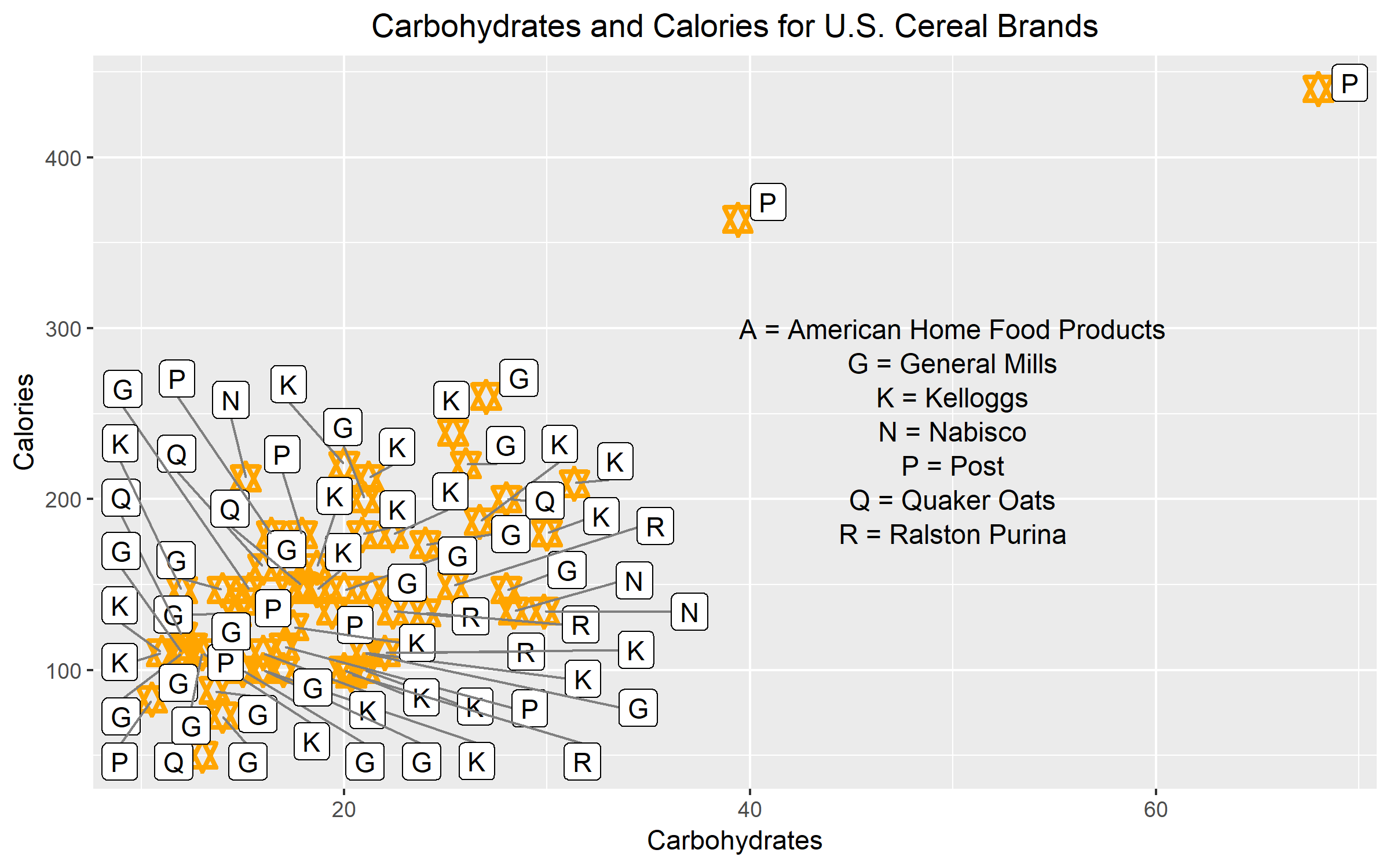
Figure 2 was redrawn from Figure 1. However, the graph was modified to violate at least two attributes of clear vision. The first modification leading to unclear vision was the use of data labels inside the scale-line rectangle. For each data point, I assigned the corresponding manufacturer label to it. As we can see, the label interferes with the data and clutters the graph. The key also adds to the graphical mess. The second modification that pushed this graph to have unclear vision was the graphical element. The plotting symbol that I used for this example was a star. The star is too fancy. The different points and lines of the stars are not prominent enough to stand out. It is hard to distinguish how many points make up the area where most of the data values are concentrated.
Figure 3.
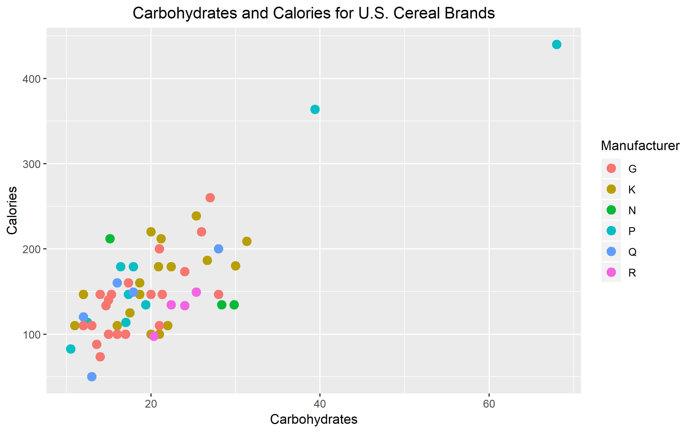
The third variable that I chose was the U.S. cereal manufacturer company. I chose manufacturer as my third variable because I believe that different companies may have their own set of regulations for nutrition. This can change how much calories and carbs are in each cereal box or serving size. Overall, I think that my graph is effective in representing my third variable. I think that between the three ways that could’ve been used to distinguish my third variable, color was definitely the most effective. I believe that color was effective because there are six different manufacturers. Using six different plotting symbols or six different sizes would make the graph look too messy. In the end, color was the best option. It worked out perfectly too because the pop of color makes it easy to identify the manufacturer for each data point.
Tuition Growth
Instructional fees per term at BGSU were collected for some selected years to assess the relationship between the two variables.

The scatter plot reveals a positive relationship between the two variables. We can see from the plot that as the years go by, instructional fees per term increases. The decade between 1980 and 1990 marks a time where fees increased the most rapidly.
The assignment provided some challenges. The hardest part for me was trying to figure out how to change the plotting symbol, how to thicken it and how to change the size of it. I wasn’t familiar with where to specify these aesthetics in my code and so I spent quite a bit of time returning error messages. After figuring how to customize the plotting symbol, I was able to thicken the connecting line with no trouble.
Is Horsepower of a Car Related to Its Mileage?
Horsepower and mileage data from 32 cars in the 1973-74 model were collected by Motor Trend magazine. To determine if horsepower of a car is related to its mileage, I constructed a scatter plot to understand the relationship between the two variables. 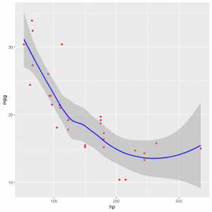
The scatter plot reveals a moderate, curve-linear, negative association between horsepower and mileage of the car. From the plot, we see that cars with more horsepower typically have less mileage. There appears to be outliers in the data as shown by the red dots that fall outside of the grey area.