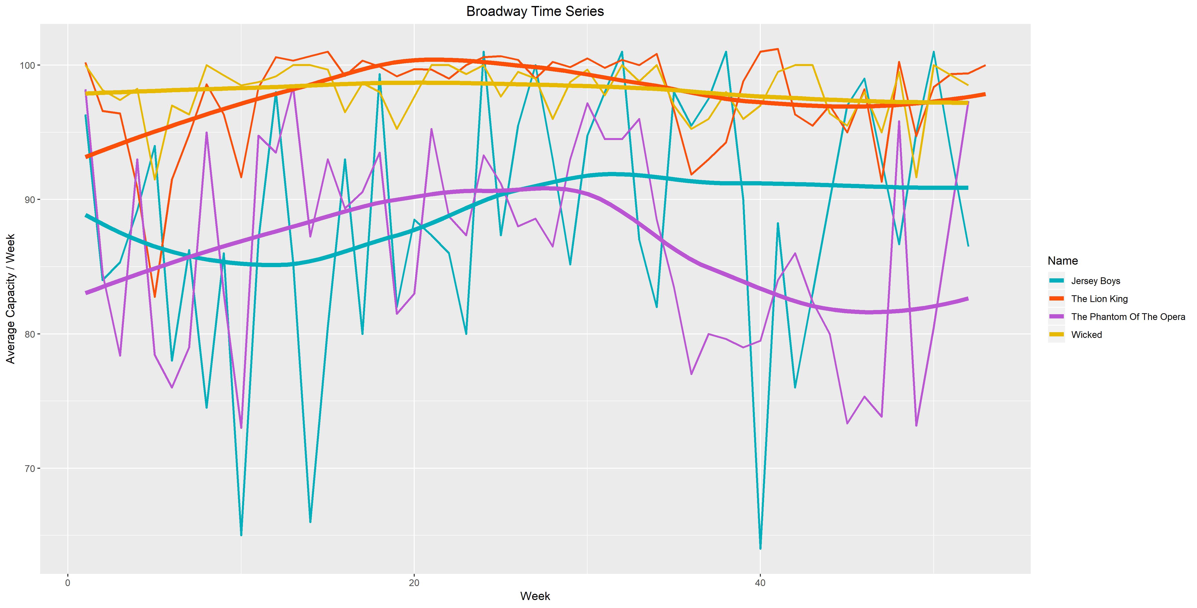
In the first figure, I plotted average capacity as a function of week and compared four different shows. These four shows (Jersey Boys, Lion King, Phantom of the Opera and Wicked) are significant because they were performed over 3000 times in the years 2009 to 2016. The colors I chose go from warm to cool as our eyes move down the graph. I decided to color it this way because the two connected and the two smooth time series in the bottom have larger vertical distance, while the ones on top don’t. I wanted to balance the attention, therefore I chose cooler tones for the bottom time series so that they don’t overpower the top ones. I chose warmer colors for the top four time series since their vertical spread is much smaller. With the choice of warmer colors, I hope that the top four time series won’t be overwhelmed by the large vertical distance of the bottom four.
Figure 1. 
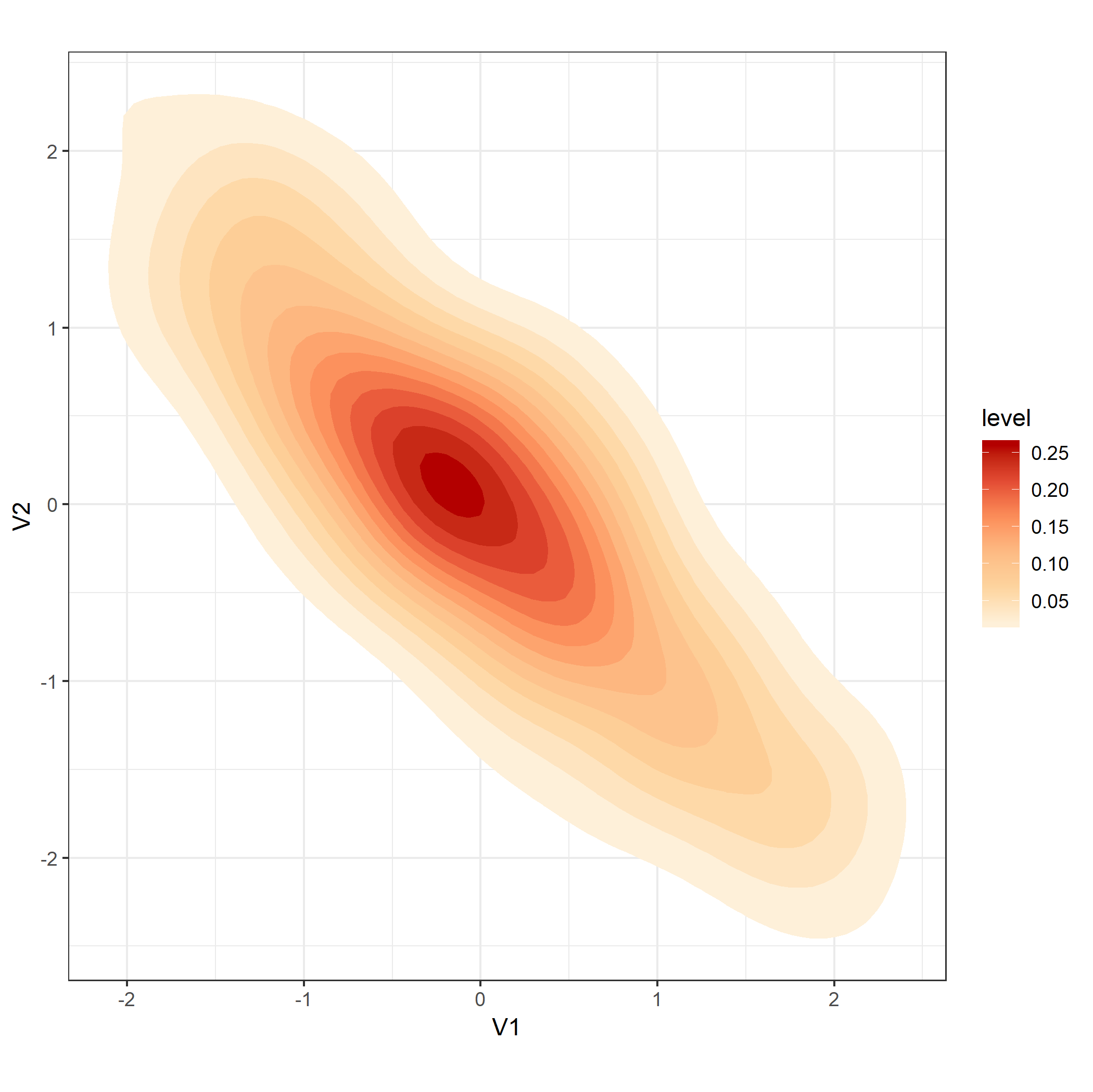
In Figure 2. I chose a sequential palette going from orange to red. I believe that these colors are more suitable because when we look at the key, we see that the level is ordered from high to low. To me, it’s easier to read the graph and understand that a lighter color indicates a lower level. Likewise, a darker color indicates a higher level. Just by observing the graph, it’s easy to identify that the brightest point has the highest levels. Although the Spectral palette is beautiful, the diverging colors don’t provide much information about the levels.
Figure 2.