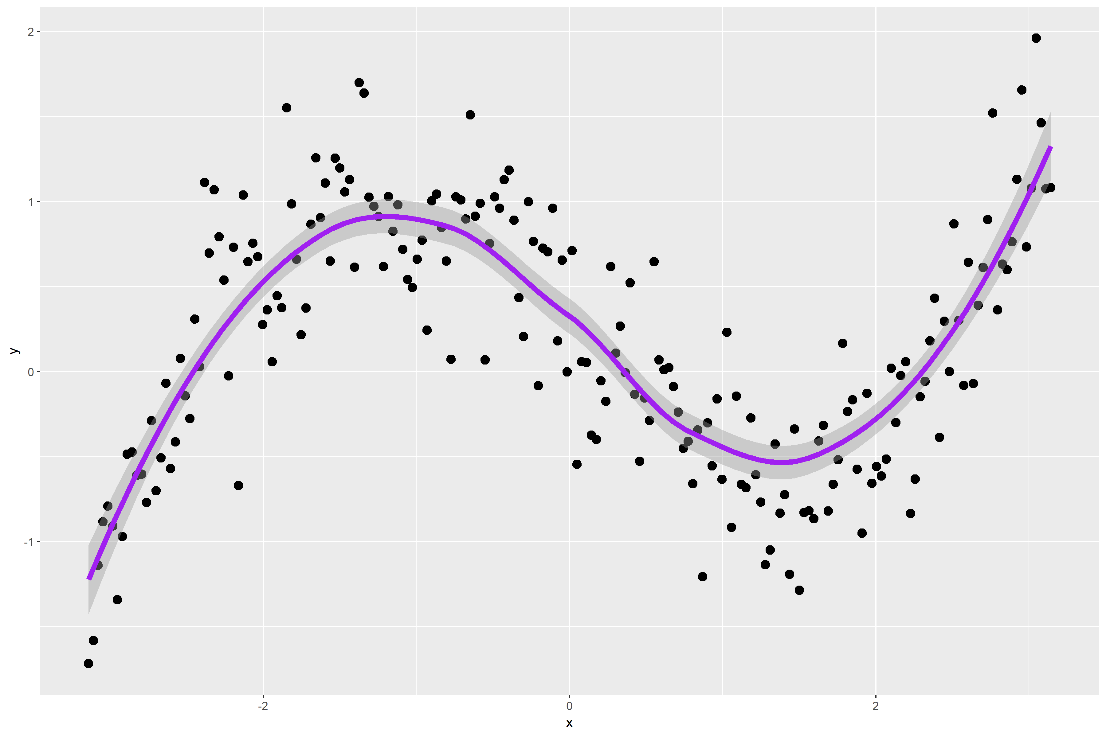
Figure 1. is a scatterplot of my randomly simulated data with a loess smooth overlay. The loess smooth overlay is set to its default value in ggplot2.
Figure 1.

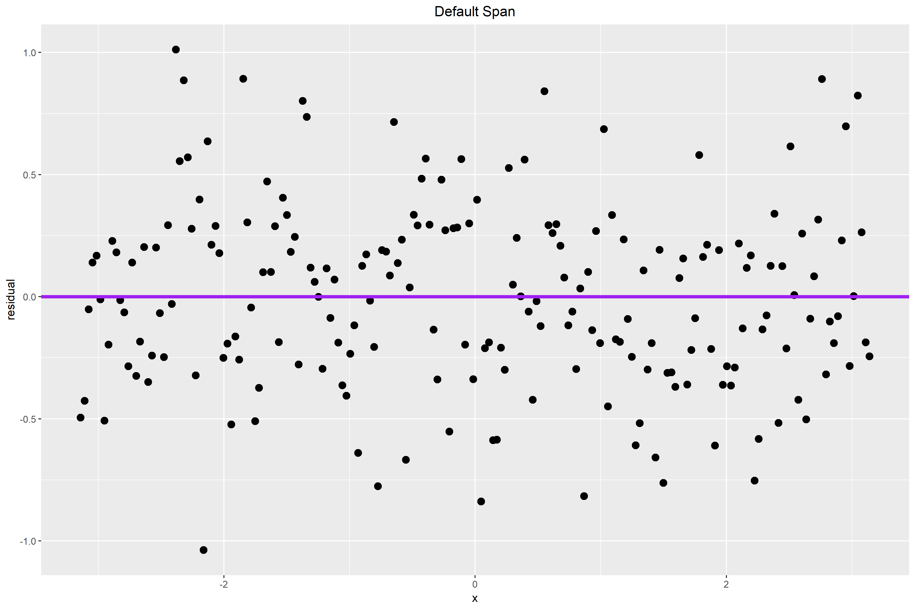
The following graph plots the residuals for my data points. The default span for the lowess curve appears to have found the signal fairly well. For the most part, the residuals are pretty randomly distributed. However, some may argue that there is a bit of a wave-like pattern in the residual plot.
Figure 2.
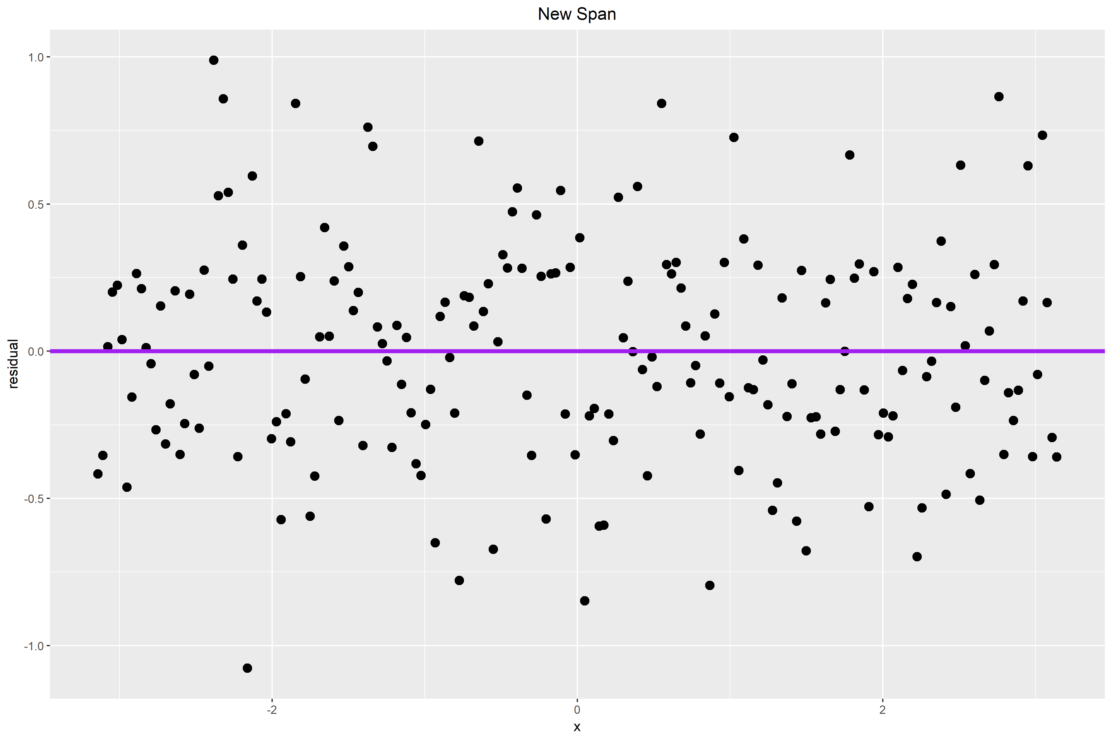
The plot below shows the residual plot after I changed the span from its default value to 0.65. The small pattern that we see in Figure 2. is probably caused by a larger alpha value. Therefore, I hope that by making alpha smaller, some of the pattern that we see in the residual plot above will be accounted for by the curve and new choice of the span.
In Figure 3. the residuals are closer to the horizontal line. The wave-like pattern that we see in Figure 2. also diminished slightly. The residuals appear to be more randomly distributed from before and there is less of a vertical spread. Thus, a span choice of 0.65 seems better than the default option.
Figure 3.
