Monthly Archives: November 2018

Decoding Pop Charts

For the first example, I chose a pie chart that showed daily phone activities for smartphone owners. The breakdown of the activities are provided below in Figure 1.

Figure 1.
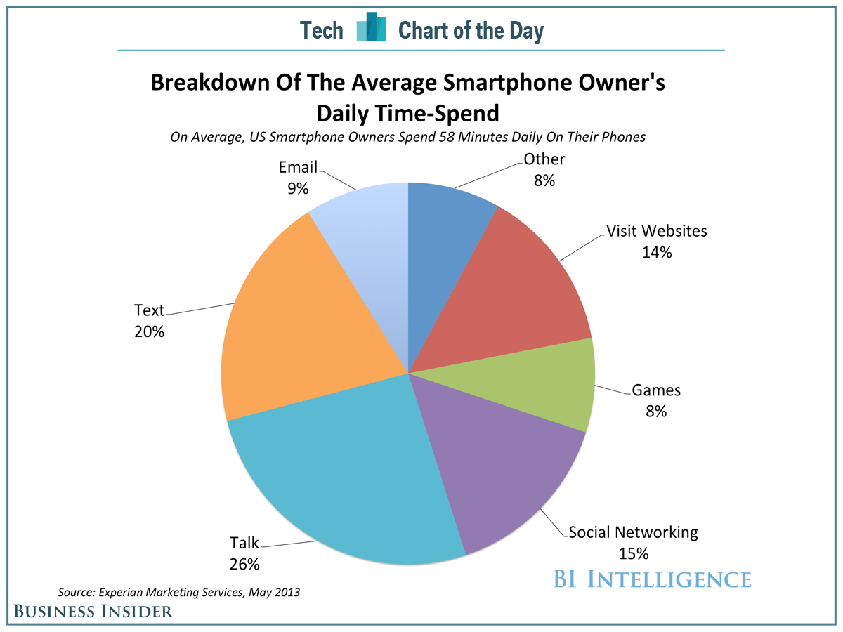
Although this pie chart is visually appealing and shows us the overall distribution of smartphone owners’ time usage, it’s hard to identify patterns quickly. In Figure 2. below, I constructed a dot plot where phone activities were plotted against percentage in an increasing order.

Figure 2.
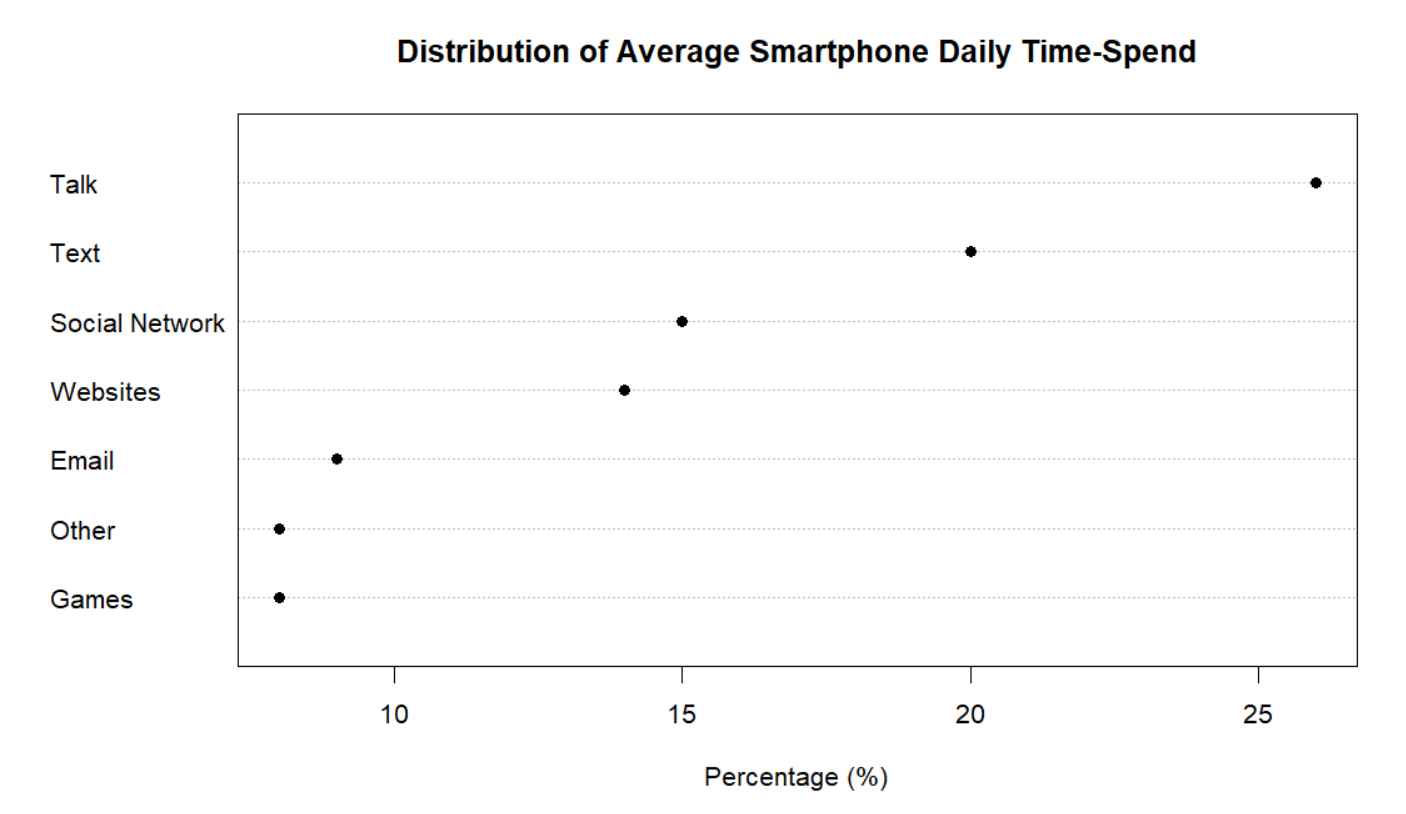
I believe that the dot plot is an improvement to the pie chart. The dot plot allows us to decode the information above and see patterns that we wouldn’t before. We can easily identify each point and match it to its percentage and phone activity.  For instance, we can quickly observe that Games and Other have the smallest percentage. Following the trend from left to right, we can say with confidence that Talk is the phone activity with the largest percentage. This method of table look-up is far more efficient that trying to mentally order the pie slices from lowest to highest percentage.

For the second example of this assignment, I chose a divided bar chart. The divided bar chart shows the number of people of color (POC) in Congress from 2001 to 2017 (9 Congress terms). The people of color are classified by race and ethnicity. They include black, Hispanic, Asian and Native Americans. The divided bar chart is shown below.

Figure 3.
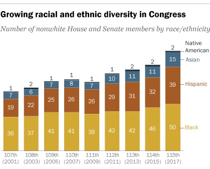
This graph is a good example of a divided bar chart but again, it’s hard to quickly note any patterns. In Figure 4., I constructed a multiway dot plot. The multiway dot plot was classified by race and ethnicity.
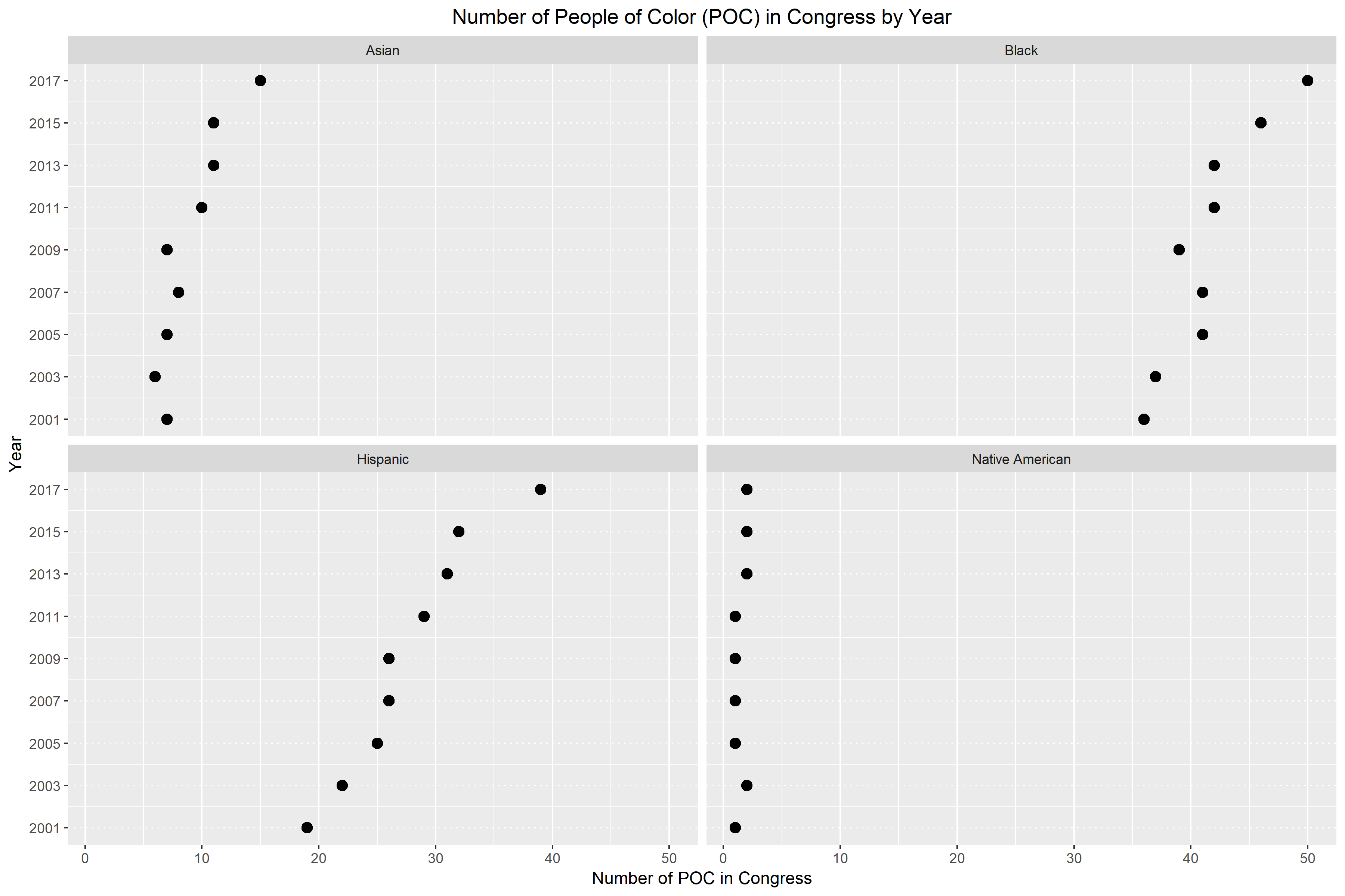
Again, I believe that the multiway dot plot is an improvement of the divided bar chart. In Figure 4., it becomes really obvious whether there is a pattern or not. For the most part, we can easily see that racial and ethnic diversity is growing in Congress. The only panel that doesn’t support this claim is the bottom right panel for Native Americans. For Native Americans, we see that they are still largely underrepresented in Congress. The number of Native Americans in Congress has been wavering between one and two for the last 17 years. Additionally, I believe that this multiway dot plot is an improvement because we can easily decode the information by table look-up. If the numbers were not on the divided bar chart, there would be no way of knowing how many people are represented by each chunk of color. However, the multiway dot plot allows us to navigate back and forth between the point and its corresponding year and number.
 

Multivariate Data

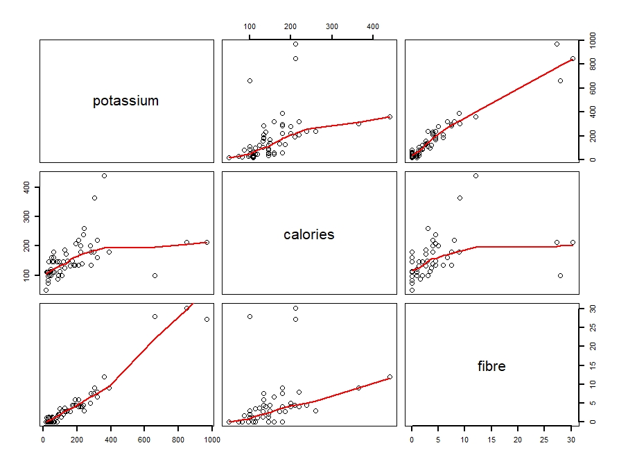
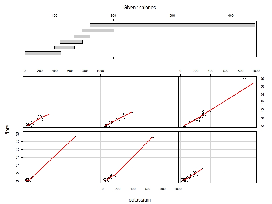
In this week’s blog assignment, I examined the relationship between calories, potassium and fibre using three different tools. They include a scatterplot matrix, coplot and spinning scatterplot.

Figure 1: Scatterplot matrix of potassium, calories and fibre with loess curve spanned at 0.8.

Figure 2: Coplot of fibre against potassium, conditioned on calories.

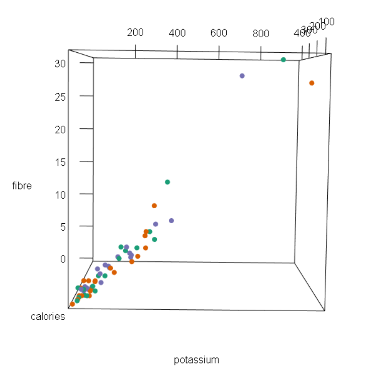
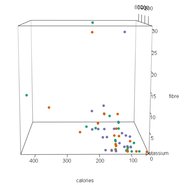
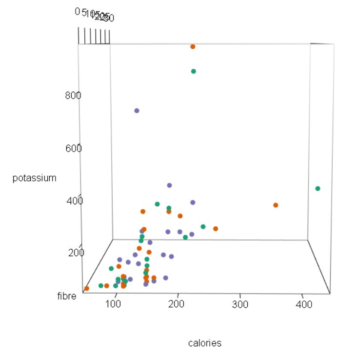
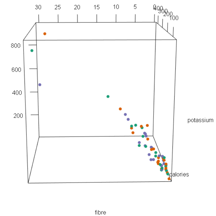
Figures 3 – 7: Snapshots of spinning scatterplot
  

Using all three tools, we see that there is a positive, moderate and linear relationship potassium and calories. Generally, an increase in potassium includes an increase in calories as well. From the scatterplot matrix, we see that as potassium reaches 400 grams, the amount of calories gradually levels out. Clearly, we can see that there are outliers and a few possible cases of high leverage.

On the other hand, the relationship between potassium and fibre is strong, positive and linear. That is, small amounts of potassium tend to have small amounts of fibre. Likewise, large amounts of potassium generally have larger amounts of fibre as well. Again, there are three data points that can be considered influential points. In other words, it seems that these three points have potassium and fibre amounts that are far from the other points.

Lastly, the relationship between calories and fibre is weak, positive and linear. A small amount of calories tends to have less fibre, vice versa. From the plots, we can see that there are a couple of points that move away from the loess curve. Some of these points are outliers, meaning that their amount of fibre deviate from the pattern of other cereal brands. Furthermore, some of these points are high leverage cases, meaning that their amount of calories stray away from the pattern of other cereal brands.

Two cereal brands that deviate from the general pattern of the scatterplot are Grape Nuts and 100% Bran. Grape Nuts is a “special” brand because for the amount of potassium that it has (360 grams), the cereal has a really high level of calories (450 cal). Most brand with 360 grams of potassium only have between 150 to 300 calories. 100% Bran is also considered a “special” case because it has a very high amount of fiber (30 g) for having only 212 calories. Other cereal brands around 200 calories have 10 or less grams of fiber. However, 100% Bran’s fiber amount is considered very large compared to the patterns of other cereal brands.


Color

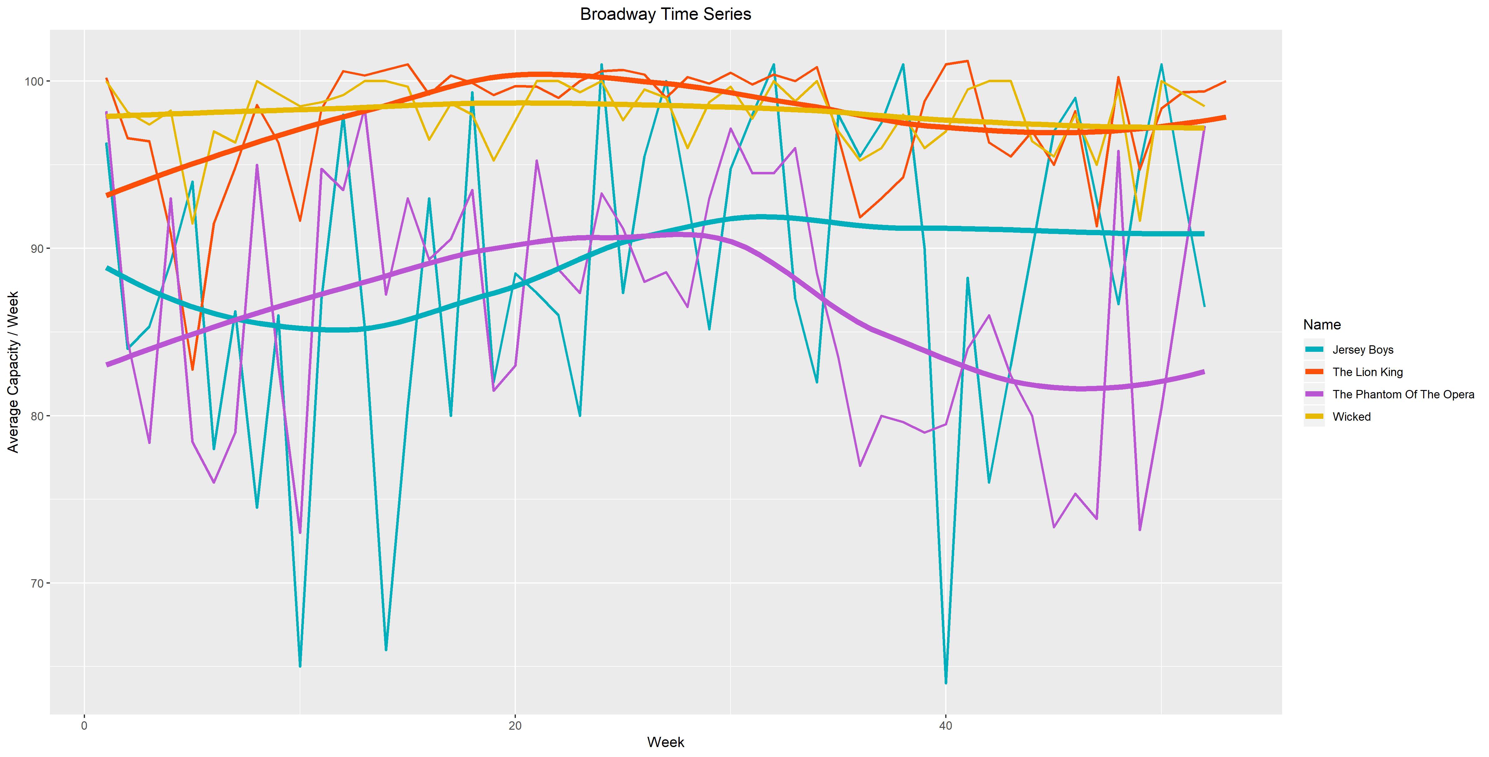
In the first figure, I plotted average capacity as a function of week and compared four different shows. These four shows (Jersey Boys, Lion King, Phantom of the Opera and Wicked) are significant because they were performed over 3000 times in the years 2009 to 2016. The colors I chose go from warm to cool as our eyes move down the graph. I decided to color it this way because the two connected and the two smooth time series in the bottom have larger vertical distance, while the ones on top don’t. I wanted to balance the attention, therefore I chose cooler tones for the bottom time series so that they don’t overpower the top ones. I chose warmer colors for the top four time series since their vertical spread is much smaller. With the choice of warmer colors, I hope that the top four time series won’t be overwhelmed by the large vertical distance of the bottom four.

Figure 1. 

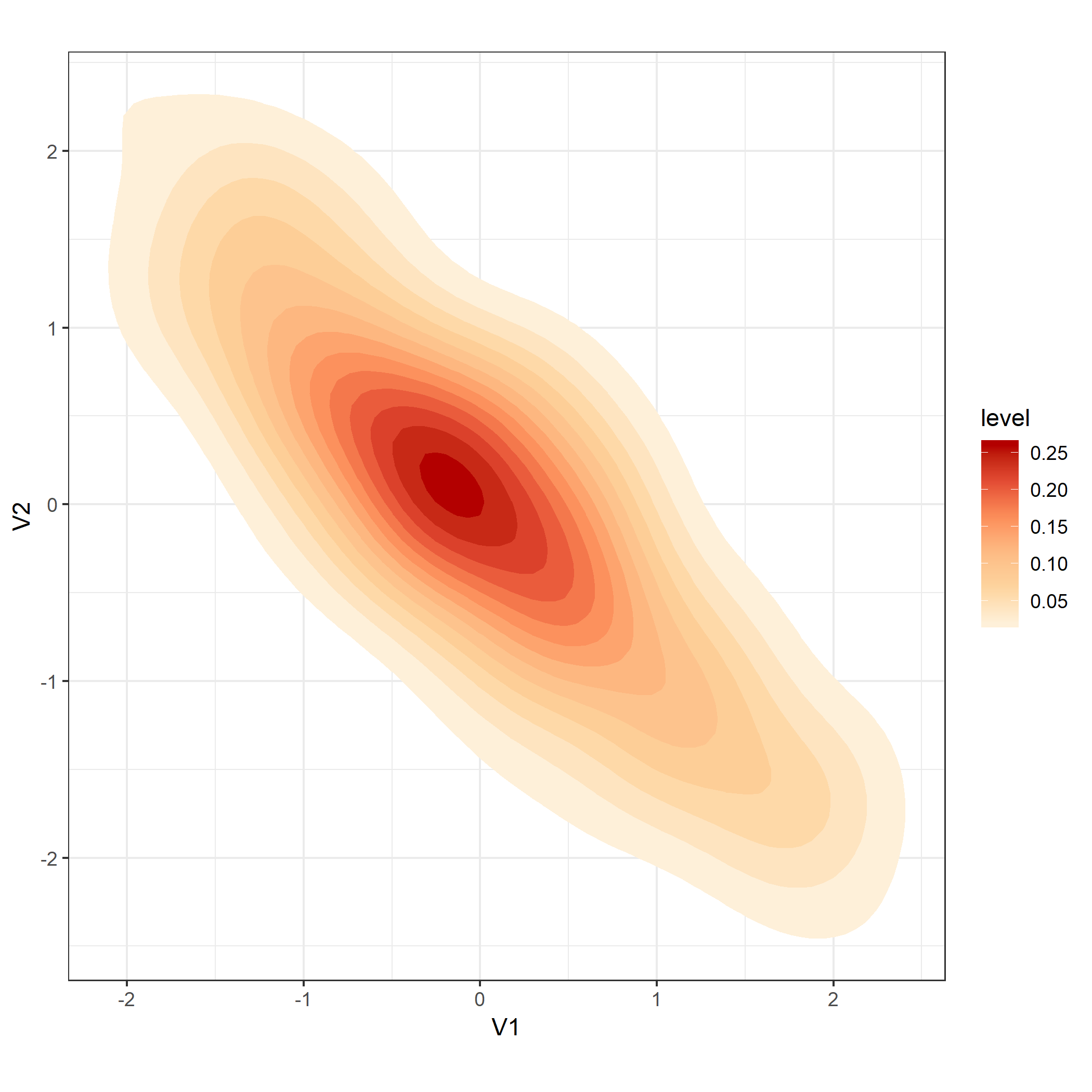
In Figure 2. I chose a sequential palette going from orange to red. I believe that these colors are more suitable because when we look at the key, we see that the level is ordered from high to low. To me, it’s easier to read the graph and understand that a lighter color indicates a lower level. Likewise, a darker color indicates a higher level. Just by observing the graph, it’s easy to identify that the brightest point has the highest levels. Although the Spectral palette is beautiful, the diverging colors don’t provide much information about the levels.

Figure 2.