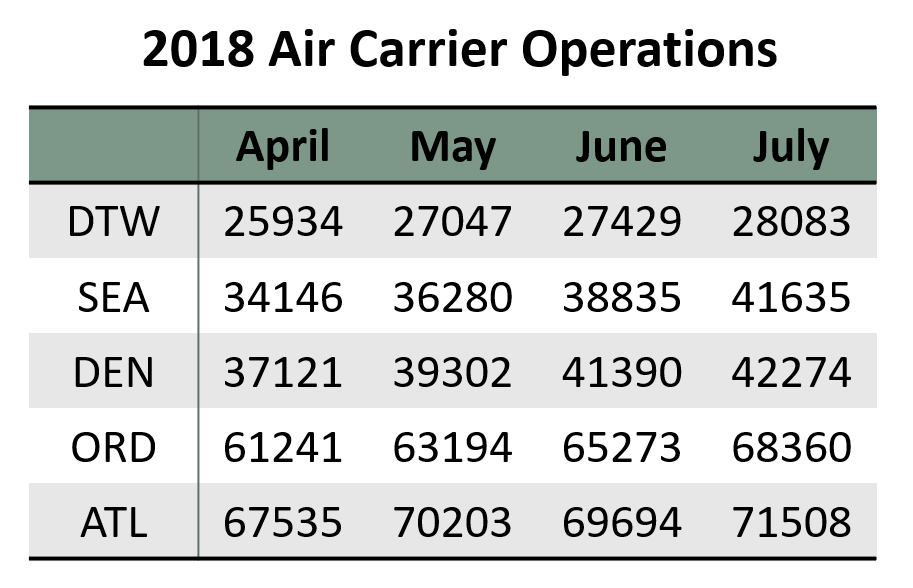
In this week’s blog assignment, I collected data on air carrier operations for five airports, namely DTW, SEA, DEN, ORD, and ATL. The response is the number of air carrier operations. The rows are classified by airports and the columns are classified by the four months between April to July 2018. The data is presented in the table below.

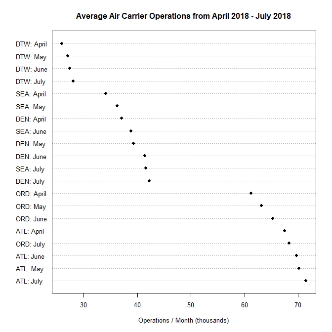
Figure 1. is a dot plot graphing the data. The horizontal scale measures the average number of air carrier operations in thousands. The vertical scale shows each airport and all four months. The mean number of operations is ordered from high to low as we read from left to right.
Figure 1.
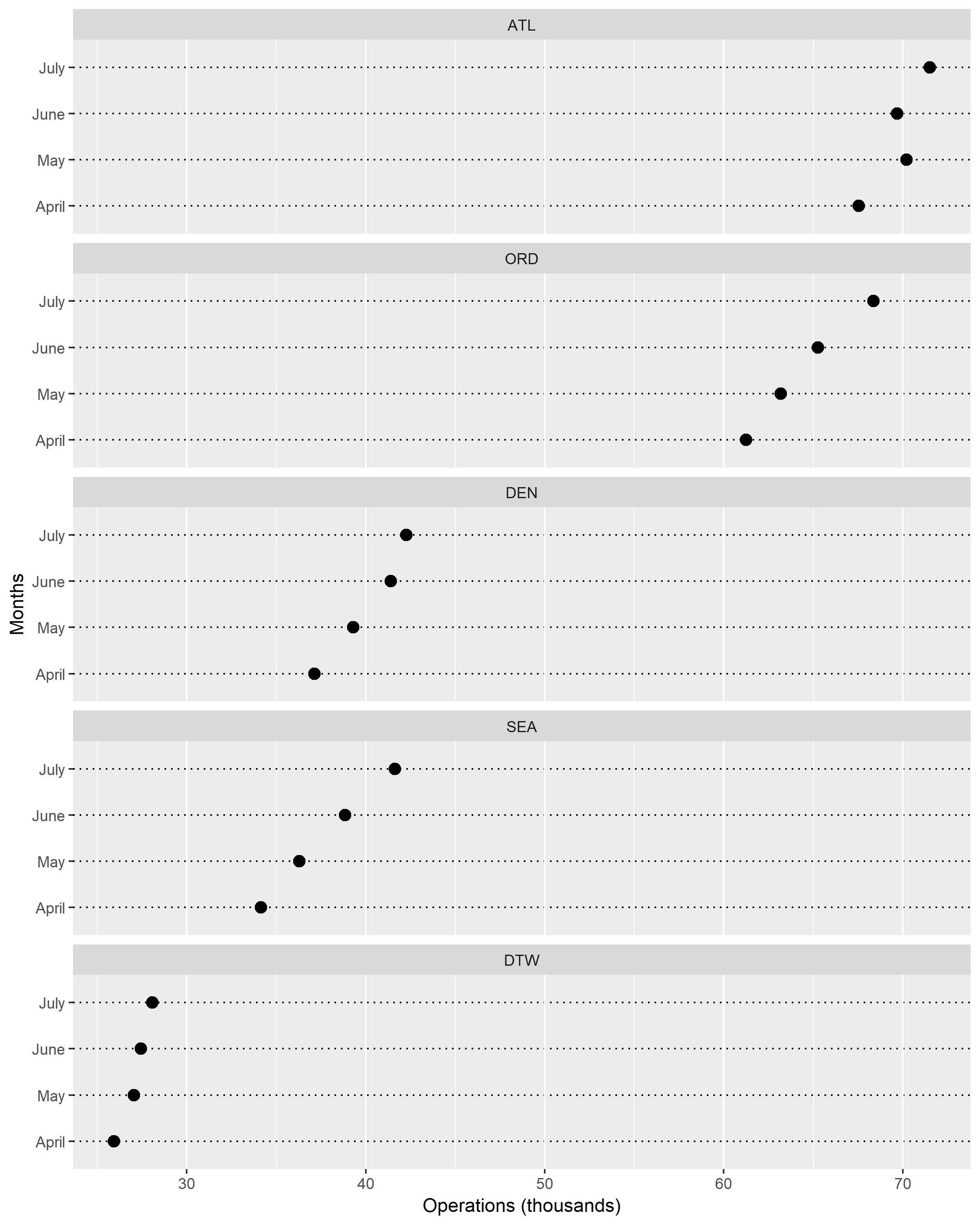
In Figure 2. I classified the multiway dot plot by rows. In this case, it was grouped by airports. I moved the panels so that it would show the airport with the largest number of operations at the top and smallest number of operations at the bottom. Clearly, we can see that there is a trend for each airport by month.
Figure 2.
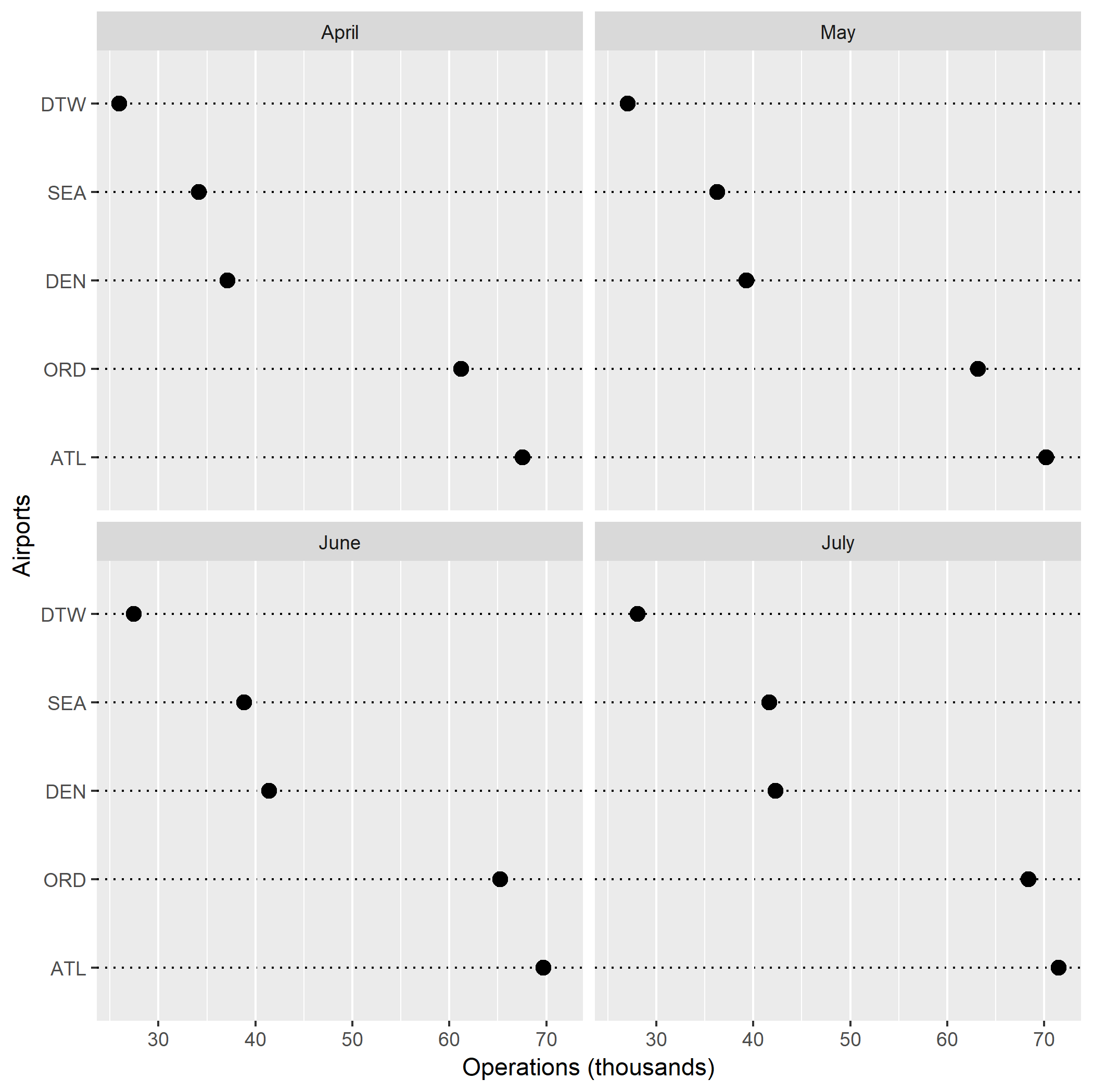
Figure 3. was grouped by columns, therefore by months. From this figure, it is also very clear that there is a trend for each airport. Throughout all four months, DTW has the smallest number of operations. In contrast, ATL remains as the airport with the most operations per month.

From these dot plots, I learned that the number of air carrier operations tend to increase as we move from the spring months into the summer months. This makes a lot of sense because more people are traveling during the summer, hence the jump in air traffic operations. The different types of dot plots that I generated taught me how each plot communicates information differently. Figure 1. gave me an overall glimpse at the trend of the data, but Figures 2. and 3. decoded the information in a more specific way. These two figures effectively graphed multiway data while retaining the labels.
I enjoyed grouping the data by rows (airports) more. Having all five panels on the same x-axis helped me to quickly and visually understand my data. Furthermore, grouping the data by airports just made more sense to me. I was able to look at the monthly trend and air carrier operations for each airport instead of looking at each month then comparing airports and their number of operations.