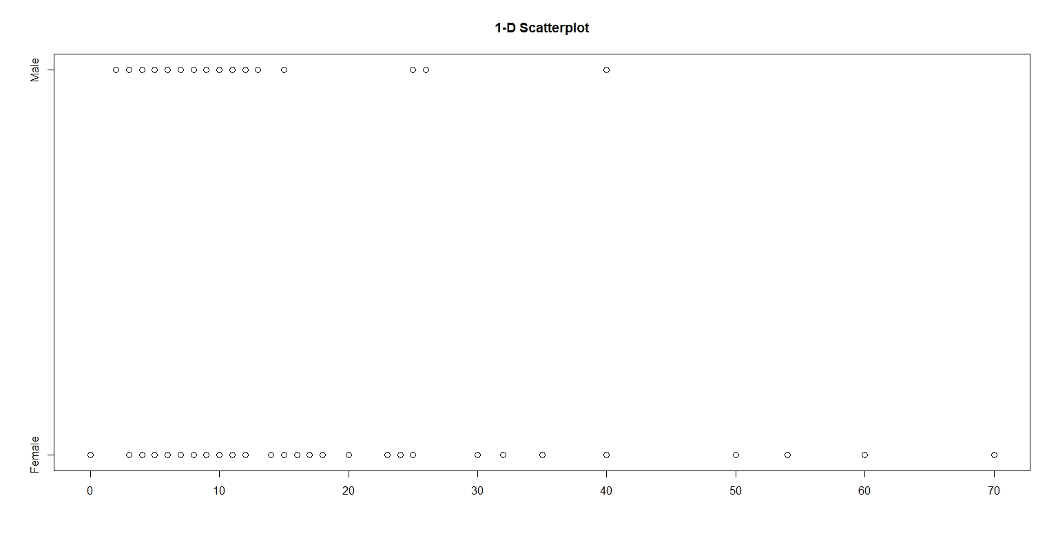
In this assignment, I examined the number of shoes owned by men and women in an introductory statistics class. Using the the package LearnBayes, I took a random sample of 100 from the dataset studentdata. Figure 1. is a one-dimensional scatterplot with number of shoes on the horizontal scale. The vertical scale is categorized into two levels – male and female.
Figure 1.
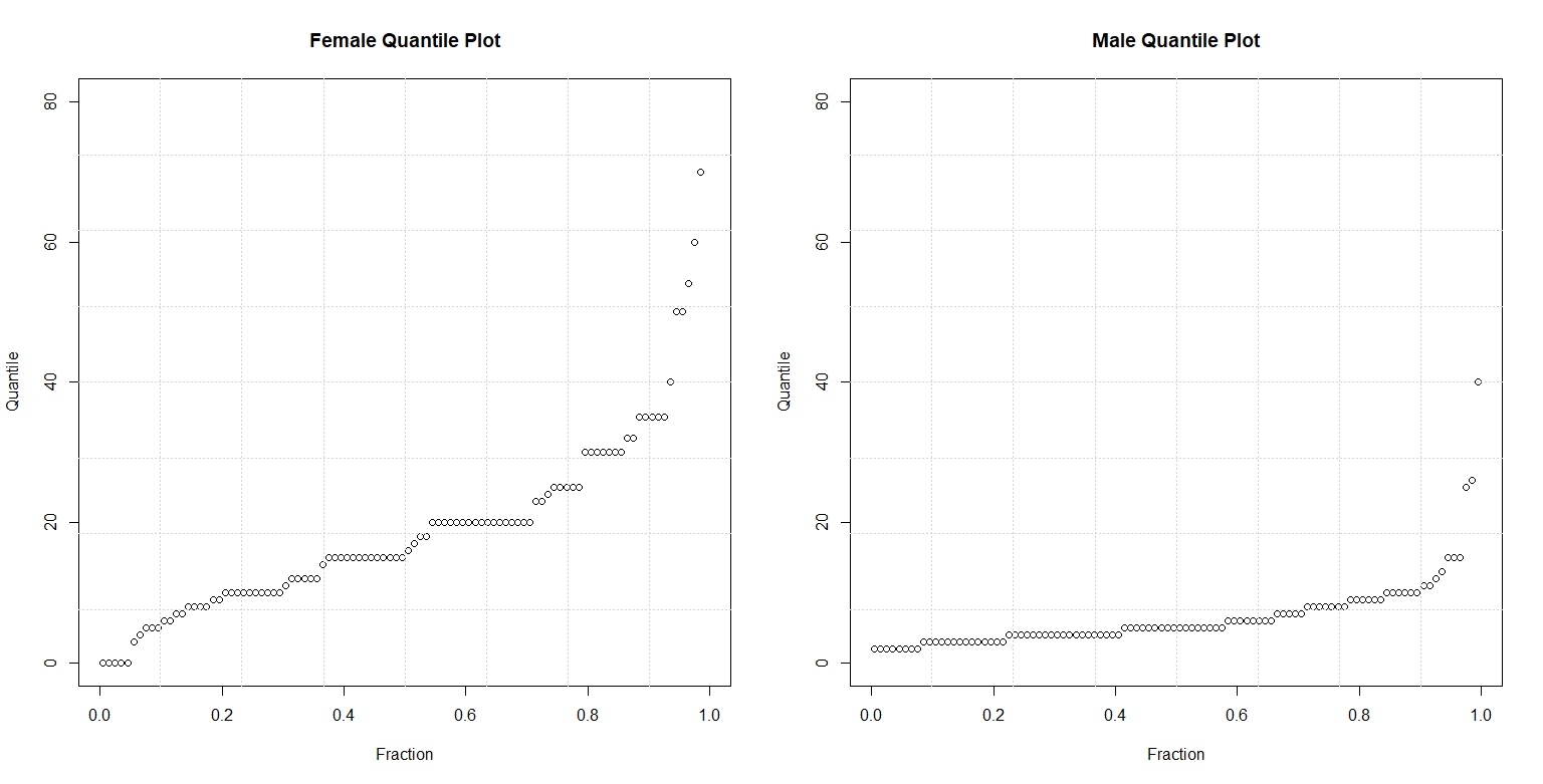
Figure 2. compares the quantile plots of the two gender and number of shoes. On each panel, the data is graphed against their respective f-values. On the left panel, we observe that the median number of shoes for women is almost 20. In contrast, we see on the right panel that the median number of shoes for men is short of ten. By looking at these parallel quantile plots, we can see that the median number of shoes owned by women doubles, more or less, that of men. Both quantile plots also reveal that the shape of the distribution of shoes is skewed. The majority number of shoes owned by males and females in this sample falls in the lower quartile, with a few in the upper quartile. Overall, the distribution of shoes for males and females is right-skewed with a few outliers near the 0.99 quartile.
Figure 2.

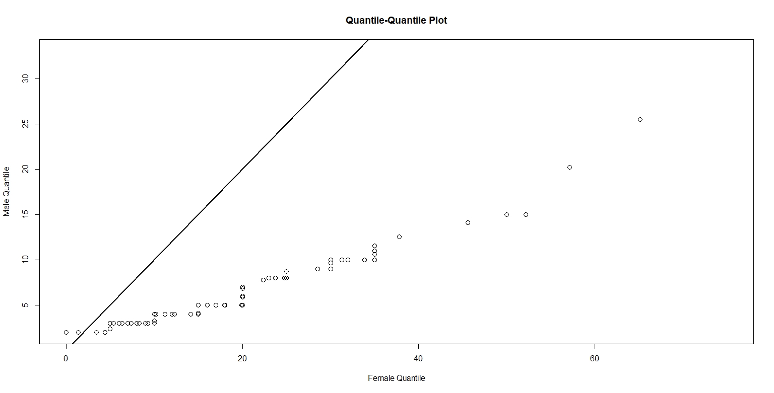
The following figure plots the quantiles of men against the corresponding quantiles of women.
Figure 3. 
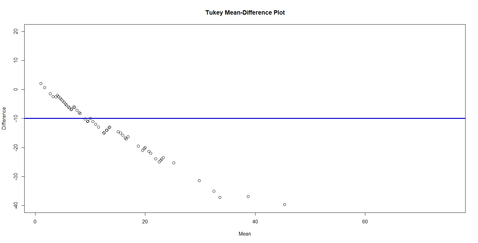
Figure 4. below plots the Tukey mean-difference for male and female number of shoes, with a horizontal reference line at -10. I chose to plot the horizontal line at -10 because the average of the difference is -10. The plot reveals that number of shoes for females is greater than men. On average, the increase in number of shoes for women is about 15. I believe the relationship between male and female values is pretty simple. That is, women tend to have more shoes than men.
Figure 4.

Between the four graphs, the Tukey Mean-Difference plot provides the best graphical comparison between the two sets. The Tukey Mean-Difference plot graphs the quantiles for the two sets together on one panel and lets us interpret the quantile difference on a horizontal line instead of a 45 degree diagonal line. Furthermore, we can easily and effectively compare the quantile differences to the average quantile. From this graph, we can deduce the number of shoes for men versus women. In short, the Tukey Mean-Difference plot is like a simple and meaningful summary of the other three graphs.