Figure 1. 
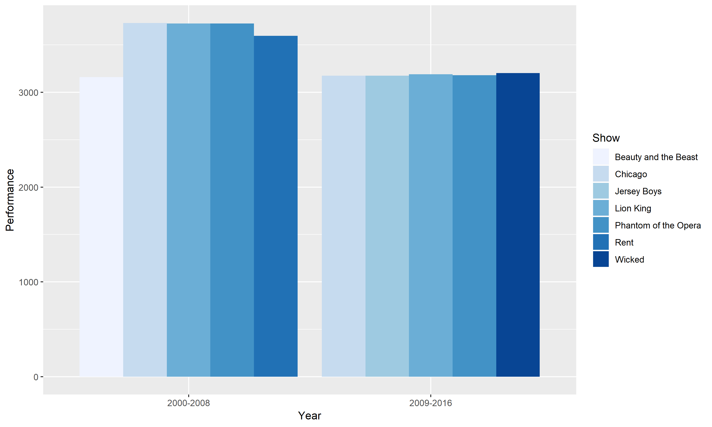
This graph compares the best Broadway shows for two time periods. The two time periods are between 2000 – 2008 and 2009 – 2016. The best Broadway shows are defined as having more than 3000 performances in each time range. The horizontal scale groups the two different period and the vertical axis shows the number of performances. From looking at this grouped bar chart, it is easy to identify that the 2000 – 2008 period had more performances. However, we also see an overlap of shows between the two periods. Chicago, Lion King and Phantom of the Opera appeared as three of the best Broadway shows for both periods.
Figure 2.
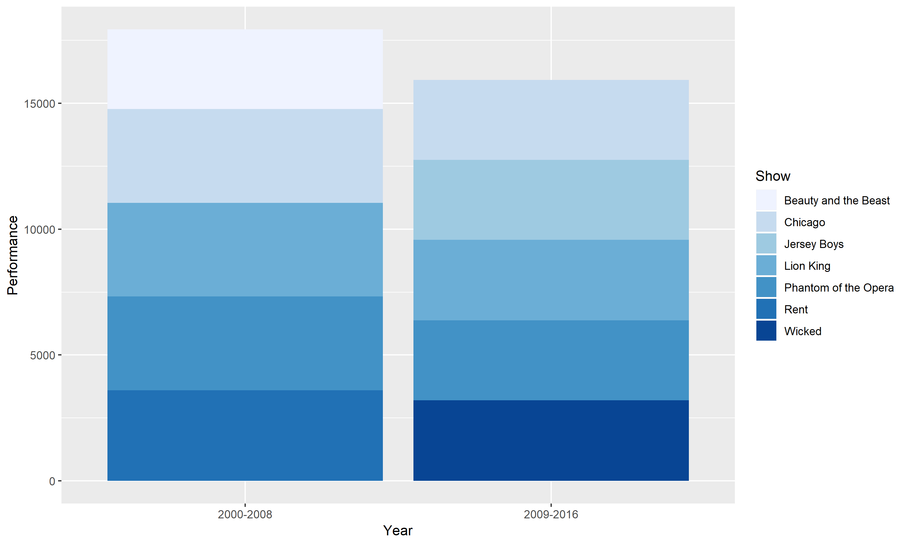
This chart is a stacked bar version of Figure 1. Instead of grouping the different shows, I stacked them on top of one another. The advantage to a stacked bar chart is it allows us to see how the best Broadway shows are divided into different show subcategories. However, a stacked bar chart may be harder to read especially when we want to compare each subcategory to another.
Figure 3.


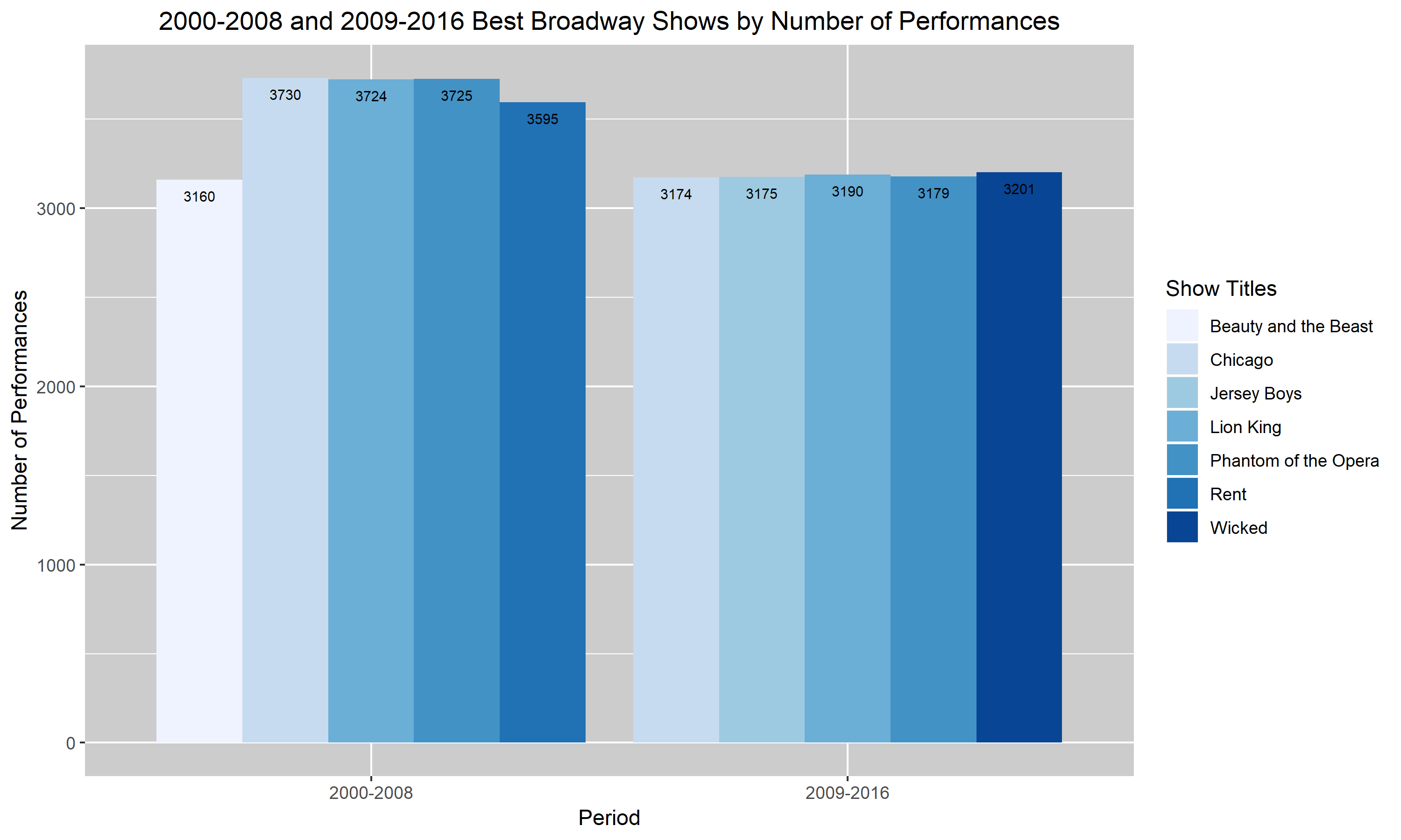
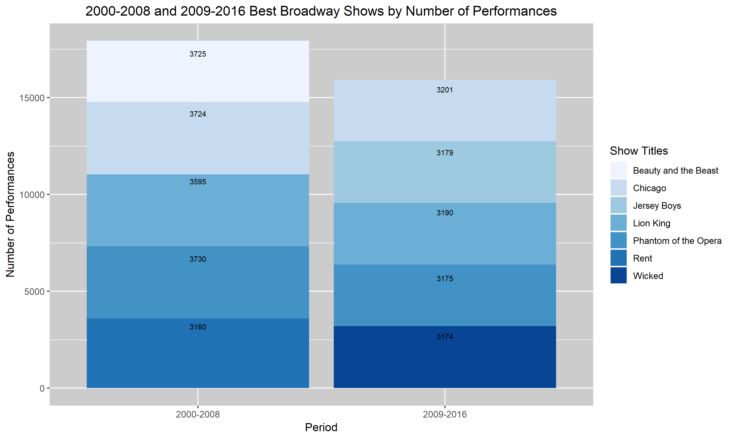
Figures 3. and 4. are my improved versions of Figures 1. and 2. I added a descriptive title to the figures so that my reader will have a rough idea of what my graph is trying to convey without having to read the caption. I also changed the labels to describe the scales more accurately. So, instead of saying “Year” and “Performances”, I changed it to “Period” and “Number of Performances”. Additionally, I darkened the background of my last two graphs. I realized that the very light blue bar in the first two graphs were almost hard to distinguish from the background. Hence, I darkened the background to help the bars pop up. Lastly, I added the values corresponding to each bar into my two final graphs. I felt like it was hard to compare each show and their number of performances in the top two graphs and so I decided that by having the values listed, it’ll help. Unfortunately for the darkest blue bar, the black font doesn’t pop up as well as I had hoped. I didn’t know how to choose a different color for that value specifically so I left it as is. I hope that with more research and assignments, I will learn how to distinguish that value through the use of color.