Figure 1.
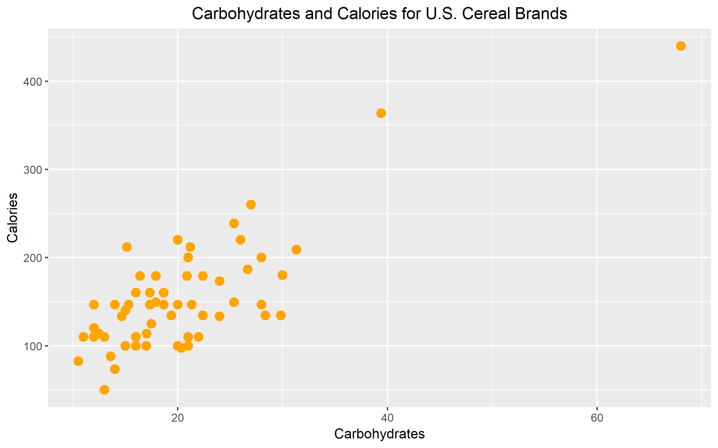
Figure 1 illustrates the nutritional relationship between carbohydrates and calories for a selection of U.S. cereal brands. The graph reveals a positive but moderately weak relationship between the carbohydrates and calories. The average carbohydrates for U.S. cereal brands ranges between 0 to 30. The average calorie count for U.S. cereal brands fall is between 0 to 250. The graph suggests that as the number of carbs increases, so does the number of calories.
Figure 2.

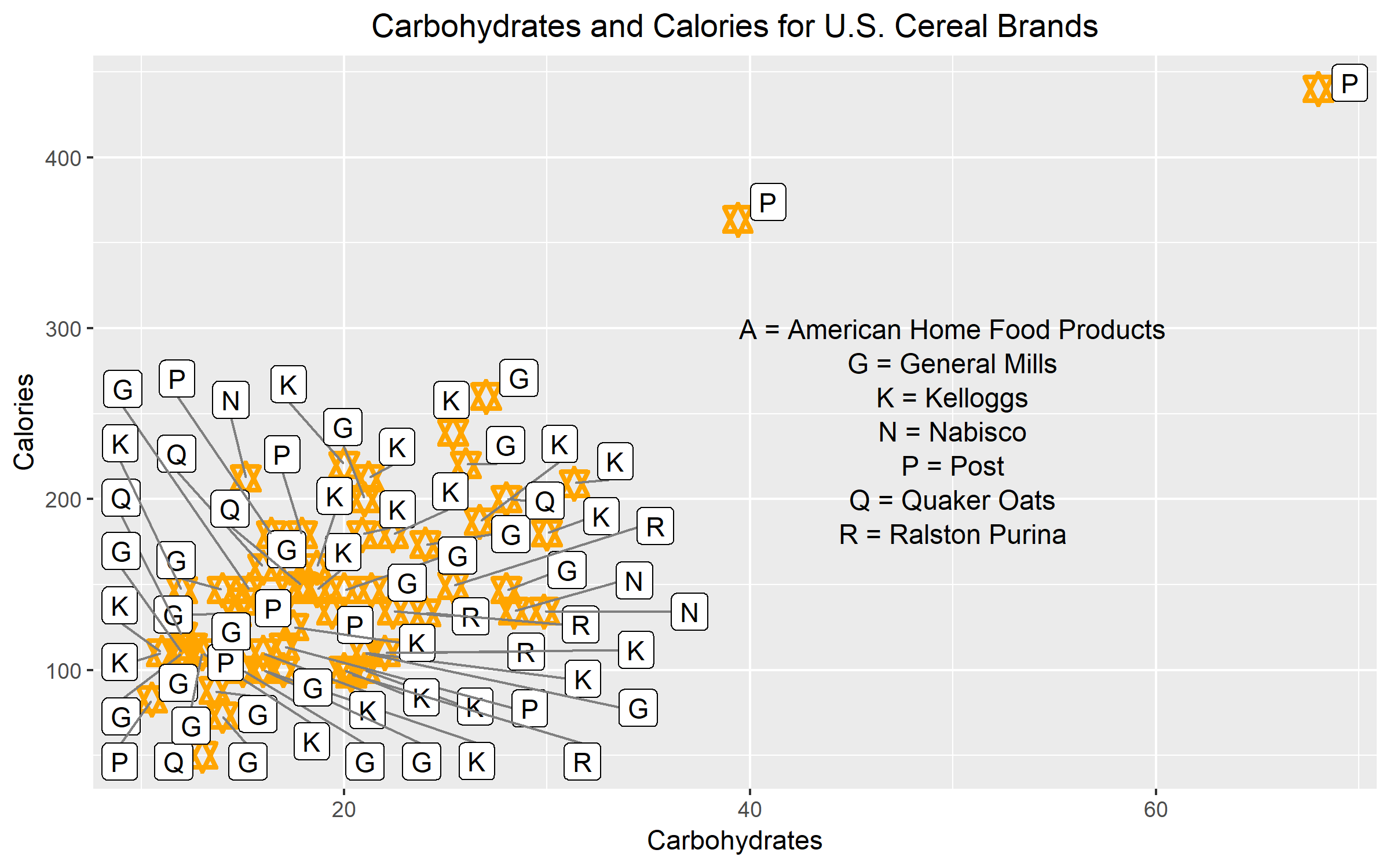
Figure 2 was redrawn from Figure 1. However, the graph was modified to violate at least two attributes of clear vision. The first modification leading to unclear vision was the use of data labels inside the scale-line rectangle. For each data point, I assigned the corresponding manufacturer label to it. As we can see, the label interferes with the data and clutters the graph. The key also adds to the graphical mess. The second modification that pushed this graph to have unclear vision was the graphical element. The plotting symbol that I used for this example was a star. The star is too fancy. The different points and lines of the stars are not prominent enough to stand out. It is hard to distinguish how many points make up the area where most of the data values are concentrated.
Figure 3.

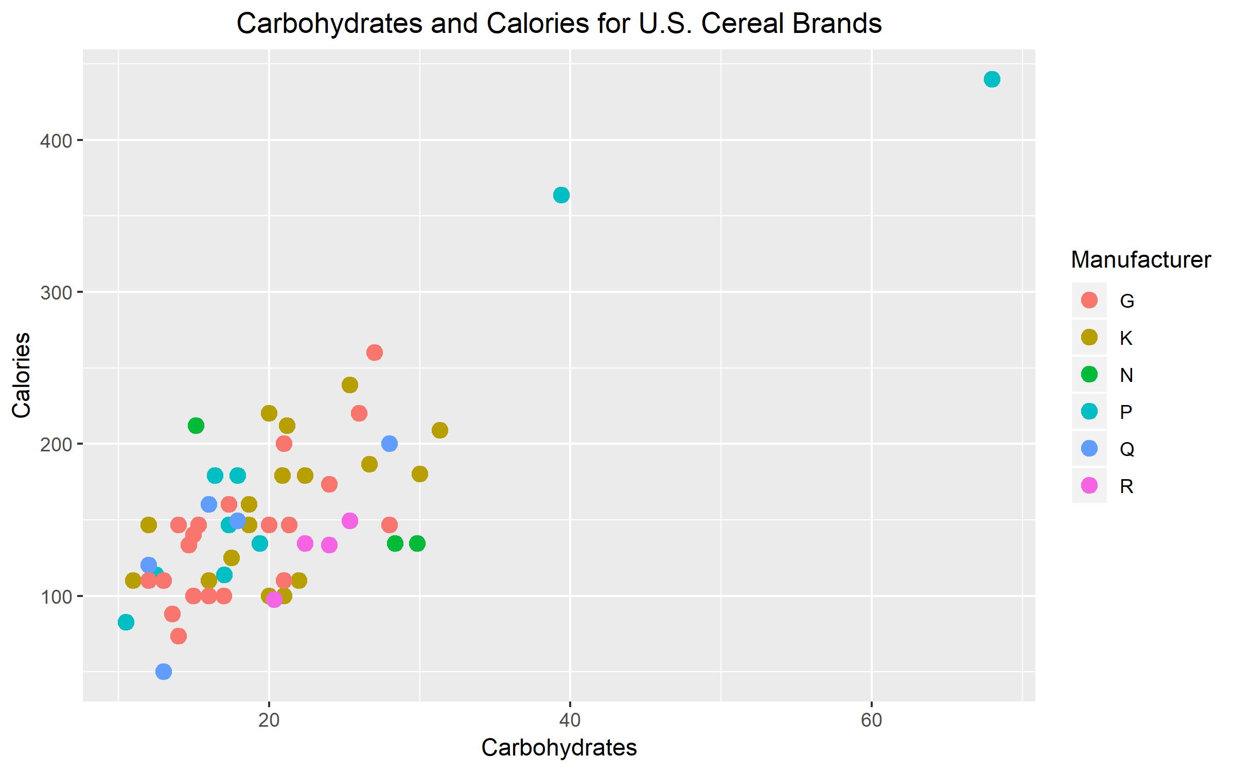
The third variable that I chose was the U.S. cereal manufacturer company. I chose manufacturer as my third variable because I believe that different companies may have their own set of regulations for nutrition. This can change how much calories and carbs are in each cereal box or serving size. Overall, I think that my graph is effective in representing my third variable. I think that between the three ways that could’ve been used to distinguish my third variable, color was definitely the most effective. I believe that color was effective because there are six different manufacturers. Using six different plotting symbols or six different sizes would make the graph look too messy. In the end, color was the best option. It worked out perfectly too because the pop of color makes it easy to identify the manufacturer for each data point.