Part I
I obtained the population data for Uganda which has an exponential growth over the years. I graphed the population against the year to verify that the population growth pattern is exponential. The corresponding graph is given below.
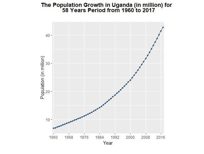
The above graph portrays the population growth in Uganda over time. The horizontal and vertical axes represent year and the population (in million) respectively. According to the above graph, it is clearly evident, the population growth in Uganda exhibit an exponential pattern over the course of 58 years period.
Further, I extracted the population data for ten year period from 2000 to 2009. Then I graphed the log (base 2) of the population against year.

The above graph shows the log 2 of population growth between 2000 and 2009 for ten year period in Uganda. In addition to this, I constructed two scales for the above graph where the left vertical scale shows the log (base 2) population and the right vertical scale shows the population (in million) in Uganda over the ten year period from 2000 to 2009. This allows us to see actual population without any mental calculation. The corresponding graph is given below.

Based on the above graph, it is clear that the percentage increase in Uganda population was approximately stable from 2000 to 2009, because the trend in the data is roughly linear. Thus, we can say the population growth pattern is clearly an exponential. For example, from 2000 to 2009, the log (base 2) of the population increased from 24.525 to 24.953. The factor of increase of population in the given ten year period is 1.3453, which corresponds to roughly 36% increase in the actual population. Further, the line segments connecting successive plotting symbols are banked to 45 degree.
Part II
Secondly, I obtained the population data for Chad for the same ten year period from 2000 to 2009. Then I plotted log (base 2) of the population against year both countries on the same panel incorporating the principles that I learned from Chapter 2.

In the above graph, the light blue and red color curve represent Uganda and Chad respectively. Here I used the two scale lines for a variable to show two different scales for the variable. Firstly, the left vertical scale line shows the log2 of the population and the right vertical scale line depicts the actual population (in million). This allows us to see actual population without any mental calculation.
Based on the above graph, it can be clearly seen that the trend in the data is approximately linear in both countries. Thus, we can say that the percentage increase in population (in million) in both countries were roughly stable from 2000 to 2009. Further, in the above plot the line segments connecting successive plotting symbols are banked to 45 degree.
In 2000, the population in Uganda was roughly 3 times larger than the population of Chad. The population between these two countries was continued to be approximately constant until 2008. For Chad, for example, from 2000 to 2009, the log (base 2) of the population increased from 23 to 23.45. The factor of increase of population in the given ten year period is 1.366, which corresponds to roughly 37% increase in the actual population. Thus, we can conclude both countries had an similar growth pattern in their population over the course of ten year period from 2000 to 2009.