Category Archives: Graphics

Reading Assignment

I read the three articles for this reading assignment. They are listed below.

  • A Rose by Another Name.
  • Winds Across Europe: Francis Galton and the Graphic Discovery of Weather Patterns.
  • La Diffusion de Quelques Idees: A Master’s Voice

However, I prepared the presentations based on the first two articles.  Please click here to see my presentation.

Blog 11: Multivariate Data

Here I consider the UScereal dataset in the MASS package. It has 65 rows and 11 columns. The data come from the 1993 ASA Statistical Graphics Exposition, and are taken from the mandatory F&DA food label. The data have been normalized here to a portion of one American cup. I considered three variables such as the number of calories, grams of fat and grams of sugars in one portion. Firstly I constructed a scatterplot matrix to determine the  linear correlation between these three variables . The corresponding graph is given below.

According to the above graph, it is clearly evident that there is a roughly strong positive association between grams of fat and grams of sugars in one portion. Also, there was one potential outlier.  This data point corresponds to Great Grains Pecan cereal. In addition to this, a moderate strong positive association between grams of calories and grams of fat variables. This graph also reflects two possible outliers. The Grape-Nuts has zero fat and high in calories whereas as  Great Grains Pecan is high in fat and also considerably high calorie food.  Moreover, grams of sugar and grams of calories also appeared to have moderate positive relationship as well.

Nextly, I constructed the coplot it is given below. The panel at the top is the given panel; the panels below are the dependence panels. Here I considered grams of sugar and grams of calories depend on the grams of fat.

Based on the coplot we can see the amount of calories increase in one gram of sugar reflects similar pattern at different levels of grams of fat. Also, the number of calories
per increase in one gram of sugar showing a slightly greatest degree of increment when the grams of fat in one portion increases. Furthermore, the fat contain in cereal increases, both calories and sugar level showing an increasing trend.

Finally, i constructed the spinning three dimensional scatterplot, which is given below. I view the three dimensional plot in three different direction. They are given below. Based on these graphs, it is clearly evident that all three variables are positively associated to each other. We can also notice that one data point is separated from other observation. This corresponds to Grape-Nuts cereal, which has greatest amount of calories and contain zero amount of fat in one portion of cereal.

Blog 10: Color

Part A

For this part, I obtained the data set from the Broadway CSV library. The data set is about  Broadway shows,  grouped over week long periods. The data set contains 12 variables including the name of the production, attendance, year, theater, type (whether it is a “Musical”, “Play”, or “Special”)  and so on.

I am interested in comparing the best Broadway shows average capacity  as a function of week number for four years such as 2011, 2012, 2013 and 2014. Using these information, I constructed time series plot for four years on the same graph. The corresponding graph is given below.

The above connected symbol plot compares the average capacity for the Broadways shows in each week for 4 different years. The time series shown on the graph is the weekly average of the attended people of the Broadway shows. It can be clearly seen, that the connected symbol plot, allows us to see the individual data points and the ordering through time.

There was noticeable declined in the average capacity in the latter part of 2011, especially after September. I believe the major reason was that the September 2011 terror attack, as a result of this people may avoid large public gathering. It is clearly evident, in 2012, mean capacity was low compare to all other year. This may be due to the fact that less number of movies released in this year. The another important factor associated with this dip is that 2012 was recorded as coldest year in most part of the world. Further, the mean capacity tend to decrease in the latter part of each year. I believe, people spent most of their time on shopping and visiting to their friends and loved ones home instead of watching Broadway shows. However, in the next two years the mean capacity for the Broadway shows started to escalate in the latter part of the year and reached the peak in 2013.

Further, I also included smoothing curve for all four year.

The above graph depicts the time series plot for each year and the corresponding smoothing curve for each year. It can be clearly seen, that the loess curves behave same pattern in all four years. In general, during the summer (the middle part of the year) time the average capacity was tend to be high compare to other time. Also, in the latter part of the year the loess curves showing an decreasing trend other than the year of  2013.

Part B

Here we simulate a sample of size 200 from a bivariate normal distribution with correlation rho = -0.9 and use a bivariate density estimation algorithm to construct a contour graph of the density estimate. First, I visualized the contour graph using a “Spectral” palette to color the regions. The corresponding graph is given below.

Further, I use ggplot2 to construct a similar graph and using the different set of colors to color the graph. I constructed the following graph with different set of colors. I would say, the following graph is much better than the above graph, because we can clearly visualize the higher level without looking at the key and it provides better order. To explain it further, when value is changing from larger to smaller the color is also changing from darker to lighter. And also, we can easily differentiate the edges of each level. Thus, in a nutshell, my graph provides better visual impression compare to the given graph.

Blog 8: Dot plots

I collected “NFL Team Touchdowns per Game” data sets from NFL Team  period for five teams for five seasons from 2013 to 2017. The corresponding data sets is given below.

  Season    
    2013 2014 2015 2016 2017
New England (NE) 3.1 3.5 3.2 3.3 3.4
Team Denver (DE) 4.3 3.5 2.3 2.2 1.9
Dallas (DA) 3.2 3.4 1.6 3.1 2.6
Green Bay (GB) 2.8 3.4 2.7 3.3 2.5
Philadelphia (PA) 3.3 3.4 2.8 2.3 3.2

Further, I computed the average touchdowns for each team over the course of five year period from 2013 to 2017.  It is given below.

Team Average Touchdowns Per Season
New England (NE) 3.30
Denver (DE) 2.84
Dallas (DA) 2.78
Green Bay (GB) 2.94
Philadelphia (PA) 3.00

Then I graphed the above data using dot plot. Here, the average touchdowns per gave for five seasons are ordered from high to low.


According to the above graph, it can be clearly seen New England had the highest average touchdowns per game for 2013-2017 period, whereas the lowest average touchdowns per game for this five-year span was Dallas which is 2.78.

Secondly, I constructed a dot plot of the average touchdowns per game for five teams for five seasons grouped by the season.

Based on the above plot, each panel shows the touchdowns points for one season. This allows us to effectively decode the distribution for each season. In this plot, the teams were ranked relative to each other in five seasons. For instance, New England had maintained highest average touchdowns points per game compared to Green Bay in all five seasons. Further, in 2017 season, Philadelphia (PA) had the highest average touchdowns points per game among all five teams. On the other hand, Denver, started 2013 season with high average touchdowns points per game compared to all other five teams and subsequently lost their performance throughout the five year span and record low average touchdowns points per game in 2017 which is equal to 1.9.

Furthermore, using the above graph, it hard for us to decode the distribution of values through time for each team. Thus, finally, I constructed a dot plot of the average touchdowns per game for five teams from the five seasons grouped by Team. I graphed in two different ways. The corresponding graphs are given below.


According to the above graph, we can more effectively decode information, that is each team performance for all five seasons. For instance, New England comparatively had the reasonable  average touchdowns points per game in all five seasons and shared the first place with Denver in 2014. Dallas had the worst season in 2015 and their highest average touchdowns points per game was recorded in 2014. Further, 2014 season was the good season for all five teams and their average touchdowns points per game lies between 3.4-3.5. Team Denver, hit the highest average touchdowns points per game in all five seasons, which was 4.3.

In a nutshell, I would say we can visualize the above two-way table in many different ways. The dot plot is a far more effective display than a number of other methods for displaying labeled data such as pie charts, bar charts and divided bar charts.

Blog 7: Distributions

My names is starting with “S” so I selected the number of shoes owned by the men and women in the class.

Firstly, I constructed parallel dot plot (parallel one-dimensional scatterplots) of the number of shoes variable by gender such as male and female. This allows us to compare the distributions of the two sets of data.  It is clearly evident that female own a significantly greater amount of shoes than males.  Also, It allows us to spot outliers as well.

Based on the above graph it hard to see the overlapping data points. That means, any individuals who have equal number of shoes or approximately equal number of pairs are very hard to visualize the data points using parallel one-dimensional scatterplots.  So I graphed the given data set using Stripchart. Here, I have stack the data points via “centerwhole” dircetions. As a consequence, the clutter has been alleviated. This can be done as follows.

According to the above graph, it can be clearly seen the overlapping number of shoes. Any individuals who has equal number of shoes have been moved vertically. This allows us to see the exact number responses in our data sets. Based on the above graph, it is clear females tend to have large number of shoes compared males. In general, on average males roughly  have 5 to 6 pairs of shoes. However, females approximately have 20 to 21 pairs of shoes on average. Further, using the above plot we can easily detect outlying observations. For example,  a female student has 164 pairs of shoes which is clearly an outlier.

Next, I constructed parallel quantile plot of the male values and of the female values as below. As you can see, an f-quantile of a distribution is a number, q, such that approximately a fraction f of the values of the distribution is less than or equal to q; f is the f-value (fraction) of q. So, the median is the 0.5 quantile, the lower quartile is the 0.25 quantile, and the upper quartile is the 0.75 quantile.

The data are graphed against their f-values (fraction).  Comparing quantiles is usually the most informative way to compare two distributions. Thus, parallel quantile plot is more effective for comparing data distributions. According to the above graph, The median number of shoes for females is larger than the males. The median of the male group is roughly 5, whereas the median value of the female category is around 25 pairs of shoes.

Further, I constructed the quantile-quantile plot by plotting the quantiles from one distribution are graphed against corresponding quantiles from the other distribution. This is simple but powerful tool for comparing two distributions. Further, I also added the reference line y=x, which allows us to give a visual reference to where the values of the quantiles from both groups would be equal. If points lie above the line, then we can conclude the quantiles from the group (female) on the vertical axis (y axis) are larger. Also, if the points lie below the line reflects that the quantiles for group (male) on the horizontal axis are larger.

Based on the above graph, we can conclude that all the points lie above the y=x line. This implies that all the quantiles  of the number of shoes for females are larger than that for males category.

Finally, I constructed the Tukey Mean-Difference plot. Here, I graphed the difference of the quantiles (female quantile – male quantile) against their average  (female quantile+ male quantile)/2 . The positive value (above the horizontal zero line) indicates that the females have more pairs of shoes than males category.

I would like to select the Tukey Mean-Difference Plot which provides the best graphical comparison of the two sets of measurements. When compare the Tukey M-D plot with the Q-Q plot, it simply translates the interpretation of the  45 degree diagonal line to  a horizontal zero line. I have included the horizontal reference line at zero (y=0). Also, both variables are in the same scale ,  Tukey Mean-Difference plot provides better comparison compare to other three graphs. In a nutshell, based on these graphs, females have significantly larger pairs of shoes than males.

Blog 6: Pythagorean Relationship

I collected the following data from 10 NFL teams for the 2016 regular season. The following variables:

  • W – the number of games won
  • L – the number of games lost
  • P – the number of points (or runs, goals, etc) scored by the team
  • PA – the number of points allowed by the team

The data was obtained from http://www.espn.com/nfl/standings/_/season/2016/group/conference
There, I randomly chose the 13 teams from the total. The corresponding dataset is given below.

The Pythagorean formula (described first by Bill James in the context of baseball). That is, (W/L)=(P/PA)^k where k is some constant. Thus, I consider the transformations log(W/L) and the log(P/PA). I summarized them below.

This allow me to perform a linear regression model centered at the origin to approximate k.

In the top plot, I graphed the log base e ( W/L) verses the log base e (P/PA). When we
implement a best fit line we get a slope of 2.9421 which is our value for k. The bottom plot in the above graph shows the residuals of  the log(W/L) values from the best fitting line and the log(P/PA) values and I have  also added a horizontal line (red) at zero.

The closer the points are to the line shown in the first plot, the closer the residuals are to 0. Based on the residual plot, we can see that Buffalo Bills (BUF) and Cincinnati  Bengals (CIN) was on a unlucky streak. Their data point is almost at -0.45 below the line which shows they have a winning percentage almost 45% below what would be expected. There are some teams like Oakland Raiders (OAK) , Houston Texans (and Miami Dolphins (MIA) that have a little higher winning percentage. The other teams close to 0.

Blog 5: Visualizing Amounts

I obtained the data set from the Broadway CSV library. The data set is about  Broadway shows,  grouped over weeklong periods. The data set contains 12 variables including the name of the production, attendance, year, theater, type (whether it is a “Musical”, “Play”, or “Special”)  and so on.

I am interested in comparing the best Broadway shows for the two time intervals such as 2000 – 2008, and 2009 – 2016. Further, I defined the best Broadway shows in terms of the total attendance (in million) who attended performances over the week.

Firstly, I constructed the grouped bar graph which can be improved to the certain extent. The horizontal axis represent the type of shows (show name) and the vertical axis represents the total number of attendance (in million).


It can be clearly seen, that the above graph needs an improvement. Because, it reflects too many show names (The name of the production) as a consequence, the show names are not visually prominent. Also, the graph does not have the title and axis labels are not clear.

Thus, I decided to look at the show which has only certain minimum number of  attendance 2 million people. Further, I put the show names on the vertical side and the total number of attendance (in million) on the horizontal side. Also, I sorted the bars based on the total attendance (in million). In addition to this, I have also added the axis labels and title to the graph. Then I re-constructed the above graph by correcting the above mistakes in the following way.

I compared 16 different shows in two different time periods.  According to the above graph, we can say that “The Lion King” was the most popular show in 2000-2008 period and there were nearly 6.36 million attendees for this show. However, “Wicked” was the popular show among people during the period from 2009-2016, where approximately 5.65 million people watched this show, whereas “The Lion King” was the second most popular show during this time.

My second graph is stack bar graph, which is given below. It is clearly evident, that this graph needs an improvement. For example, the labels on the horizontal axis are not clear and the graph does not process the title. Another, disadvantage of this graph is that the total on each columns are not the same. Thus, there is a room to improve this graph.


I improved the stack bar graph by correcting the above mentioned mistakes in the following way.  I included the total number of people  (in million) in each bar. Also, I improved the above graph by putting the show name on the vertical axis and the total attendance (in million) on the horizontal axis. The improved stack bar graph is given below.


According to the above graph, it can be clearly seen, the most popular show was “The Lion king” in 2000-2008 period which was watched by 6.36 million people whereas this was the second most popular show during the 2009-2016 period. Further, approximately 5.65 million watched “Wicked” show, this was the most popular show during the 2009-2016 period.

Moreover, I improved the stack graph by constructing the 100% stacked graph, which shows the percentage of the whole of each time period and are plotted by the percentage of each value to the total amount in each time period. This makes it easier to see the relative differences between the shows in each time period.  I portrayed them in percentage of the total in the following manner.


Blog 4: Two Scales and Comparison

Part I

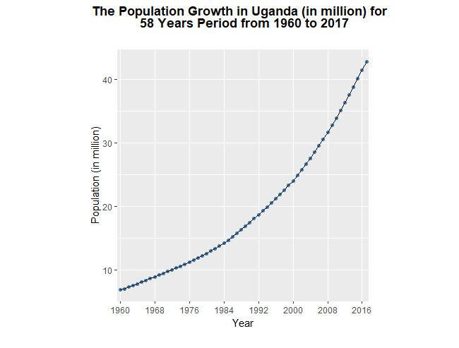
I obtained the population data for Uganda which has an exponential growth over the years. I graphed the population against the year to verify that the population growth pattern is exponential.  The corresponding graph is given below.

The above graph portrays the population growth in Uganda over time. The horizontal and vertical axes represent year and the population (in million) respectively. According to the above graph, it is clearly evident, the population growth in Uganda exhibit an exponential pattern over the course of 58 years period.

Further, I extracted the population data for ten year period from 2000 to 2009. Then I graphed the log (base 2) of the population against year.

The above graph shows the log 2 of population growth between 2000 and 2009 for ten year period in Uganda. In addition to this, I constructed two scales for the above graph where the left vertical scale shows the log (base 2) population and the right vertical scale shows the population (in million) in Uganda over the ten year period from 2000 to 2009. This allows us to see actual population without any mental calculation. The corresponding graph is given below.

Based on the above graph, it is clear that the percentage increase in Uganda population was approximately stable from 2000 to 2009, because the trend in the data is roughly linear. Thus, we can say the population growth pattern is clearly an exponential.  For example, from 2000 to 2009, the log (base 2) of the population increased from 24.525 to 24.953. The factor of increase of population in the given ten year period is  1.3453, which corresponds to roughly 36% increase in the actual population. Further, the line segments connecting successive plotting symbols are banked to 45 degree.

Part II

Secondly, I obtained the population data for Chad for the same ten year period from 2000 to 2009. Then I plotted log (base 2) of the population against year both countries on the same panel incorporating the principles that I learned from Chapter 2.

In the above graph, the light blue and red color curve represent Uganda and Chad respectively. Here I used the two scale lines for a variable to show two different scales for the variable. Firstly, the left vertical scale line shows the log2 of the population  and the right vertical scale line depicts the actual population (in million). This allows us to see actual population without any mental calculation.

Based on the above graph, it can be clearly seen that the trend in the data is approximately linear in both countries.  Thus, we can say that the percentage increase in population (in million) in both countries were roughly stable from 2000 to 2009. Further, in the above plot the line segments connecting successive plotting symbols are banked to 45 degree.

In 2000, the population in Uganda was roughly 3 times larger than the population of Chad. The population between these two countries was continued to be approximately constant until 2008. For Chad, for example, from 2000 to 2009, the log (base 2) of the population increased from 23 to 23.45. The factor of increase of population in the given ten year period is  1.366, which corresponds to roughly 37% increase in the actual population. Thus, we can conclude both countries had an similar growth pattern in their population over the course of ten year period from 2000 to 2009.


Blog 3: Unclear Vision and Adding a Third Variable

Part I

The UScereal data frame has 65 rows and 11 columns. The data come from the 1993 ASA Statistical Graphics Exposition, and are taken from the mandatory F&DA food label. The data have been normalized here to a portion of one American cup.

Firstly,  I constructed the scatterplot to examine the relationship between grams of protein in one portion and number of calories in one portion.  They horizontal axis represents the grams of protein in one portion  and the vertical axis represents the number of calories in one portion. The above graph suggests that there is a moderate association between grams of protein in one portion and number of calories in one portion. Further, the segments are banked to 45 and the aspect ratio is 1 vcm/hcm. Thus we can readily judge the association between these two variables.

Secondly, I reproduced the above graph with violating few attributes of clear vision described in the Cleveland’s book.I incorporate the following attributes which may affects the visual clarity of the above graph.

  • The plotting symbols are not sufficiently large enough.
  • The tick marks look inward.
  • There are large number of tick marks and labels needlessly clutters the graph.
  • The aspect ratio is 0.25 vcm/hcm. So the absolute orientation are centered on an angle much less than 45 degree, which interferes with our judgment of rate of change.

Part II

I chose Shelf as a third variable in the USCereal dataset that is associated with both variables grams of protein in one portion and number of calories in one portion. The Shelf variable contains values 1,2,3 which correspond to the bottom, middle, and top shelf at store. Generally, the cheaper cereals are placed on the bottom shelf, the middle shelf have kids cereals and the adults cereals are on the top shelf. The following graph portrays the association between grams of protein in one portion and number of calories in one portion in the different place of shelf at store.

Further, in the following graph, I included the smooth curve to see the relationship between variables.

Blog 2: A Basic Line Graph: Tuition Growth

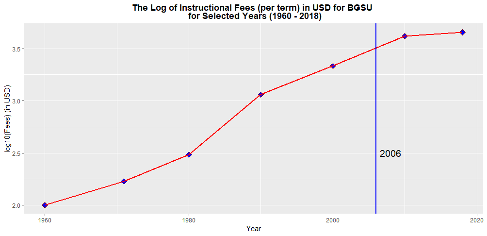
As we know that a line chart is a graph with the points connected by lines. Here I created a  line graph to visualize the tuition growth of the BGSU. I used the log10 of the instructional fees (per term) in USD for BGSU for selected years between 1960 and 2018.

The above line graph portrays how the log10 of  instructional fees (per term) for BGSU changes over 58 years period of time.

It is clearly evident that the log10 of instructional fees (per term) for BGSU has increased dramatically over the course of 58 years period. More specifically, in during the 1960-1961 school year, the instructional fee per term at BGSU was $100. By 2018-2019, that number exploded to $4548. Further, there was a steady increase in log10 of the instructional tuition fee per term from 1990 to 2010. However, the log10 of the instructional fee per term for BGSU is rising at a slower pace since 2010.

The rapid increase of college tuition is associated with several external factors. For instance, lack of funding from state government, increase in faculty salaries , general increase in the cost of living, demand for education and so on.

The vertical blue line indicates the year (in 2006) that I started college my studies. The most challenging part of this assignment is that determining the appropriate plotting symbol and size. Apart from that I was comfortable in completing this assignment.

Blog 1: Is Horsepower of a Car Related to Its Mileage?

Motor Trend magazine collected the horsepower and mileage for 32 cars in the 1973-74 model year. To see if there is any relationship between horsepower and mileage, I construct a scatterplot of the two variables.


According to the above graph, it can be clearly seen that the horse power of the engine (hp) increases, the mileage (mpg) reduces. So we can say there is a negative association between  horse power of the engine and the mileage. Further, when looking at the fit, I would say the quadratic approximation might be the good one.