As we know that a line chart is a graph with the points connected by lines. Here I created a line graph to visualize the tuition growth of the BGSU. I used the log10 of the instructional fees (per term) in USD for BGSU for selected years between 1960 and 2018.
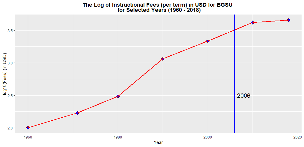
The above line graph portrays how the log10 of instructional fees (per term) for BGSU changes over 58 years period of time.
It is clearly evident that the log10 of instructional fees (per term) for BGSU has increased dramatically over the course of 58 years period. More specifically, in during the 1960-1961 school year, the instructional fee per term at BGSU was $100. By 2018-2019, that number exploded to $4548. Further, there was a steady increase in log10 of the instructional tuition fee per term from 1990 to 2010. However, the log10 of the instructional fee per term for BGSU is rising at a slower pace since 2010.
The rapid increase of college tuition is associated with several external factors. For instance, lack of funding from state government, increase in faculty salaries , general increase in the cost of living, demand for education and so on.
The vertical blue line indicates the year (in 2006) that I started college my studies. The most challenging part of this assignment is that determining the appropriate plotting symbol and size. Apart from that I was comfortable in completing this assignment.