Author Archives: Sima Sharghi

Reading!

I read three articles:

  1. Scaling the Heights (and Widths) Vol 9, No 3
  2.  A Political Statistic, Vol 16, No 4
  3. A Centenary Celebration for Will Burtin: A Pioneer of Scientific Visualization, Vol 22, 1

I chose, A Political Statistic and  A Centenary Celebration for Will Burtin: A Pioneer of Scientific Visualization and summarized them here

Please let me know what you think and ask your questions. 🙂

Have a wonderful winter break! 

Happy New Year

Pop Charts


Today I passed my preliminary exam! 

Now I am ready to talk about the pop charts and try to have a better replacement for them.

In this blog post I explain why some choices of plots are not recommended.   We will talk about the pop charts. 

I have always been curious about the amount US government spend on military because I know Iran’s government wastes  a  lot of our budget to all branches of military!

I found the budget of US spending for 2015 fiscal year and interestingly, US also wastes a lot of budget on Military! You can find the pie chart here

There are 12 categories. We don’t have a separate key in this pie chart.   Even though the pie chart is drawn with scales, we still  have to judge the sizes of angles to make inferences about the percentages since we have 12 categories. The scanning and interpolation based on the pie chart is hard. The following dot plots helps to better see the pattern and judge easier. Even though pie charts are favorable by many people, they should not be used for everything. It is extremely important to choose our plots and visualizing techniques wisely, as we do not intend to create more confusion. The main reason so many people these days use visualizing techniques is because we would need to immediately see the existing patterns. Can see easily notice that without taking a second to examine the pie chart further? I don’t think so.


The ordering that I have done when plotting the dot plot above  is very helpful to get a pretty good grip of the fact that in 2015, the government didn’t spend much on transportation. This tells us that US government wanted to support the car companies. It is not hard to see the spending on Government is above spending for all other categories, even higher than Education, except Military. I wonder what the expenses of the government is in the US. 


Next, I chose a bubble graph and decided to replace it by a dot plot.

The graph is trying to show the gross value of the top 10 movies.  The first graph has the gross value written on each bubble which is a little help, but still confusing. We don’t have an easy scale. It creates confusion about judging which ones sold better. 

You can find the graph area here.

Also, here.


Display it with  a dot plot:

With the dot chart we can also see that titanic is the best seller. In the bubble chart, it is also easy to see that. But, what about the other smaller bubbles? Can we just looking at the size of the bubbles and easily know which one sold better? Dot plot can better help us displaying them.


Displaying Multivariate Data


In this blog assignment, we are  using UScereal data set in the MASS package. 

Information about the data can be found here.

I  choose three variables among (calories, protein, fat, sodium, fibre, carbo, sugars, potassium, vitamins) and construct a scatterplot matrix, a coplot, and a spinning 3-dimensional scatterplot for these variables. Then, based on my graphs, I will describe the general relationships between the three variables. In addition, I will find two “special” cereals that seem to deviate from the general relationship patterns.

First, I choose Calories, Protein, and fibers and portray their scatter plot. 

There is a positive association between calories and protein, Calories and fiber, and protein and fiber. It is not hard to notice there exists some outliers in the data. If we removed them, we might see a better linear relationship but right now, the relationship is not linear. At this point, I have a few guesses of some outliers. I remove them to see the effect of removing them on my scatter plots.

We notice an increasing pattern between protein and calories. This means more protein, more calories on average. Also, an increasing pattern between fiber and protein. 

Well, now that I removed a few data points, we can better see the associations. But still the non linearity of the relationship exists. 

Conditional plot:

“A conditional plot, also known as a coplot or subset plot, is a plot of two variables conditional on the value of a third variable (called the conditioning variable). The conditioning variable may be either a variable that takes on only a few discrete values or a continuous variable that is divided into a limited number of subsets.

One limitation of the scatter plot matrix is that it cannot show interaction effects with another variable. This is the strength of the conditioning plot. It is also useful for displaying scatter plots for groups in the data. Although these groups can also be plotted on a single plot with different plot symbols, it can often be visually easier to distinguish the groups using the conditional plot.”

There is a nonlinear association between the number of calories in one portion vs. the amount of protein in almost all the bins of fiber. In the first bin, where the amount of fiber is less than 2, panel (1,1) the amount of  of calories increases as the amount of protein increases. Then it decreases and then again it increases.

As the amount of fiber increases, the association between Calories and protein gets more positive and maybe moving toward linearity.

We see some outliers in the last panel. In some cereals with high amount of fiber, we have high amount of calories, as the amount of protein increases. What those outliers would be?

I believe the ones that don’t follow the general pattern are  Grape-Nuts and Great Grains Pecan, because they are the ones that have too high of calories counts and high protein counts, in comparison with the rest of the cereals.

The following code was helpful in finding the outlying cereals.

UScereal[which(UScereal$calories==max(UScereal$calories)),]
UScereal[which(UScereal$calories==max(UScereal$calories[which(row.names(UScereal)!="Grape-Nuts")])),]

Next, 3-dimensional scatterplot: 

So, based on this three dimensional graph, we again see how for high level of fiber, we have some outlying cereals that have high protein and high calories counts, in comparison with other ones. We can also see the positive associations among the three variables.


Time Series plots of Broadway shows/ Bivariate Normal graph

This post has two parts.

In the first part I will explore the long term trend of Broadway shows in terms of average capacity over the years of 2012 and 2015.  We notice that almost in all 4 years, the attendance decreases around the week of 20 and it decreases around the week of 30, which is the end of  summer time. It decreases around the week of 43 and then it increases immediately. This is around Thanksgiving. From this graph it is almost hard to notice the long term trend. thus, I superimpose a smooth curve to capture it. 

In the following graph, we see the long term trend and the fact that in all the 4 years, around the week of 28 to 30 the average capacity increases and it gradually decreases as it gets colder. The average capacity decreases as years get closer to their end. The long term trend of 2015 and 2012 is more similar. The long term trend of 2013 and 2014 are also more similar. The peak of average capacity in 2014 around the week of 30 seems to be higher than other three years. We also notice that the average capacity has increased from 2012 to 2014, and then we see it decreases a little bit in 2015. 


Part 2:

We simulate a sample of size 200 from a bivariate normal distribution with correlation rho = -0.9 and use a bivariate density estimation algorithm to construct a contour graph of the density estimate. Then we use  ggplot2 to construct a graph and use a good set of colors to color the graph and explain why this set is better than the one Dr Albert has used.

The color I have chosen is better because it can better explain where we have a higher density and where we have a lower density. Below we see the graph Dr. Albert has produced. In my graph, dark green represents lower density and light green represents higher density.  Both variables seem to have a high capacity near zero. (0,0)

The following graph is the graph Dr. Albert has produced. Notice that Dr. Albert is awesome and produces the best graphs :))


Loess

In this post we are going to explore Loess in ggplot2. 

Let’s look at the definition of it first.

“Local regression or local polynomial regression, also known as moving regression, is a generalization of moving average and polynomial regression. Its most common methods, initially developed scatterplot smoothing, are LOESS (locally estimated scatterplot smoothing) and LOWESS (locally weighted scatterplot smoothing). They are two strongly related non-parametric regression methods that combine multiple regression models in a k-nearest-neighbor-based meta-model.”


We are going to see how this interesting function works. First some X and Y is simulated through the following code:

simdata <- function(sigma=0.4){
 x <- seq(-pi, pi, length = 200)
 curve <- sample(1:4, size = 1)
 f <- (sin(x) + cos(x)) * (curve == 1)+
 (sin(x) - cos(x)) * (curve == 2) +
 (sin(x) * cos(x)) * (curve == 3)+
 (.28 - .88 * x - 0.03 * x^2 + .14 * x^3) * (curve == 4)
 y <- f + rnorm(length(f), 0, sigma)
 data.frame(x=x, y=y)
}

This simulates some (x, y) data where the true signal follows one of the curves
sin(x) + cos(x), sin(x) – cos(x), sin(x) * cos(x),  .28 – .88 * x – 0.03 * x^2 + .14 * x^3.

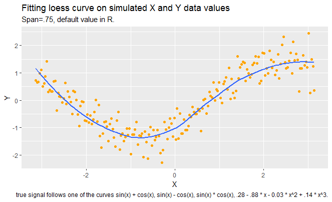
First:  Construct a scatter plot of data and overlay a loess smooth (using the default value of span in the loess function). The default value is .75.

It seems that loess curve is capturing the pattern in data well, but we can not be sure of this until we look at the residual plot which follows next. 


Next,  construct a plot of residuals and comment if the loess curve has effectively found the signal.


Since we see a pattern in scatterplot of residual versus X vaues, loess has not been successful in capturing the signal. Some part of the data was not covered by the loess and it shows itself in patterns of residuals.


Next, 3. Assuming that a better smooth can be found, construct a scatterplot using a better choice of the span. By the use of a residual plot, demonstrate that your choice of f
is better than the default choice in 1.

In this part, I tried several values of alpha and compared them with each other and with the plots in part 1 of this assignment. 

First, I increases alpha to .90 and I got even a worse pattern in residuals. Then I reduced alpha values to values less than .75. It seems that values between .55 and .60 are doing a pretty good job in capturing the signal.


Overall, I find this method very interesting, especially when it is hard to know what model better describes the association of the two variables.  

Using dot plots to better understand some patterns of Students at BGSU

In this blog I am going to talk about featuring the two way tables through dot plots. The data that I have used in this post belong to BGSU office of undergraduate Education. 

In my  two way table I have collected the median high school GPA of Cohort 2018 students across their Ethnicity, at different colleges at BGSU. Since the data is university data, I call them E1:E6 to better protect university data and students’ identity. The reason that I chose Ethnicity to investigate on is because university and our office strives to create fair opportunity for people with different background so everyone at BGSU have the chance to succeed, even if they are a minority.  


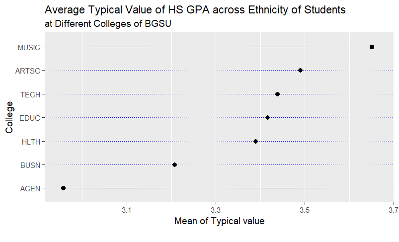
In my first plot, I intend to find the mean response for each row. Construct a dot plot
of the means where the means are ordered from high to low.

Well, it seems that the average of typical High School GPA across different Ethnicity in Music Department is higher than Art and Science college!  To my surprise the Business department has even a lower value! These kind of graphs are very beneficial for the Education office I work at, because it provides an immediate picture that keeps in mind easier than pivot tables. 


Next, I construct a dot plot, grouping by Ethnicity.

In this graph, we see that in college of Arts and Science, Ethnicity 2 is having a higher typical High School GPA. In college of Business Ethnicity 4 has a higher typical HS_GPA. The lowest Typical HS_GPA in Health Department belongs to Ethnicity 1 and Ethnicity 3. This might be an insight so we look at this Ethnicity group and see how we can better help them to be as successful as other Ethnicities.


Next, I construct a dot plot, grouping by College.

In this plot, we see the distribution of the typical high school GPA across colleges, at each Ethnicity. For instance, in the first row, first plot on the left, is showing that in Ethnicity1 the typical value of high school GPA is higher in music department. Also in the second row, the far right plot, shows that people with Ethnicity 6 have a higher typical high school GPA in music department. Also, comparing all the plots below together, we see that people with ethnicity 6, are coming to BGSU with a higher typical HS GPA across all colleges. We want to make sure other students that come to BGSU with lower HS_GPA have enough opportunity to succeed as these student, while making sure these students reach their potentials at BGSU.


In summary, these kind of dot plots work way better than a pivot table or a number alone, because  visualization is a strong tool that can make the information stuck in people’s brain for a longer time. 


Acknowledgement:

Kim Brooks, thank you for letting me use the data.

Comparing the distributions via graphic tools

In this blog I am going to compare the distribution of number of shoes owned by female and male students in an introduction to Statistics class. In fact, at BGSU all instructors give a survey to their introduction to Statistics’ students and ask several questions about their life style and preferences. Later, during the semester, the instructor is suppose to use the data to teach different plots, such as scatter plot. I find it very useful, as it can make the students more excited about the analysis of data. 

I use tidyverse package in R to take a sample of 100 students. It is always nice to do some very basic exploratory analysis on the data before any analysis. A simple exploration could be just to get a summary of the number of shoes or to see how many male and female are in my sample. It turns out, I have 66 female students and 34 male students. Male students own at most 10 shoes in my sample, while female’s maximum number of shoes is 164! Could this be an outlier? Or the data has been put by mistake in the data set? In either case, we can analyse our data without being in so much trouble. 

Next, I plot the number of shoes of those female and male students in order to compare their distributions. There are several different type of plots that can help me to tackle this task. In the following several parts, I will display how each plot can help compare the distributions.

Before getting down to displaying, I should mention that I sometime try to plot with both base plotting codes in R and ggplot. We know that ggplot has all the embellishments we need to make our graph prettier and more interpret-able. I leave the judgement to the audience to some extent. 


Part 1: Construct parallel one-dimensional scatter plot


We see that female students obviously have more shoes. The number of shoes owned by females is stretched all the way till 164! Males own at most 10. 

Part 2: Parallel Quantile Plot

In this part, I have two different styles of displaying the parallel quantile plots. I prefer the second one, since I can compare the quantiles easier. 

From this kind of plot, we can compare the quantiles of male and females easily. Quantiles of  Fraction are values in which approximately (100*Fraction)% of the observations from the sample is below that value. For example, Fraction=0.5 corresponds to the median. 


The median number of shoes owned by males is 5, meaning, 50 % of the male students have less 5 shoes.
This number for the female students is 20. This means, less than 50% of the female
students have less than 20 shoes!

All of the quantiles of females are larger than the corresponding quantiles
of males. Also, near the maximum, we see that there must have been some
female with crazy number of shoes. I mentioned this peculiarity at the beginning. 


Part 3: Quantile-Quantile plot

For this part, I display the QQplot, with both basic and ggplot tools. 

“In statistics, a Q–Q (quantile-quantile) plot is a probability plot, which is a graphical method for comparing two probability distributions by plotting their quantiles against each other”

This Quantile Quantile plot is vividly showing that men have less shoes than women as all the
dots are below the line y=x.

Although, since it is hard to see the individual quantiles since we have combined the quantiles of male and female, we can tell  for all quantiles, female students  have larger quantiles.  Here also we see the spread of  the quantiles is increasing. Also, we see when a female student owns 50 shoes, the count for a male student is 10. We can explore the difference of their quantiles in Tukey plot which I expalin next. 

Part4: Tukey Mean-Difference Plot

In this last part, I have used both basic R commands and ggplot to display the Tukey’s plot.

As the quantiles increase, the differences of the quantiles of males and females also increase. In this plot we can see the trend of increasing  spread maybe easier. Also we see the difference between the quantiles readily. This is because we are plotting the difference of the quantiles on the y axis and the mean of the quatiles on the x axis. 
Only in the first few quantiles the differences of the number of shoes between male students and female students is small. We had seen this in other plots too. I mentioned in QQ plot that when a female student owns 50, a male student own 10 shoes. Here in Tukey we see the difference of the quantiles for those counts is 25.  

I prefer the parallel quantile plots because I can compare the corresponding quantiles easier as the example above explained how. Tukey is also effective because we can see the differences of the quantiles, also the average of them. 

R Code:

library(LearnBayes)
library(tidyverse)
library(ggplot2)
library(devtools)
#install_github("easyGgplot2", "kassambara")
library(easyGgplot2)
library(gridExtra)

set.seed(13555)
d.sample <- sample_n(studentdata, size = 100)
names(d.sample)

#1. Construct parallel one-dimensional scatterplots of the variable by gender.

levels(d.sample$Gender)
summary(d.sample$Shoes)

SP1=d.sample[which(d.sample$Gender== "female"),]$Shoes
summary(SP1)
SP2=d.sample[which(d.sample$Gender== "male"),]$Shoes
summary(SP2)

#SP1<- subset(d.sample, Gender == "female")$Shoes

#SP2 <- subset(d.sample, Gender == "male")$Shoes

#stripchart produces one dimensional scatter plots (or dot plots) of the given data.
#These plots are a good alternative to boxplots when sample sizes are small.

stripchart(list("Female" = SP1, "male" = SP2),
 main = "Parallel Scatterplot \n comparing the number of shoes", xlim = c(1,164), xlab = "Number of Shoes", ylab = "Gender")
 
 
##########

ggplot2.stripchart(data=d.sample, xName="Shoes",yName="Gender",
 groupName="Gender",
 xTickLabelFont=c(7,"bold", "#993333"),
 yTickLabelFont=c(14,"bold", "#993333"),
 mainTitle="Parallel Scatter plot via ggplot2",
 position = position_dodge())+
 scale_x_discrete(breaks= pretty(d.sample$Shoes, n=60))+
 labs(title = "Parallel Scatter plot via ggplot2",
 subtitle = "Comparing the distribution of Number of shoes owned by female vs. male",
 caption = "", x="Number of Shoes")


#Based on the graph, we can see that female students tend to have more shoes than males.


#2. Construct parallel quantile plots of the male values and
#of the female values. Write several sentences that help the
#reader interpret the quantile plots.
n1=length(SP1)
n1
n2=length(SP2)
n2

f1 <- (1:n1 - 0.5) / n1
plot(f1, sort(SP1, na.last = TRUE),
 xlab = "Fraction", ylab = "Shoes",
 main = "Parallel Quantile Plot", pch=21, col="blue")
f2 <- (1:n2 - 0.5) / n2
points(f2, sort(SP2, na.last = TRUE), col="red")

legend(0, 150, legend=c("Female", "Male"),
 col=c("blue", "red"), cex=0.8, pch=c(21,21))

# We need a data.frame to get the ggplot.

SP1
SORT.F=sort(SP1, na.last = TRUE)
df=cbind.data.frame(SP=SP1, FR=f1, Sort.Shoes=SORT.F,GENDER=rep("Female", length(SP1)))
names(df)
#View(df)

SORT.M=sort(SP2, na.last = TRUE)
dm=cbind.data.frame(SP=SP2, FR=f2, Sort.Shoes=SORT.M, GENDER=rep("Male", length(SP2)))
names(dm)


# To get the side by side parallel quantile plot, like the one in the book.
# Make two plots and then use the grid to put them side by side.


Pf=ggplot(df, aes(Sort.Shoes,FR))+
 geom_point(shape= 1, fill="orange",size=3, col = "orange")+
 theme(aspect.ratio = 1)+
 labs(title = "Parallel Quantile Plots",
 subtitle = "Female",
 caption = "", 
 x = "Number of shoes", y = "Fraction")

Pm=ggplot(dm, aes(Sort.Shoes,FR))+
 geom_point(shape= 1, fill="orange",size=3, col = "orange")+
 theme(aspect.ratio = 1)+
 theme(axis.title.y=element_blank())+
 labs(title = "",
 subtitle = "Male",
 caption = "", 
 x = "Number of shoes", y = "Fraction")


grid.arrange(Pf, Pm, nrow=1, ncol=2)


# To get a plot like what dr Albert did in his post:

BOTH=rbind.data.frame(df,dm)
nrow(BOTH)
names(BOTH)
#View(BOTH)

ggplot(BOTH, aes(FR, Sort.Shoes, colour=GENDER))+
 geom_point()+
labs(title = "Parallel Quantile Plot",
 subtitle = "Comparing the distribution of Number of shoes owned by female vs. male",
 caption = "Source: studentdata from the LearnBayes", 
 x = "Fraction", y = "Number of shoes")


# Female students tend to have more shoes. The difference between number of shoes
#owned by females vs. males increases as the number of shoes owned increases.

#It seems in my sample, if you are a male student and own less than 10 shoes, you can 
# find a female with less than 10 shoes. But, if you are a female and have more than 30
# shoes, you won't find a male student that has as many shoes as you have.

# The median number of shoes owned by males is 5, meaning, 50 % of the male students have less 5 shoes.
# This number for the female students is 20. This means, less than 50% of the female 
#students have less than 20 shoes!

# For the most part the quantiles of females are larger than the corresponding quantiles 
#of males. But, near the maximum, we see that there must have been some 
# females with crazy amount of shoes, because the quantiles near 100% for women have more shoes than those for
#men in this sample.

# 3. Construct a quantile-quantile plot of the male and female
#values.


#Quantile-Quantile Plot
#A different plot is a scatterplot of the corresponding quantiles. 
#Below I set up a grid of fraction values, find the quantiles of each dataset
#corresponding to these fractions, and construct the scatterplot.

qqplot(SP1, SP2, main="QQ Plot", xlab = "Number of Shoes owned by Females",
 ylab = "Number of Shoes owned by Males", col="blue")
abline(a=0,b=1,col="red",lwd=2)
text(labels="Y=X",x=4,y=8,col="blue")


 f <- (1:15 - 0.5) / 15
 q1 <- quantile(SP1, f, na.rm = TRUE)
 q2 <- quantile(SP2, f, na.rm = TRUE)
 # plot(q1, q2, main = "Quantile-Quantile Plot")
 # abline(0, 1,col="red",lwd=2)

##############

# QQplot:

d <- as.data.frame(qqplot(SP1, SP2, plot.it=FALSE))
ggplot(d) + geom_point(aes(x=x, y=y), col="blue")+
 geom_abline(intercept = 0, slope = 1, col="red")+
 labs(title = "Quantile Quantile Plot",
 subtitle = "Comparing the distribution of Number of shoes owned by female vs. male",
 caption = "", 
 x = "Number of Shoes owned by Females", y = "Number of shoes owned by Males")+
 geom_text(aes(x = 0, y = 5, label = "Y=X"),col="red")+
 annotate(geom="text", x=162, y=9, label="164 Shoes",
 color="red")

# This Quantile Quantile plot is vividly showing that men have less shoes than women as all the 
# dots are below the line y=x.

####################

##4. Construct a Tukey m-d plot from the quantiles of the two 
#samples. Interpret the plot. Is there a simple relationship
#between the male values and the female values?

#plot((q1 + q2) / 2, (q2-q1),main = "Tukey Mean-Difference Plot")


quant_male=quantile(SP2,probs=seq(0,1,by=.1))

quant_female=quantile(SP1,probs=seq(0,1,by=.1), na.rm = TRUE)

Difference=quant_female-quant_male

Mean=(quant_female-quant_male)/2

plot(Mean,Difference, main="Tukey Mean-Difference Plot")
#abline(h = 0, col = "blue")

## qqplot version.

Q.data=cbind.data.frame(quant_female,quant_male, Difference, Mean)
names(Q.data)

ggplot(Q.data) + geom_point(aes(x=Mean, y=Difference), col="blue")+
labs(title = "Tukey Mean-Difference Plot",
 subtitle = "Comparing the distribution of Number of shoes owned by female vs. male",
 caption = "", 
 x = "Mean of Quantiles", y = "Difference of Quantiles")+
 #geom_hline(yintercept=0)


Exploring the Pythagorean Formula

In this blog we are going to explore the Pythagorean Formula (described first by Bill James in the context of baseball). 

The Pythagorean formula is (W/L)=(P/PA)^k where k is some constant. We consider the transformations log(W/L) and the log(P/PA) so we can perform a linear regression model centered at the origin to approximate k.  

Part 1, Data:

 I collected my data from  NFL teams for the 2017 regular season. (football)

I collected my data from here.

The original data looks like this:

I chose 10 teams randomly and focus my attention on “W”: the number of games won, “L”: the number of games lost, “P”: the number of points (or runs, goals, etc) scored by the team,  and “PA” : the number of points allowed by the team. 


Part 2: Data Analysis 

After fitting the model , regression through origin: 

my.model=lm(log_WtoL~log_PtoPA+0, data = footbal), we get k which is:  2.4406. 

For every one unit increase in log(P/PA), the log(W/L) increases by approximately 2.4406.  In other words, in NFL, the win to lose Ratio is equivalent to the points scored to points given Ratio raised to  2.4406 power.


Part 3: Plots


Part 4:  Residual Analysis

The least lucky team is Los Angeles Chargers with residual of -0.39721208 which has the lowest residual.

And, the luckiest team is Pittsburgh Steelers with the highest residual of 0.79238146 . 


Part 5: R Code:

# Blog assignment.
# I chose footbal.

library(dplyr)
library(ggplot2)
library(ggfortify)
install.packages(“gridExtra”)
library(gridExtra)

footbal <- read.csv(“C:/Users/Sima/Desktop/math 6820 Graphics/footbal.txt”)
names(footbal)

#”Tm” “W” “L” “W.L.” “PF” “PA” “PD” “MoV” “SoS” “SRS” “OSRS” “DSRS”

# Get the followings:

#W – the number of games won
#L – the number of games lost
#P – the number of points (or runs, goals, etc) scored by the team
#PA – the number of points allowed by the team

footbal=as.data.frame(footbal)
colnames(footbal)[colnames(footbal)==”PF”] = “P”
colnames(footbal)[colnames(footbal)==”Tm”] = “Team Name”
head(footbal,10)

footbal=select(footbal, c(“Team Name”,”W”, “L”, “P”, “PA”))
head(footbal,10)

#Choose 10 teams:
footbal=footbal[c(1:7, 14:16),]
View(footbal)

##### Do some math here:

footbal$WtoL<-round(footbal$W/footbal$L,3)
footbal$log_WtoL<-round(log(footbal$WtoL),3)

footbal$PtoPA<-round(footbal$P/footbal$PA,3)
footbal$log_PtoPA<-round(log(footbal$PtoPA),3)

# Fit the regression line on the data:

my.model=lm(log_WtoL~log_PtoPA+0, data = footbal)
summary(my.model)
summary(my.model$residuals)

# The solpe which is the K we are looking for is 2.440.
# Construct the scatter plot with the regresion line imposed on it.
# Also, construct the residual plot.

# ggplot(footbal, aes(x=log_PtoPA, y=log_WtoL)) +
# geom_point()+
# geom_smooth(method=lm, se=FALSE)

#############################

P1=ggplot(footbal, aes(x=log_PtoPA, y=log_WtoL))+
geom_point(shape= 20, fill=”orange”, col =”red”,size=3, col = “steelblue”)+
geom_smooth(method=lm, se=FALSE)+
ylab(“LOGe W/L”)+
#xlab(“”)+
ggtitle(“Ratio of Wins to Loses Versus \n Ratio of Pts. Earned to Pts. Given in NFL”)+
theme(plot.title = element_text(hjust =0.5, lineheight=.9, face=”bold”))+
theme(aspect.ratio = .75)+
theme(axis.title.x=element_blank(),
axis.text.x=element_blank(),
axis.ticks.x=element_blank())

P1

#e <- sum(1/factorial(0:100))
##### Now residuals plot:

#my.model$residuals
modf <- fortify(my.model)
modf$.resid
modf$log_PtoPA

P2=ggplot(modf, aes(x=log_PtoPA, y=.resid))+
geom_point(shape= 20, fill=”orange”, col =”red”,size=3, col = “steelblue”)+
ylab(“Residual”)+
xlab(“LOGe (P/PA)”)+
#scale_y_continuous(sec.axis = sec_axis(trans = ~., name = “Residual”))+
geom_hline(yintercept=0,0,
color = “blue”, size=1)+
theme(aspect.ratio = .75)

P2

grid.arrange(P1, P2)


Broadway show comparisons

Hello world! 

This is a typical Friday night in graduate school  and I am about to start my blog. I intend to compare Broadway shows in two different time periods. The first time period is 2000-2008, and the second is 2009-2016. 

I am not that familiar with broad way shows unfortunately, so I can not ramble about them as much as I like.

How did I get the data?

The data and explanation can be found here.

Since I intend to compare the best performances, I can choose any of the variables in the data set to do the comparison. The easier ones seem to be either Gross or Attendance of people which I can set up my bar charts for.I choose Attendance of people as a criterion of best performance. 

Part1:

First, I display a bar chart below where I have plotted Name of the shows versus attendance grouped by the period when the show was displayed. Note that as I explained above we have two periods. 

As we can see, we have so many names on the horizontal axis, we don’t have a title and the bar plot is so cluttered. Fortunately we can improve our plot a little bit.

Below is the edited graph. I have switched y and x axis. I only look at the shows that people’s attendance is more that three million. I changed the attendance to million for clarity.

 The Wicked is outperforming in the later period base don the criterion of success I defined above. 

Part 2:

Next I intend to have a bad stacked bar plot.


Show names I are easily read. There is no title.

Next I improve this stacked bar plot a little bit. I add the attendance on the bar for ease of the comparisons.


R code:

######################
library(ggplot2)
library(tidyverse)
library(lubridate)
d <- broadway
d$Year <- year(mdy(d$Full))

d %>% filter(Year >= 2000, Year <= 2016) %>%
mutate(Period = ifelse(Year <= 2008, “2000-2008”, “2009-2016″)) %>%
group_by(Period, Name) %>%
summarize(Attendance = sum(Attendance)) -> S
names(S)

ggplot(data=S, aes(x=Name, y=Attendance,colour = Period)) +
geom_bar(stat=”identity”)

######################## The minimum of 3000000
S=S[which(S$Attendance>=3000000),]

S$Attendance=as.numeric(paste(round(S$Attendance / 1e6, 1)))
#######################

ggplot(data=S, aes(x=Name, y=Attendance)) +
geom_bar(aes(fill=Period),stat=”identity”,position = “dodge”)+
coord_flip()+
xlab(” Show Name”) + ylab(“Total Attendance in million”) +
ggtitle(“Best Broadway Shows, Total Attendance (in million)
Periods: 2000:2008/ 2009-2016”) +
theme(
plot.title = element_text(
colour = “black”, size = 16, hjust = 0.5
)
)
#################

ggplot(data=S, aes(x=Name, y=Attendance)) +
geom_bar(aes(fill=Period),stat=”identity”)+
#coord_flip()+
xlab(” Show Name”) + ylab(“Total Attendance in million”) +
#ggtitle(“Best Broadway Shows, Total Attendance (in million)
# Periods: 2000:2008/ 2009-2016”) +
theme(
plot.title = element_text(
colour = “black”, size = 16, hjust = 0.5
)
)
#################

ggplot(data=S, aes(x=Name, y=Attendance)) +
geom_bar(aes(fill=Period),stat=”identity”)+
coord_flip()+
xlab(” Show Name”) + ylab(“Total Attendance in million”) +
ggtitle(“Best Broadway Shows, Total Attendance (in million)
Periods: 2000:2008/ 2009-2016”) +
theme(
plot.title = element_text(
colour = “black”, size = 16, hjust = 0.5
)
)+
geom_text(aes(label = Attendance), size = 3, position = position_stack(vjust=.5))
#################


Population growth in Iran versus Uganda

In this post I am going to compare population growth in Iran and Uganda

At first I would like to explore the population growth in Iran over the last 58 years. This is of my interest since I am from Iran, and I am better than anyone aware of the consequences of revolution in Iran after 1977. Also, I miss my homeland so much and writing about it makes me feel good at this gloomy Friday night. After all BG’s wind started to blow!

In above graph, we notice an exponential growth  from 1960 till almost 1990. After that it gradually starts having a linear growth like many countries in the world. 

Don’t take it wrong though! It is not because the economy is stable or people are happy! In fact, it is the exact opposite. 

Now, I choose some portion of the data that has exponential growth to plot. I choose 1970 till 1980. First, I will construct a graph with one y axis, when my y axis is log (base 2) of the population. 


Next, I will construct a graph with two y axis. The y axis on the left will be the population in log base 2, and the axis on the right will be population in millions. 


Since we roughly have a linear trend in above graph, it is reasonable to think that the percent increase was almost stable. This alludes that our assumption of a exponential growth is right. Thus, we can calculate the factor of increase in Iran’s population in this ten year. Note that on the left y axis, the population on a log 2 base changes from 24.8 to 25.2 which corresponds to .4 difference on a log base 2. This in turn corresponds to factor increase of 1.319. 

Also, to calculate the percent increase in population in million, the right y axis, I do the following: ((38-30)/30)*100=26.66.Thus we have roughly a 27% increase in the population.

Next, I compare the population growth in Iran versus Uganda from year 1970 to 1980.

Getting a summary of Iran’s population and Uganda’s population in the period of 1970 to 1980 tells me Iran has a bigger population. This is also visible in the below graph since Uganda lies at the bottom of the graph. The main question is do they have the same growth rate?

This can be achieved by the step I took when calculating Iran’s growth rate. ((12.50-9.40)/9.40)*100= 33%. So the increase rate is 33% in Uganda.

Well, we see that even though the population of Uganda is smaller that the population of Iran in those years, the increase rate is higher in population. 


R code:

# Week 4 assignment:
#setwd(“C:/Users/simas/Desktop/Albert”)
#world.population <- read.csv(“C:/Users/simas/Desktop/Albert, graphics/world.population.csv”)
#world.population <- read.csv(“C:/Users/simas/Desktop/Albert/world.population.csv”)
world.population <- read.csv(“C:/Users/Sima/Desktop/math 6820 Graphics/world.population.csv”)
names(world.population)
#world.population<-world.population[, -c(2:4)]
Country.1 <- world.population[which(world.population$Country.Name== “Iran, Islamic Rep.”),
which(grepl(“X”, colnames(world.population))) ]
temp=as.numeric(Country.1)
names(temp)=names(Country.1)
TEMP=data.frame(Year=as.numeric(gsub(“X”,””,names(temp)))
, Population=temp)
row.names(TEMP)=NULL
# Choose a time period.
TEMP

Log.population=log2(TEMP$Population)
TEMP$LOG.POPU=Log.population
TEMP$Year=as.numeric(TEMP$Year,0)
names(TEMP)
head(TEMP$Year)
TEMP$Population.million=as.numeric(paste(round(TEMP$Population / 1e6, 1)))
names(TEMP)

######
library(ggplot2)

# Get the graph of Iran’s population:

ggplot(TEMP, aes(Year, Population.million))+
geom_point(shape= 20, fill=”orange”, col =”red”,size=3, col = “blue”)+
geom_line(size=1,col= “blue”)+ ggtitle(” Population Growth (In million) In Iran from 1960 till 2017 “)+
ylab(” Population in million”)+
theme(plot.title = element_text(hjust =0.5, lineheight=.8, face=”bold”))+
scale_x_continuous(breaks = seq(1960, 2017, by=8), limits = c(1960, 2017))+
theme(aspect.ratio = 1)

# Here we can notice the exponential growth.

#################
# log scaling on the left

TEMP.1=TEMP[11:21,]
str(TEMP.1)
#TEMP.1$Year=as.numeric(TEMP.1$Year,0)

ggplot(TEMP.1, aes(Year, LOG.POPU))+
geom_point(shape= 20, fill=”orange”, col =”red”,size=3, col = “steelblue”)+
geom_line(size=1,col= “purple”)+ ggtitle(” Population Growth (on a log base 2) \n in Iran from 1970 till 1980″)+
ylab(” Log2 (Population)”)+
theme(plot.title = element_text(hjust =0.5, lineheight=.8, face=”bold”))+
scale_x_continuous(breaks = seq(1970, 1980, by=2), limits = c(1970, 1980))+
theme(aspect.ratio = 1)

###################
# Have two scales

library(scales)

ggplot(TEMP.1, aes(Year, LOG.POPU))+
geom_point(shape= 20, fill=”orange”, col =”red”,size=3, col = “steelblue”)+
geom_line(size=1,col= “purple”)+ ggtitle(” Population Growth in Iran from 1970 till 1980″)+
ylab(” Log2 (Population)”)+
theme(plot.title = element_text(hjust =0.5, lineheight=.8, face=”bold”))+
scale_x_continuous(breaks = seq(1970, 1980, by=2), limits = c(1970, 1980))+
theme(aspect.ratio = 1)+
scale_y_continuous(sec.axis = sec_axis(trans = ~2^., name = “Population”,
labels = unit_format(unit = “m”, scale = 1e-6)))

####### Add a second country and compare: I chose Uganda.
# A google search will tell which countries have an exponential growth.

Country.2 <- world.population[which(world.population$Country.Name== “Uganda”),
which(grepl(“X”, colnames(world.population))) ]
temp.A=as.numeric(Country.2)
names(temp.A)=names(Country.2)
TEMP.A=data.frame(Year=as.numeric(gsub(“X”,””,names(temp.A)))
, Population=temp.A)
row.names(TEMP.A)=NULL
# Choose a time period.
TEMP.A

Log.population=log2(TEMP.A$Population)
TEMP.A$LOG.POPU=Log.population
TEMP.A$Year=as.numeric(TEMP.A$Year,0)
names(TEMP.A)
head(TEMP.A$Year)
TEMP.A$Population.million=as.numeric(paste(round(TEMP.A$Population / 1e6, 1)))
names(TEMP.A)

###########
ggplot(TEMP.A, aes(Year, Population.million))+
geom_point(shape= 20, fill=”orange”, col =”red”,size=3, col = “blue”)+
geom_line(size=1,col= “blue”)+ ggtitle(” Population Growth (In million) In Iran from 1960 till 2017 “)+
ylab(” Population in million”)+
theme(plot.title = element_text(hjust =0.5, lineheight=.8, face=”bold”))+
scale_x_continuous(breaks = seq(1960, 2017, by=8), limits = c(1960, 2017))+
theme(aspect.ratio = 1)

###########

TEMP.2=TEMP.A[11:21,]
str(TEMP.2)

##########

X<-data.frame(Log.2.pop = TEMP.1$LOG.POPU,country = rep(“Iran”,nrow(TEMP.1)), Year=TEMP.1$Year)

Y<-data.frame(Log.2.pop = TEMP.2$LOG.POPU,country = rep(“Uganda”,nrow(TEMP.2)), Year=TEMP.2$Year)

both<-rbind(X,Y)

both<-as.data.frame(both)
#ggplot(both, aes(x = Log.2.pop, fill = country)) + geom_density(alpha = 0.5)

ggplot(both, aes(Year, Log.2.pop, colour = country))+
geom_point(shape= 20, fill=”orange”, col =”blue”,size=3, col = “blue”)+
geom_line()+ ggtitle(” Population Growth in Iran and Uganda \n from 1970 till 1980″)+
ylab(” Log2 (Population)”)+
theme(plot.title = element_text(hjust =0.5, lineheight=.8, face=”bold”))+
scale_x_continuous(breaks = seq(1970, 1980, by=2), limits = c(1970, 1980))+
theme(aspect.ratio = 1)+
scale_y_continuous(sec.axis = sec_axis(trans = ~2^., name = “Population”,
labels = unit_format(unit = “m”, scale = 1e-6)))

head(TEMP.2$Population.million)
head(TEMP.1$Population.million)
summary(TEMP.2$Population.million)
summary(TEMP.1$Population.million)
##############
# Explore Uganda a little more :

ggplot(TEMP.2, aes(Year, LOG.POPU))+
geom_point(shape= 20, fill=”orange”, col =”red”,size=3, col = “steelblue”)+
geom_line(size=1,col= “purple”)+ ggtitle(” Population Growth in Uganda from 1970 till 1980″)+
ylab(” Log2 (Population)”)+
theme(plot.title = element_text(hjust =0.5, lineheight=.8, face=”bold”))+
scale_x_continuous(breaks = seq(1970, 1980, by=2), limits = c(1970, 1980))+
theme(aspect.ratio = 1)+
scale_y_continuous(sec.axis = sec_axis(trans = ~2^., name = “Population”,
labels = unit_format(unit = “m”, scale = 1e-6)))


US Cereal Data Set Analysis

In this post I will talk about the analysis of US Cereal data set.

Information about this data set can be found here

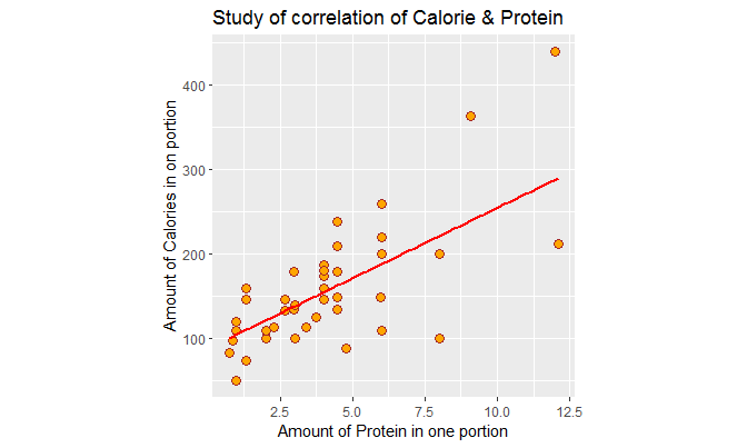
In the following graph, I have plotted the amount of protein per American portion versus, the amount of calorie per American portion. There is a positive association with correlation of .70  between them.  I have adjusted the graph so that the aspect ratio is 1.  We see a few outliers. 

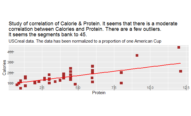
Next, I violate a few of clear vision principles in the book. 

I change ratio aspect such that the line segments don’t bank to 45 any more. 

I also make the tick marks inward to create unnecessary clutter.

I create a subtitle that doesn’t seem to be necessary. Also, I elaborate a lot in the title. This was elaborated in the text above so it only creates unnecessary clutter. Also, the choice of square instead of dots, is not a good choice, it makes the points get lost and they are not distinguishable any more.


Next, for part 2, I add shelf as the third variable in the scatter plot. Shelf is a factor variable that has three levels. “1” refers to the first shelf in the store and “3” refers to the top shelf. Basically, we are examining to see the association of shelf on the protein vs. calories. 

Supposedly, the cheaper cereals are located on the first shelf, and adults’ cereal are on the top shelf. In the following graph we see that color red is associated with the bottom shelf which has less protein and less calories. There are a few that have higher protein though.

Also, note the blue color, the adult cereal which is located on the top shelf which has high protein and calories in turn. Although it is noticeable that even in this shelf, we can find variety of cereal where they have lower protein and calories. 

You can be the judge yourself to see how adding a third variable has enhanced the study such that we can differentiate between cereals in different shelves, and can better see the pattern.


R code is as follows:


library(MASS)
data(“UScereal”)
names(UScereal)
cor(UScereal$calories, UScereal$fibre)
cor(UScereal$calories, UScereal$protein) # I like the way this is scattered though.
cor(UScereal$calories,UScereal$fat)
cor(UScereal$calories, UScereal$carbo) # I choose this one.
cor(UScereal$calories, UScereal$sodium)

# Bulid the scatter plot:
# BGSU colors
#Part 1:
library(ggplot2)
ggplot(UScereal, aes(protein, calories))+geom_point(shape=21, fill=”orange”, col=”brown”,
size=3, col=”steelblue”)+geom_hex(size=1)+geom_smooth(method= lm, se=FALSE,size=1, col=”red”)+ggtitle(“Study of correlation of Calorie & Protein”)+
xlab(“Amount of Protein in one portion”)+ylab(“Amount of Calories in on portion”)+theme(aspect.ratio = 1)

ggplot(UScereal, aes(protein, calories))+geom_point(shape=15, fill=”orange”, col=”brown”,
size=3, col=”steelblue”)+geom_hex(size=1)+geom_smooth(method= lm, se=FALSE,size=1, col=”red”)+ggtitle(“Study of correlation of Calorie & Protein. It seems that there is a moderate
correlation between Calories and Protein. There are a few outliers.
It seems the segments bank to 45.”, subtitle= “USCreal data. The data has been normalized to a proportion of one American Cup”)+
xlab(“Protein”)+ylab(“Calories”)+theme(axis.ticks.length = unit(-.50, “cm”))+
theme(aspect.ratio = .25)

# Part 2:
# ggplot(UScereal, aes(protein, calories, color=shelf))+geom_point()+geom_hex(size=1)+ggtitle(“Study of correlation of Calorie & Protein”)+
# xlab(“Amount of Protein in one portion”)+ylab(“Amount of Calories in on portion”)+theme(aspect.ratio = 1)
View(UScereal)
ggplot(UScereal, aes(protein, calories))+geom_point(aes(colour=factor(shelf)))+geom_hex(size=1)+ggtitle(“Study of correlation of Calorie & Protein”)+
xlab(“Amount of Protein in one portion”)+ylab(“Amount of Calories in on portion”)+theme(aspect.ratio = 1)

Hello to ggplot world!

As a PhD student in statistics, I am required to know how to visualize my graphs properly. The more I read Cleveland’s book, the more I understand the importance of good visualizations. I always postponed learning ggplots properly over the last 4 years of graduate school, but now it is the time to tackle this challenge and master it well.

For this blog task, we were required to plot the year versus the log of instructional fee to demonstrate the increasing pattern of tuition increase. I have to say, this is probably the first time I have spend this much time on a plot and have fussed about color and pattern and symbols. But, I assume it is totally worth it. I am not aware of the reasons for the increase, but I am sure it all boils down to the global increase of cost of living in the US.


Any ways, since it was the first time I started my plot from scratch with ggplot, I was not sure if the order of events matter. What I mean is that for instance, should I first take care of the THEME and then add the title. If you pay attention to my code, you will realize that I have used THEME a lot throughout the code but I am not sure if it really matters where it should be.

Also, I am not sure how this ggsave is working or if it really worked for my plot. I would like to see other people’s R code just to see how things have worked for them.


My R code:

# HW2 Blog Assignment:


Year=c(1960, 1971, 1980, 1990 , 2000, 2010, 2018)
Fees=c(100, 170, 306, 1146, 2157,4161,4548)
log.ten.fees=log(Fees,base=10)
BGSU=cbind.data.frame(Year, Fees, log.ten.fees); View(BGSU)


#Construct a scatterplot of year (horizontal) against log10 of fees with the points connected by lines. 
library(ggplot2)
 
 ggplot(BGSU, aes(x=Year, y=log.ten.fees)) + 
 geom_point(colour = "brown", size = 5, shape=25)+
 geom_line(aes(Year, log.ten.fees), linetype = 1, color="orange", size=2)+ 
 ggtitle("The data consists of Log 10 of instructional fee per semester in BGSU for selected years.
This graph displays the increasing trend of instructional fee throughout the last fifty years 
and the year I got into college.")+
 theme(plot.background = element_rect(fill = "grey90"), plot.title = element_text(colour = "brown", face = "bold",
 size = rel(.7),family = "Helvetica"))+
 geom_vline(xintercept = 2005, linetype = 2,colour="brown", size=1)+
 annotate("text", x=2005, y=2 ,label="In 2005, I started College", colour = "black", size = 3.5)+
 labs(x="YEAR", y="Log Base 10 of Fee")+
 theme(panel.border = element_rect(linetype = "dashed", fill = NA))+
 theme(panel.grid.major = element_line(colour = "white"))+
 theme(panel.grid.minor = element_line(colour = "white"))+
 theme(axis.line = element_line(size = 2, colour = "grey80"))+
 theme(axis.text = element_text(colour = "brown"))+
 theme(axis.title.y = element_text(size = rel(1.2), angle = 90))+
 ggsave("fee.png",width =3.5 , height = 5)


Is Horsepower of a Car Related to Its Mileage?

Motor Trend magazine collected the horsepower and mileage for 32 cars in the 1973-74 model year. To see if there is any relationship between horsepower and mileage, I construct a scatter plot of the two variables.

There seems to be a negative or inverse association between the horsepower and mileage of the cars in the 1973_74. This association suggests, as horsepower increases, the mileages decreases. We notice some outliers too.