
Today I passed my preliminary exam!
Now I am ready to talk about the pop charts and try to have a better replacement for them.
In this blog post I explain why some choices of plots are not recommended. We will talk about the pop charts.
I have always been curious about the amount US government spend on military because I know Iran’s government wastes a lot of our budget to all branches of military!
I found the budget of US spending for 2015 fiscal year and interestingly, US also wastes a lot of budget on Military! You can find the pie chart here.
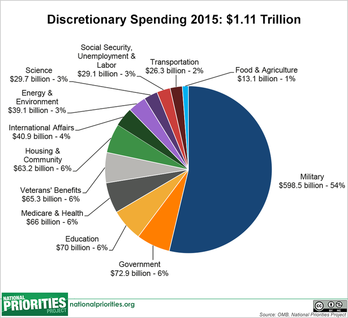
There are 12 categories. We don’t have a separate key in this pie chart. Even though the pie chart is drawn with scales, we still have to judge the sizes of angles to make inferences about the percentages since we have 12 categories. The scanning and interpolation based on the pie chart is hard. The following dot plots helps to better see the pattern and judge easier. Even though pie charts are favorable by many people, they should not be used for everything. It is extremely important to choose our plots and visualizing techniques wisely, as we do not intend to create more confusion. The main reason so many people these days use visualizing techniques is because we would need to immediately see the existing patterns. Can see easily notice that without taking a second to examine the pie chart further? I don’t think so.

The ordering that I have done when plotting the dot plot above is very helpful to get a pretty good grip of the fact that in 2015, the government didn’t spend much on transportation. This tells us that US government wanted to support the car companies. It is not hard to see the spending on Government is above spending for all other categories, even higher than Education, except Military. I wonder what the expenses of the government is in the US.
Next, I chose a bubble graph and decided to replace it by a dot plot.
The graph is trying to show the gross value of the top 10 movies. The first graph has the gross value written on each bubble which is a little help, but still confusing. We don’t have an easy scale. It creates confusion about judging which ones sold better.

You can find the graph area here.
Also, here.

Display it with a dot plot:

With the dot chart we can also see that titanic is the best seller. In the bubble chart, it is also easy to see that. But, what about the other smaller bubbles? Can we just looking at the size of the bubbles and easily know which one sold better? Dot plot can better help us displaying them.