
In this post we are going to explore Loess in ggplot2.
Let’s look at the definition of it first.
“Local regression or local polynomial regression, also known as moving regression, is a generalization of moving average and polynomial regression. Its most common methods, initially developed scatterplot smoothing, are LOESS (locally estimated scatterplot smoothing) and LOWESS (locally weighted scatterplot smoothing). They are two strongly related non-parametric regression methods that combine multiple regression models in a k-nearest-neighbor-based meta-model.”
We are going to see how this interesting function works. First some X and Y is simulated through the following code:
simdata <- function(sigma=0.4){
 x <- seq(-pi, pi, length = 200)
 curve <- sample(1:4, size = 1)
 f <- (sin(x) + cos(x)) * (curve == 1)+
 (sin(x) - cos(x)) * (curve == 2) +
 (sin(x) * cos(x)) * (curve == 3)+
 (.28 - .88 * x - 0.03 * x^2 + .14 * x^3) * (curve == 4)
 y <- f + rnorm(length(f), 0, sigma)
 data.frame(x=x, y=y)
}
This simulates some (x, y) data where the true signal follows one of the curves
sin(x) + cos(x), sin(x) – cos(x), sin(x) * cos(x), .28 – .88 * x – 0.03 * x^2 + .14 * x^3.
First: Construct a scatter plot of data and overlay a loess smooth (using the default value of span in the loess function). The default value is .75.
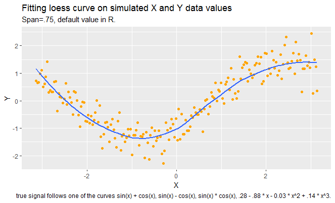
It seems that loess curve is capturing the pattern in data well, but we can not be sure of this until we look at the residual plot which follows next.
Next, construct a plot of residuals and comment if the loess curve has effectively found the signal.

Since we see a pattern in scatterplot of residual versus X vaues, loess has not been successful in capturing the signal. Some part of the data was not covered by the loess and it shows itself in patterns of residuals.
Next, 3. Assuming that a better smooth can be found, construct a scatterplot using a better choice of the span. By the use of a residual plot, demonstrate that your choice of f
is better than the default choice in 1.
In this part, I tried several values of alpha and compared them with each other and with the plots in part 1 of this assignment.
First, I increases alpha to .90 and I got even a worse pattern in residuals. Then I reduced alpha values to values less than .75. It seems that values between .55 and .60 are doing a pretty good job in capturing the signal.


Overall, I find this method very interesting, especially when it is hard to know what model better describes the association of the two variables.