
In this blog I am going to talk about featuring the two way tables through dot plots. The data that I have used in this post belong to BGSU office of undergraduate Education.
In my two way table I have collected the median high school GPA of Cohort 2018 students across their Ethnicity, at different colleges at BGSU. Since the data is university data, I call them E1:E6 to better protect university data and students’ identity. The reason that I chose Ethnicity to investigate on is because university and our office strives to create fair opportunity for people with different background so everyone at BGSU have the chance to succeed, even if they are a minority.

In my first plot, I intend to find the mean response for each row. Construct a dot plot
of the means where the means are ordered from high to low.
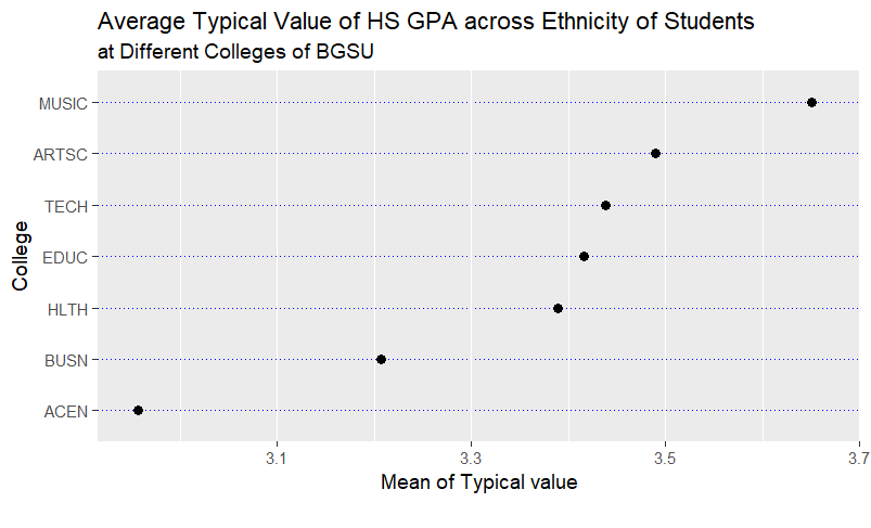
Well, it seems that the average of typical High School GPA across different Ethnicity in Music Department is higher than Art and Science college! To my surprise the Business department has even a lower value! These kind of graphs are very beneficial for the Education office I work at, because it provides an immediate picture that keeps in mind easier than pivot tables.
Next, I construct a dot plot, grouping by Ethnicity.
In this graph, we see that in college of Arts and Science, Ethnicity 2 is having a higher typical High School GPA. In college of Business Ethnicity 4 has a higher typical HS_GPA. The lowest Typical HS_GPA in Health Department belongs to Ethnicity 1 and Ethnicity 3. This might be an insight so we look at this Ethnicity group and see how we can better help them to be as successful as other Ethnicities.

Next, I construct a dot plot, grouping by College.
In this plot, we see the distribution of the typical high school GPA across colleges, at each Ethnicity. For instance, in the first row, first plot on the left, is showing that in Ethnicity1 the typical value of high school GPA is higher in music department. Also in the second row, the far right plot, shows that people with Ethnicity 6 have a higher typical high school GPA in music department. Also, comparing all the plots below together, we see that people with ethnicity 6, are coming to BGSU with a higher typical HS GPA across all colleges. We want to make sure other students that come to BGSU with lower HS_GPA have enough opportunity to succeed as these student, while making sure these students reach their potentials at BGSU.

In summary, these kind of dot plots work way better than a pivot table or a number alone, because visualization is a strong tool that can make the information stuck in people’s brain for a longer time.
Acknowledgement:

Kim Brooks, thank you for letting me use the data.