
In this post I will talk about the analysis of US Cereal data set.
Information about this data set can be found here
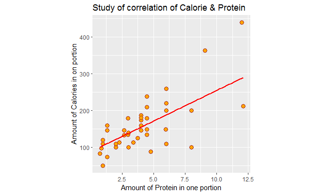
In the following graph, I have plotted the amount of protein per American portion versus, the amount of calorie per American portion. There is a positive association with correlation of .70 between them. I have adjusted the graph so that the aspect ratio is 1. We see a few outliers.
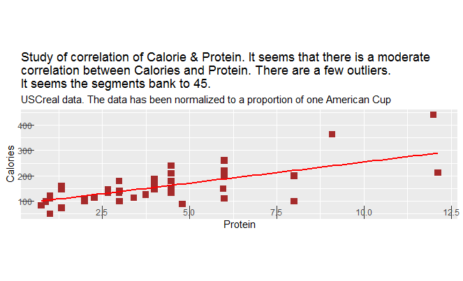
Next, I violate a few of clear vision principles in the book.
I change ratio aspect such that the line segments don’t bank to 45 any more.
I also make the tick marks inward to create unnecessary clutter.
I create a subtitle that doesn’t seem to be necessary. Also, I elaborate a lot in the title. This was elaborated in the text above so it only creates unnecessary clutter. Also, the choice of square instead of dots, is not a good choice, it makes the points get lost and they are not distinguishable any more.
Next, for part 2, I add shelf as the third variable in the scatter plot. Shelf is a factor variable that has three levels. “1” refers to the first shelf in the store and “3” refers to the top shelf. Basically, we are examining to see the association of shelf on the protein vs. calories.
Supposedly, the cheaper cereals are located on the first shelf, and adults’ cereal are on the top shelf. In the following graph we see that color red is associated with the bottom shelf which has less protein and less calories. There are a few that have higher protein though.
Also, note the blue color, the adult cereal which is located on the top shelf which has high protein and calories in turn. Although it is noticeable that even in this shelf, we can find variety of cereal where they have lower protein and calories.
You can be the judge yourself to see how adding a third variable has enhanced the study such that we can differentiate between cereals in different shelves, and can better see the pattern.

R code is as follows:
library(MASS)
data(“UScereal”)
names(UScereal)
cor(UScereal$calories, UScereal$fibre)
cor(UScereal$calories, UScereal$protein) # I like the way this is scattered though.
cor(UScereal$calories,UScereal$fat)
cor(UScereal$calories, UScereal$carbo) # I choose this one.
cor(UScereal$calories, UScereal$sodium)
# Bulid the scatter plot:
# BGSU colors
#Part 1:
library(ggplot2)
ggplot(UScereal, aes(protein, calories))+geom_point(shape=21, fill=”orange”, col=”brown”,
size=3, col=”steelblue”)+geom_hex(size=1)+geom_smooth(method= lm, se=FALSE,size=1, col=”red”)+ggtitle(“Study of correlation of Calorie & Protein”)+
xlab(“Amount of Protein in one portion”)+ylab(“Amount of Calories in on portion”)+theme(aspect.ratio = 1)
ggplot(UScereal, aes(protein, calories))+geom_point(shape=15, fill=”orange”, col=”brown”,
size=3, col=”steelblue”)+geom_hex(size=1)+geom_smooth(method= lm, se=FALSE,size=1, col=”red”)+ggtitle(“Study of correlation of Calorie & Protein. It seems that there is a moderate
correlation between Calories and Protein. There are a few outliers.
It seems the segments bank to 45.”, subtitle= “USCreal data. The data has been normalized to a proportion of one American Cup”)+
xlab(“Protein”)+ylab(“Calories”)+theme(axis.ticks.length = unit(-.50, “cm”))+
theme(aspect.ratio = .25)
# Part 2:
# ggplot(UScereal, aes(protein, calories, color=shelf))+geom_point()+geom_hex(size=1)+ggtitle(“Study of correlation of Calorie & Protein”)+
# xlab(“Amount of Protein in one portion”)+ylab(“Amount of Calories in on portion”)+theme(aspect.ratio = 1)
View(UScereal)
ggplot(UScereal, aes(protein, calories))+geom_point(aes(colour=factor(shelf)))+geom_hex(size=1)+ggtitle(“Study of correlation of Calorie & Protein”)+
xlab(“Amount of Protein in one portion”)+ylab(“Amount of Calories in on portion”)+theme(aspect.ratio = 1)