I am interested in Broadway shows. I want to find the “best” Broadway shows for the time periods of 2000-2008 and 2009-2016. To determine “best” here, I will be using the gross amount of each play during the respective time periods.
I obtained my dataset from here. Next, I plotted a grouped bar chart for all of the shows during the respective periods with one bar representing 2000-2008 and the other 2009-2016 for each show. This bar graph is shown below.

This graph is a complete mess. I can’t even read the show titles, and the axes aren’t even properly labelled. I need to narrow down the number of shows I am looking at. Looking at the graph, I see the highest earning shows earn about over $300-$400 million. So, I decided to look at the shows that earn over $300 million. To fix the graph, I flipped the x and y axes here so that the names won’t be too crowded. I also didn’t like seeing 4e+06 in the axis, so I rescaled the y-axis to display 400 and made a note in the axis title that we are looking at millions of dollars. The improved graph is displayed below.

We can now see the highest grossing title for each time period. For the 2000-2008 period, The Lion King performed by far the best. It earned about $500 million. The next closest was about a tie between Wicked and Mama Mia! each around $350 million. For the 2009-2016 period, it seems both Wicked and The Lion King performed by far the best. They both earned about $675-$680 or so. It looks like Wicked barely edged out The Lion King.
Now, I want to plot a stacked bar chart. Again, I plotted all the shows together to see what the chart would look like. It is shown below.
Again, this chart suffers from the same problems as the first bar chart shown above. So, I used the same fixes. This time I displayed two different stacked charts. The first keeps the axes and grid. The second gets rid of the explicit y-axis (as suggested by Claus O. Wilke in Fundamentals of Data Visulaization) as well as the grid.
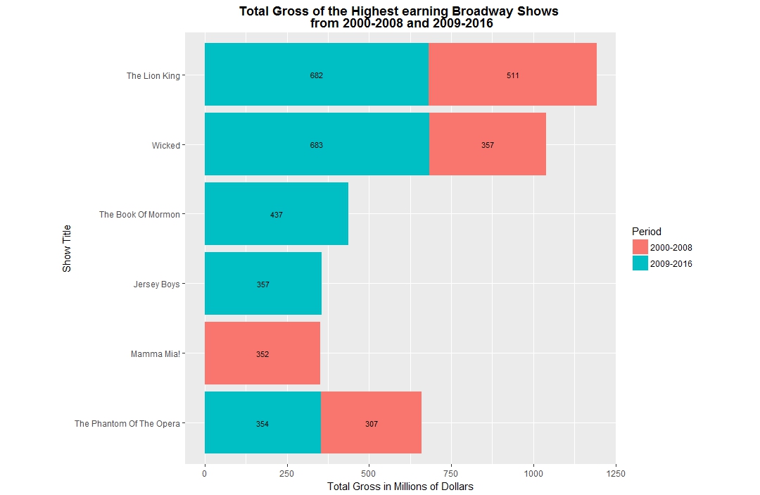

Both graphs display the same data and have the numbers displayed inside of them. Again, we can see the same best shows as noted before. However since we have the explicit numbers here, we can have a more accurate answer instead of the guesses from above. Also, we can more easily see which show performed the best across both time periods together. We can see that The Lion King outperformed every other show for both time periods together with Wicked being the second highest with earnings of $1.193 billion and $1.040 billion.