For the first time this semester, I had to scramble to make sure that my blog assignment was complete for this week. At the school where I teach, both Halloween and parent-teacher conferences presented themselves as new schedule challenges for me. As a result, I had to complete my blog in the afternoon hours of Friday. I never procrastinate, so obviously this is an unusual set of circumstances. Let’s see if I can pass this latest challenge.
This week in Cleveland’s text, we read over content on time-series plots and the use of color in differentiating graphs. Relatedly, our blog assignment this week pertains to using color while graphing plots in R. Thanks to some advice from Dr. Albert, I was able to make sure the graphs I present are accurate. This week’s blog is broken into two parts: Part A describes a time-series plot comparing Broadway attendance numbers, while Part B discusses a contour graph of the density of a bivariate normal distribution.
Part A
In the first part of this week’s entry, I looked at data from Broadway shows of the past twenty six years. I was very interested to see the relationship between the three main genres of shows: musicals, plays, and specials. Particularly, I was curious to see how their average attendance numbers compared for each year. Initially, I expected musicals to have by far the largest average attendance numbers. This is due to their popularity and relevance in the American zeitgeist compared to plays and specials.
To create the plot, I first calculated the average attendance numbers by year for each of the three genres. This was found using an aggregate function in R. Then, I create a time-series plot of the average attendance numbers by year, grouping by genre. The red line represents the time-series of musical attendance, the blue line represents the time-series of specials attendance, and the green line represents the time-series of play attendance. The figure is seen below.
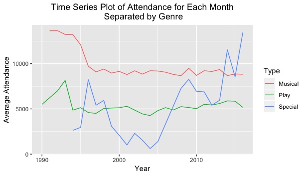
Not surprisingly, musicals have had large average attendance numbers the past twenty six years. However, there appeared to be a drop-off in average attendance during the mid 1990s. This could be due to the increasing popularity in television and video games as other forms of media. Plays have had a relatively stable attendance series. There was a brief spike in play popularity during the early 1990s, but then the average attendance numbers level out around 5000 for the remaining twenty years.
The “specials” genre has been the most surprising of the three. Specials had a dramatic decrease in average attendance during the early to mid 2000s. However, their popularity spikes up extraordinarily from the mid 2000s to present day. This could be due to increasing popularity in specials such as celebrities performing one-man shows, anniversary specials of Broadway shows, stand-up comedy routines, etc. These types of intimate and unique performances tend to garner steam and attention through social media and YouTube, and thus could result in higher attendance numbers.
The differentiation in color for the three groups made the graph very easy to interpret. There were no unusually close colors or values that would cause for any misreadings. As a result, selective color choice is a smart decision to make when plotting multiple time-series on the same figure.
Onto our next section!
Part B
In Part B, I entered the simulation code for a bivariate normal distribution into R, which was given to me by Dr. Albert on the Canvas website. In his initial code, Dr. Albert selected a color palette which represented a traditional rainbow spectrum. While the figure looked very pleasing to the eye, it did not seem to be most effective for representing the density in the normal distribution.
In my figure, I decided to color the density plot with different shades of purple. As the density level increases, the purple color of the plot becomes lighter. The figure is shown below.
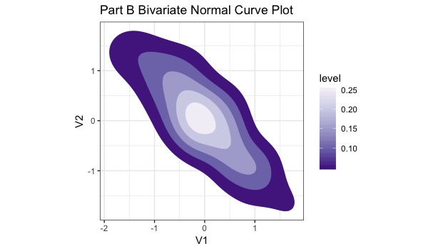
I find this plot to be very effective in showing the different levels of density. First, the change in density appears more fluid/continuous in the purple plot than the rainbow spectral plot. This is due to the similarity in purple colors. Second, I find that choosing similar colors allows the figure to be less distracting. Multiple varying colors can muddle the plot or confuse the viewer into thinking there is a sharp/dramatic change in density. The contrast between colors such as red and blue in the original plot allow for easy differentiation, but the average viewer might misconstrue these different color changes as vast changes in density.
In this assignment, I was able to better understand that color choice is very important when creating figures. Ultimately, it depends on the context of the graph. Similar choices in color are useful when comparing similar units with slight changes, while different colors are useful to analyze time-series or plots of differing categories. In addition, I was also able to learn personally that it is not optimal to wait until Friday to complete a blog assignment.