I am sick today. I’m not editorializing or being dramatic: I had to call into work today due to unexpected head cold. The benefit of my faulty immune system? I had the opportunity to work on this week’s blog post. Working full-time while taking some grad classes is a fun challenge, but I do relish the chance for some extra time to work while I recover.
Enough about me, though. This week, we are studying sampled data from students in an introductory statistics class. Since my first name starts with the letter “N,” I was charged to study the relationship between gender and the number of shoe pairs owned by each student. First, I took a random sample of size 100 from the group, using software from R Studio (full disclosure: R Studio was used to code and create the figures in this assignment). Next, I filtered the data by gender and shoe size into two data frames: one frame for men and their shoes, and a second frame for the women and their shoes. With my new vectors in place, I was all ready to create some figures using R Studio. Let’s dive in!
Parallel Dot Plot
First, I composed a parallel dot plot for the shoe pairs, organized by gender. Dot plots are nice because they are very difficult to misinterpret. They are one-dimensional and can quickly show the values and spread of the observations. Dot plots are the vanilla ice cream of plots: a true classic for numerical data.
However, as one can see below, this dot plot has some visual issues.
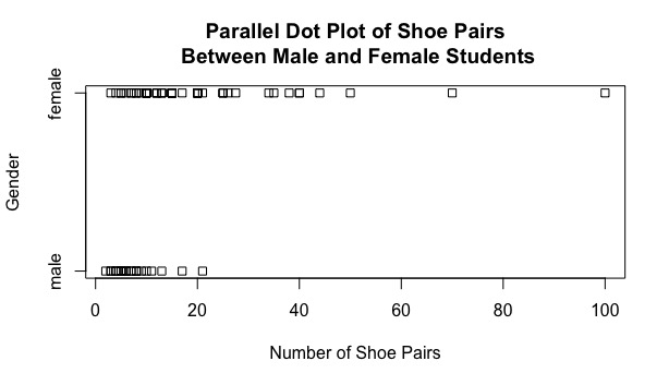
The obvious issue is that many of the observations obscure or completely overlap each other. As a result, we cannot accurately visualize how many observations exist in the sample nor what their exact values could be. Nonetheless, I can still make some conclusions from the plot. The male observations seem to have little variability and are clustered in the 1 to 20 range. The female observations have much greater variability, extending from about 5 to 100. These female observations, similarly to the men, do have congestion in the 1 to 20 range.
While the plot gave us some pockets of information, it was far from perfect. Onto the next figure!
Parallel Quantile Plot
The second plot on our journey is a set of quantile plots included in the same scale line rectangle. Quantile plots help add an extra dimension to our data. On the x-axis, I have broken the labels into fractions from 0 to 1. On the y-axis, the quantiles (i.e. equal sized groups for the distribution) are labeled. To make sure the data is organized in an increasing fashion, the observations for the male and female data frames are arranged in ascending order. In essence, we are just plotting the quantiles of the two distributions.
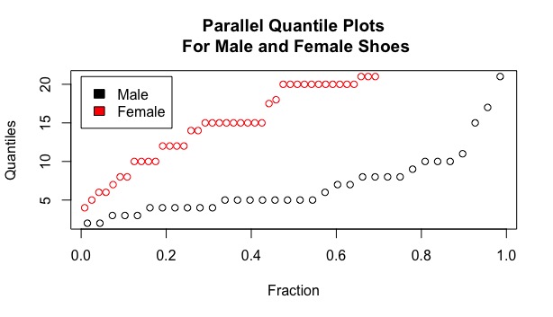
This figure provides more clarity than the previous dot plot. First, a legend is included to differentiate the two types of points. Second, no data points are being obscured and we can clearly see the shape/trend of each group. While both groups move upwards as the fraction values approach one, the female values on average are much higher than the male values. The female observations are greater than the male ones ranging from 5 to 15 quantiles, which is a considerably large range since this figure is broken into 20 quantiles in total. It is also important to note that many female and male observations fall within the same quantile. A group of six men fall under the third quantile and a group of eight men fall on the fourth quantile, while nine women lie on the 15th quantile and eleven women fall along the 20th quantile.
What could be deduced by this graph? In this introductory statistics class, female students on average have many more shoes than the male students.
Quantile-Quantile Plot
While the second plot provided plenty of additional information to me, I was curious to see if other figures could provide any new insights. A quantile-quantile plot is a nice brand of scatter plot which compares the quantiles of male shoe pairs on the x-axis and the quantiles of female shoe pairs on the y-axis. For this plot, these quantiles are broken down by a group of size 15 so that the two categories can be properly compared despite their different sizes. Subsequently, one can see that there are only fifteen observations in the plot below.

Luckily for this plot, the observations only have one obstruction; in addition, this obstruction does not deny us the possibility of determining the two values. On this figure, the line y = x is included as a reference. If the points fell along this line, we could deduce that male and female shoe amounts have virtually no difference. One can see that this is not the case. Every single observation lies above this reference line, which means that on average, female shoe amounts are much higher when compared in ratio to the male shoe amounts. After conducting some visual analysis, that there is no constant difference between female and male shoe pair amounts. These differences between x and y increase as the observations move to the right. In other words, female students with a small amount of shoes have little difference than male students with a small amount of shoes. However, if a female student and a male student each has a large amount of shoes (relative to their categories), then the difference between their amounts is massive.
Tukey Mean-Difference Plot
To confirm this notion that the female-male difference in shoe pair amount increases as the number of pairs increase, I created a Tukey mean-difference plot. On the x-axis, the mean of the female + male shoe pairs are plotted, while their difference is plotted on the y-axis. The fourth figure in our study is seen below:

Based on this increasing trend, my initial analysis appears to be corrected. As the number of shoe pairs increase for each male and female, then the difference between their values also increase. That being said, these differences between female and male shoe amounts tend to all fall under a specific value. With the exception of two observations, these differences fall below 20 (as shown with a purple horizontal line in the figure, for reference). In other words, most female student have less than 20 more shoes than their male counterparts. With the observation on the far right, the female student being studied had 35 more shoes than the male student with the largest amount. Wow!
What relationship can be determined here? For one, female students tend to have more pairs of shoes than their fellow male students. Second, the differences in shoe pairs increase at their means increase. In other words: there is a big gap between the larger values for females and males, respectively. This could be a result from the large variability in female data and small variability in male data.
Conclusion
All four graphs provide a glimpse into the relationship between shoe pairs in male and female students. The dot plot gave us a nice glimpse into the raw data distribution; however, many of the data points obscured each other. I would argue that this figure, among the four included in this post, was not the best for analysis.
The parallel quantile plot was very helpful to determine how the observations trend for each category and helped us determine that female observations were noticeably higher than the male observations for shoes. However, this graph could not tell us the sizes of their differences. As a result, the qq-plot and the mean-difference plots were able to extend from that data and explain the change in differences.
Myself, I would argue that the mean-difference plot was the most helpful for analysis. This plot showed the exact values of male-female differences, and it confirmed my initial conclusion that the differences increase as shoe pair amounts increase. It also gave me a glimpse into how close some of these differences were (i.e. a majority of the differences fell under 20). While one could argue that a qq-plot could provide the same information (which is true, to be honest), I personally found the mean-difference plot easier to analyze.
In conclusion, the sample and the four graphs provided a nice window into shoe pair amounts for male and female students in this introductory statistics course. From this study, we saw that on average, female students own more pairs of shoes than male student. In addition, as the number of pairs of shoes increased for each gender, the difference between their amount also increased. This is mostly attributed to the large range and variability found in the female students’ observation in shoe amounts.