Monthly Archives: September 2018

Visualizing Amounts with Broadway Shows

I long wondered when my days of dancing and singing in the high school musical would come into handy. Luckily, this week’s assignment examines the data for Broadway musicals. While my old dance shoes won’t come in handy here, my prior statistical skills and thirst for improved theatre knowledge should play as a featured role.

I downloaded the CSV file from the given link and began to analyze the data, particularly from both periods of 2000 to 2008, and 2009 to 2016. In this study, we are asked “what makes a Broadway show the best?” While it is almost impossible to qualify a work of art as “best” (that’s an argument for another class), we can use some parameters that would give us a glimpse into their popularity and feature in the zeitgeist.

I had considered attendance, number of weeks performing, size of the theatre, and several other factors for the “best” descriptor. However, I decided that “gross income” for the show would be an excellent indicator. Current blockbusters like Hamilton and The Book of Mormon not only have high attendance numbers, but they also require the theatregoer to dole out large amounts of money per ticket, due to high demand. Gross is positively correlated to attendance, as one might imagine, but I would also wager that gross and ticket price (and tangentially, demand) share some positive correlation.

To compare every single Broadway show by gross income would indeed be a gargantuan task; as a result, I am only comparing highly grossing shows. In my study, the shows displayed in the figures have cumulatively made over 200,000,000 dollars. This reduces the number of shows, which makes it easier to analyze.

I used RStudio to make my graphs. First, I have a set of grouped bar graphs included below. The first graph is a bad one. Let’s take a look at it:

Do not adjust your computer screen; I am well aware that there are some issues with the graph. First, the labels are all clustered together on the x-axis. It is impossible to read which shows are being presented. This can be fixed by changing the location of the x and y-axes. Second, the x and y labels need to be interchanged. Third, the title is acceptable, but it might be useful to declare that this is a grouped bar chart. Upon looking at these mistakes, I made some edits and the new final product is seen below:

This graph is much improved compared to the first one presented. First, the x and y-axes have been switched, allowing us to read the bar labels without any obstruction. Second, the axis labels are in the correct location. Upon looking at this graph, The Lion King is the highest grossing Broadway show in both the 2000-2008 and 2009-2016 periods. The show Wicked comes second in total gross among the periods, with The Book of Mormon rounding out as the third highest grossing show. To a Broadway fan like myself, this makes sense: The Lion King and Wicked are often considered in the theatre wing to be the most popular shows of the past two decades, and these Tony-Award winning shows are highly acclaimed by audiences and critics.

I was curious to see the stacked bar charts for this data, since several of these shows have runs spanning throughout both periods. As a result, I created two versions of this specific type of chart: a “bad” version and a “good” version. The bad version is displayed below:

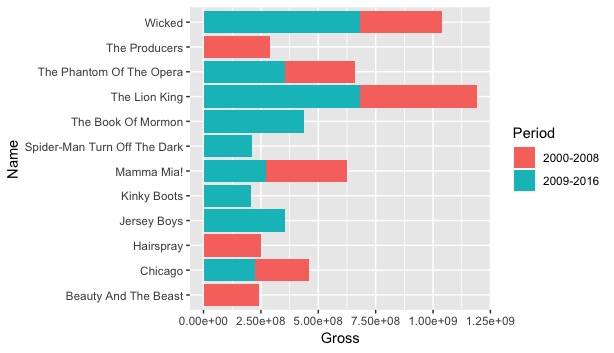
You can deduce why this would be considered the “bad” version of the graph. First, the graph does not have a title. To the common viewer, one might not know what the graph is display, aside from gross. The y-axis label “Name” also does not provide enough context to the average viewer. Second, the stacked bars are not arranged in size order, which makes it a little more difficult (while not impossible) to analyze. A positive of the graph? A legend is provided outside the data rectangle, and the axes are correctly labeled. The second graph, seen below, improves on those identified mistakes:

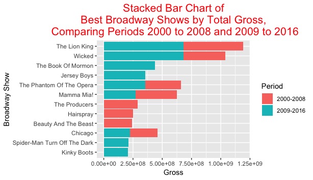
As one can see, the title of the graph provides context of 1. the type of graph, and 2. the exact data being studied without any confusion. The data has been arranged in decreasing order, with the largest total gross on the top of the graph and the smallest total gross income on the bottom. The graph arranges the data according to largest total gross per period as well. This characteristic can be seen when comparing The Book of Mormon and The Phantom of the Opera. The Book of Mormon is placed higher on the graph due to the fact that it had a higher gross within a single period; that being said, The Phantom of the Opera had a higher overall gross throughout its entire run.

As stated with the grouped bar charts, The Lion King has the record for largest overall gross within the two periods. By my own criteria, The Lion King would be considered the best Broadway show from 2000-2008 and 2009-2016. The show has amassed almost 1.25 billion dollars in ticket sales during its run. There are some other shows with high gross incomes that could claim the title as “best.” Wicked, like the Lion King, has grossed over 1 billion dollars and has immense global popularity. The Book of Mormon, while only active in the 2009-2016 period, has grossed just under 500 million dollars, which is one of the largest values for a single period. Based on my own parameters, the “best” shows in these periods would be The Lion KingWicked, and The Book of Mormon.

Two Scales and Comparison for UAE Population

Upon learning that this week’s assignment was pertaining to population growth, I was ecstatic. Population studies have always been an interest of mine, but I have mostly focused solely on city and state populations of the United States. This assignment provides a nice blend, mixing my interest in populations with my unfamiliarity of world growth patterns.

Part I.

In my first part of analysis, I gathered data and a CSV file of countries’ population data over the past 57 years. To simplify the calculation and figure construction, I only selected a 10 year period for analysis. I chose the interval 1997 to 2006. To be honest, there is no specific reason why I chose this ten year period; it is purely arbitrary. Perhaps the selection of 2006 is a unconscious attempt to remind myself that my favorite sports team, the Detroit Tigers, lost the World Series in 5 games in that year. Who’s to say?

For analysis, I chose to study the country of the United Arab Emirates. Primarily, this is because the United Arab Emirates, or UAE for short, is noteworthy for its rapid population growth. This growth is most famously seen in its city of Dubai, where its population gained 600,000 people from the span of 1995 to 2005. I conjectured that population growth in the UAE from 1997 to 2006 would be exponential, and thus determined the country to be the most interesting for this study.

Using R Studio, I graphed the yearly population data from 1997 to 2006 using line graph. On the horizontal axis, each year was plotted. For the vertical axis, two different scales were used. On the left vertical scale, the logarithm (base 2) of the population is represented to best analyze the growth rate. On the right vertical scale, the population itself is represented. The figure I created is seen below:

There are several noteworthy observations made from this graph. First, the graph looks linear with a constant slope from the years 1997 to 2002. Using the points at 2002 and 1997, I was able to make a quick visual calculation of the slope, which is approximately 0.08. This means that the growth rate each year from this span, converting from logarithm base 2, would be 2^0.08, or 1.057. In other words, the average growth rate would be 5.7% per year. As someone who lives in the Rust Belt in 2018, this rate is massive!

However, this slope does not even represent the largest period of growth! The slope no longer becomes linear and follows an exponential pick-up from 2003 to 2006. At its steepest, from 2005 to 2006, the slope of the line is approximately 0.2, which corresponds to a growth factor of 1.149. That is a massive 14.9 percent in one year!

Lastly for this graph, it is important to know that these population sizes are not miniscule: they start at 2.75 million to nearly 5.25 million by 2006. Gaining 2.5 million people in decade, for a small country area-wise, can have major repercussions for the UAE’s infrastructure and public policy. Population growth can be very beneficial for a nation, particularly for their economy, but extremely rapid growth can sometimes be met with disastrous economic bubbles and crashes.

Part II.

For part II, I decided to compare the population of the UAE with another country. The second country I chose was Honduras. The reasoning was twofold: first, Honduras has a similar reported 2017 population size to the United Arab Emirates. Second, I wanted to compare the population trends of a West-Asian country with a Latin American country, since both areas have seen positive trends of population growth in the past few decades.

Once more using R Studio, I plotted the two countries’ populations from 1997 to 2006. On the horizontal axis, the year is represented, while the logarithm base 2 of the population is represented on the vertical axis. Only one vertical scale is used for this graph, as shown below:

The shape of the UAE graph should have no surprising characteristics, considering we studied this trend in part I. However, it is intriguing to compare the UAE trend to the Honduras population trend. Throughout each year from 1997 to 2006, the slope of the UAE graph is greater than the slope of each year for the Honduras graph. Thus, we can conclude that the UAE’s population growth rate is greater than Honduras’s rate, even though the population is smaller. Should these rates continue, it would be reasonable to assume that the United Arab Emirates will pass Honduras in total population. (Author’s note: this leapfrog in population happened in 2010)

Secondly, it is noteworthy that Honduras’s population growth is perfectly linear from 1997 to 2006; thus, each year’s rate should be approximately the same. Performing a quick calculation for Honduras, with the years 1997 to 1999, the slope was found to be 0.025, which corresponds to a growth factor of 2^0.025, or 1.017. This translates to a 1.7% growth rate, which indeed much smaller than any of the UAE growth rates determined in part I.

Is it possible to make a general conclusion about West-Asian and Latin American population trends based on this single graph? Absolutely not. Only two sets of population data for a small span of years does not provide enough information to speak for entire global region’s growth. However, it does provide a specific glimpse into these two countries and their particular growth rates. These rates can also help one create predictions for their future populations.

Unclear Vision

Part I.

In this blog, I will be creating two graphs comparing the caloric and sugar content of United States cereals. First, I created a scatterplot using the ggplot2 feature in R Studio. I was able to clearly plot the observation and provide the graph with detailed labels and a title. The final product is shown in the image below:

The purple data observations show a steep, increasing trend. In general, as the amount of calories per serving increases for the cereal, then the number of grams of sugar is likely to increase. There are two particular outliers found on the far right of the graph; that being said, those specific high calorie cereals also result in a higher sugar content. From this data and its overall trend, we can deduce that high calorie and high sugar content in cereals are strongly, positively correlated.

Next, I created a second scatterplot using the identical data set. However, for this particular plot, I made some slight adjustments which violate the principles of “Clear Vision” found in the Cleveland textbook. This adjusted graph is shown in the figure below:

Within this graph, one can see that there are several violations to the “Clear Vision” principles. First, it violates the principle of “use visually prominent graphical elements to show the data.” These observations are much too small to be noticed by the naked eye. Additionally, the colors of the observations are too bright, which makes it more difficult to be discerned.

Second, the graph violates the principle of “do not clutter the interior of the scale-line rectangle.” For this graph, I added two labels: “cluster of observations” and “observations lying outside the cluster of data.” These labels not only are unnecessary, but they provide too much information for the scale-line rectangle.

Thirdly, the graph violates the principle of “do not allows data labels in the interior of the scale rectangle to interfere with the quantitative data.” These labels, while possibly useful for an average viewer, obscure the data points and can cover up important data values or outliers. This can affect a viewer’s interpretation of the figure and provide contradictory analysis. As one might gather, these additions to the new graph create more drawbacks than benefits for data analysis.

Part II:

In Part II of this post, I have decided to include a third variable in the analysis: number of fat grams per cereal serving. I figured that fat content would be related to both calorie and sugar content in cereals. In this figure, the purple squares represent the sugar observations when compared to calories per serving, while the red triangles represent the fats observations when compared to calories per serving. The analysis comparing the two variables of sugar and fat is shown in the figure below:

In this figure, we can easily differentiate between the two types of observations. The shape, sizes, and colors allow each observation to be distinguishable from one another. Thus, we are allowed to make some conclusions from the data. In this graph, we can see that the trend for caloric and sugar content is much steeper than the trend for that of caloric and fat content. In terms of grams, there is much more sugar found in cereals than fats, per serving size. Using this information, one could conclude that sugar plays a larger factor in cereal consumption than fat.

This does not mean that the graph is perfect. First, I was unable to create a legend from R Studio. Without my preface, the viewer would be unable to discern between the two types of observations and could possibly lead to a different conclusion. Second, there are some fat serving observations which overlap and obscure individual data points for sugars. While this would not affect the shape of the overall trend, this might cause an adjustment should one perform measures of central tendency or variation.

Nevertheless, the graph performs an effective comparison between the two variables of sugar and fat content, when both being compared to caloric content. The viewer is able to make conclusions from the figure, namely that sugar content is much higher per calorie than fat content per calorie.


Tuition Growth at BGSU

This week, I was able to construct a scatterplot with academic term on the horizontal axis, and the logarithm of the instructional fees on the vertical axis. The raw data is seen below:

YEAR  FEES
1960  $100
1971  $170
1980  $306
1990  $1146
2000  $2157
2010  $4161
2018  $4548

Using R Studio, I created a data frame and used the tidyverse library features to create a plot with the table. To mix things up, I changed some of the features of the plot. I made each observation an orange color with a square shape. For the segmented lines connecting the observations, I increased the line thickness so that it may appear more visible. The horizontal and vertical axes were labeled as “Academic Year” and “Log of Instructional Fees, in US Dollars,” respectively. The title of the plot was re-named to “A Scatterplot of Bowling Green State University Instructional Fees Per Academic Year from 1960 to 2018.”

The final product is seen below:

From this plot, we can determine that instructional fees have consistently increased from the year 1960 to 2018. Particularly, I notice a sharp increase between the years 1971 and 1980, and an additional large jump between 1980 and 1990. This most likely reflects the value of the US dollar per year and the rising expenses of higher education. It is wise to note that from 1990 to 2010, the rate of increase for instructional fees appears to be mostly constant. However, since we are working with only three total observations in this interval, we cannot definitively conclude that this is the case for every year. One last important trend I noticed is that the rate of increase is lower between the years 2010 and 2018. Perhaps this is an indicator that higher education costs will still increase, but at a much lower rate to accommodate for incoming college students.

In the plot, I made a green, dashed vertical line to denote the year (2012) when I started my undergraduate studies at Ohio State. As one would expect, those fees are slightly higher than those from the 2010 term. If I were to use the graph as my barometer for the 2012 fees, I would expect the fees to have been between $4200 and $4300 for that term. Based on my current student loan balance, this would not be too surprising. 🙂

In this project, there were a few minor challenges. I have never created a vertical line with an annotation on a plot before, which required me to do some Google research to make sure I was constructing the correct line for the year 2012. In addition, there were some initial formatting issues with labeling the axes and title, but those matters were resolved quickly.