It feels so great to be back here on the WordPress blog. After a nice, yet brief, two weeks hiatus from the blog, we have returned to discuss everyone’s favorite genre of statistical figure: the pop chart. Pop charts are popular charts often seen in media, such as pie charts, divided bar charts, and area charts. However, we will see that oftentimes, dot plots provide more pattern and information for analysis than these popular charts.
Our favorite author and statistician William S. Cleveland has stated: “Any data that can be encoded by one of these pop charts can also be decoded by either a dot plot or multiway dot plot that typically provides far more pattern perception and table look-up than the pop-chart encoding.” In this week’s blog post, I will consider two pop charts and use their information to create respective dot plots. As a result, we will notice that the dot plots provide much clearer information for visual analysis.
Part I
First, I will study an interesting and creative derivation in one type of chart: a pie chart made with actual pie! Journalists at NPR conducted a survey in June 2012 about preferences in pie flavor, and compiled the data into a pie chart composed of actual pie slices. The result is seen below:

While this iteration of pie chart is incredibly creative, it might not be as effective in displaying patterns or how close/separated the values are from one another. Consequently, I compiled these percentages from each pie category and created a simple dotplot. The x-axis displays the percentages, while the y-axis partitions each pie flavor. In honor of this past week’s Ohio State-Michigan game, I color coordinated this particular graph in accordance with the game’s victors (I had to, I am an alumnus of Ohio State). As always, graphs look best in scarlet and gray. This recreation is seen below:
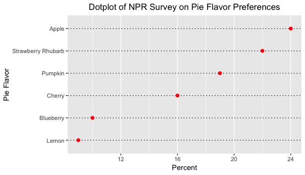
This dotplot provides a much better visual representation of how much separation lies between all of the percentages. A viewer can picture an exact numerical amount of separation between the percentage of apple pie lovers and lemon meringue pie lovers without having to constantly refer to labels or legends. In addition, this dotplot is arranged in ascending order, so the viewer can stratify the categories quickly according to preference. Lastly, the dotplot is very helpful to show how little the separation is between 1) the blueberry and lemon percentages, and 2) the apple and strawberry rhubarb percentages. While one might easily determine this in the original figure, the dotplot provides affirmation to this particular conclusion.
Let’s move onto a topic that is closely related to pie: shark attacks.
Part II
Secondly, I will study an area chart presented by ABC News in 2015. This area chart displays the number of historical shark attacks from the past 430 years, and each circle represents the amount of attacks for each global region. In total, there are 13 global regions presented in the figure. For reference, ABC News includes a scale to compare the circular observations and their areas. This area chart is shown below:

In my opinion, I believe that ABC’s graphics department did a decent job on projecting the area chart and catching the eye of an ordinary newsreader. Including the map in the foreground draw the reader in, while the inclusion of a legend for the area chart allows the reader to compare each observation according to its area. Nonetheless, I posit that a dotplot for the same data would allow for a much clearer comparison among the thirteen regions, and it would permit the viewer the accurately determine the amount of difference of attacks per region.
Using R Studio, I compiled the data of the regions and attacks into a data frame and composed a dotplot of the corresponding information. The x-axis labels the frequency of shark attacks, while the y-axis separates the global regions on their own respective lines. To aid in analysis, I arranged the observation in increasing order. Finally, I color coordinated this figure with maize and blue, to honor the University of Michigan Wolverines. Their efforts this past Saturday were not done in vain. This recreation of the shark attacks data is displayed below:
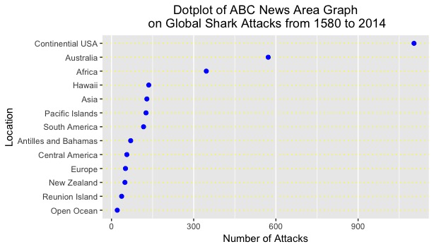
To an average viewer, one might be discouraged in that this figure is not as visually pleasing as the area graph. This figure purely displays raw data. However, the purpose of this figure is to help determine the relationships among the regions and see if any new conclusions can be drawn. One could unequivocally state that this graph does a much better job in presenting the pattern and spread of the observations.
First, one can easily see the magnitude of separation between United States shark attacks compared to the other 12 regions. The USA eclipses all but 2 regions in attacks by more than 1000 attacks, which (one could deduce) is extremely significant. Side note: this phenomenon might be due to 1) more “reported” attacks in the United States and 2) large coastline areas and coastal populations in the continental US.
Second, one can see that there is little spread or variation among most of the regions in shark attack numbers. From the Open Ocean to Hawaii, the range of values hovers from 0 to 150. For a span of 430 years, this range appears to be notably small. In addition, when compared to the Continental USA, Australia, and Africa, these values seem miniature.
Third, this figure is arranged in ascending order, which provides stratification for the regions based on the number of attacks. This was not provided in the area graph and did not allow the viewer to organize the region in a specific manner. I could continue onwards with improvements, but I believe the reasons provided above allot for multitudes of evidence for why dotplots are the superior figures for analysis.
Conclusion
In conclusion, we have seen in the two pop chart figures that dotplot recreations provide a much clearer visual representation of the patterns and spread of the data. While pop charts are pleasing to the eye and allow the viewer to be drawn into the information, they do very little to effectively show any relationships or phenomena between categories or groups. Thus, dotplots are the optimal choice for displaying patterns and relationships for our studies.


 .
.