In order to demonstrate that “Any data that can be encoded by one of these pop charts (such as a pie chart, divided bar chart or an area chart) can also be decoded by either a dot plot or multiway dot plot that typically provides far more pattern perception and table look-up than the pop-chart encoding.”, I picked up two examples of pop charts.

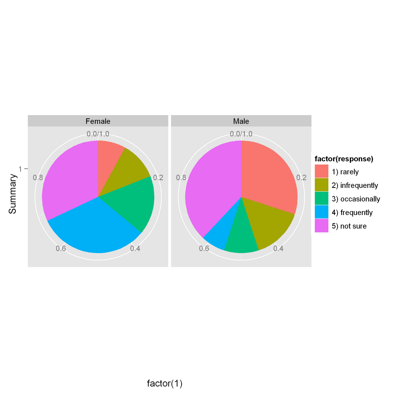
This pie chart gives an ordinary response of how frequently people would go shopping on weekends grouped by gender. One apparent drawback of this graph is that the quantitative side of the data is not easy to obtain. Also, the color encoding is not enough representative for the orders of the responses.

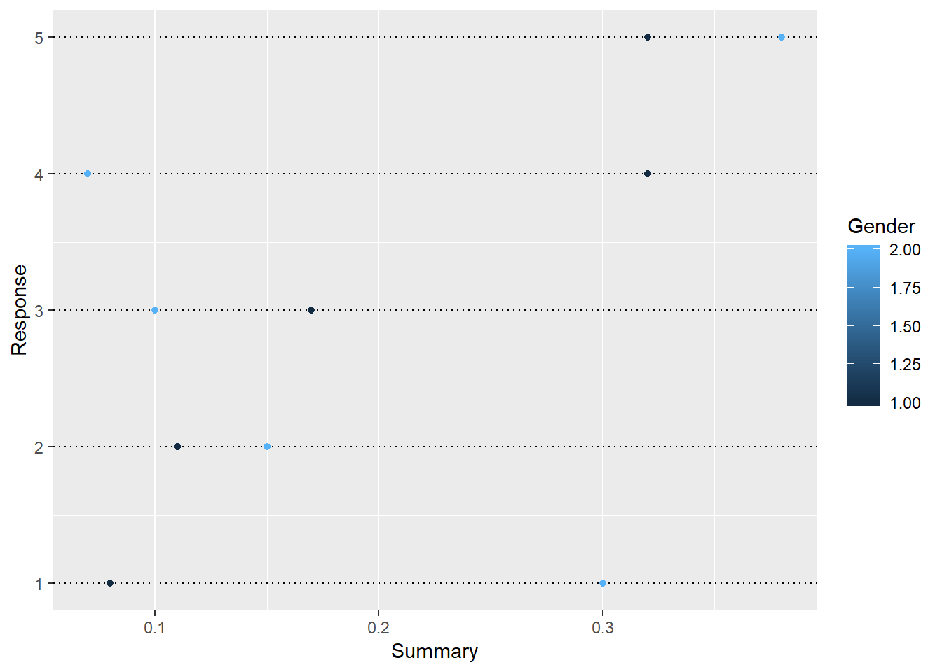
After transforming into a dot plot, these responses are listed in 5 rows. More importantly, for each response, we have clear impression of how the values can differ for males and females in dots with different colors.

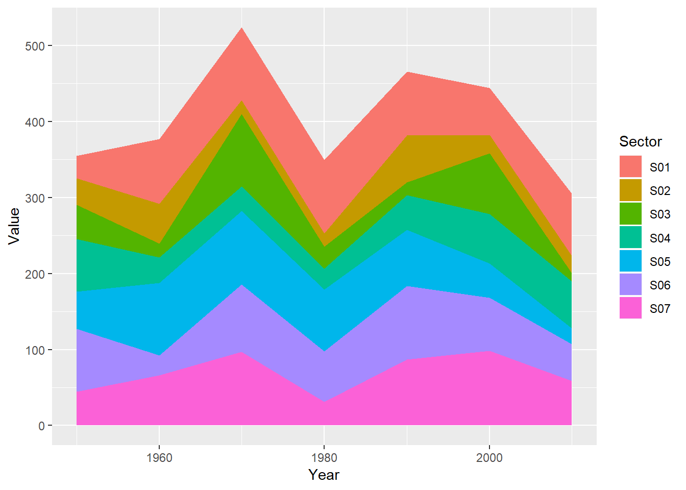
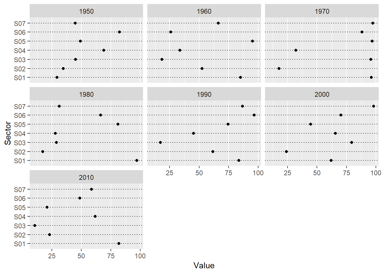
The second example is an area chart of seven groups. It has more or less the same issue as the first example which is not that reader-friendly for comparison and classification. Again, this encourages me to apply multiway dot plot for better interpretation of data as following.

Now we seems to have more enough evidence to conclude which sector has the most or the least quantitative values in each year, and it’s relatively easier to actually obtain the values. Additionally, we have straightforward comparison among the years as well because these values share the same horizontal scale.