This week we are looking at different methods of graphing multivariate data. In order to be able to graph all three variables at the same time we are limiting the number of variables to three. We will be looking at pairs plots, coplots, and a 3d scatterplot. We are working with the dataset “USCereal” in the R MASS package. The variables I selected are Calories, Carbohydrates, and Sugars.
Pairs Plots
The first graph we will be examining is the pairs plot.

From the pairs plots we can see there is a positive and linear relationship between the carbohydrates in a cereal and the calories in the cereal. The relationship between sugars and carbohydrates and sugars and calories is a little less clear. There seems to be a moderate positive linear relationship between sugars and calories, but almost none at all between sugars and carbohydrates.
We can also see several outliers in the pairs plots. In the pairs plot for calories and carbohydrates, the two outliers are the cereals “Grape Nuts” and “Great Grains Pecan”.
Coplot
Next we will be looking at a coplot. I experimented around with different variables as the “given”, and decided that using the amount of sugar as the “given” provided the most insightful coplots.
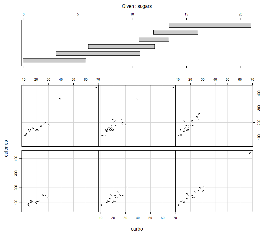
From the top of the coplot we can see that the data is divided into 6 ranges of sugar content, the lowest being from 0 to 6 grams and the highest being from 13 to 22 grams. Interestingly enough, the “given” condition of sugar doesn’t really change the scatterplot of carbohydrates and calories. each scatterplot has almost the same shape, which is a positive linear relationship with roughly the same slope. We can see the two outliers “Grape Nuts” and “Great Grains Pecan”, in the 4th and 5th coplots, but besides those two outliers the scatterplots are almost the same. Just out of curiosity, I plotted the same data set in a coplot without the two outliers.

Removing those two outliers, we can see the scatterplots have very similar ranges for the data, as well as correlations. The conclusion is that the amount of sugar in a cereal isn’t very strongly related to the amount of carbs and calories. This is probably because most sugar in cereal is in the form of added sugar.
3D Plot
The third plot we will be looking at is a 3D plot of the data, which unfortunately cannot be displayed on the blog. The 3D scatterplot reveals the trends discussed above; the positive linear relationship between carbohydrates and cereal, and the fact that sugar content isn’t strongly related to either factor.


These two screen grabs show the outliers “Grape Nuts” and “Great Grains Pecans”, circled in red.


These next two screen grabs show that sugar content isn’t strongly related to calories or carbohydrates. The first graph is looking at the data in a roughly parallel perspective to the sugar axis. We can see the relationship between calories and carbohydrates previously described. The second view is from the graph rotated roughly 90 degrees counterclockwise, around the “north south” axis. We can see the values of sugar content are fairly evenly distributed along the Calorie-Carbohydrate plane.
Overall, all three graphs were effective in displaying this data. The 3D plot was by far the most fun to use, but in higher dimensions the pairs plot would probably be the most useful for quickly assessing relationships between variables.