This week, I will construct the three (Cleveland style) dotplots based on a 2-way table.
Meet with data
The 2-way table I chose records the Top 10 population by states in the U.S from 2010 to 2017. The following is an overlook of the dataset:

Note: I round the values of the population to million because the raw numbers are relatively large.
Graph 1. Construct a dotplot of the means by rows which are ordered from high to low.

From the above figure, it is clear to see that, among the past 8 years, California has the highest population among these 10 states and the difference is literally significant. Impressively, even more than 10 million ahead of Texas which is in the 2nd place.
Graph 2. Construct a dotplot, grouping by rows.
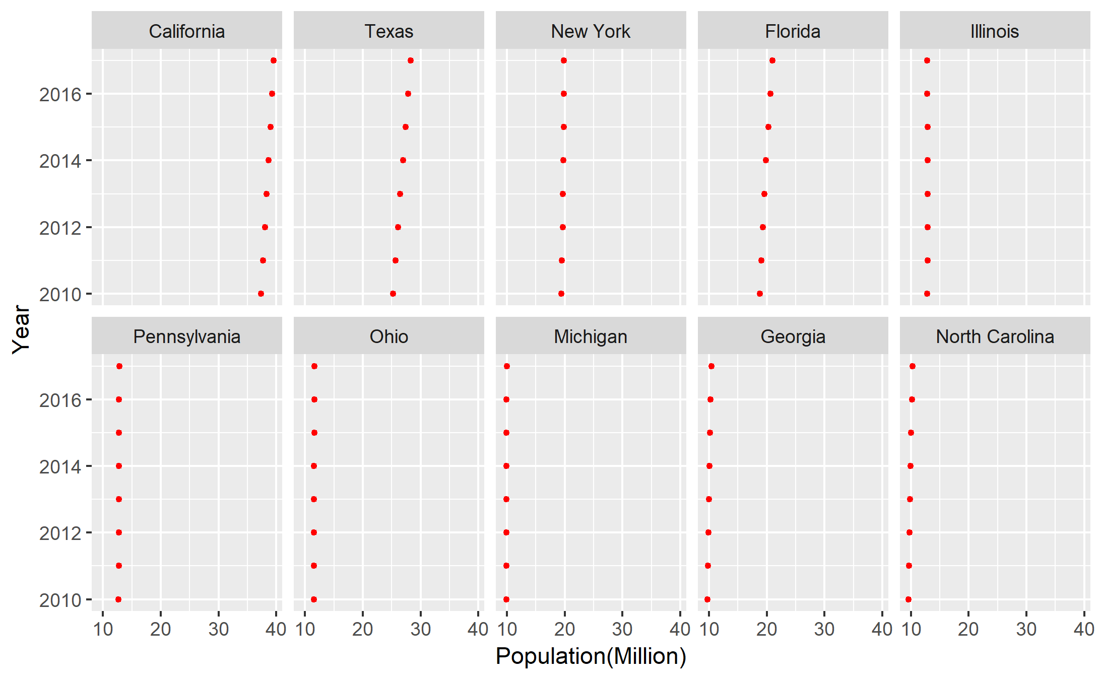
Form this graph, we are able to observe the changes among the past 8 years in each state. Because the unit of the population is million, it is not easy to tell the changes in some states, but California and Texas still are outstanding. Between these two states, Texas seems to have the stronger growth of population.
Graph 3. Construct a dotplot, grouping by columns.

Grouping by columns, this graph tells the general patterns of these 10 states among the past 8 years. As mentioned anteriorly, the unit of million makes most of the states seem to be stable in the growth of population except California and Texas. Thus, there is no dramatic change in the general patterns.
Summary
These three different graphs provide different aspects into the dataset. In this case, the dotplot grouped by rows (states) makes more sense to me, because I am more interested in the annual growth of population in each state. Actually, we could compare the differences among the states as well from this dotplot.
Data Resource
United States Census Bureau: https://www.census.gov/data/datasets/2017/demo/popest/state-total.html