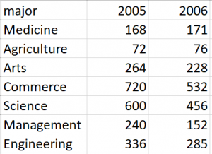
The original Pop chart and dataset

Redrawing data by using a multiway dot plot
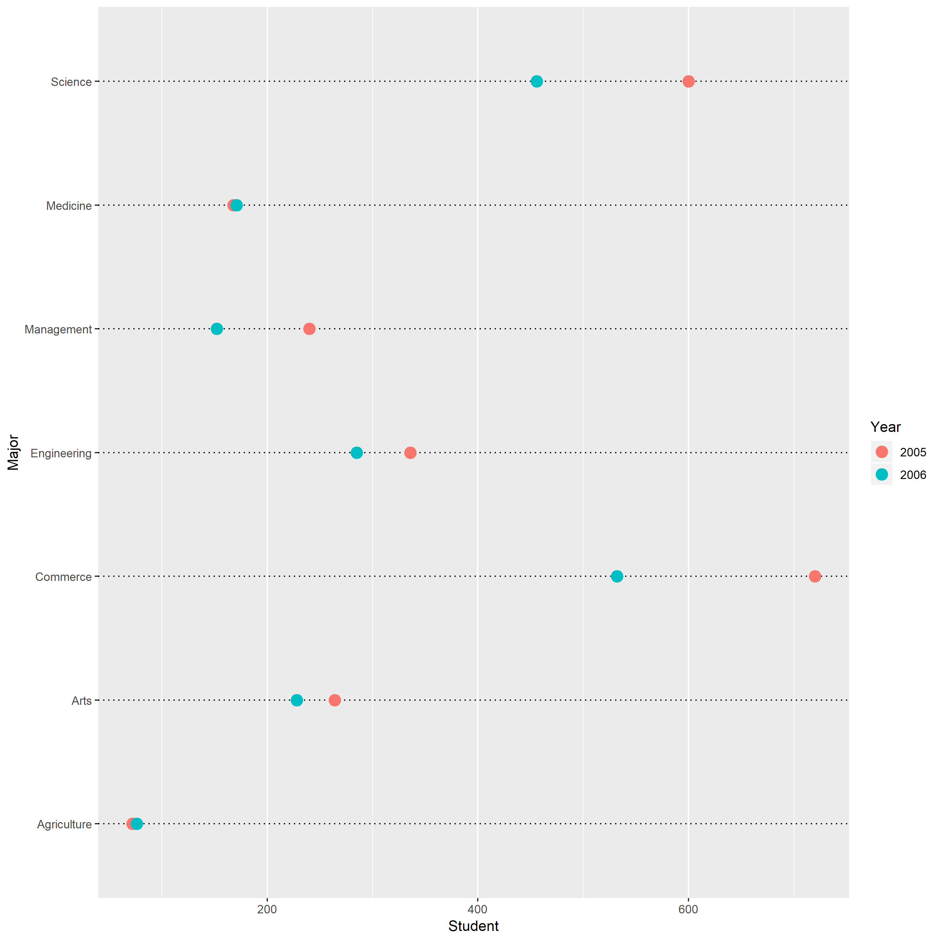
According to the new multiway dot plot, I can easily find scale information of observations by using table look-up, which is not directly obtain from the original pie chart. For instance, the scale information of the observation with the largest people is (1) major =Commerce (2) Year=”2005″; (3)Student= 720 people.
And viewers can get more accurate physical information from the new dot plot by using Pattern Perception. From the dot plot, I observe that the red symbols as a group are shifted to the right with respect to the blue symbols, which means the number of student at particular major in 2005 is larger than the number of students at that major in 2006. However, this information is impossible to visually get from the pie charts.
Over all, the statement that “Any data that can be encoded by one of these pop charts, such as a pie chart, divided bar chart, can also be decoded by either a dot plot or multiway dot plot that typically provides far more pattern perception and table look-up than the pop-chart encoding” is correct.