Part A:
I plot the mean Capacity as a function of week number, comparing four years 2012-2015.
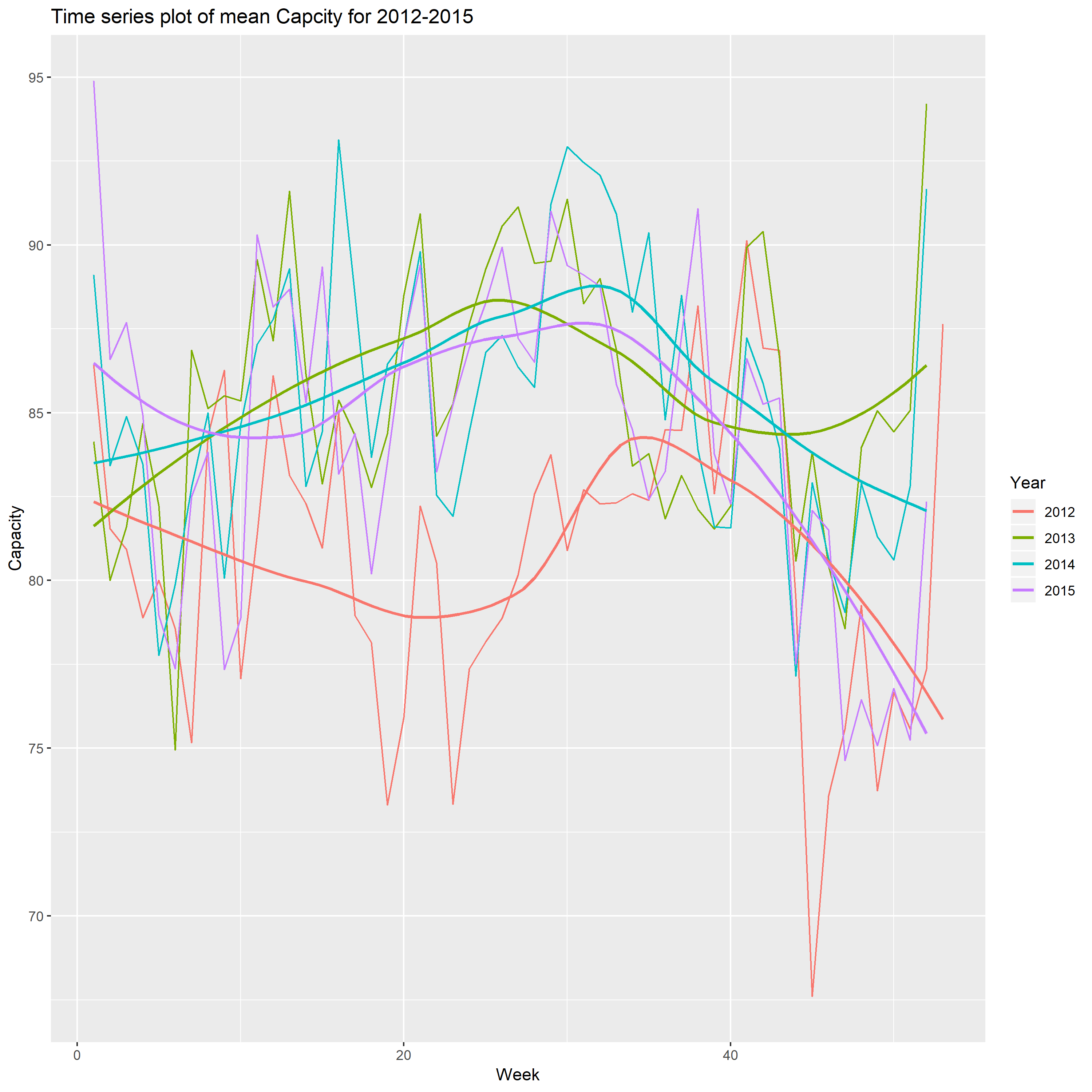
From the above plot, I find that when the number of week is about 30, the mean of capacity reach a peak, and the capacity has significant increase from 2012 to 2013, and does not have obvious change for the rest three years. The another interesting thing is the biggest decreases are from week 35 to the end of year, and reach the minimum on the week 52. In my opinion, the audiences would like spend more time with their families celebrating holiday.
Part B
Form the contour plot using different color set
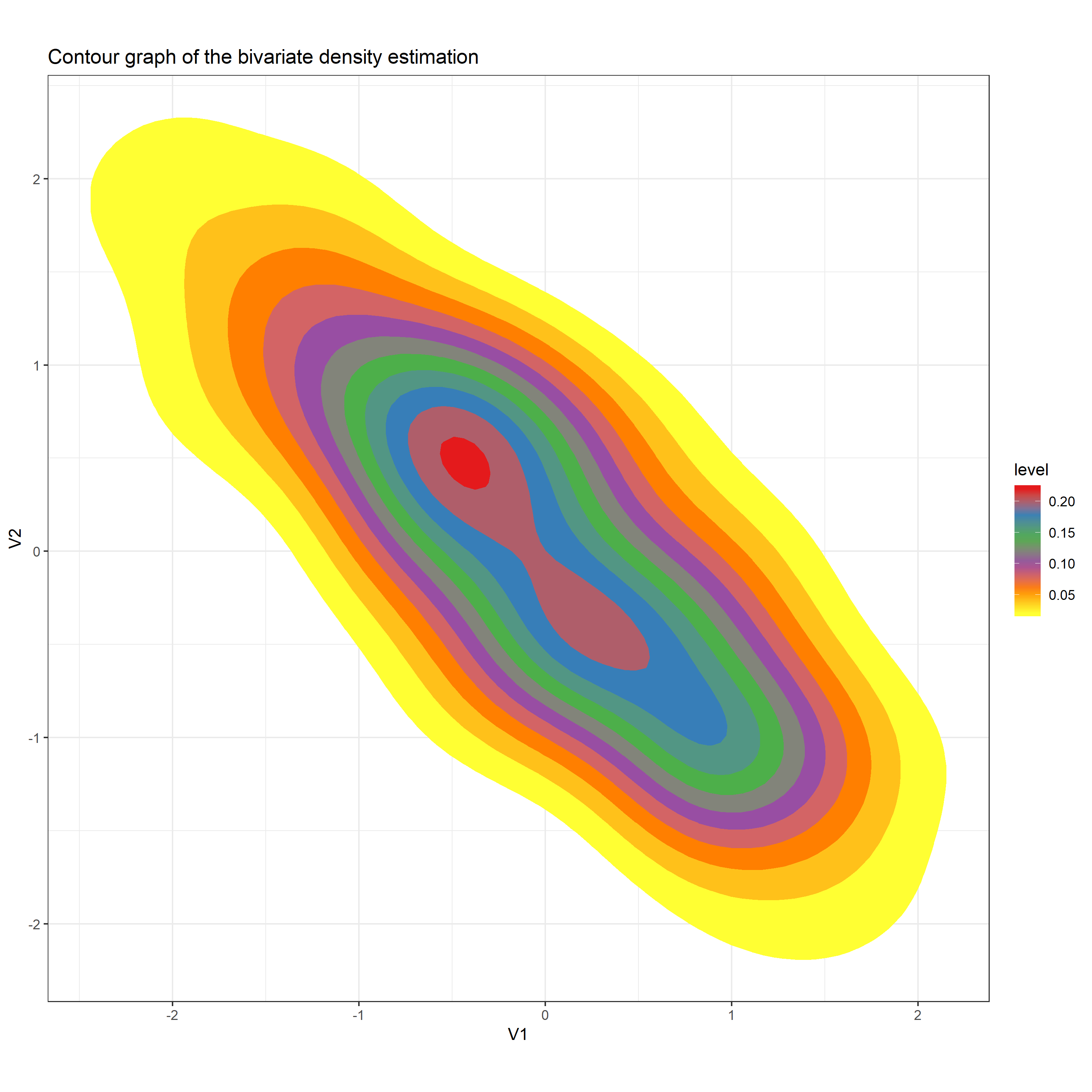
I select Set1 to be the Palette in the function Scale_fill_distiller. After running the code, I got the above plot. The reason why I think this plot is better than the plot shown on Canvas is that this contour plot is formed by a set of color which distinguish the different levels clearly. The contour plot shown on Canvas does not give a clear vision.