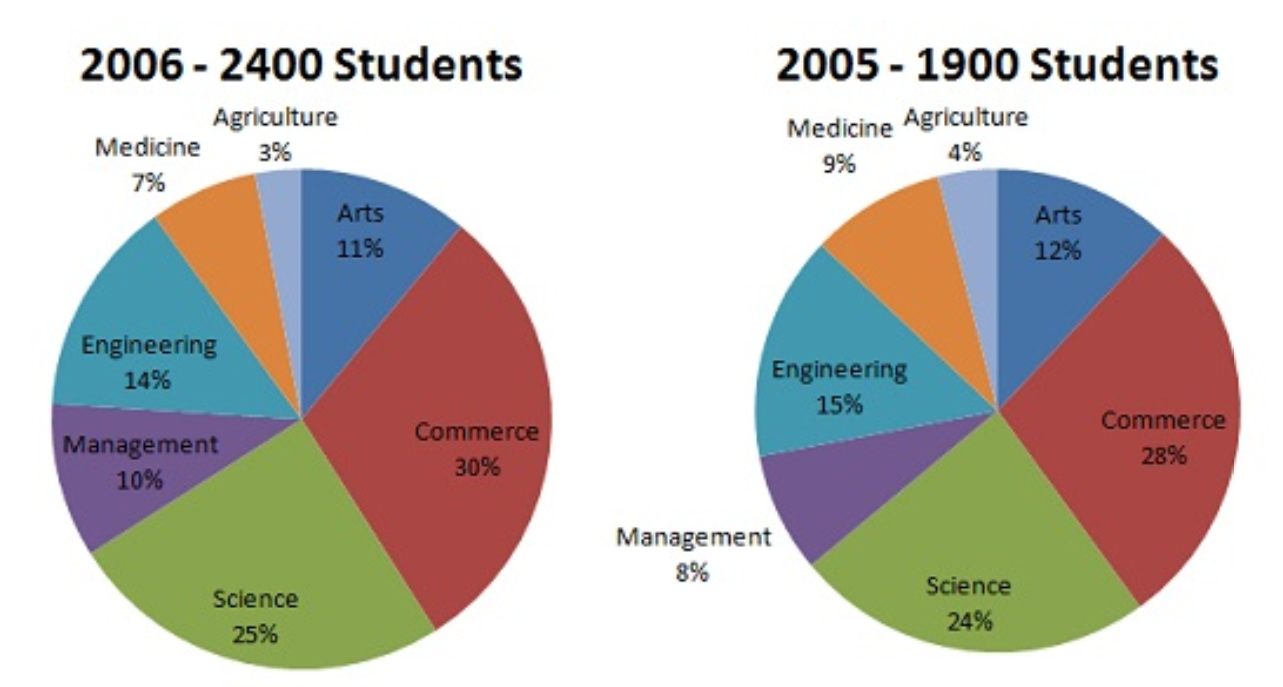
The data contain three variables, calories, fat, sugars, from UScereal dataset.
- Scatterplot matrix
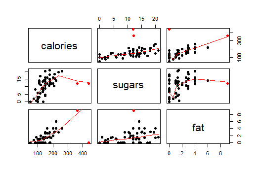
In this Figure the (2,3) panel is a graph of calories on the vertical scale against sugars on the horizontal scale. From the (2,3) panel, I find that the general relationship between calories and sugars is positive. As the sugars increases, the calories also increase.
In this Figure the (3,3) panel is a graph of calories on the vertical scale against fat on the horizontal scale. From the (3,3) panel, I find that the general relationship between calories and fat is positive. As the fat increases, the calories also increase.
In this Figure the (2,1) panel is a graph of fat on the vertical scale against sugars on the horizontal scale. From the (2,1) panel, I find that the general relationship between sugars and fat is positive. As the fat increases, the sugars also increase. As the sugars increase, the change of fat become larger.
The two special points marked in red. Based on the original data, one is Grape-Nuts, another one is Great Grains Pecan.
Grape-Nuts: Calories= 440, fat=0, sugars=12
Great Grains Pecan: Calories=363.63, fat=9.09, sugars=12.12
Therefore, Grape-Nuts has zero fat but its calories is higher than others. Great Grains Pecan has much higher calories but its sugars and fat are not large. These two points do not follow the general pattern.
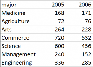
2. Coplot
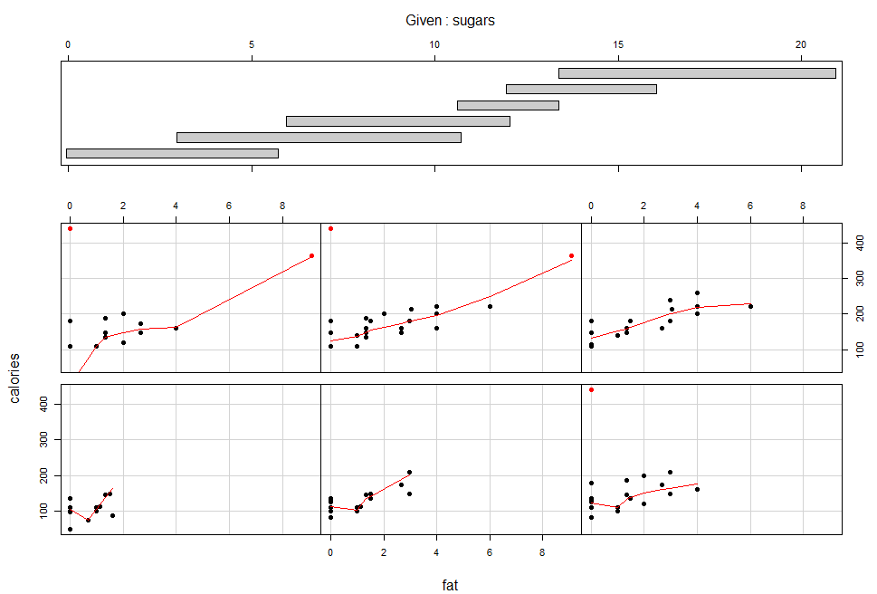
This plot condition on Sugars; calories is graphed against fat for six intervals of sugars chosen. Except for panel (2,2), each conditioning on sugars, the dependence of calories on fat has a nonlinear pattern: hockey-stick. On the five panels, the slopes are positive. the panel(2,2) shows this conditioning on sugars has linear pattern. This suggests that there is no interaction between the two factors; the effect of fat on calories is the same for most values of sugars.
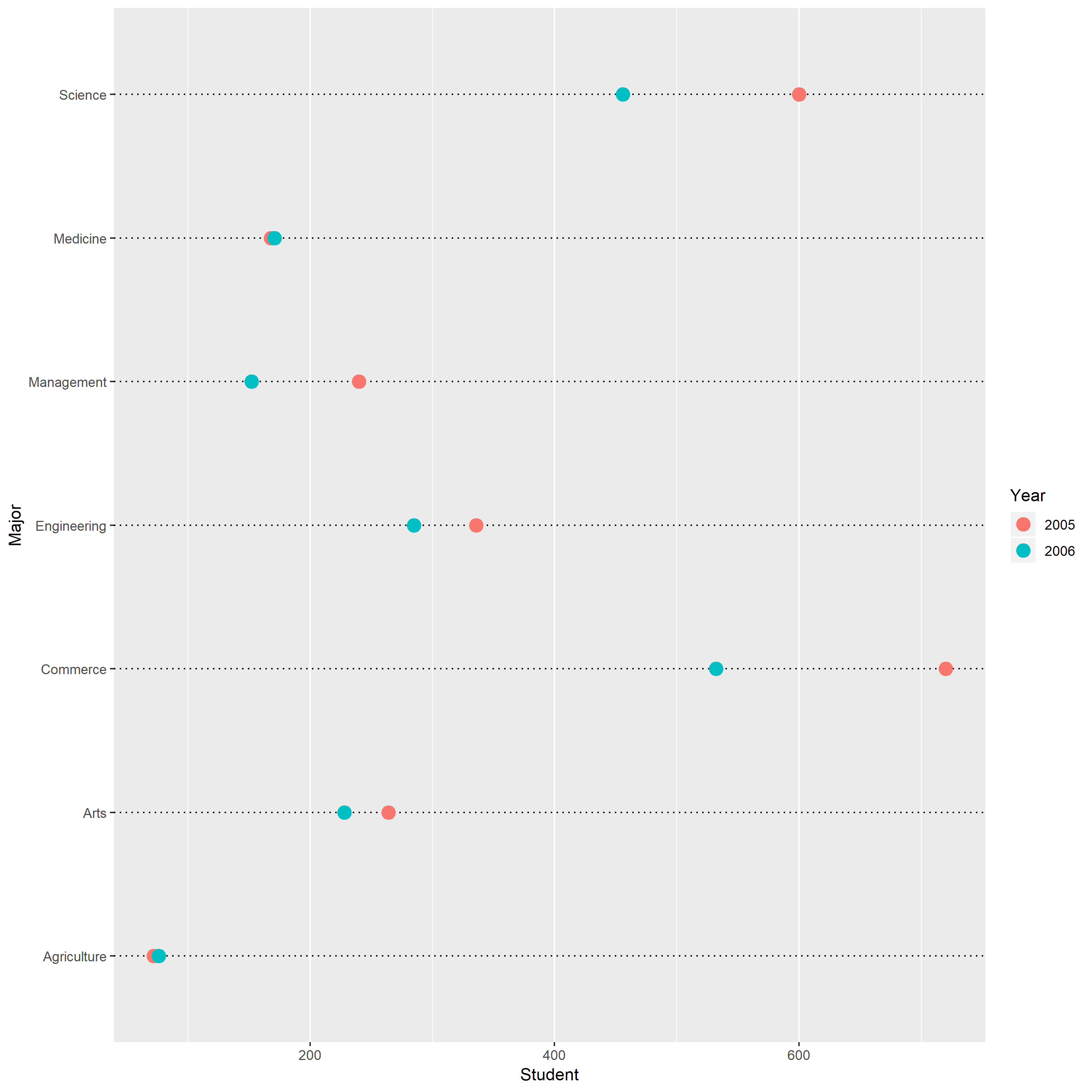
3. Three-dimensional scatterplot
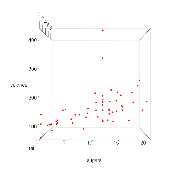
From the above plot, I find that the general relationship between calories and sugar is positive. As the sugar increases, the calories also increase.
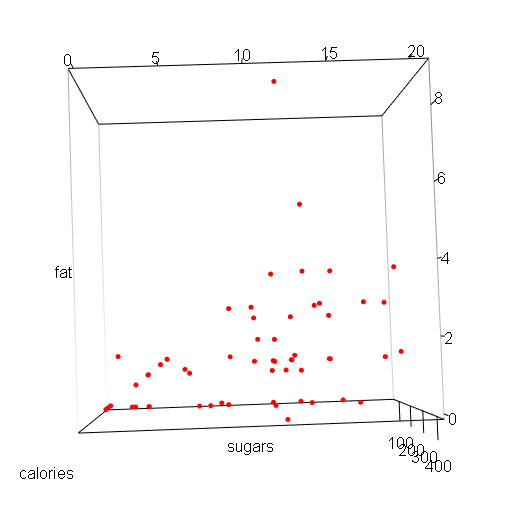
From the above plot, I find that the general relationship between sugars and fat is positive. As the sugars increases, the fat also increase.
There are two special points in the upper space. They do not contain large sugars, but their calories are higher than others.
From the above plot, I find that the general relationship between fat and calories is positive. As the fat increases, the calories also increase.
And a special point in the right corner has zero fat and highest calories, which do not follow the general pattern.