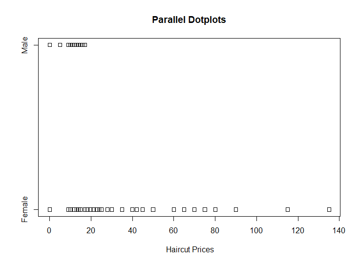
1.Construct parallel one-dimensional scatterplots of the variable by gender.
2.Construct parallel quantile plots of the male values and of the female values.
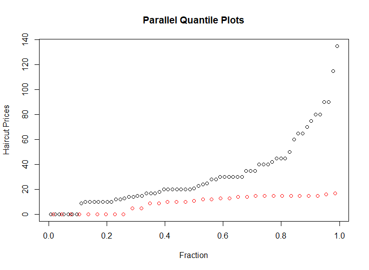
In above plot, the red circles represent the male, the black circles represent the female.
This plot shows that the median of the haircut prices for male is near by 10 dollars, the median of the haircut prices for female is about 20 dollars. And the upper quartile and lower quartile of haircut cost of female are larger than males’.
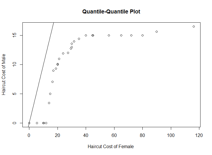
3.Construct a quantile-quantile plot of the male and female values.
4.Construct a Tukey-m-d plot from the quantiles of the two samples.
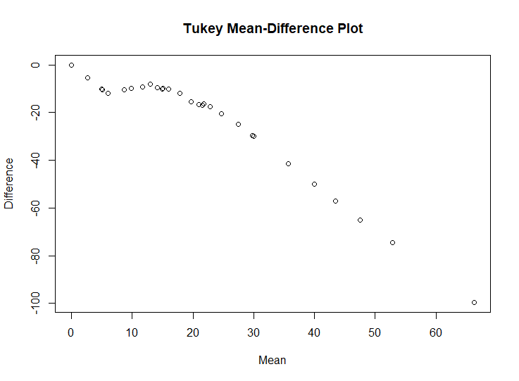
The above plot shows that throughout the entire range of the distribution, the haircut cost of female are greater than the haircut cost of male. And for the top half of the distributions, haircut cost of female are typically 0 to 30 higher, and that for the bottom half the difference ranges from 30 to 100 in going from the median to the highest quantiles.
The quantile-quantile plot provides the best graphical comparison of the two set of measurements. Since q-q plot give us a detailed comparison of the two distributions, It can reveal the complication of data distributions to us.