Monthly Archives: October 2018

Loess

The simulated data (x,y) where the true signal follows one of the curves

Curve 1:   sin(x) + cos(x),

Curve 2:   sin(x) – cos(x),

Curve 3:   sin(x) * cos(x),

Curve 4:  .28 – .88 * x – 0.03 * x^2 + .14 * x^3.

1.Construct a scatterplot of the simulated data and overlay a loess smooth.


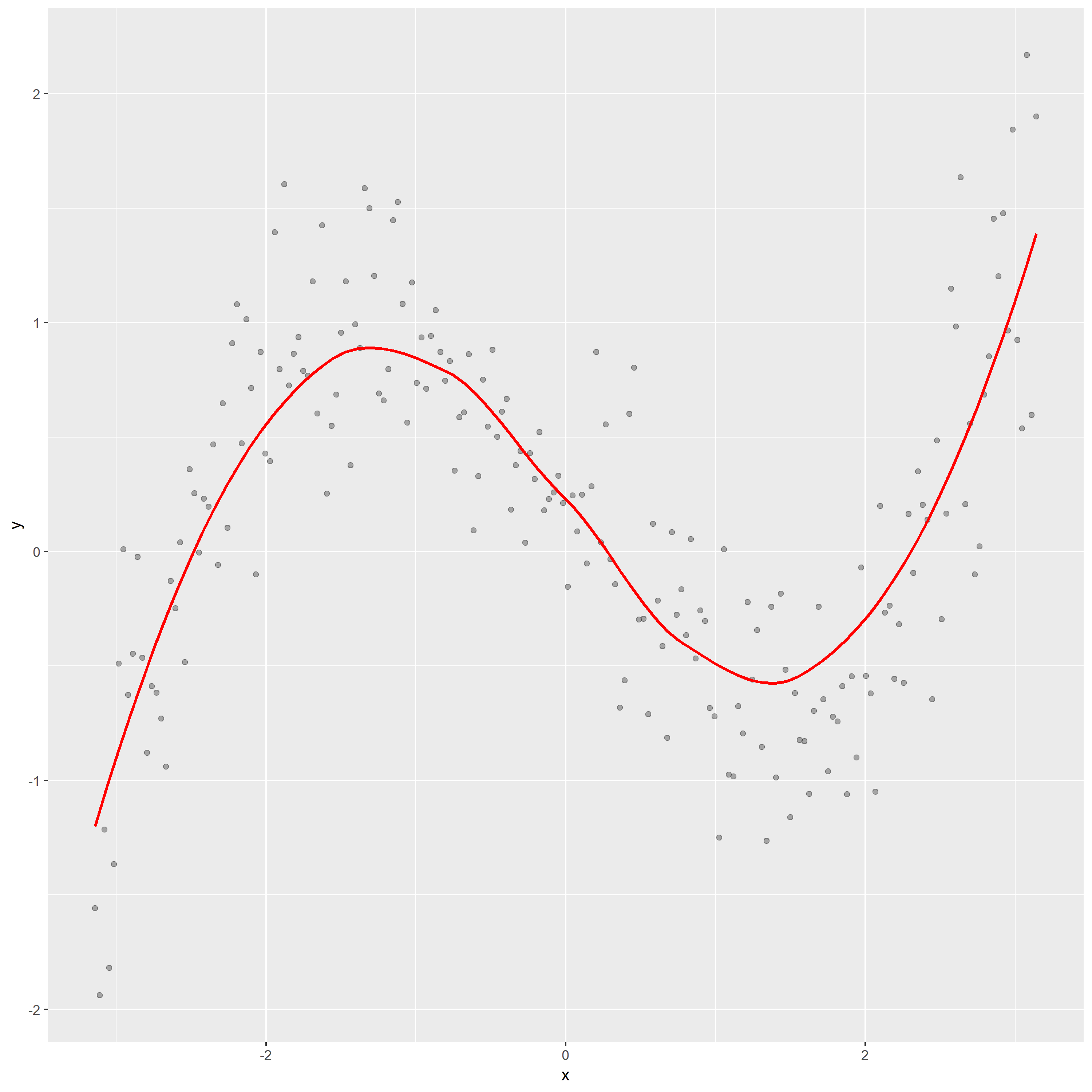
In above graph, the loess curve shows that the relation between y and x is nonlinear. According to the overall shape of loess curve, it seems like the curve 4, which indicates that the response y follow  this curve: .28 – .88 * x – 0.03 * x^2 + .14 * x^3.


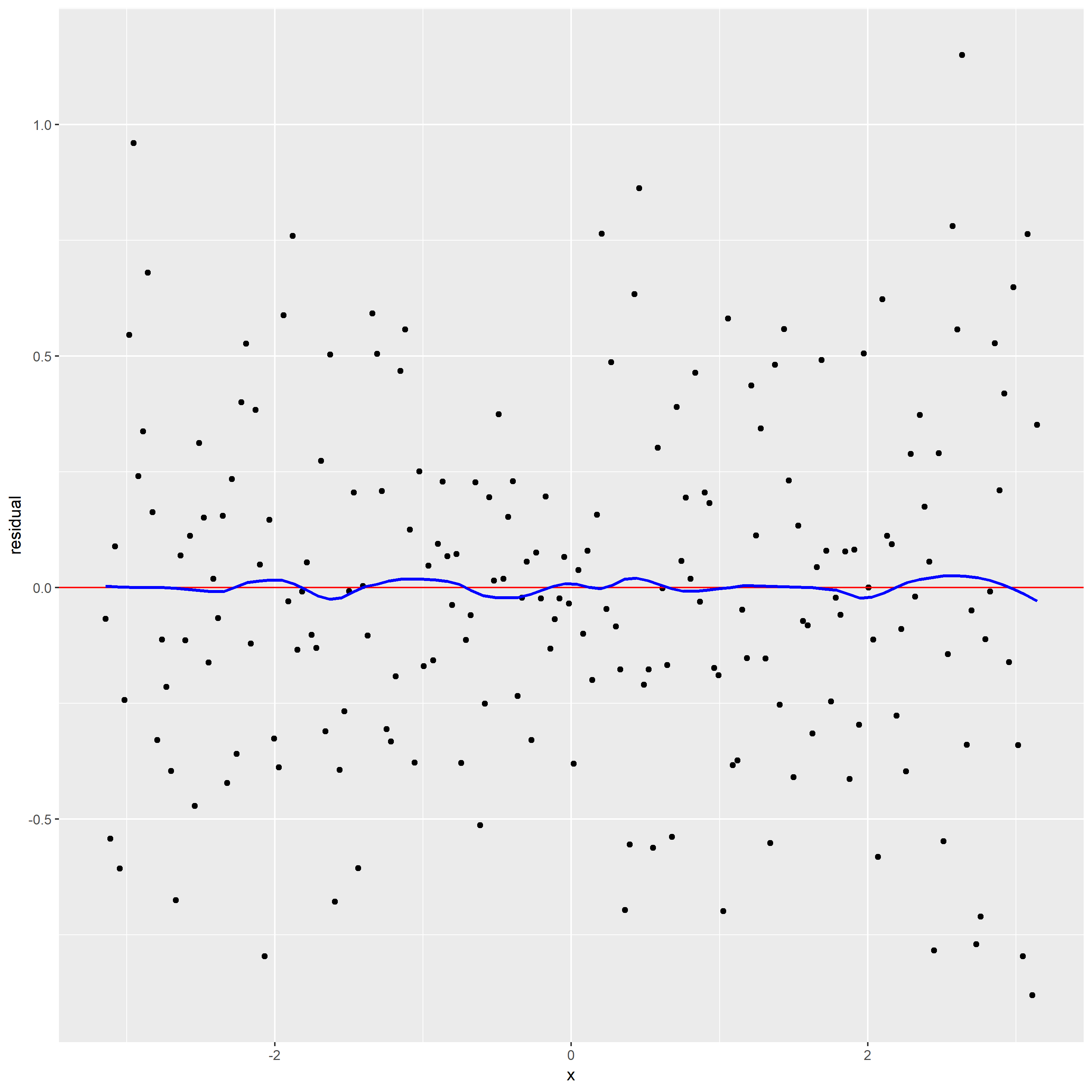
2.Construct a plot of residuals and comments

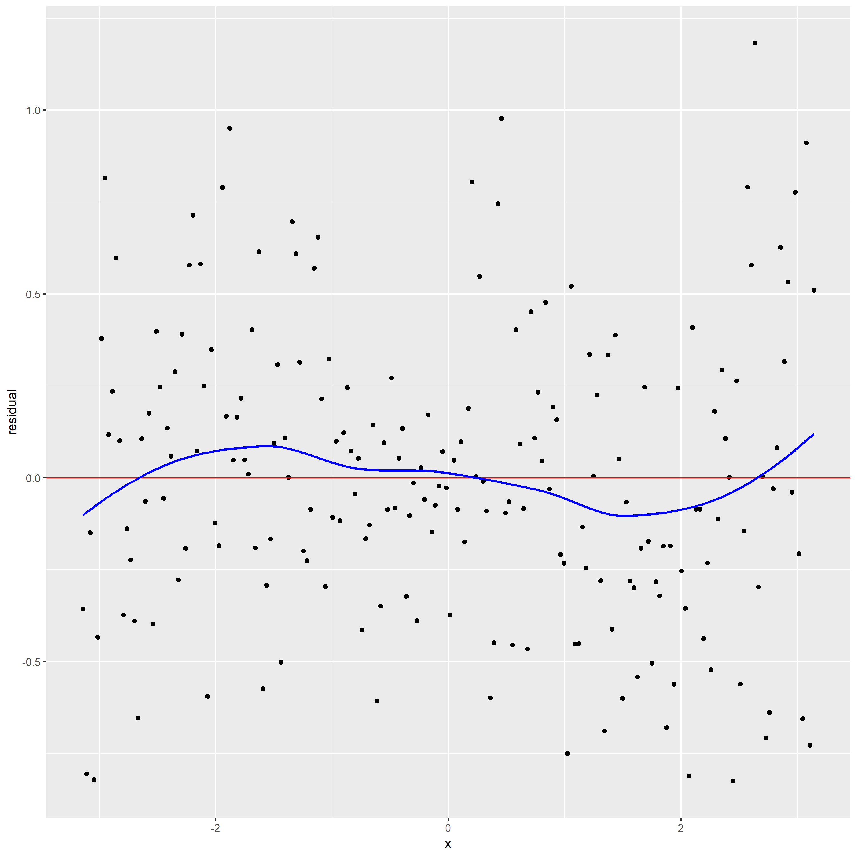
From the residual graph with loess curve superposed, the loess curve is not a horizontal line, which suggests there is a dependence of the residuals on x. It indicates alpha maybe too large leading loess smoothing has missed part of the pattern.

The loess curve in scatterplot has effectively found the signal. But the loess curve in residual graph does not have effectively found the signal.

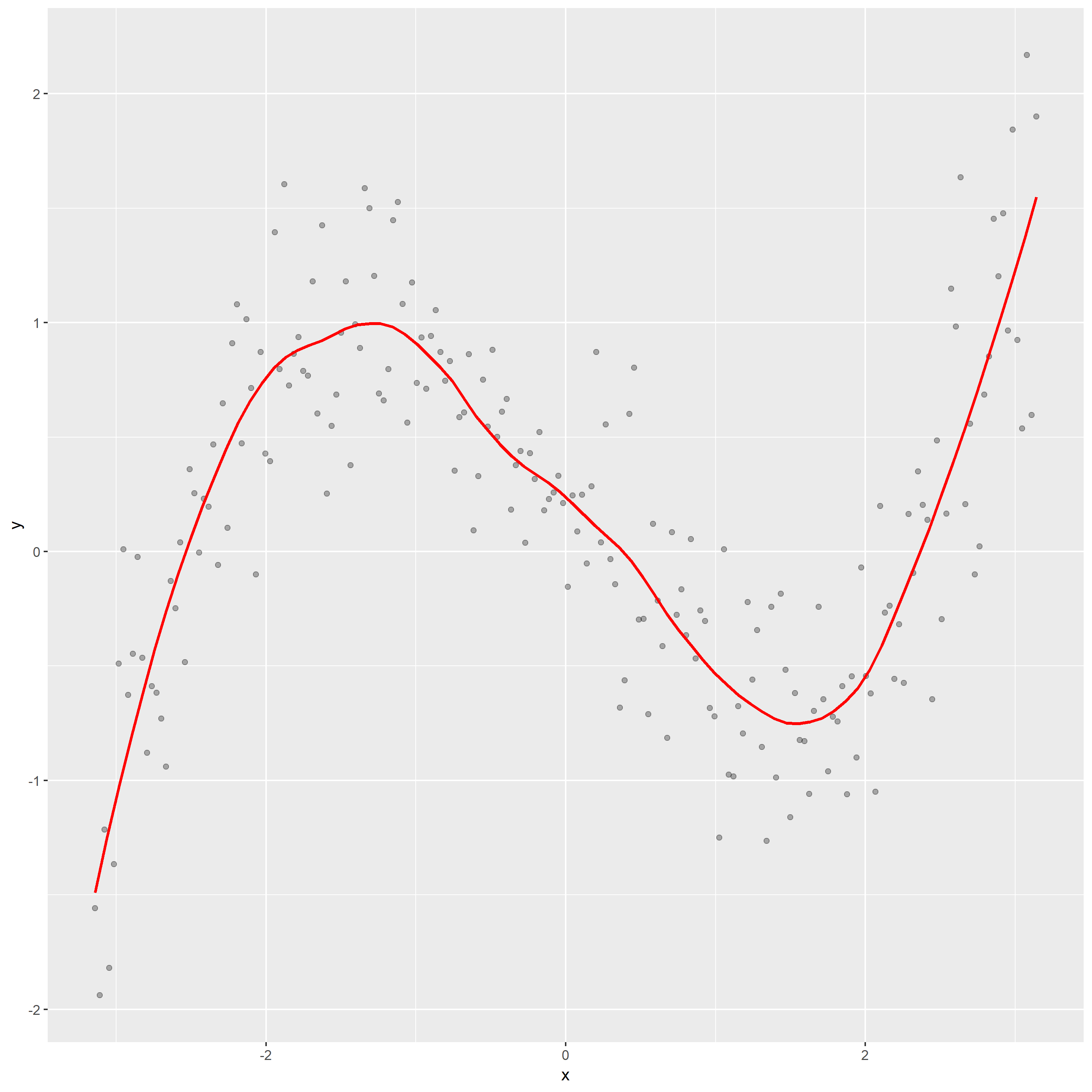
3. Use better loess smoothing parameter draw scatter plot and residual plot.

For this time, I choose span=0.3.  The top one is scatter plot, the bottom panel is residual graph.

From the residual graph, the loess curve is nearly a horizontal line, which shows no dependence of the residuals on x. It also indicates that the loess curve with alpha=0.3 is not distorting the underlying pattern.

Then, according to the new scatterplot, I think f is .28 – .88 * x – 0.03 * x^2 + .14 * x^3 (curve 4) since the pattern seems like the curve 4. And for this time, we eliminate the problem that x effect the residual since the loess smoothing parameter is too large.

Dot Plot

I collect the temperature of five cities for five months.  This data table shows below where the response is the average high temperature in Fahrenheit, row classification is city, column classifications is month.

#Graph 1. Find the mean response for each row. Construct a dotplot of the means where the means are ordered from high to low.

In this above plot, the x value represents the mean of temperature from January to May. And the data is ordered from largest to smallest. So, Phoenix has the highest temperature among these five cities in first five month. And the temperature of Adak is distinctly less than other cities.

Graph 2. Construct a dotplot, grouping by rows.

For this above plot, I construct a dotplot grouping by City.  I find that the temperature in May always is largest one than other months. And ranges of temperature for Phoenix, Montgomery, Acampo, and Addison are almost equal. But the range of temperature for Adak is much narrower than others. Finally, we can observe that the means of different cities are roughly same as the first graph.

Graph 3. Construct a dotplot, grouping by columns.

This dotplot grouping by column Month.  From this plot, I find the temperature increases when time goes by for five cities. But the temperature of Adak has the least growth than other cities.

At the end, I find draw a dotplot  by grouping the data by row or column is a better option, since it allows us to effectively decode the distribution of quantitative  data from different angles and enhance data visualization.

Distributions

1.Construct parallel one-dimensional scatterplots of the variable by gender.

2.Construct parallel quantile plots of the male values and of the female values.

In above plot, the red circles represent the male, the black circles represent the female.

This plot shows that the median of the haircut prices for male is near by 10 dollars, the median of the haircut prices for female is about 20 dollars. And the upper quartile and lower quartile of haircut cost of female are larger than males’.

3.Construct a quantile-quantile plot of the male and female values.

4.Construct a Tukey-m-d plot from the quantiles of the two samples.

The above plot shows that throughout the entire range of the distribution, the haircut cost of female are greater than the haircut cost of male. And for the top half of the distributions, haircut cost of female are typically 0 to 30 higher, and that for the bottom half the difference ranges from 30 to 100 in going from the median to the highest quantiles.

The quantile-quantile plot provides the best graphical comparison of the two set of measurements. Since q-q plot give us a detailed comparison of the two distributions, It can reveal the complication of data distributions to us.


Pythagorean Relationship

Here is NBA 2017-18 season standing. I used these data complete this blog assignment.

This data set contain seven variables and variable W, L, P and PA are numerical variables. The data is the season summary for 15 teams of the Eastern Conference  of the NBA. I used the following variables to graph the above plot.

W – the number of games won
L – the number of games lost
P – Points per game
PA – Opponent points per game

In the top panel of plot, the overall pattern of data follow a trend that Log(W/L) goes up when Log(P/PA) increase. But it is hard to assess the residuals since the points of the plot lie in a narrow band around the line. Then, based on the bottom panel of plot,  the percent deviations of the actual Log(W/L) from the ideal ones range between about -20% and 20%.

In the top panel of above figure, the fitting line go through point (0,0) and point (0.04,0.12). So, the best fitting choice of k is 3.

The unusual teams are Chicago Bulls, Cleveland Cavaliers, and Charlotte Hornets. In my opinion, Chicago Bulls is lucky teams, since they win games with smaller points scored by their team.