Monthly Archives: September 2018

Visualizing Amounts

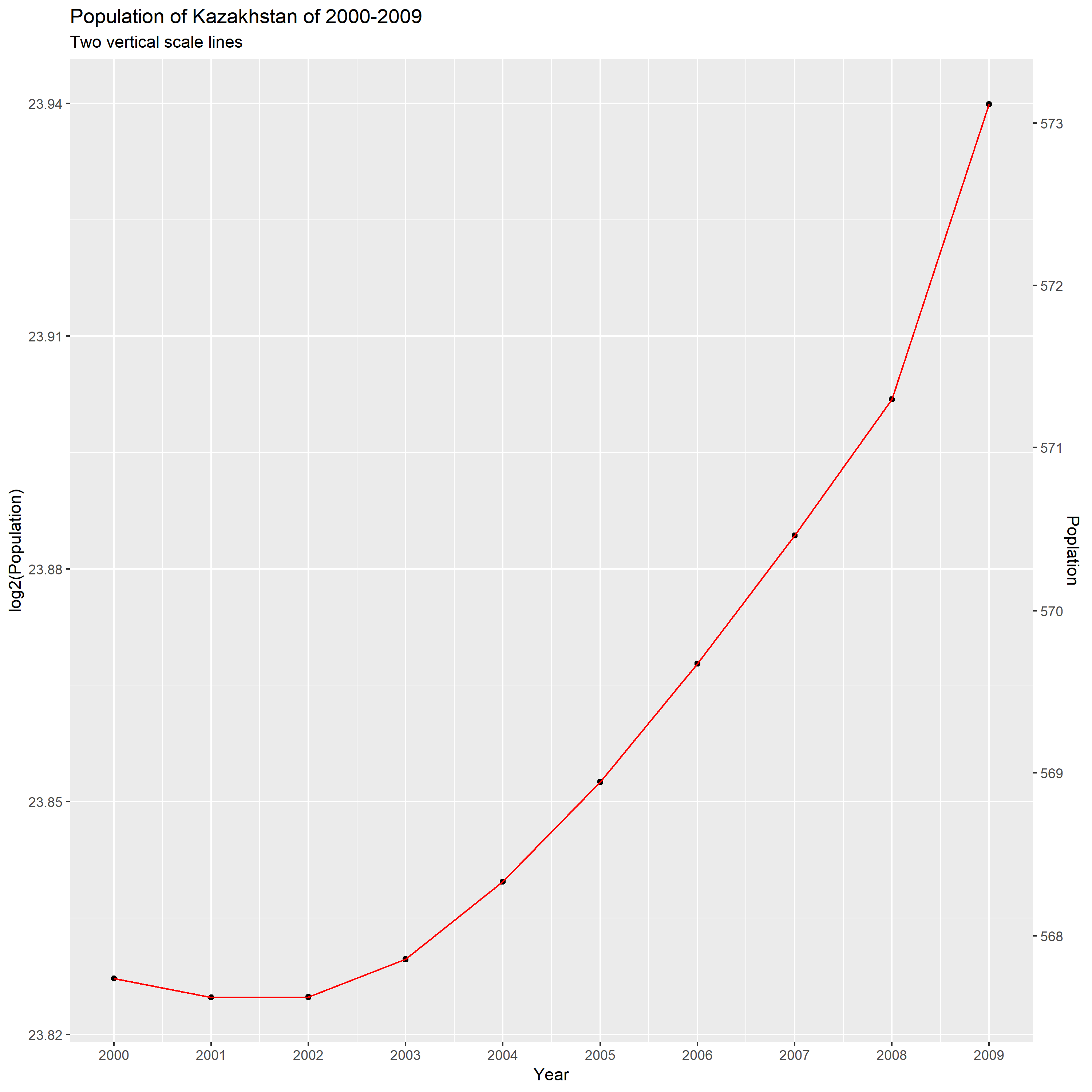
The first stacked bar plot
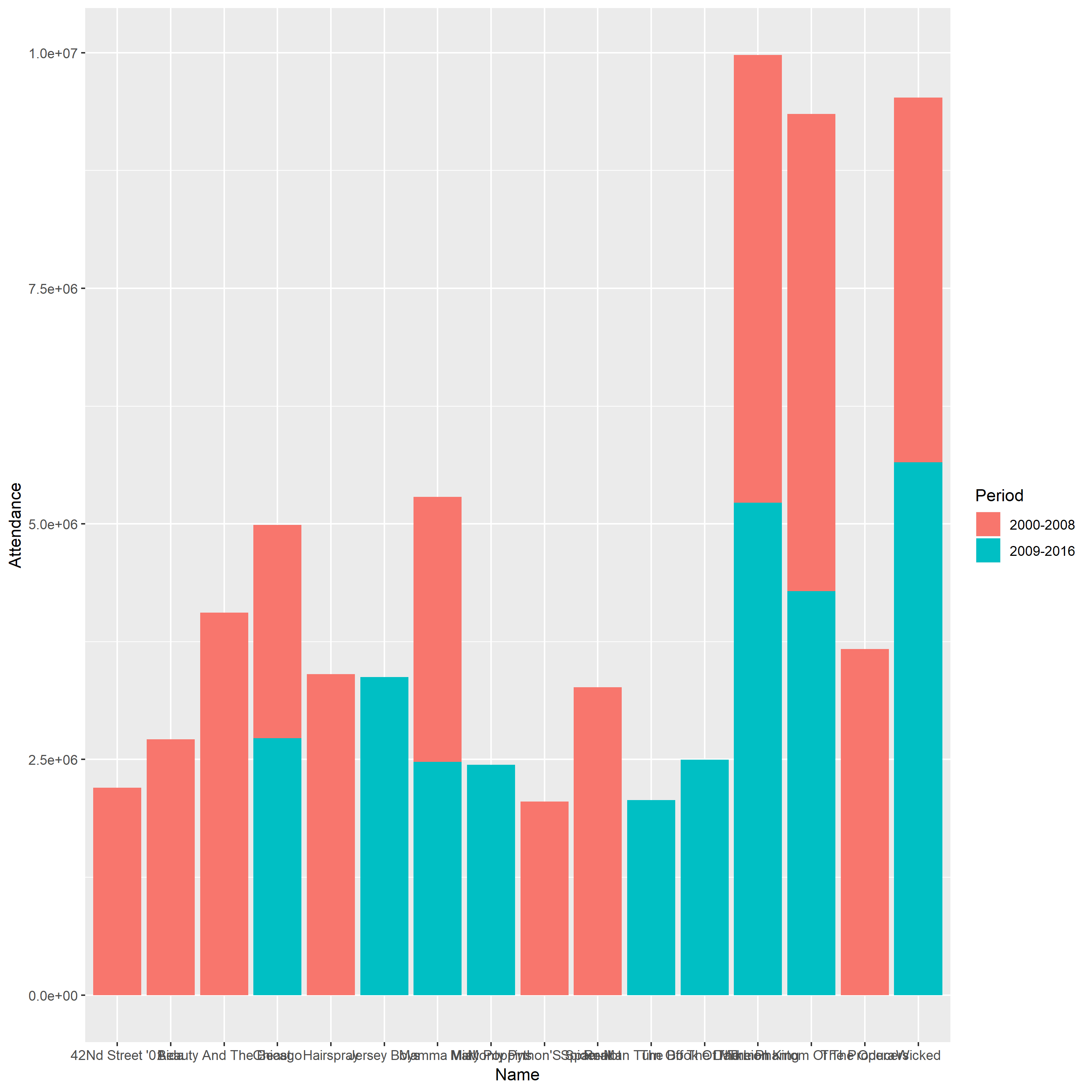
Problem

1.The bars of this plot are arranged arbitrarily, which make the figure become more confusing and less intuitive.

2.The labels of each bar cannot be discerned since them take up a lot of horizontal space.

3.The vertical scale line does not have detailed description and this plot does not have descriptive title.

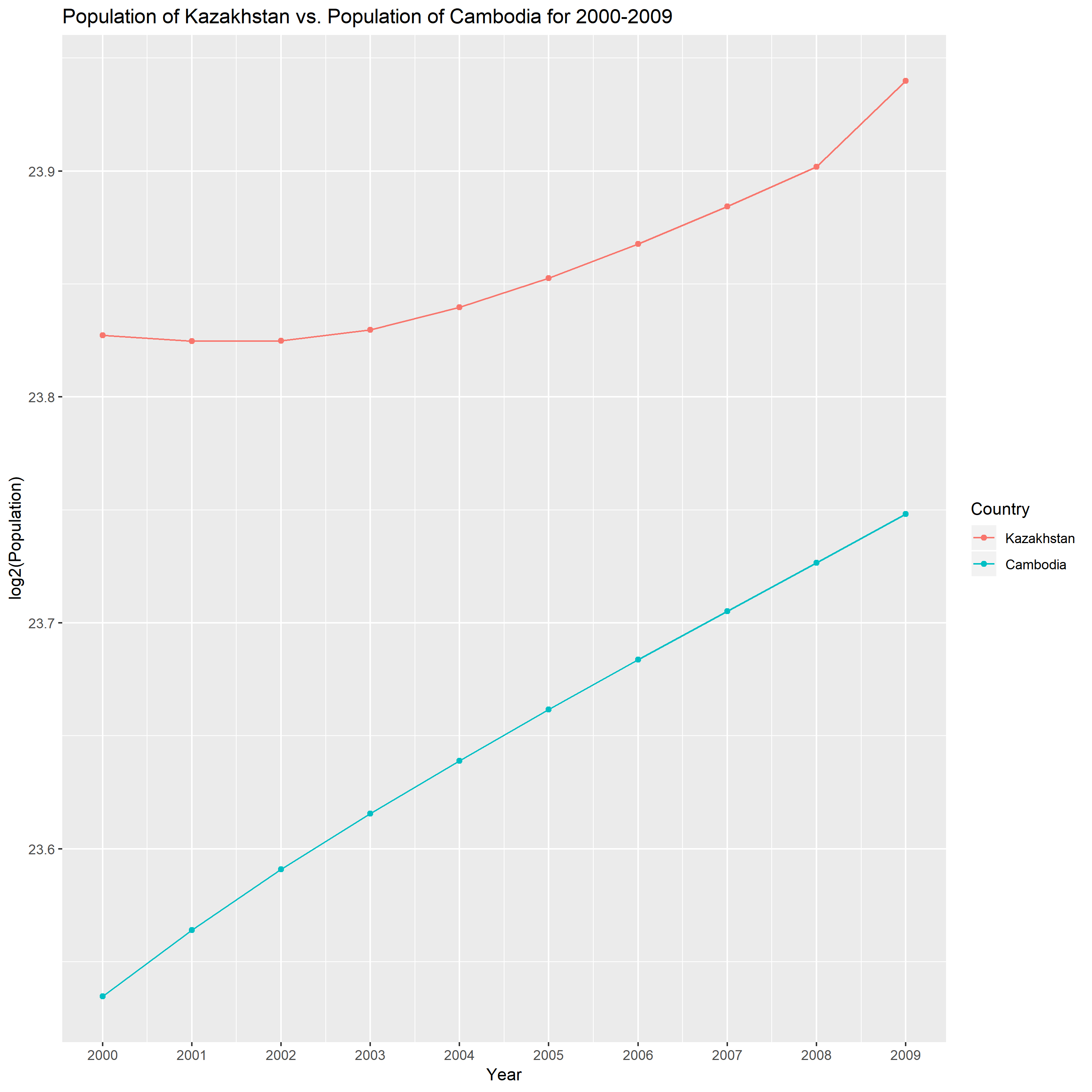
The improved stacked bar plot

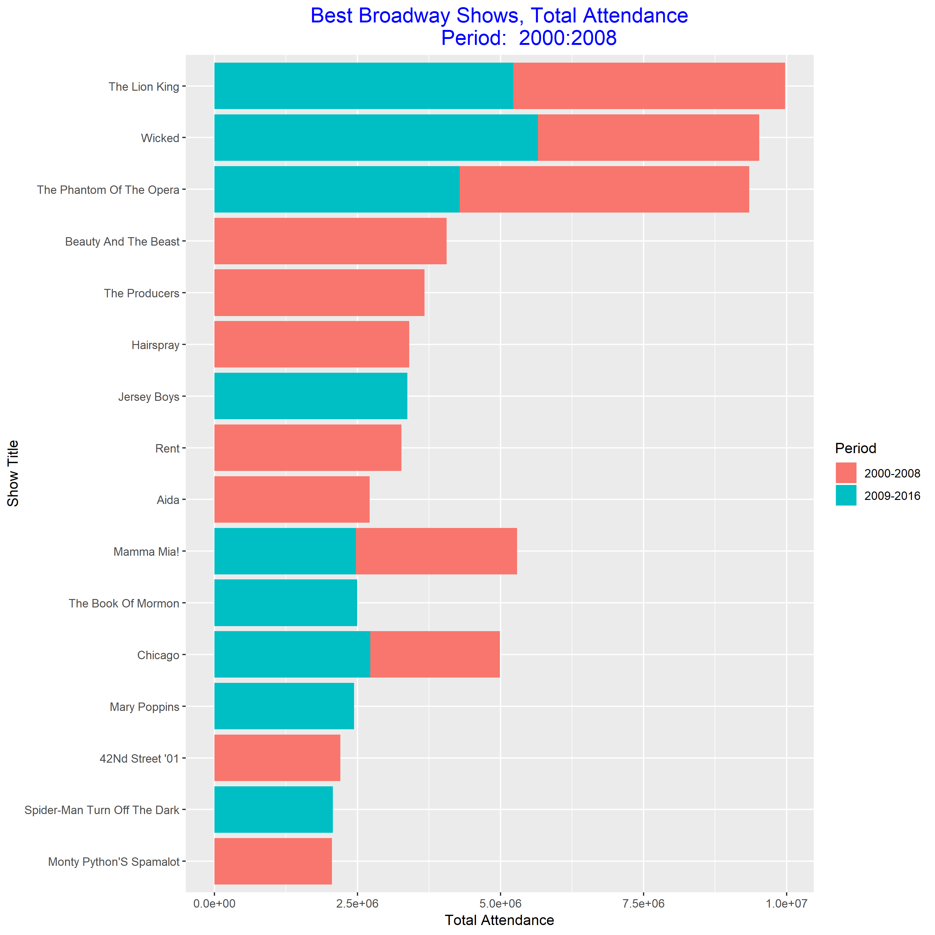
This plot is much easier to read than the previous one. From this plot, we know that “Wicked” is the best show during 2009-2016, and “The Phantom of the Opera” is the best show during 2000-2008. And “Wicked” become more and more popular.

The first grouped bar plot
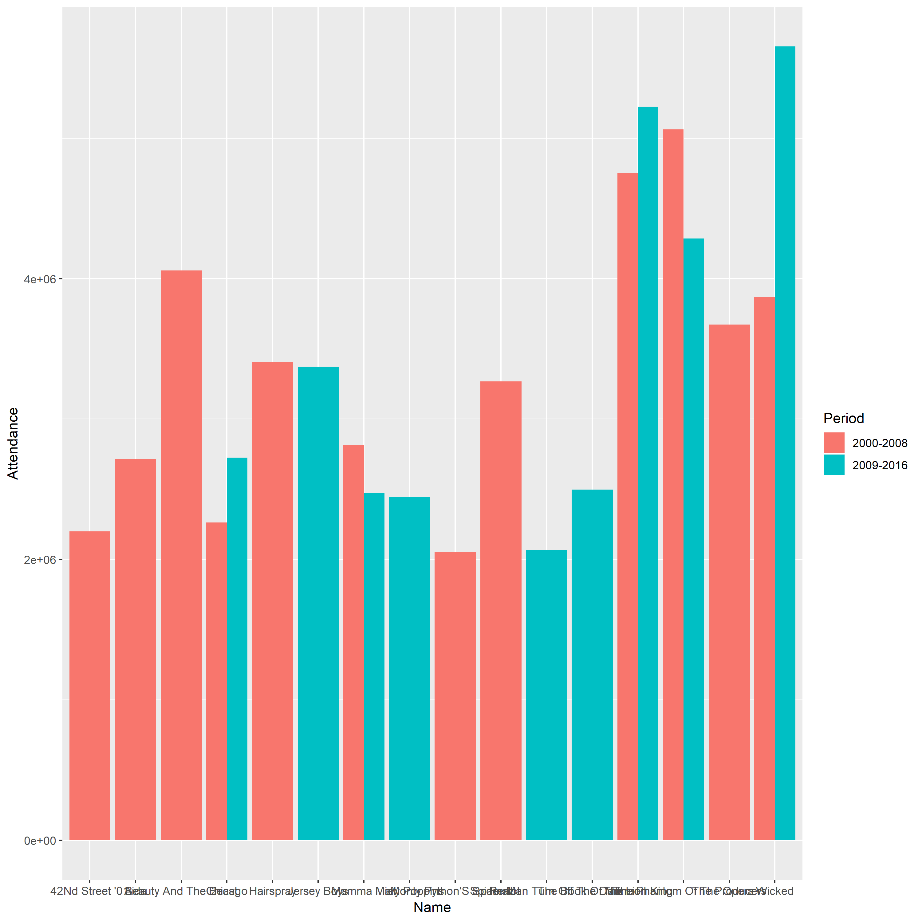
Problem

1.The bars of this plot are arranged arbitrarily, which make the figure become more confusing and less intuitive.

2.The labels of each bar cannot be discerned since them take up a lot of horizontal space.

3.The vertical scale line does not have detailed description and this plot does not have descriptive title.

The improved grouped bar plot

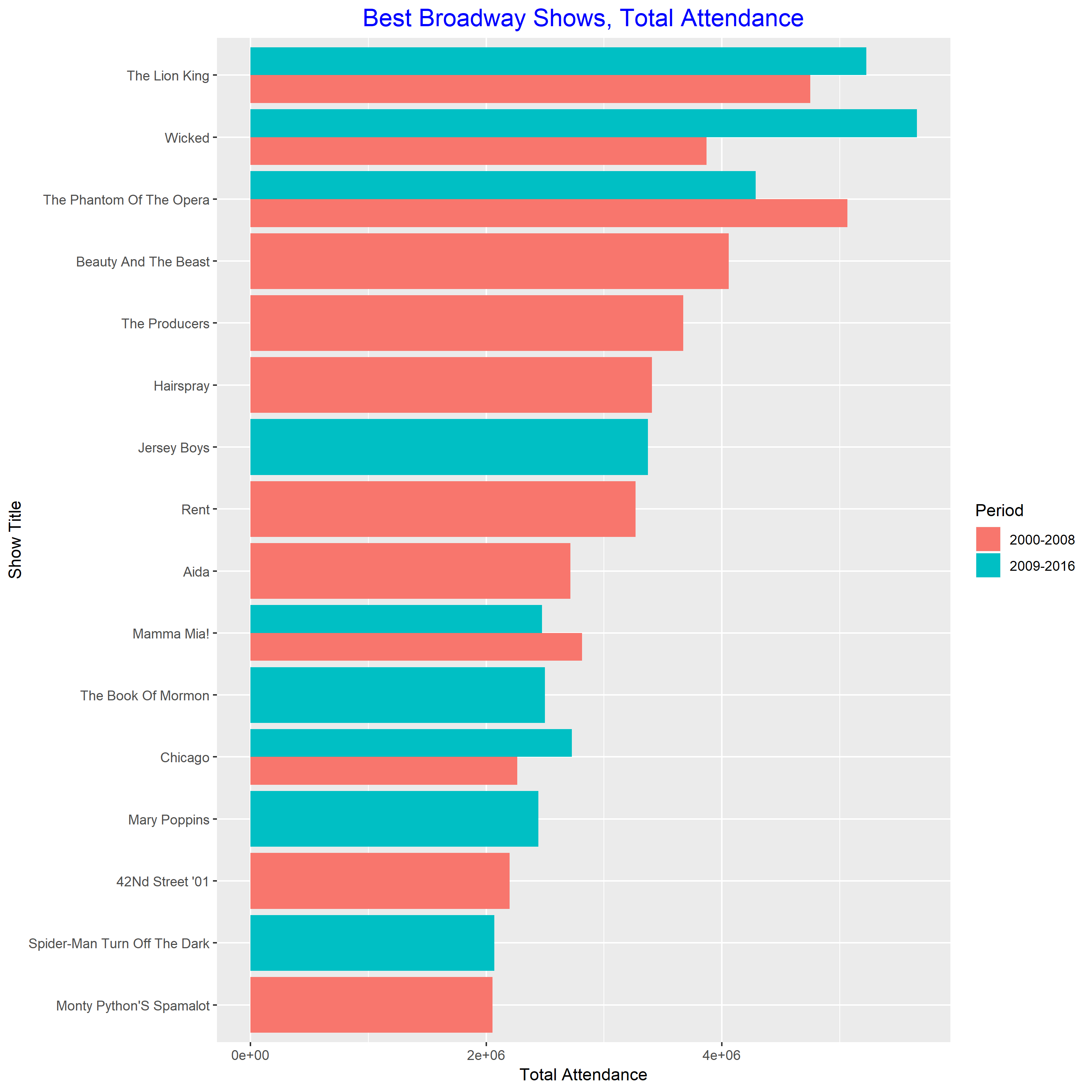
This plot is much easier to read than the previous one. From this plot, we know the best show in 2000-2008 is “The Phantom of the Opera”. The best show in 2009-2016 is “Wicked”. And both of them are very popular during 2000-2016.


Two Scales and Comparison

Part I

From this plot, we can know that the population grow faster and faster as it gets larger during this decade. And we can know that the percentage increase in population is unstable and increasing. According to the following calculation, we can know the Kazakhstan’s population of change percents is 8%.

23.94-23.83=0.11; 2^0.11=1.08; 1.08-1=0.08=8%

Part II

The second country is Cambodia. From the above plot, I observe that the percentage change increase of Cambodia through this ten year has been  roughly stable.  It is different with Kazakhstan’s growth pattern.

Unclear Vision and Adding a Third Variable

This dataset UScereal involves the nutritional information for a selection of US cereals.

Part I

Good display

Bad display

The modified graph violate the following elementary principles of graph, which make the modified graph has unclear vision.

1.do not allow data labels in the interior of the scale-line rectangle to interfere with the quantitative data or to clutter the graph.

Some points are obscured by the tick marks and the regression line.

2.tick marks should point outward.

The tick marks all point inward and obscure the data inside the scale-line rectangle.

Part II

In the new graph, I use color to add protein variable in the graph. I delete the regression line in order to make the data stand out and avoid superfluity. And I change the size of the plotting symbols to prevent being overlooked.

From the new scatter plot, I observe that higher protein contains higher calories for one portion. The cereal has higher protein could contain higher sugars.

Tuition Growth for BGSU

The data includes the instructional fees (per term) for BGSU for selected years. Then I created a scatterplot of year against log10 of instructional fees. Based on this scatterplot, I observe that the instructional fees increase rapidly in 1960-2010. In past eight years, the growth speed of tuition is slower than before.

I find that understanding and applying a new function into my case are pretty hard in sometime.