Research
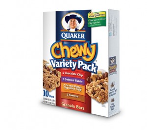
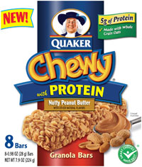
The product I decided to do was the Quaker Oats Chewy Bars. I am doing the packaging for the box, the wrapper, and for the new rip-n-go packaging they created. The one thing I noticed about these packagings is that there is way too much text on everything. Too much text usually overwhelms the consumer and then they will not even read anything that is on the package. Sometimes text heavy packaging can also create the buyer to get something different and not so overwhelming. The one thing I would like to change is how much text and information they are giving on these packages. I also noticed that the design needs a little updating. It looks a little old and a new design can bring in new consumers and excite the old consumers with the new change. I also think they are using too many different colors. They do not go well together. If they limited the color chooses to the same blues instead of having 2 different blues, having yellow and orange together and changing that to a single color, and etc. These little improvements will help the packaging look better. I am attaching images of the packaging and you can see the problems I am talking about.
Thumbnails and Sketches


I actually like your weblog, Its high-quality to discover not everybody is just posting a bunch of garbage nowadays!
Do some of these guys even read through the document? You should probably severely seem at getting rid of a number of the feedback over.