Research and Thoughts
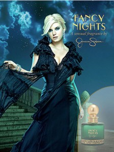
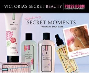
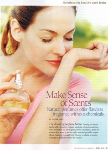
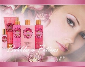
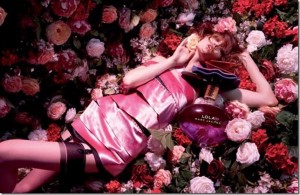
The product I am choosing to do are the Victoria Secret scents. I was thinking about creating an advertisement to market the new small bottles that can be taken on flights, but I could not even find the bottles online. I have only seen them in the stores so I might change that concept to just a fragrance line that they offer. The one thing I notice when I was researching for fragrance magazine spreads is that many of the advertisements are images of a women either holding the bottle and looking seductive and flirtatious. But for some of the Victoria Secret ads it was slightly opposite, which I thought would not be the case. They have women in some of the ads, but they are just looking happy and playful. Or they have the fragrances on set up on a white background by themselves and only including some text with the advertisement.
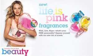
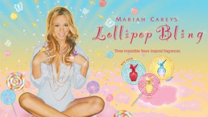
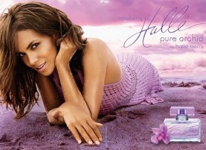
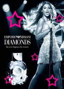
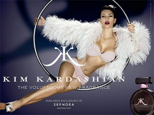
Also something else I notice in fragrance advertisements is that they use a lot of color. Most of them use darker colors or colors that would give it a more seductive feel to it, but with most of the Victoria’s Secret ads the use very bright and flirty colors. I liked the advertisements Victoria’s Secret offers because they have a slightly different feel to the scent. Another thing I noticed about the more seductive ads include a celebrity. Not all of them do, but a lot of them do. More and more celebrities are creating there own scents. They are so concerned about making it feel seductive and sexy that I think they forget about people that are looking for scents that are just fun and flirty. Most of the fragrances give a night time only feel to them as well. While most Victoria’s Secret fragrances have a more day time feel, unless they are the more expensive kinds and not marketed as a body splash.
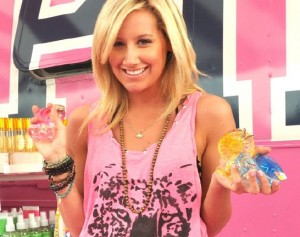
Below are just some of the images I found:
The product I am going to use is the peace, heart, and flower shaped bottles. I want to go with the hippie theme, like they used for there advertisements of this product. I want to use fun, bright colors and make it as simple as possible. I think simplicity works well with this product. The bottles are already fun shapes so they speak for themselves really. I think I am going to try and use the colors to match the bottles. Also, for this project I am going to try and use my own images to create the advertisement. I actually have the perfect people in mind to use for the pictures so I would like to create my own images. I also feel like I would be more willing to manipulate and change around things on the image if I use my own and I believe for this advertisement manipulation is going to play a big part in the whole process.
Thumbnails and sketches

