THFM 1710 Reflection
I learned a lot of valuable material this semester. I learned how to effectively use and notice movements, colors, and lines in films. I now know that these concepts are used to convey an intended meaning to the audience instead of just fitting a narrative or making a scene look better. My favorite material that I learned this semester was movement. After learning how to create intended movement, I started to use it in my films and think about how movements will add to my films.
I grew as a filmmaking this semester by applying the knowledge gained from this course to filmmaking. After every concept that we learned, I was able to practice using them in my own work. I now have trained my eye to pay attention to color, spacing, depth, movements, and many other things we learned this semester in my own work. While making my films this semester I dealt with a lot of issues with lighting. The lighting in the apartment building I had been filming in was not great. To overcome this, I added light in the shot with my cell phone while filming and edited colors in the still image project.
At the beginning of the semester, I wrote that all films should reflect the filmmakers view of the world through a narrative story. I still believe in this manifesto and use it in my own work.
Final Project – The Spy That Got Away
Final Project Update
So far, I have filmed everything for my final project and am starting post production. In post production, I have already recorded all of the needed voice overs. In this next week, I plan on editing my film and the sound recordings I have, while also finding sound effects and background music to add to the film. Since I haven’t started putting the clips together yet, I do not have a draft of the film to show.
I have changed my initial project. Instead of creating an animated title sequence for a spy film, I decided that I would create a live action opening scene for a spy film. I made this switch because I felt that I would be able to use more of the concepts that I learned over the semester in live action recording than I would creating an animated sequence.
Questions for the audience?

Is it clear that this character is a spy? Does his costume fit the role?
Are the camera movements that I used effective?

Is the lighting in this shot too distracting?
How would I fixed the lighting here?
Screen Analysis: Goodfellas
For the screening analysis project I watched Goodfellas (1990) directed by Martin Scorsese. While watching the film, I noticed that Martin Scorsese carefully coordinated color to emphasis meaning and support the narrative. Throughout the film, Scorsese seemed to want to make the gangsters stand out from everyone else. This was accomplished with the style of clothes that the gangsters wore and the color of clothes they wore as well. The gangsters in the film wore dark colors such as black, grey, brown, and tan. The gangsters also wore formal clothing throughout the film as well.
 In the photo above, the gangsters are clearly distinctive from the crowd around them. This is because their dark colored clothes stand out from the lighter colors surrounding them such as white, purple and light brown.
Scorsese also uses color to emphasis contrasts within the film. One particular scene in which I noticed this use of color was when Karen (Lorraine Bracco) woke Henry (Ray Liotta) up by pointed a gun at him.
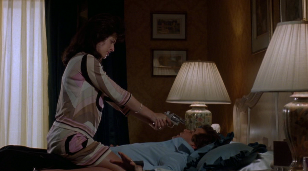
In this shot, Henry’s blue clothes match the blue bed he is laying on and Karen’s tan, light brown, pink, and white colored outfit match the rest of the room. It is also interesting to note that the colors that match Henry also match his position in the shot, underneath Karen and laying horizontally. Similarly all the colors that match Karen are above Henry and moving vertically. All of this emphasizes the conflict between the two characters, while also supporting the idea that Karen clearly has the upper hand in this situation. To further emphasis this conflict between the characters, soon after this shot Henry knocks Karen onto the floor. I was unable to find a clear image of this shot, but while Henry is on top of Karen on the ground with the gun in his hand this time, the bed is also above Karen and the cream colored carpet that she is lying on.
Another strong use of color that is shown throughout the film is Henry’s growing divide with his fellow gangsters. As the film progresses Henry begins to distance himself from the gangsters as he starts his own business selling cocaine without the leader of their gangs permission. While going through this secretive process, Henry begins to wear less formal, lighter colored clothes.
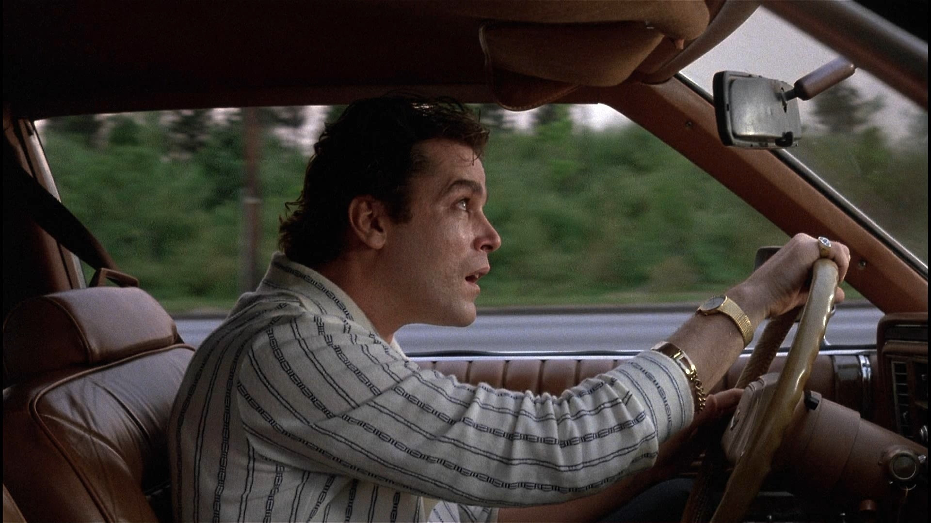
This photo is from one of the final scenes in the film. Henry is at the climax of his cocaine business as the police are following his every move. The style of clothes that Henry wears in this shot are vastly different from the dark colored suits that he and his gangster friends wear throughout the film. Henry has already made the decision to focus on his own business instead of continuing his crimes with his fellow gangsters prior to this scene. The contrasts in clothes with his friends and his prior self clearly support this narrative.
I enjoyed watching this film and learned a lot about the use of camera movements and color to support and emphasize the narrative that I want to portray throughout the film.
Rhythm and Movement
The first shot in this film is an example of an object moving. The man opens the door, walks out, and closes it.
The second shot in this film is an example of point of attention movement. Initially the eye is drawn to the white suv in the background, until the man walks into the frame and the eye follows the man.
The third shot in the film is an example of relative movement. As the camera follows the man, the building behind him seems to move.
The final shot in the film is an example of camera movement. The camera is following the man.
Final Project Proporsal
For my final project I will be making a moving graphic title sequence for a spy film. For this project, I will be using a black and white color scheme to create a visual contrast within the title sequence as it would resemble the contrast between the spy and their enemy. I plan on using vertical and horizontal image and text movements within the project.
I will be working in Adobe after effects for this project and will be working by myself. I expect the sequence to be sixty to ninety seconds long. My challenges for this project are going to be learning how to effectively work in after effects and keeping track of the timing and location of the moving objects that I will be creating.
Nine Shot Film
Monsters Inc. Title Slide Color Analysis
This title sequence for Monsters Inc. (Doctor, 2001), maintains a visual style by using doors as pathways for monsters, letters, and, in the end, the audience. The title sequence seems to maintain ambiguous space as doors and monsters move around the frame in different directions. The color scheme is highly contrasting as it begins with dark blue colors and transitions down the color scale to light red and orange colors and then ends again with dark blue colors.
This color scheme seems to evoke happier emotions with its use of lighter colors for the majority of the sequence; However, throughout the sequence the darker tones, the scarier monsters, and the screams that are used seem to be trying to scare the viewer. I think that both of these emotions are present to contrast the different monsters within the film. Some of them are bad monsters (the ones that destroy the letters and make children scream) and some are good monsters (the ones that put the final Monsters Inc. title together in the end).
After Effects Intro
High Vs. Low Visual Intensity
 This image is an example of low visual intensity. The image is relatively flat. It is primarily only one color, and everything flows horizontally. An affinity of space is used throughout the image which creates the low visual intensity.
Sheizaf, Nao. Sunrise and Clouds no 2. Lensculture.com. Web. 20 Oct. 2017.
 This image has high visual intensity because it has a strong contrast within it. This contrast is created by the presence of both black and white in the image. There is also a lot of depth within this image. This is created with the contrasting images within the photo. The tree is the background of the image adds a diversity of lines in the image and is a strong part of the contrast of the image. The mirror is also a strong contributor to the contrast and visual intensity in this image. If the image just included the person’s shoes and the sidewalk, there would be a low visual intensity. However, since the mirror provides an opposing subject in the shot, high visual intensity is created.
Simsek,Hakan. “Out Of Breath.” Lensculture.com. Web. 20 Oct. 2017.
The Shadow Lurker
Sound Effects Activity
For this activity, I looked for sounds that would create a suspenseful, scary atmosphere. The initial background music that is heard is titled, “Zombie Hoodoo.mp3” and can be found on incompetech. I felt that this background music creates a suspenseful atmosphere, especially when you reverse the track and play the reversed track and the original track at the same time. The next sound that can be heard is titled “Scary Ambience 2.wav” and can be found at Freesound.org. Ideally I would include this sound whenever the monster/person chasing the main character appears in the frame. That is why I repeated the sound multiple times in the sequence, to indicate that the pursuer had entered the frame.
Video editing basics
Photoshop: Cutouts and Transparency
I began this project thinking that I would make a simple collage of my favorite animals randomly mapped out in a single image until I noticed that both the wolf and tiger had been similarly framed in each shot.


After noticing this I decided to remove the eyes from the tigers photo and use them to replace the wolf’s eyes. I then duplicated the layer and played with the soft lighting and opacity of the eyes in order to brighten them in the final photo.

Found Image
I first noticed the symmetry in this photograph with the two trees on the left and right. The trees also seem to frame the image as most of the photograph’s content is within them. The photographer’s use of a deep depth of field captures the true beauty and grandness of the forest. I also liked how he captured the light coming down through the trees lighting up everything within the image. The photographer seems to be trying to persuade the audience to come experience nature for themselves. The forest itself seems to be inviting guests to explore the unknown world that within the trees.
Davis, Ellie. Stars 13. 2014-2015. Lensculture.com. Web. 25 Sept. 2015.
Image Portfolio
Challenge: Wide Open Aperture.
Symmetry:

Shallow Depth of Field

Colors:

Frame within a Frame:

Depth:

Flatness:

Deep depth of Field:

Straight Lines:

Video Embedding Example
Photoshop For Filmmakers
Original Image:

Photoshopped Image:

Digital Camera Shooting Activity
High Angle
Low canted angle 