For your first prompt, locate and cite one image with low visual intensity and one image with high visual intensity and post the images to your blog. What basic visual components are dominant in each frame? How do those components work to give the image a certain kind of visual intensity?
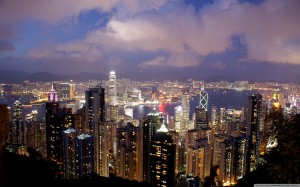
High Visual Intensity

(source: http://wallpaperswide.com/hong_kong_night_view-wallpapers.html)
This is a photo of the nightview at The Peak of Hong Kong. The basic visual component is space and color. It has a deep depth of field , allowing it to capture the whole scene of Hong Kong clearly. Also the way this is captured accentuates how deep the space is, as the foreground is Hong Kong Island, midground the Victoria Harbour, and background the further areas. The colors in it are also in a variety; I like how there was contrast in the colors but it didn’t overpower it like an HDR photo would have, and the saturation is not tuned up to a point where the blobs of yellow lights would have looked artificial. The combination of color and space enriches this photo’s content and leaves an impression to the viewers of this busy metropolitan city. I hope this leaves an impression to you too because this is one of the prettiest scenic spots.
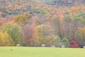
Low Visual Intensity
(source: http://monkmanphoto.com/wp-content/uploads/2012/02/Monkman_MABKS_D30112.jpg)
This photo is composed of pastel colors, which gives a sense of ambience. The space in this photo is relatively flat, as there is not much distance between the foreground (grass) to the middle ground (house) and the background (trees). It seems to me that it is taken by a telescopic lens. Also the tone is slightly bright, so it further enhances the calmness of the photo. These components join together to give an overall ambience to the viewers, as suggested by the colors and the flat space. I think it would make a good poster in a living room, especially when living in the city. 🙂

