Kung Fu Hustle – Screening Analysis
Kung Fu Hustle (2004)
Directed by: Stephen Chow
Starring: Stephen Chow, Wah Yuen, Qiu Yuen
Kung Fu Hustle is about a jobless young man Sing who wanted to join a gang to earn some money. He was hired to fight against the villagers in Pig Sty Alley, who actually exhibit martial arts skills although their appearances do not suggest so. Sing is later discovered to have the extraordinarily rare potential of being a kung-fu master.
It was the first Gish screening that I have attended, and the movie just had many elements that made me love it. Firstly, the movie had a lot of witty Cantonese colloquial in its dialogue accompanied by intense fighting scenes which maintained a good balance between light-heartedness and intensity. Secondly, the style and setting of the movie were almost too appropriate to the era described, and these are all done by careful planning in the cinematic elements. In the passage below, I would analyze a scene from Kung Fu Hustle in regards to its cinematic elements with the basic visual components as mentioned in Block’s The Visual Story.
The scene that I have chosen to analyze is when Sing first arrived and challenged the Pig Sty Alley residents, coincidentally the Axe Gang’s first intrusion into the Alley.
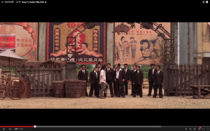
The movie is set in Shanghai in the 1940s, and the architecture and costumes were cleverly designed to match the era. Overall, it is a coherent visual structure because not only the color schemes used were consistent, the setting and plot were well thought of. It also uses a lot of deep spaces in its shots – to showcase the environment and details. These elements all contributed to bringing the audiences into the movie and that era more easily.
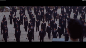
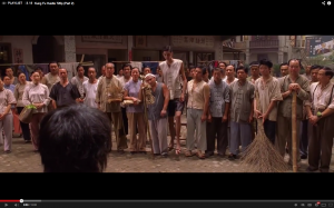
The editing, especially the fight scenes, was very quick which matches with the swift movements and keeps the intensity of the rhythm. The cinematography was smooth, with quick often rack focuses, and a lot of wide angle shots in deep focus especially in fighting scenes and showcasing the environment or the numerous members in the Axe Gang. It gives a high visual intensity as there is a lot of details in the screen which gives the scenes a very “busy” look. For example, in the Pig Sty Alley wide shot, there is different people hurt in every part of the building, alongside with the natural setting with cloth racks and billboards. It makes the audience think that the setting is legitimate and designed carefully, and not just hastily done.
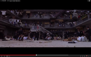
One of the repeating patterns of shots would be the composition of these wide shots were mostly symmetrical and of a wide angle, as if it was a kind of signature shot of the movie. Dutch angles were rarely used, probably because the movie is not going for something fancy, but rather more straightfoward narrative.
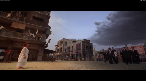
The overall look of the film is analogous, which means it uses adjacent colors on the color wheel, and also similar shades of colors, as can be seen repetition of colors from the Pig Sty Alley building, as well as the costumes. The movie did not have to have a high contrast of colors because the visual intensity is high enough to keep the audience’s eyes busy.
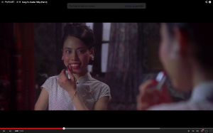
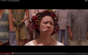
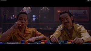
Costumes were carefully picked to reenact the lifestyle of the people back then. Somewhere overdramatic which adds to the comedic element of the movie. As seen from the screen shots below, firstly there is rabbit-tooth Jane who is being uglified on purpose with that dramatic makeup which matches her personality in the movie. Secondly, the landlady had many curlers on her hair with a cigarette hanging on the side of her mouth, she really pulls of the bossy and in-charge look of being the person with authority there. These little details of the characters actually adds a lot to the movie because they are crafted unique characters with depth and personalities.
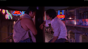
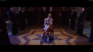
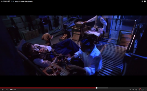
There are some specific moments when the tone of the movie changes into a cool tone of blue. It is usually the scenes that are “calmer”, either an intense setting before a fight, or the calmness after a fight where everyone is hurt. The change in tone adds some variety to the look of the film, since most of the parts in the alleys is consisted of beige and brown. The difference in color tones also suggests a different scene and environment which helps the audience to understand better the progression of the narrative. The tone in the same scene tends to be in affinity – costume, background – but may be contrasting between scenes as suggested by the different color balances.
I think the success of movie not only counts on the marvelous special effects done at that time, but also the carefully designed setting, costumes and cinematography of the movie. I highly recommend this to those who love martial arts movies!

