


-
Recent Posts
Recent Comments
- Leif on About Exposure
- Anonymous on About Me
Archives
Categories
Meta
Reflection
I believe that my editing skill have developed rather nicely and that I have a far better understanding of editing. I also believe that I better understand some elements of photography. I would say that at times I felt very behind while using the programs and that I was far slower than others since I had no prior experience. Personally I really enjoyed the color chapter and the crazy effects I could put on photos. I assumed that I would be awful at after effects and I actually did better than I expected. Yes I still firmly believe in my film manifesto.
Posted in Assignments
Leave a comment
Final Project Update
We have changed directions slightly in this project. The film has gone from strange limbo focused dream film to a more environmental message. There are still many dream like qualities being used and the plan still stands to use selective/distorted color. We also cut down on the non-dream parts of the film. The original plan to have voice over narration has also been dropped because we feel that the message of the film is apparent in its visuals. Our group lost some of our footage from the second day of filming but we have plenty so it is not a huge loss. The selective coloring process has been a little less smooth than we originally hoped but it is working.


The rose’s are from one of our inserts (Not yet colored) and the one of me is the first shot of the non-dream portion of the film. (This portion will be in traditional color)
Posted in Assignments
Leave a comment
Screening Analysis: O Brother, Where Art Thou?
The Coen brothers’ film from 2000 O Brother, Where Art Thou? is a film that does a lot of effective and unique things visually speaking. From a production stand point the film was one of the first ever to use digital color correction extensively throughout. The film which is set in 1937 rural Mississippi uses techniques of color correction to give it a vintage and period appropriate appearance. The entire film has a sepia-tinted look to it that gives the film a warmth because of the reddish-brown nature of the tinting but not an overpowering warmth like if it had used a true red tint. The tinting of the film has been described as giving the film a fall-like atmosphere. Even though the film has a fall-like appearance it takes place in summer and thus highlights a great deal of greens and yellows in the lush vegetation seen throughout the film. The greens contrast with the reds of the sepia tenting which creates a complementary color scheme at times for the film.

Seen here on the poster for the film the greens of field contrast with the sepia tint of the sky.

According to the film’s Cinematographer Roger Deakins, “The Coens wanted the film to look like an old hand-tinted picture.”
Even though at times there is a complementary color scheme of sorts present the majority of the film uses more of a monochromatic sepia scheme.

Seen in this frame from near the end of the film and many others, O Brother, Where Art Thou uses a symmetrical balanced shot. In this shot the frame is divided into 3 parts forming a triptych in which the viewer is drawn to the center were the action is occurring and the outsides of the frame remain still and nearly identical. This motif is repeated throughout the film and is one of the things that stood out to me the most upon watching.

This still from a different part of the film shows a similar pattern as the action is occurring in the center 3rd of the frame with identically dressed individuals filling the sides of the frame. This scene is also notable because it is one of a few scenes in the film that occurs outside at night. For this scene the Coens wanted the appearance of torch light so the lighting that was used was very different however the sepia tint is still clearly present.

Another still using this same balanced symmetrical motif and lighting from flames.

This still is from a different scene in which flames or the appearance of flames are used as the only source of light. This scene also uses the balanced symmetrical frame motif. The use of flame as the light source in these scenes helps to create a tension and sense of danger. The most suspenseful moments in the film mostly occur when this lighting style is used versus the natural daylight that much of the rest of the film is shot in.

This shows off the balanced symmetrical motif and some of the natural daylight used in the film.
Overall O Brother, Where Art Thou? is a film that creates a world for a period film and does so very effectively with its visuals. The repeated motif of symmetrical frames is one that while some what boring at times is very effect in other cases and helps to really showcase the relationship between the protagonists. The sepia tinted color correction truly is the most effective visual technique used in this film and is a technique that helped the film standout upon release yet still remain beautiful to this day.
Posted in Assignments
Leave a comment
Final Project Details
Our short film is about a sense of Limbo on Earth. It is an avant garde/experimental film that is focused around one man in a dream like state. We hope to fill the film with strange imagery edited in randomly throughout. The story narrative of the short film will be explained by voice over narration. The film will be shot in all black and white or in distorted colors to portray the dream state of the character. We will be using either a 60 D or a 70 D from the lab to film more than likely. I am working in a group with Geno and Phil. We don’t know how long the film will be because it will be determined by how much footage we use from out shoot. We have already changed things from a creative perspective due to casting issues and lighting needed for on location shooting. We hope to use a still image sequence within the film likely in some 360 degree manor.
Posted in Assignments
Leave a comment
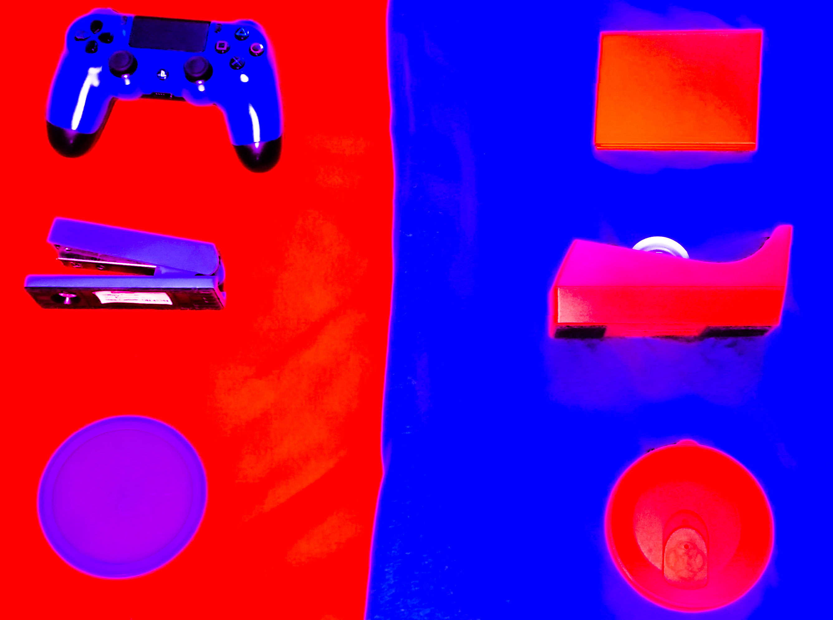
Reading Activity #6: Color
Edited
Original
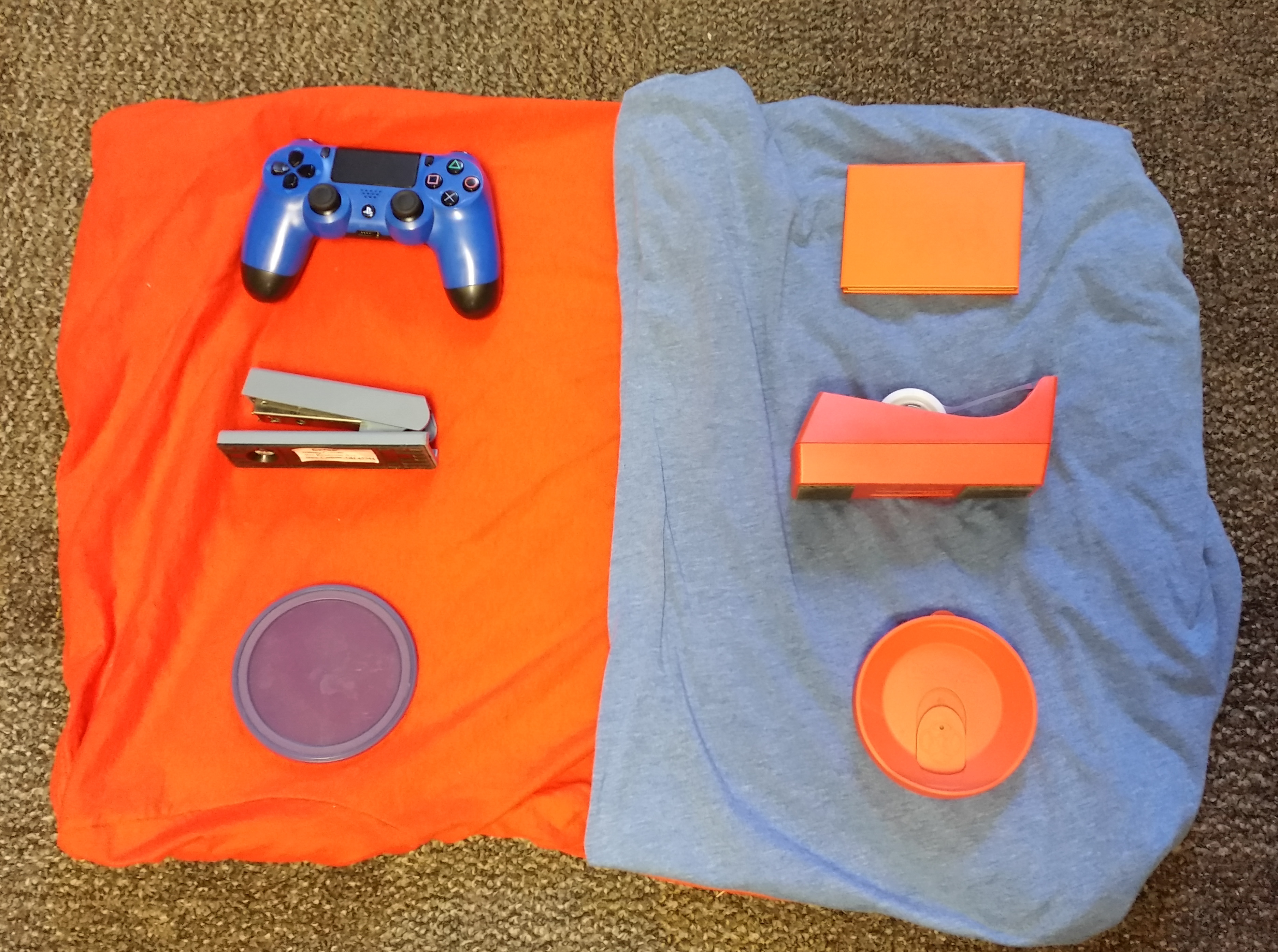
These photos shows Split color scheme by its use of contrast between blue and orange.
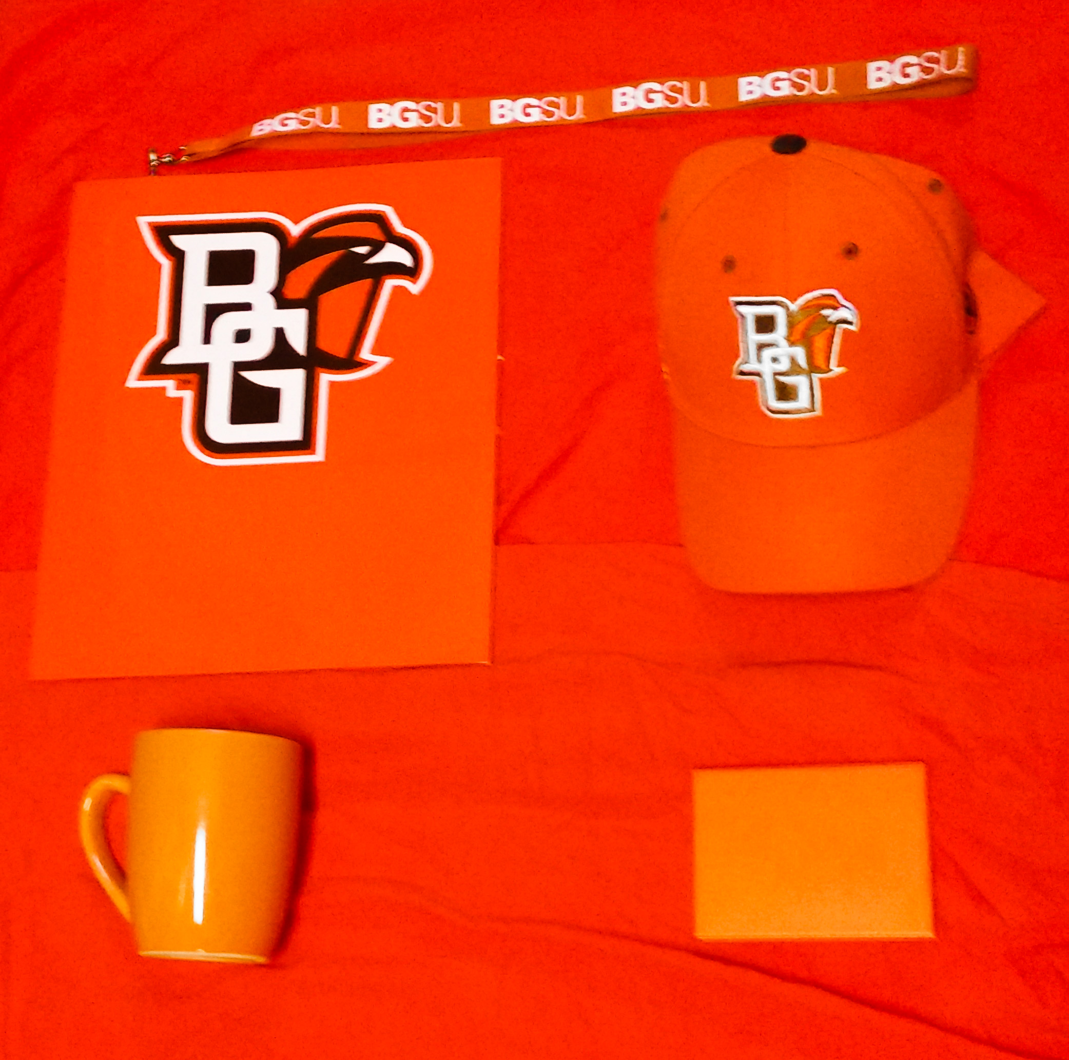
This photo shows a Monochrome color scheme because the most dominant color is orange and every object is a different shade of orange.
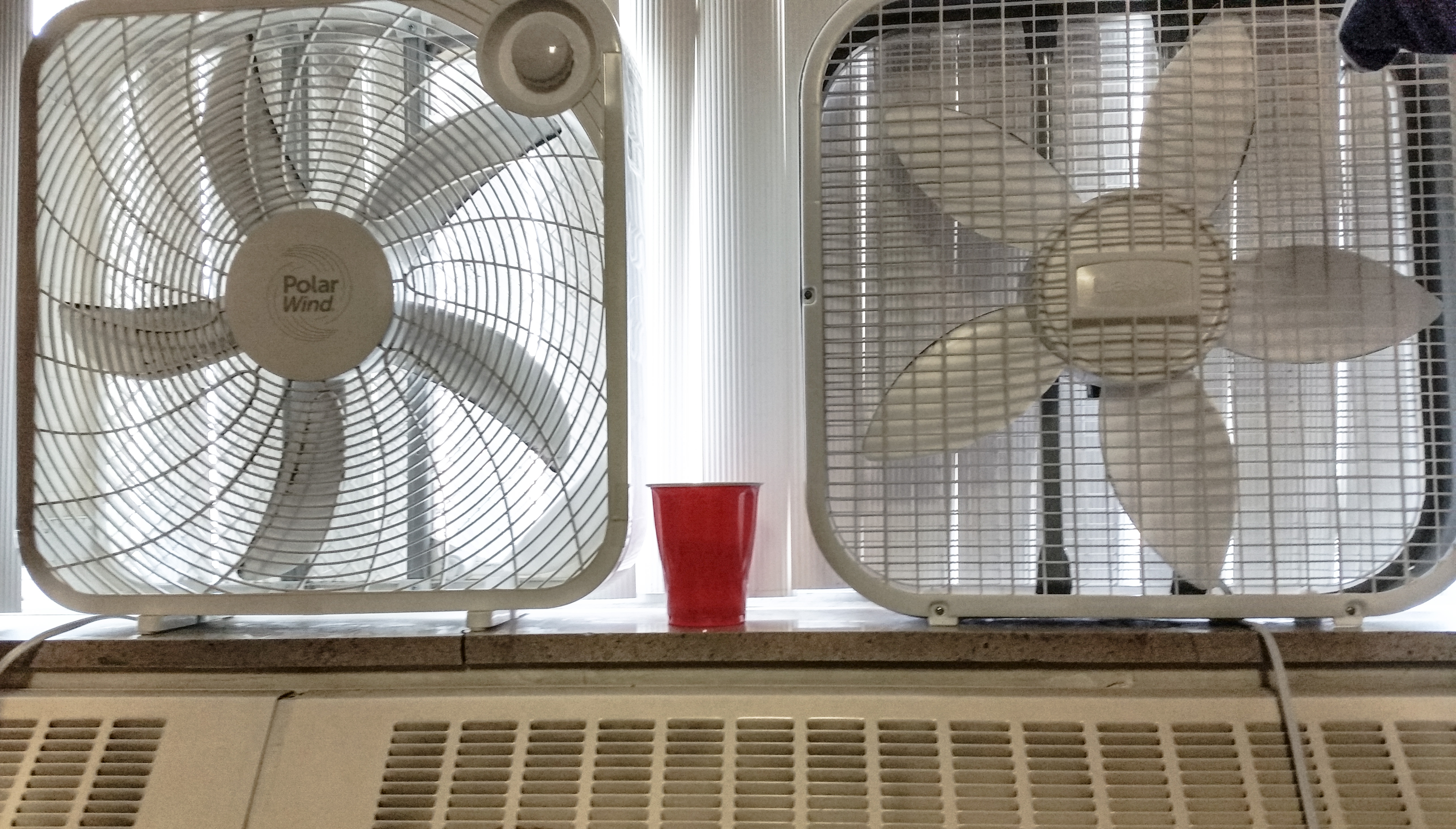
I believe this a a neutral color scheme because the image is dominated by whites, grays, and whites with the exception of the red solo cup which stands out.
Posted in Assignments, Digital Portfolio
Leave a comment
Reading Activity #5: Movement and Rhythm
Shot 1 – As the stick flies into frame it demonstrates Point of Attention Movement because the viewer is drawn to it.
Shot 2 – Demonstrates Object Movement as the stick moves in the water.
Shot 3 – Demonstrates Induced Movement because the traffic is the only thing moving. The trucks are moving relatively to the still road signs, fencing, and traffic lights which creates a sense of movement.
Shot 4 – Demonstrates Camera Movement as the shot tracks to follow Phil.
Posted in Assignments
Leave a comment
Reading Activity #4: Chapter 5 (Tone)

Affinity of Tone
This photo demonstrates affinity of tone because there is not a sharp contrast between the blacks and whites in the photo. Truly there isn’t much black in the photo at all. The white on white gives the illusion of the shadows being more grey than intense black.

Contrast of Tone
This photo demonstrates contrast of tone because of the intense difference between the blacks and whites. The shoelaces for example stand out a great deal on the white of the ledge. The shadow above the shoe created a good contrast before putting the picture in black and white because it was cast on a white surface however the filter intensified the contrast of tone.

Coincidence of Tone
This photo demonstrates coincidence of tone through its creation of a silhouette. The original photo made the jar very hard to see with the bottom being nearly invisible versus the black of the keyboard. With the filter applied it created a keyhole in which the jar is very visible and almost highlighted by the surrounding environment.
Posted in Assignments, Digital Portfolio
Leave a comment
Reading Activity #3:Line and Shape

Contrast of Line Orientation

Horizontal Linear Motif

Vertical Linear Motif

Contrast of Line Quality

Contrast of Shape
Posted in Assignments, Digital Portfolio
Leave a comment
Reading Activity #2: Image Portfolio

1. Surface Divisions

2. Deep Space

3. Flat Space

4. Limited Space (?)

5. Deep Depth of Field

6. Shallow Depth of Field

7. Canted/Dutch Angle

8. Slow Shutter

9. Fast Shutter

10. Ambiguous Space – This is the corner of a wood paneled room. You can tell it is a corner if you look closely at the little speck of black bottom panel.
Posted in Assignments
Leave a comment
Film Manifesto
To me film is both an art form and a source of entertainment. I believe that topics such as drug abuse, social inequality, racial and gender issues, and class should be shown in realistic manners and not glorified. I believe that artistic exploration is necessary for the evolution of film, therefore nothing should ever be considered “Too odd.” I personally believe that if a creator has an idea they should pursue it no matter the response and opinions of others. Most importantly I believe that neither a definitive ending or happy ending is needed in order to craft a good film. In reality life is not always happy therefore film should reflect life and should be unpleasant at times as well.
Posted in Assignments
Leave a comment
Digital Camera Shooting Activity

Above: Our high angle shot
Below: Our low angle shot

These poses where inspired by mixtape covers but we decided to change up the norm by using different angles.
Posted in Assignments
Leave a comment
Reading Activity #1

School Employee: Arson, Vandalism
This photo is high intensity because of the extreme difference between the orange of the shirt and the black of the background. The lighted area vs not lighted area creates the intensity. A lot of contrast in this picture. This image is very visually striking. I feel that this is an intriguing image because of the placement of the camera and the mystery of the person in the photo.
The photo below is very low intensity because of the lack of contrast present. This photo has a high affinity. The photo uses almost exclusively one color and very dull landscape. I choose this picture because it was visually appealing to me and because I enjoy winter landscapes. There is not much contrast in this picture. This picture has a sense of sadness and beauty to me.

Posted in Assignments
Leave a comment