Portfolio Piece #5
Portfolio Piece #5
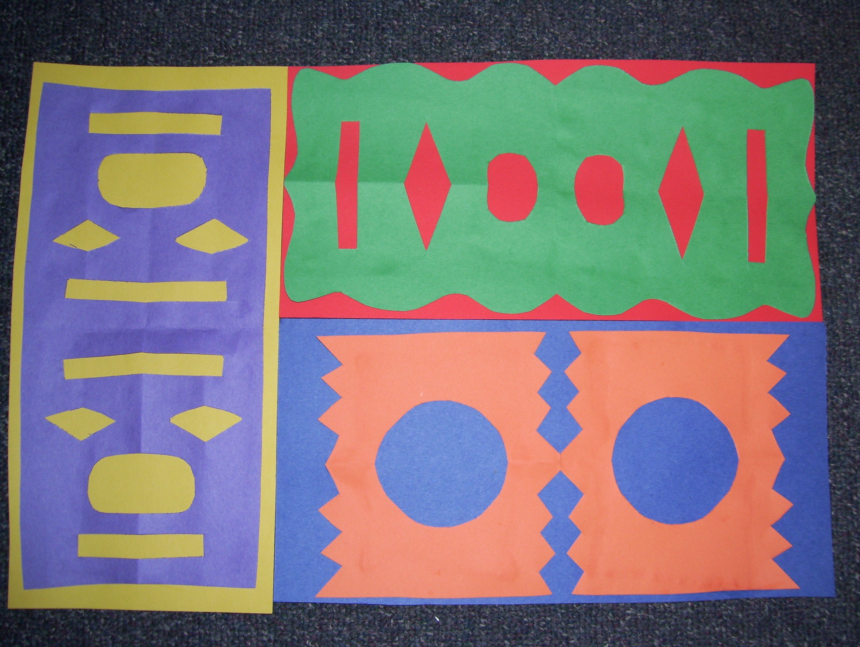
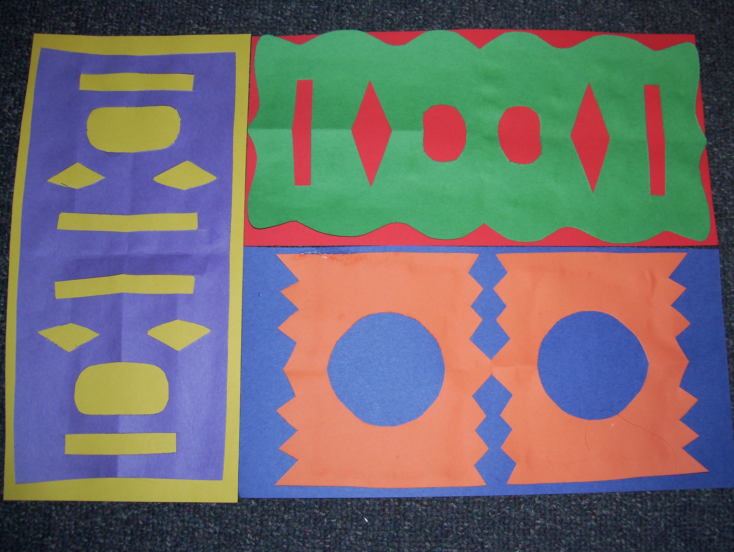
For this portfolio piece, I did the Cut-Paper Complementary Color Project (pgs. 40-42 in Prince’s Art is Fundamental). I started by creating three backdrops – 6″ by 12″ rectangles of yellow, red, and blue. I made three same-size rectangles in purple, green, and orange. The purple, green, and orange papers were folded into fourths, and then I cut shapes around the edges, just as if I was making a paper-snowflake. I unfolded the cut-paper and glued the different designs down onto the background that was its complementary color.
I liked this lesson because it was a hands-on way to introduce complementary colors. It was open-ended, as students would have the choice about which color to make the backdrop vs. which color to make the cut-paper designs. They also had the freedom to create any design they wanted for the three cut-papers. Also, this lesson allowed students to visualize the colors directly next to their complementary color. It would be a fun and useful lesson for children.