1) Name an Early artist mentioned in the article for CONCEPTUAL WORK performing in front of the camera.
Describe a work. (2 points)
Joan Jonas. She used a vertical roll to fragment and mess up the way women’s bodies were viewed and their roll in the home during that time period.
2) Name an artist mentioned who deals with PERSONAL NARRATIVE. Describe a work. (2 points)
Pipilotti Rist. Her Video was about how women were degraded in pop culture. She sings a sings the title of a pop tune while dancing. The longer it went on the more her movements became grotesque and akward.
3) Describe the piece you were most interested in viewing after reading this article. Look the work
up on the links, and expand on Rush’s comments. (2 points)
Ana Mendieta’s pieces were the ones I was more interested in. The pieces that I strongly remember were the ones where she was buried and the one where she was bleeding from her head. I am assuming that she used her body as a sacrifice for art. And to show how spiritual those sacrifices are.
4) What do you better understand now about Video Art? (2 points)
Video art is more about the artist rather than entertainment. It also allows the artist to express their thoughts and feelings though video.
5) Based on Rush and this article, what makes Video Art vs. an “artful video”? (2 points)
Artful video is more for comercials, television,film, and advertising, while in video art the artist’s gesture could be recorded while in tha act of making the video. Video art is also more personal.
March 24th, 2010 at 10:54 pm |
Comments & Trackbacks (0) |
Permalink
My concept is to show me doing stuff that I like to do.It will include the reflection of me riding my bike in a window,poster making for ANO,and some footage from the convention,and possibly a flip book of stuff Ido during the week(if Ihave time).The location for the bike footage will vary. I am testing out which path is the least bumpy. For those shots I plan on having Aaron my partner film on the ground while I come in from out of view and then some footage from another closer angle. Icould even have a scene where it looks like I am going to get run over by my own bike.The poster making so far has been filmed in Offenhauer but I am sure the rest will be filmed at the union in the poster room.Iam thinking a table shot , a high angle, and maybe a pan around the room. Next I could show me watching the anime convention online. I plan on doing shots at the entrance, at the first aid table , on stairs, and above starbucks. The shot I plan for the entrance would be a dolly like shot and a high shot like on the stairs. The scenes regarding the first aid table would be views from the table view and my eyelevel shots. For the flipbook I plan on possibly show me doing laundry on laundry day or me walking up the stairs for class. I want to draw a fip book where the angle is on the floor of the stairs and I emerge from the stairs or me me throwing people’s laundry out on laundry day. The laundry day one could be mostly middle view shots, medium full shots, close up of my feet tapping, and me throwing there stuff out. At home my cats had kittens and Ialso have footage of the. I might want from those scences whatever looks the best will go into the video.
My intention is to show the audience what I am interested in, and how I like to spend my freetime. I will show the studying me versus the me that likes to act goofy at anime conventions.For the first sequence I will show me walking to the dorm with books in my hand , and then some shots of me going in the opposite direction in the direction of the con, in my gear for then con . The walking me will have scenes of me looking at my watch up and then up to a shot of me coming toward the camera. Then a close up on the walking me squenting to see the rider and then a close up of the rider pasing by or medium shot. And then me looking in the direction of the rider and saying watch it you almost hit me. And then a scene showing the rider leaving in that direction raising her hand saying no breaks sorry. And back to the other me in a medium close up with me looking mad and then another close up on my watch and then a pan to direction the wallking me was riding.Then a fade black to white. Of the me riding the bike to the con. from my perspective.Iwill shorten the scene of me arriving to the con by long shot of the building from my view, a close up of my bike and the building from my view. Another way I could do that is a long shot of me coming toward the building on my bike (front view), then me disappering down the little hill and biking toward the bike rakes and then a medium or full shot of me at the rakes locking up my bike. Next is close up of me opening the doors up to the union. fade then me up high viewing the people coming into the entrance or someone holding the camera and shooting me having people sign up for the con. Next a table shot of me at the first aid table, and then me going to see taiko perform. And maybe the taiko performance. After that I will do different shots of me at in the crowd of me at the con(mostly my point of view). Then I will end with a scence of the rave from afar and then a transition to the other me at my desk reading my book for my assign mnts with the video of the convention playing on the computer with scenes of me posing with my friends. And a zoom in on that to my face and then a fade to black.
Timing I am unsure of until Ido the takes but most likly will be 10secs to 1min.Some of the scences I won’t know untl I shot them. Fri. I plan on going to Union and checking out the spots I was thinking of.Most of the shots I at the Union might not come out right because there will be so many people there. They might bump into me or cause the camera to almost fall. So that is my plan so far . The con vention seens will be this sat. and the others can be done any time of the week coming up. I just need help on which shots would be right for this. There is too many ideas for shots that Idon’t know which is right.
March 22nd, 2010 at 10:58 pm |
Comments & Trackbacks (4) |
Permalink
February 26th, 2010 at 9:57 am |
Comments & Trackbacks (0) |
Permalink
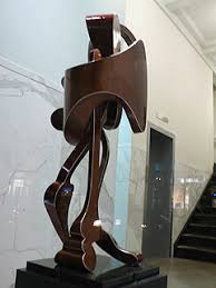
David smith
I liked his work because of the abstract shapes look human and even it isn’t human it is still recognizable. One of the peices in his firsr work looks like a clock piece for the person’s leg to me. I how polished he sculptures look.

Louise Bourgeoise
I like her work even though I don’t like spiders. Her sculptures are not the typical looking spiders however. These ones are larger than humans and have no eyes, mouth,and etc.The bodies look like a hornets nest or a beehives, but you can tell that they are spiders by the legs. I chose the metal layered because Ithought it would be cool to look up and see yourself and the building reflected in the metal.
Barbara Hepworth
The reason Ichose this artists is because I liked how she twisted the forms and added string to it.I caught myself wondering how she made that form.Iliked her second pic because of the color and how the wire draws you ion to a central point.


Tatlin
I like his work because it looks like it’s going to fall. Another reason I like this iartist is because some of his works looks as though it could be a roller coaster. The reason I like his second work is because of the name. It supposed to be a whirl of energy but it seemed static to me.


Archipenko
Ilike how his sculptures interpreted human form in different ways. You can tell from his sculptures what he is trying to represent but not realistically.

.jpg)
Louise Bourgeoise
I like her work even though I don’t like spiders. It made me wonder how those small tips could sustain all that weight. i believe the reason I like this sculpture is because of it’s size and that it doesn’t have the real eyes,and mouth of a spider. her other work i like it because i just thought it would look cool to look up and see ourself reflected over and over in it.


February 19th, 2010 at 2:20 am |
Comments & Trackbacks (1) |
Permalink
January 29th, 2010 at 11:39 pm |
Comments & Trackbacks (0) |
Permalink
January 26th, 2010 at 9:09 pm |
Comments & Trackbacks (1) |
Permalink
January 22nd, 2010 by ddenton
1. Before the WWII there wasn’t an ENIAC, which the first computer,because without war it wouldn’y have been built. It was 50×30 ft long and had 18 vacuum tubes. Because of the ENIAC, Vanner Bush started to think about what else it could be used for. After the war Norbert Wiener completed his theory on cybernetics. Then they both created a foundation for computer scientists called Advanced Research Projects Agengy(ARAP). This foundation lead to the funding of many other advancements in computer science such as the Dynabook by Alan Kay. This led to, Richard Wagner, an opera composer ,developing the idea of an idealized union of all arts. Then in 1916 F.T. Marinetti proclaimed that film was the supreme art form in ,” The Futurisic Cinemas.” Next was Billy Kluver, that let artist use advanced engineering in their work. He created severalworks that involved the audience, and created art that couldn’t have been completed without technology. In 1960 Alan Kay wrote about his idea the Dynabook which basically was the first to think about something taht could be referred to as todays laptops. And then computer science progressed further to modern day.
2.Alan Kay
Alan Kay is the man that was the first person to write about the, “Dynabook,” which basically a laptop but less advanced than what we have now. I liked him because without him I wouldn’t be typing on this laptop right now. He was the first to think about turning computers like the ENIAC into decives used for more than just communication, but a smaller size. It interested me that he wrote about something that hadn’t been ceated yet. I actually wondered how he came to the conclusion to write about it at such a length.
And I also liked his most recent work that teaches 6 year old kids hard concepts in an easy way and about his last statement about the war in the second link below. It all started from something simple a teacher wanted to do with her kindergarden class.She was teaching them concepts that were way over their heads. But in the end they got it to learn concepts like, gravity,accerleration, and Alan created a new tool for kids to do just that but with a $100 computer. He even made it simple enough for little kids to be able to understand and use it.
3. What I was most surprised about was how large the first computer was. The reason whyis because I was complained about how big my computer 2 years ago was, which was a philip, but the first computer was even bigger than it. It amazes me that computers develped from that large computer to these extremely small ones considering the first ones size.
http://www.w2vr.com/timeline/Kay.html
http://sciencestage.com/v/428/alan-kay-education-technology-children-collaboration-computers-design.html
Posted in Uncategorized | Edit | No Comments »
January 26th, 2010 at 8:58 pm |
Comments & Trackbacks (7) |
Permalink
January 22nd, 2010 by ddenton
http://brucebennett.com/
Artisit 1. Bruce Bennett
I like his black and white photos the most. They are just simple everyday activities yet they seem to have some sort of strength or appeal to them. I like the darks and the light in his pictures and that he sometimes blurs the background to emphasis the person in the pictures. Like the little boy with the mask on. His background is blurred but he is in sharp focus.
I belive that the identity of this piece is about everyday life. The pictures I see are from everyday lives of people from different cultures. From the pictures I can see that he must like traveling.From these pictures I can tell that he likes to use contrast to make the pictures more interesting.
I like Bennett’s pictures because of the focus of his work and the contrast in his pictures. In addition to that I like how he made everyday activities become interesting by turning them into black and white if they had enough differences in shades. His first pictures with color was one of favorite of the pictures with color. The reason I like his work because I find it fun to catch people off guard sometimes by taking a pictures. In some of his pictures it looked as though some of the people were just doing their work and he came and took a picture of them.
http://www.davidho.com/
Artist #2 David Ho’s
The artsist works color seem to consist of dark colors. Most of the chatracters seem to either have big eyes or have stone like elements in there skin. Some look like game characters and some look like they can be real photos of people. He works with digital media for his pictures.When his images don’t haveof people inthem it has ony one image with some sort of color to fill the open space.
The identity for this artists seems to be on more unhappy and weird things that anything. His focus is on textures, shading, and using wide eyes and skin color to give the images their edge. For instance the pictures with the persons head with people coming out of it and eyes looking everywhere makes the viewer think cool but it looks creepy. Not all his work is creepy though, but a majority of his work uses dark colors.
The creepiness of his work and those big eyed characters are what made me like this artists. Some of his art reminded me of some movies that I have watched. I do watch creepy movies but some of this art was really creepy. The colors of some of his works really draw you in to get a closer look or use the pale skin to contrast with the characters dark wavy hair. He made one picture where characters didn’t even have eyes and were being feed red soup.There are some normal pictures on his site though.
http://digitalarts.bgsu.edu/faculty/helliot/Spring09/artc201_2/201_NegarNanidian.html
Artist #3 Negar Nahidian
I like the contrast of the black and white in this photo. It seems very balanced. The half of the face that is dark seems to be another angle of the face and not as semetrical as it would seem. The light half is look at you with one open eye and the dark half has it’s nose turned upward with it’s eyes closed. The back letters and the smoky look gives it a myserious look. It also seems like it could be from a mystery because in the spoke there are a lot of little pictures.
The identity of this piece seems to be about the two sides of the person in the picture. Like how one side is what that person shows peopel and the other they keep hidden. And then the mysterious letter in the background make this seem like something needs to be solved. The birds in the pictures are a mystery to me though. This whole pictues basically plays on the blacks and whites in the picture in order to make this picture more interesting.
I like this piece because it has great contrast. It makes me think good versus evil or outer and inner self. I like how at first that you can’t tell that the other side is turned upward. In addition to that I like how one side doesn’t have any hair beads , curls or jewelry in it while the other half does. It like a play on opposites. The effect I like the most in this is he smoke in the background. It kind of make me think that it’s on fire.
Posted in Uncategorized | Edit | No Comments »
January 26th, 2010 at 8:55 pm |
Comments & Trackbacks (4) |
Permalink