
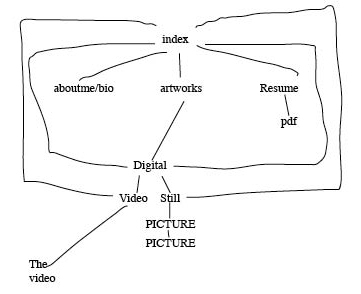
Portfolio Research
http://rodneyf.com/
Nice and Clean but its got some flash that i think could be just a bit heavy on lesser computers.
http://www.dcept.com/about/
Clean like the last site. The thumbnails are pretty good size. I really like the in page popup of the works.
http://www.spiritonin.com/
The site has a bit too long load time for the flash.The thumbnails are a bit small.
Video ARt quiz
Howard Fried
His video Into the Harlequin (1971) was just some projectors showing video on multiple walls that were meant to be viewed from above.
Bill Viola
His video A Non-Dairy creamer (1975) consisted of him drinking a cup of coffee and as the coffee depletes so does his reflection.
My favorite video is technology/transformation: wonder woman from what I understand of what I think the author is trying to say is that he is basically trying to make or ruin the popular tv show Wonder Woman and to make break it down to just monotony.
I learned that there are sometimes more than just what can be seen in videos most of them are supposed to have a “deeper” meaning.
Rough Video Proposal
My video will consist of me trying too many things. I will start off by practicing guitar(with my limited knowledge of guitar chords). Then in the next scene I will be trying to do something on the computer by typing on my laptop. Then the next scene will be me trying to sketch on paper. At the end of the different scenes I will throw the item/s down or do something to convey frustration. Audio will consist of me messing up on the guitar, different destructive noises at the end of each shot to illustrate what is happening. The intention of the video will be to show my many interests and how I cant just keep on working on one.
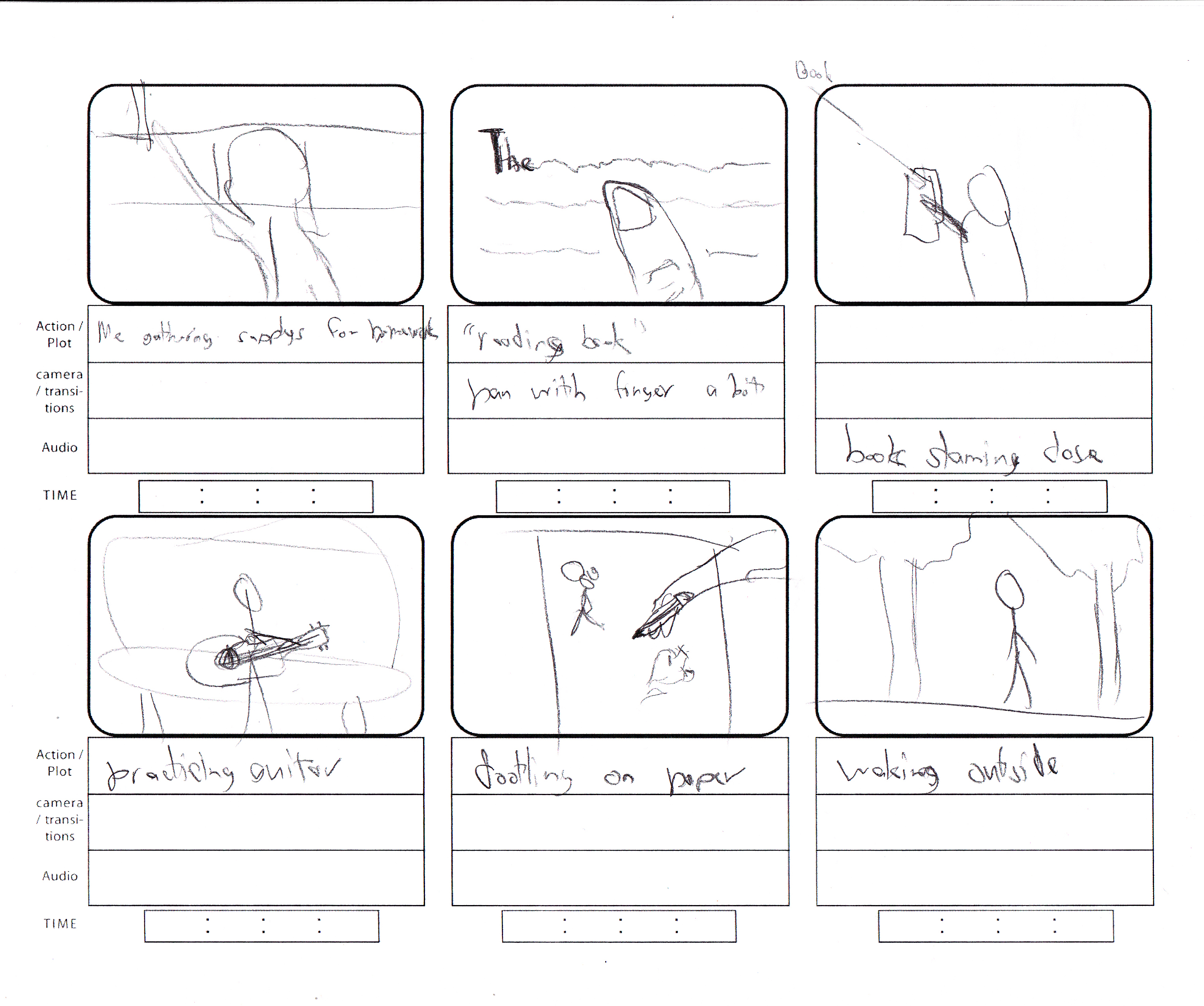
Revision:
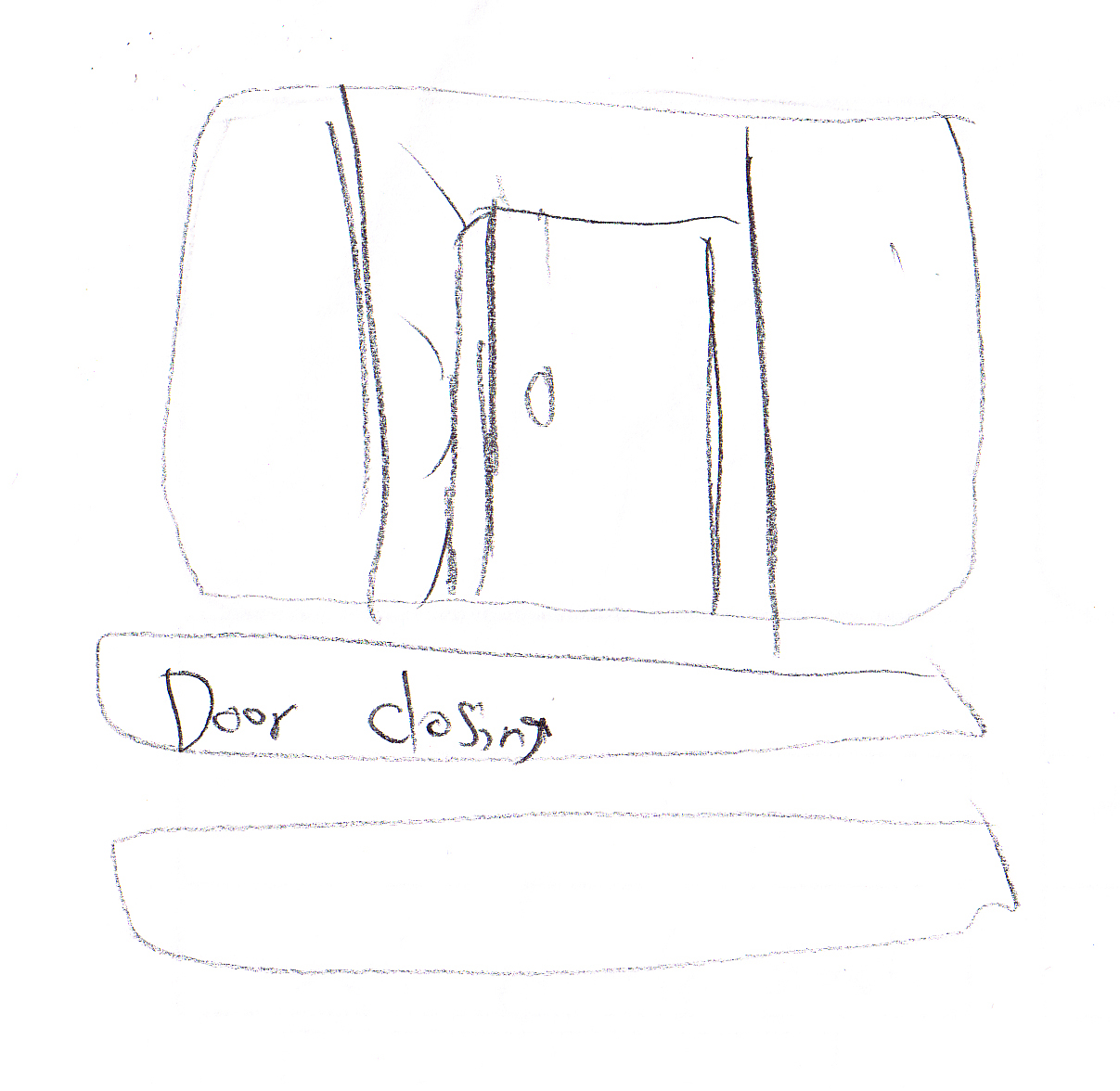
First shot will be a medium close up of me at my desk opening a class book and pulling a binder and taking a sheet of paper out of it. Then close up shot of my finger scanning the text. Cut to medium shot of me writing something on the paper. Then medium shot of me getting frustrated then putting the pencil and paper in the book then closing it. Full shot of me on couch practicing guitar. Then close up of strumming hand then messing up dropping the pick.Then next shot is an extreme close up to frustrated face. Extreme/Close up of me dootling on my paper then erasing it and continue to finish homework. Next shot me walking outside (full shot) then after a short amount of time I check my watch and notice the time and I start to run away from the camera. Next shot medium from profile paper almost filled writing on it then I finish and close the paper in the book get up from chair and walk out door and door closes.
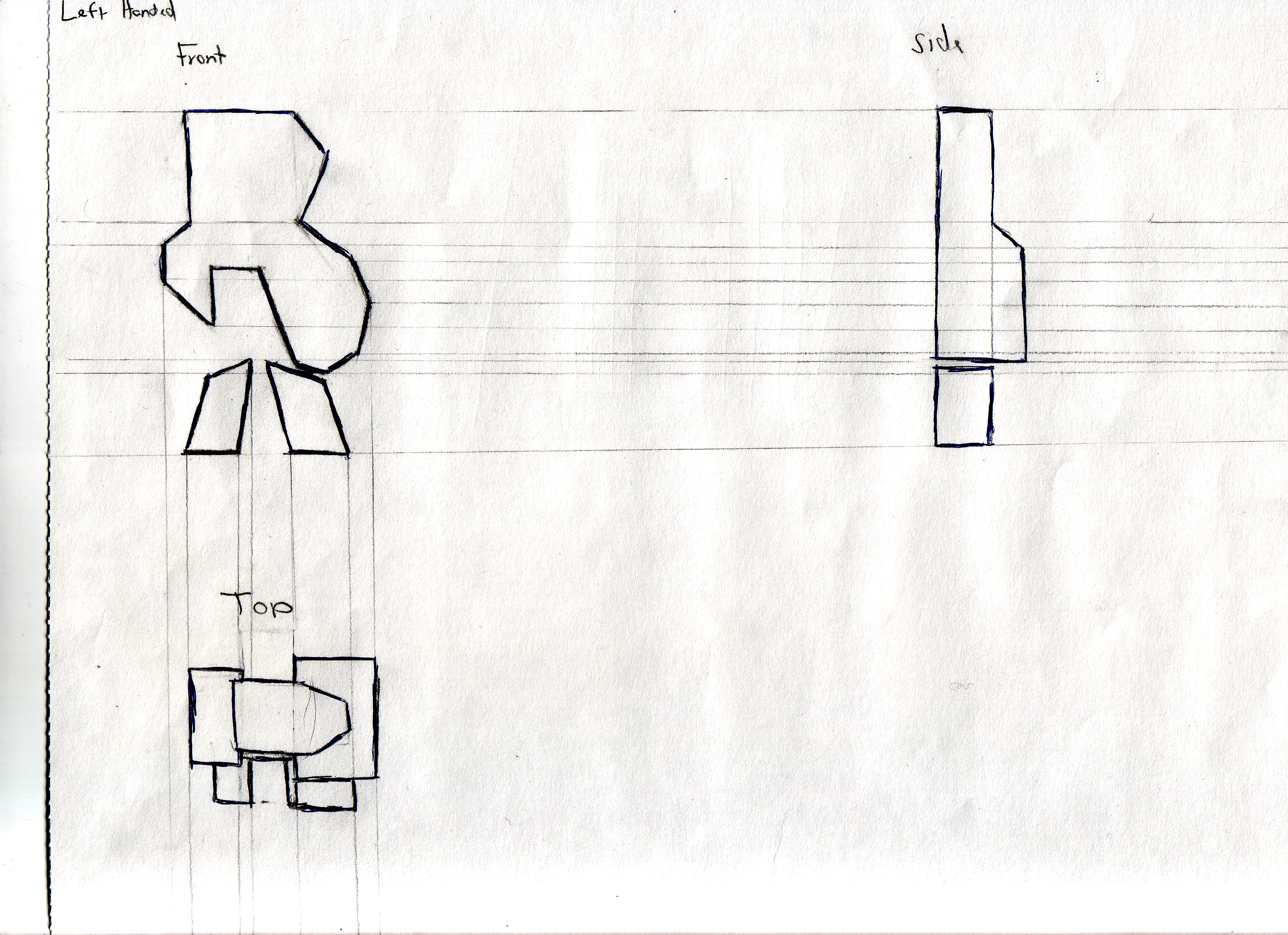
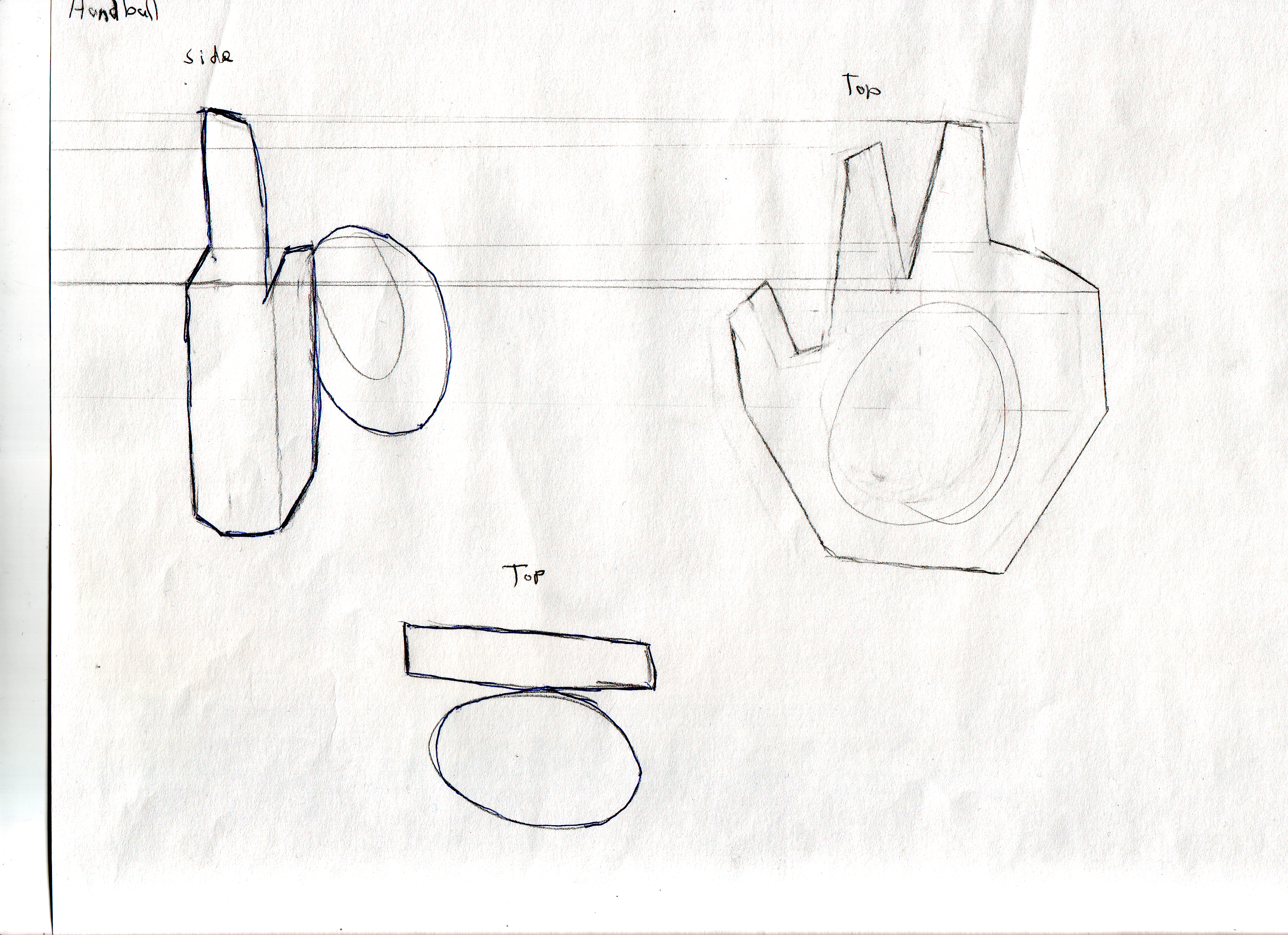
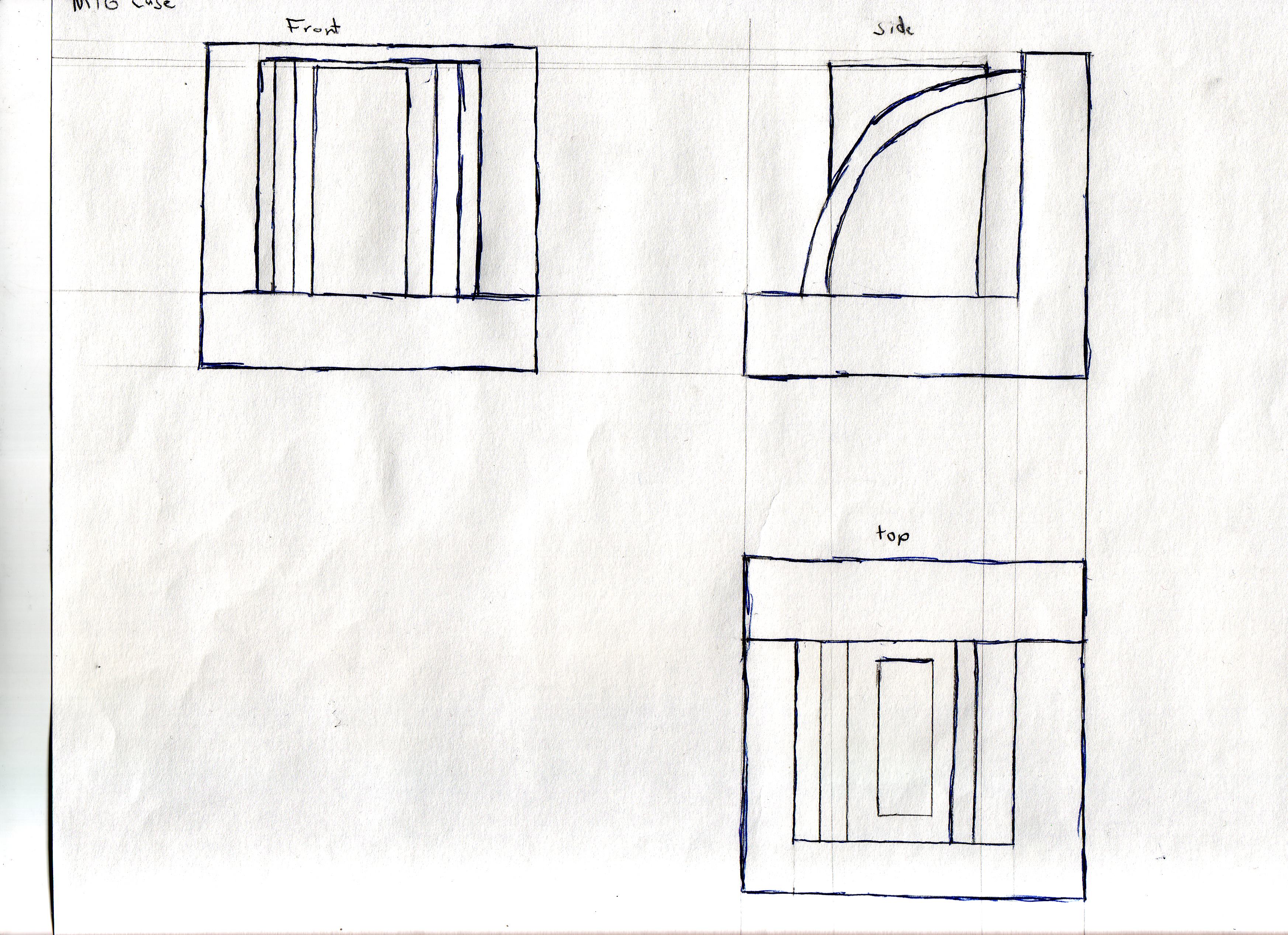
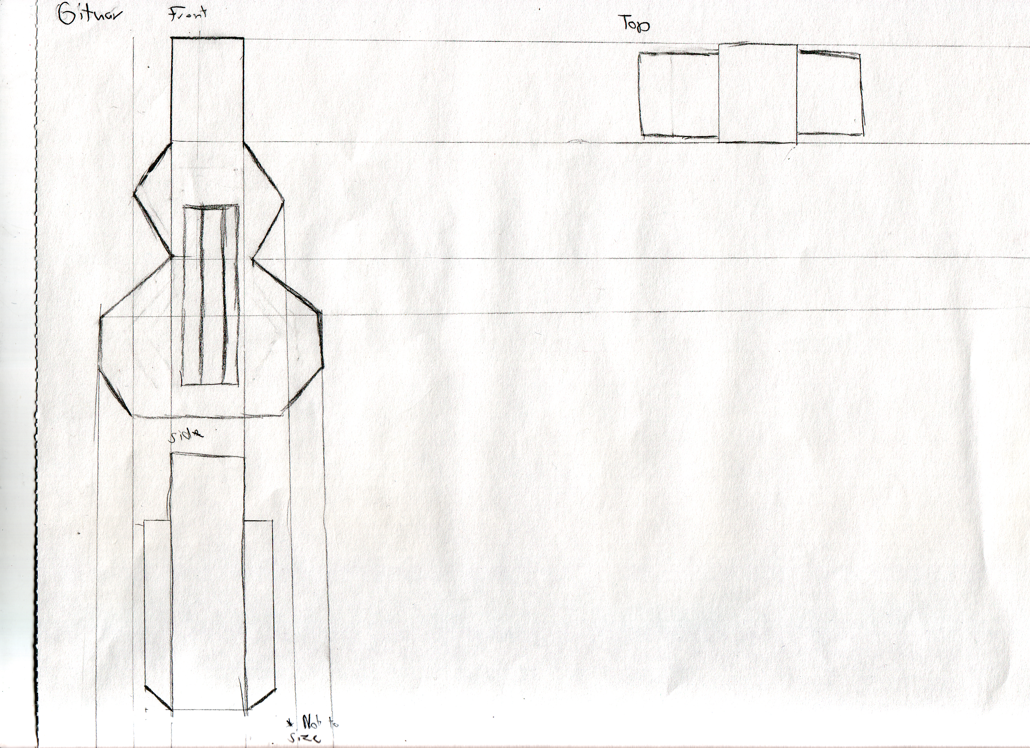
3D Blueprints
5 blue prints to be made in Maya.
3D Research
First artist: David Smith
Born: 1906
Died: 1965 at the age of 59.
I liked his message in his speech at Ohio University called Tradition and Identity(April 1959)

- Home of the Welder (1945)
Things that I like about this Sculpture is how he summarized the personality and the tools of a welder. Its small enough to be pleasing to the eye but not to big to overwhelm. One bad thing about it just from looking I can only identify very little of the tools that a welder would use, but then again i have never welded before. This piece of art does look well crafted. The organic shapes add a nice touch by contrasting the geometric shapes that there are more of.
The base shapes he used are very basic it made it somewhat more complex shapes with them. The one one the far right is my favorite. It has some nice unbalance to it.

- Cubi sculptures
Second Artist: Joan Miro
Born: 1893
Died:1983 at the age of 90.
The things I like about this work of his is the vivid color he put on it, and the shear size of the sculpture. It almost looks as if the top pieces could fall off. The texture is both smooth and bumpy looking. Its got a cool organic shape to it.

- Dona i Ocell (1982)

- Femme assise et enfant (1967)
It is a bit to simple. He just attached separate small pieces of art to a chair that he painted. Yet again I do like the vibrant colors and the texture of the surfaces are very appealing.
Third artist: Henry Moore
Born: 1898
Died: 1986 at the age of 88
He did a lot of this simple yet complicated sculptures. You can guess that I is a woman figure because of the hips and other defining components. The exaggerated hips almost make it comical. The color and texture is simple yet elegant by being so smooth and white.
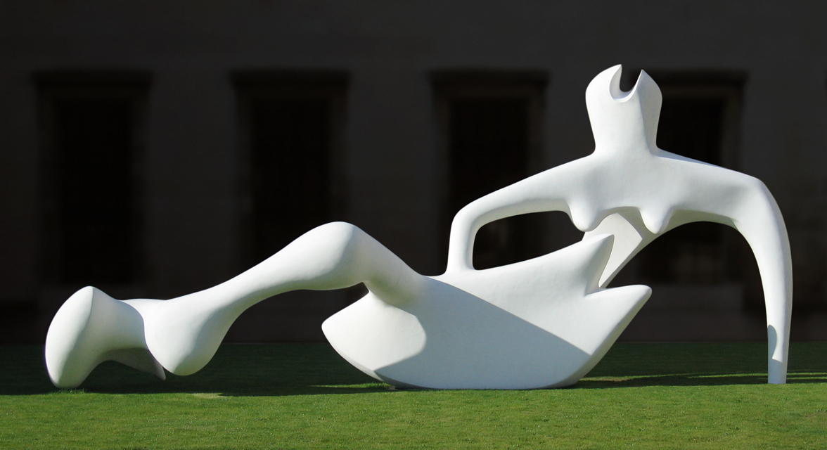
- Reclining Figure (1951)
I like the part of the sculpture that almost resembles an ancient Greece or Roman statue. But the one thing that I don’t like about it’s head. Its seems like not much work was put into it, but most of the work was put into making the rest of it.
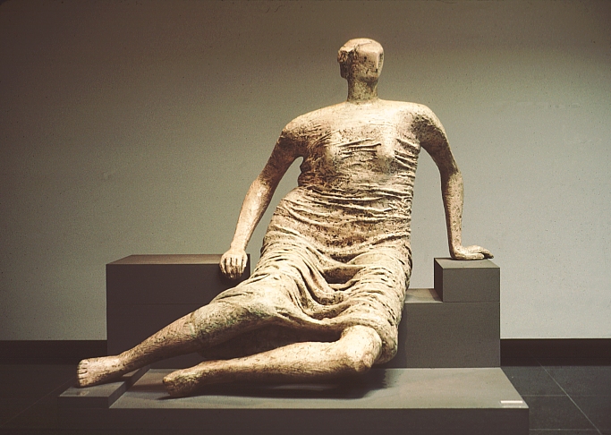
- Draped Reclining Woman (1958)
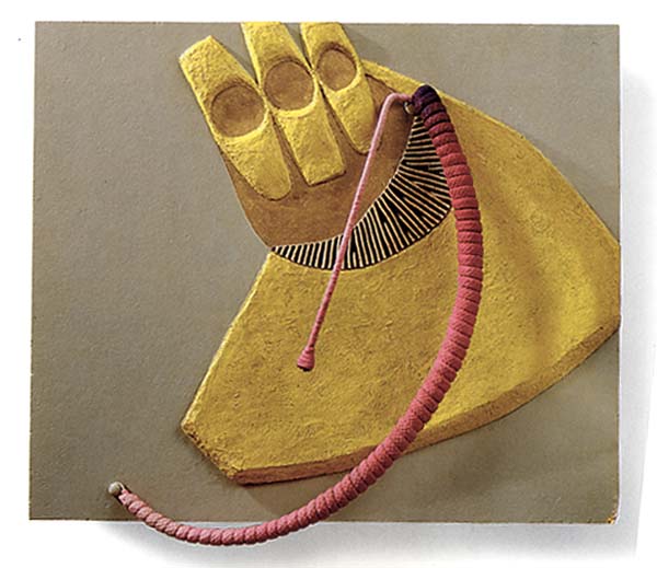
Forth artist: Eva Hesse
Born: 1936
Died: 1970 at the age of 34.
The sculpture reminds me of technology. It is simple yet if you were to encounter it in a gallery it would be strange, because of how it might be a picture frame but it is disturbing of how it looks like it wants to trip a person and maybe absorb them.

- Hang Up (1966)
This one is ingenious of how it it is a 2D/3D picture. Even tho the colors are muted they have a appealing earth tones to it.
- Oomamaboomba (1965)
Assignment 1
During WWII they devolved several technological advances including radar and sonar. ENIAC was also devolved at the same time. It was used to produce ballistics tables for artillery in battle. In 1986 Douglas Engelbart unveiled a computer that used a mouse, was able to “E”mail, and edit text.
Daniel Sandin and Thomas DeFanti conceived of a virtual reality system that puts the whole human body directly inside a computer-generated environment. They called their system the CAVE. It is an immersive virtual reality environment where projectors display a whole environment. They used it in 1992 as a “virtual tour” where a person could explore the prehistoric caves of Lascaux.
Daniel Sandin links:
http://www.evl.uic.edu/core.php?mod=4&type=1&indi=209
First Day of ARTC 2010
Words Test