Another amazing bgsu blog
Archive for the ‘Image Essays’
Post on December 9th, 2008
by alyssao
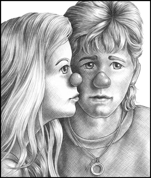
Value is the way that you use shading and other techniques in order to create a way to accent an artwork. In this image value contrast is shown from the high dark parts of the image to the very white parts. This creates a contrast and can help define an image and break of sections that the artist is trying to show. When looking at the woman on the left you can tell that the light source on her face is quite high as compared the the man on her left. This vast white space breaks up the darkness in the image and can help give the characters life. When looking at the woman on the lefts hair you can see depth and definition when a black line is placed next to a white line. Using contrast is very effective when you are trying to give expression to your artwork as shown in this image.
Category
Image Essays |
60 Comments »
Post on December 8th, 2008
by alyssao
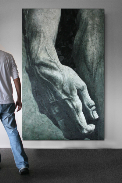
Wow. When given enough motivation and time art can be allowed to grow into something amazing and breathtaking. In this image, shading is presented in a wonderful fashion. When you shade correctly you can help pop out parts of what you’re trying to capture and can add definition to your subject matter. As you can see, the veins of the arm in front of you stand out almost as if you can feel them if you were to reach out to them. With shading also comes contrast and this image is a prime example of both techniques working hand in hand to create an astonishing piece of artwork. Shading can make an image feel more realistic and lifelike and can help capture something more acurately than if the image were nothing but a flat looking attempt. This artwork is a wonderful example of shading that captures the point of view of the artist and can make you feel almost as if you are staring that close at someone’s leg and arm.
Category
Image Essays |
60 Comments »
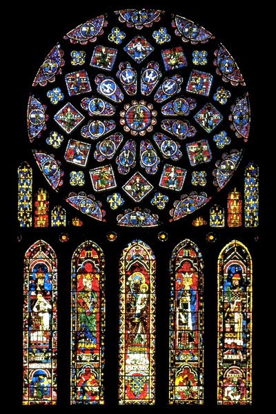
Post on December 8th, 2008
by alyssao
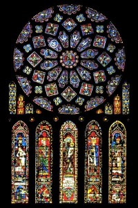
Radial Symmetry is when an image uses a technique to either draw the audience/viewer to the center of the image, or causes the viewer to allow their eye to travel aroundthe image in a circular fashion. This technique words great in this image. While at first your eyes are drawn to the middle of the window, you cannot help but want to look around the image in a circular fashion to see all that the image offers. Radial symmetry is a wonderful technique that works great to move the eye around, without having too much trouble to do so. In this window, the glass and colors jump out at you in brilliant ways. While the center is a brilliant blue color the further out that you go the more spread out and brighter the colors grow. When the individual sections of the window grow in size, it also helps create a simple way to move the eye around the art piece.
Category
Image Essays |
556 Comments »
Post on December 8th, 2008
by alyssao
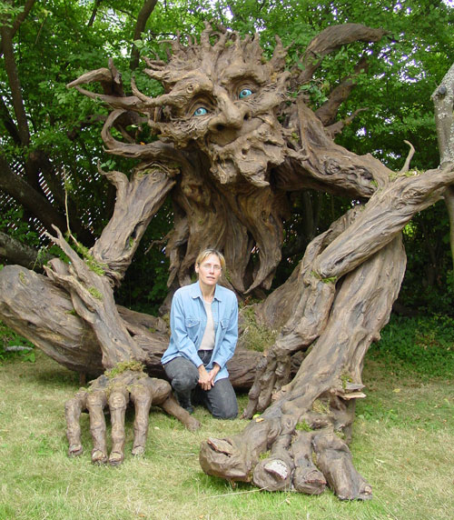
When you place something familar to oneself in front of something else it creates a contrast that can be called scale. Scale allows the audience to relate to the picture before them. In this image a woman who is placed in front of this wooden sculpture shows the audience how large the sculpture really is. When placed into scale, the womans hand is about as size as a single finger nail on the sculpture. How amazing it is to be able to see how large this sculpture is. But not only is it’s size impressive but so is the detail of the creature. You are able to see the bone structure of the sculpture and get a great feel for another vocabulary word, texture. When used together the vocabulary words we have learned, are able to correctly create an amazing piece of artwork, whether it be painted, created, or sculpted.
Category
Image Essays |
60 Comments »
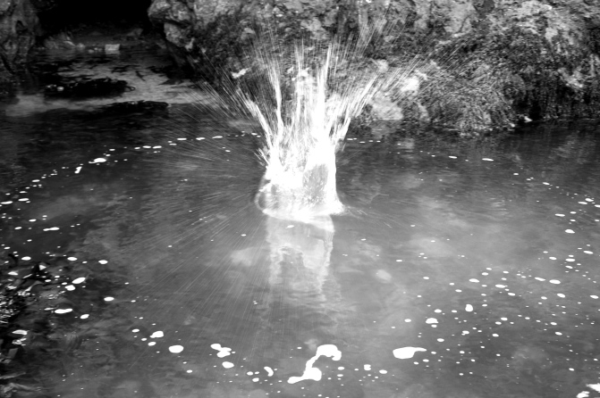
Post on October 9th, 2008
by alyssao

This picture leaves me very very curious as to what it is that has jumped into the middle of the water or possibly what has jumped out of the water. When you use tension you are bringing together two things that could be potentially complete opposites. In this image the water is calm and clear when it is struck with a blast whether something came out of it, or came into it. This breaks the calm and causes tension to appear in the image. If this were just a picture of a calm body of water it wouldn’t have as much visual fighting as this image has. And even the same if this was just an image of an explosion. The fact that the two are coexisting leave you questioning why? what? and how? You want to know what all is going on in this image and you are left unknowing. This is a great example of tension in a picture.
Category
Image Essays |
136 Comments »
Post on October 9th, 2008
by alyssao
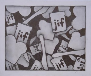
Overlapping is a technique that almost all artists use in their imagery. When you overlap somthing you cause your audience to assume or guess that something continues behind it or that there is something back there. In the image above there are numerous times where the knife, bread, and jif jar overlap eachother to create almost a pile like composition. When the jif jar is above two pieces of bread your mind does not believe that the bread must be cut to fit the jar next to it, but believes the the jar is actually laying on top of the two pieces. This whole picture just kinda gives me that urge to walk into the kitchen and make a peanut butter and jelly sandwich. As simple designed as this picture is, it still gives your mind that idea that you should probably go and make some peanut butter and jelly sandwichs, so go ahead and do so. =D
Category
Image Essays |
No Comments »
Post on October 9th, 2008
by alyssao
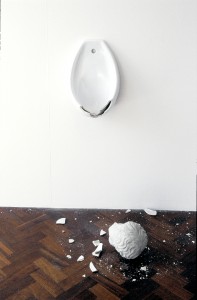
To juxtapose is to place something either in or on something else in order to show a comparison. In this image I like how the photographer used juxtaposition to inclue not only the ceramic piece on the wall but also the broken piece smashed onto the ground. Without the broken piece on the bottom the piece could seem incomplete. Yes, the top half looks as if something was broken off of it, but without the bottom half of the image to confirm that something was broken, would you care? Without either piece the composition would be utterly boring and you would feel as if you were missing half of the image or information. With juxtaposion you are complleteling an image without overly doing so. Usually the other half is neccessary to make the picture make more sense. Unless you are going for the whole think outside of the box, juxtoposition could be very helpful to you.
Category
Image Essays |
No Comments »
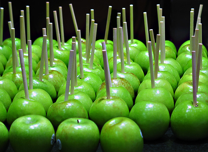
Post on October 8th, 2008
by alyssao

Okay, so I really like this picture a lot. Part of the reason is because I feel like I should be making carmel candied apples, and for some reason the fact that the apples are all lined up perfectly is aesthetically pleasing to me. In this image, the use of repetition causes your eyes to move back into the image by way of rows of apples. It appears that the apples on the right are perfectly lined up and slowly the apples on the left break out from perfect formation. However, this does not take away the effectivness of the repetition in the image, but only adds to the ways to move your eyes around the page. Doesn’t this image just make you feel like you should go and candy some apples? I know that i feel the need to do so. =]
Category
Image Essays |
2 Comments »
Post on October 8th, 2008
by alyssao
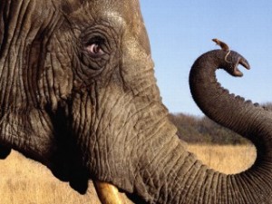
When it comes to dominance there can be so many examples that you could use. In class, we were told to visualize it like an itty bitty french fry compared to a colossal dump truck. When I think dominance, I always get the idea of an elephant holding an itty bitty mouse. Which, can show dominance, and be adorable. I like this picture because it causes your eye to move around it. The elephant takes up more than half of the page so you can clearly tell that it is the dominant creature in the picture. However, as much of space that the elephant takes up, you are reminded once you follow his trunk around that there is another creature in this picture, the mouse. The mouse takes almost an accent position to this picture. When you use dominance in a picture you can sometimes force the audience to look at that image first before moving on
to the rest of your picture.
Category
Image Essays |
No Comments »
Post on October 8th, 2008
by alyssao
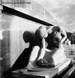
Sculpture
by
Dan Heller
This sculpture is a very good example of contrast in a piece of art work. The way that the light plays on the stone creates these beautiful shadows and high lights. These contrasting shapes make the viewer’s eye scope around the sculpture with not just one focal point. I find this sculpture to be very flowing and doesn’t cause you to feel jolted when you look at it. The fact that there are dark shadows and light highlights makes it almost seem as if the person is real and in mourning. If the sculpture were to be, say, a relief, I don’t believe you would get the same effect that it does now. The light and darks playing on the sculpture really brings a round look to it. I really like the fact that this is a grave marker and not just a piece off a building or wall. This person must have really meant something special to receive such a beautiful grave marker.
Category
Image Essays |
59 Comments »
