VCT4600 Project 3 Blog
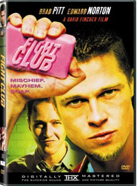
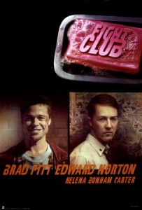
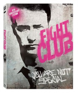
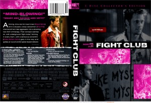
For this assignment I chose to make a poster & movie cover for the movie Fight Club. After researching some past examples of posters & dvd covers, here’s what I found:
The first thing that I noticed about all of these designs was that they all reflect the gritty nature of the movie. Of course I’m going to want to show the same thing in my designs. Also, a couple of them pull in line & themes from the movie & incorporate them into it, like the lines “you are not special,” or “Mischief. Mayhem. Soap.” I think I might want to do this as well. I also like the ones that keep the color palate very minimalistic, either by washing out the image to a certain tone or just using black & white with a pop of one color. I think that the movie deals a lot with getting rid of the unnecessary things in life, & I think that the design should reflect that.
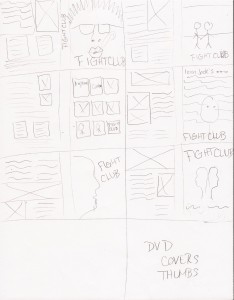
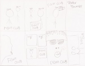
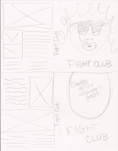
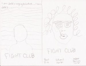
Here are my thumbnails & sketches for the poster & DVD cover:
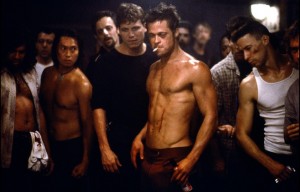
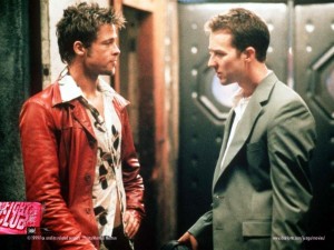
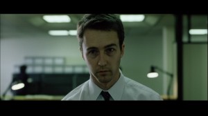
Here are some of the images that I plan to chose from for this project:
