VCT4600 In-Class Assignment 5
Tuesday, October 4th, 2011The first part of this assignment that I worked on was the motion blur effect.
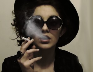
Here’s the original image I worked from:
& here is the altered image:
I accomplished this by first duplicating the layer, then creating a radial blur with an amount of 50, the zoom method, and the best quality. I also moved the center of the blur up & to the right, right around the area where the girl’s face would be. This gave me an extremely blurry image. But then I added a layer mask to the blurred layer, chose the black to white, radial gradient tool, and clicked near the center of the girl’s face & pulled outward. Finally I flattened the image & saved it as a jpeg.
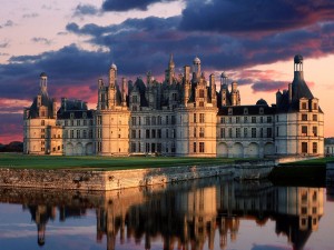
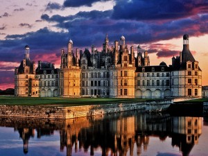
The next part of the assignment I did was the HDR image. I began with this image:
& ended up with this image:
I did this by first duplicating the background layer. Then I went to Edit > Adjustments > Shadows/Highlights. I changed both settings to 50%. Next I duplicated this layer & went to Edit > Adjustments > Desaturate. This took all the color out of the image. Then I changed the blending mode of this layer to Hard Light. Finally I duplicated the original background image one more time & moved this layer to the top. I gave this a Gaussian Blur & changed the blending mode to Soft Light. This brought back more of the color of the original image.
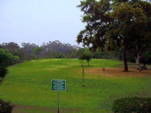
The third part of this assignment was to use the Content Aware tool to get rid of a distracting object in an image. For this one I started with an image of a park that had a distracting sign posted in it:
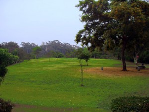
This is my finished version:
For this one I simply used the polygonal lasso tool to select the sign & post, then hit the delete key which allowed me to chose the content aware fill option. This got rid of my selection & filled it in with information from the surrounding area.
Finally the last part of this assignment was to create a sunny looking picture out of a cloudy day image.
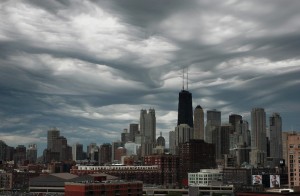
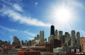
These were the original images I worked with:
& here is my final image:
The first thing I had to do was to place the layers. I first opened the image of the sunny sky, then moved the cityscape layer onto the other. Next I had to select the buildings. I used the polygonal lasso tool with a 1px feather to do this. Then I gave this layer a layer mask. This automatically filled in the unselected space a black fill, ultimately getting rid of the cloudy sky in that image. This just left the sunny sky as a background for the city. I had to move the background though so only sky was visible. I also used the Levels & Vibrance adjustments to lighten & add color to the buildings so it was more believable that it was in fact a sunny day when the photo was taken.

