Archive for September, 2011

VCT4600 In-Class Assignment 4

Tuesday, September 20th, 2011

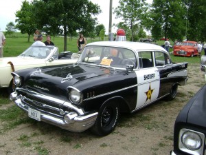
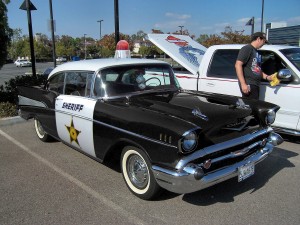
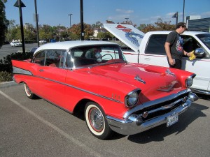
For this assignment I had to adjust one image of a red car to make it look like the police car from another image.  Here are the original images:

And here is my adjusted image:

There were a lot of steps I had to take in order to make it look like the police car of image 2.  The first thing I did was to change the car’s color from red to black.  I did this by making a rough selection of the car with the polygonal lasso tool, but avoiding the red detailing of the truck behind it.  Then I went to Image > Adjustments > Hue/Saturation.  I changed the settings from Master to Reds, then brought the Lightness down all the way to -100.  This changed all the red in the selection to black.  I also had to bring down the lightness of Magenta tones as well to get rid of all the red.  I wasn’t quite yet happy though with car color, as it was a bit more grey than black.  So while the car was still selected, I went to Image > Adjustments > Levels, & moved the left handle slightly to the right until I liked the tone of the blacks.

After I was got rid of all the red of the car, I moved on to taking elements from the original police car image & moving them to my own.  I started with the white door.  I selected it with the polygonal lasso tool, copied it, then pasted it into the image I was working on on a new layer.  Since it was backwards, I had to flip it, but before that I had to copy the word ‘sheriff’ from the door & paste it on a new layer so I could replace it later.  Once I flipped the door the right way, I used the Warp function to make the door fit to the new car.  After this I replaced the word ‘sheriff’ back on the door, & used the Perspective function to reverse the perspective.  I used layer masks & the brush tool to make slight corrections along both the door and word in order to blend them correctly.

The last thing I did was to select the police light from the top of the car & paste it as a new layer on my working image.  I used the rotate and scale tools to make the light the right size & angle, then again used a layer mask & brush tool to blend the bottom of the light against the top of the car.  When finished I flattened the entire image & saved it was a jpeg.
VCT4600 Project 2 Blog

Monday, September 19th, 2011

For this project, I’ve decided to create a poster for the book “The Little Prince.”  It’s a story of a little boy from a small planet that travels  to different planets to learn about life and love.  I’ve read the book more times than I can count & have seen the movie as well, but I still did some research into the book’s themes, symbols, and motifs.  This is some things that I’ve come across during my research:

The Stars

As a pilot, the narrator attaches importance to stars because he depends upon them for navigation. After the narrator meets the little prince, he finds the stars hold new meaning for him because he knows that the prince lives among them. The stars in The Little Prince also symbolize the far-off mystery of the heavens, the immensity of the universe, and at the end, the loneliness of the narrator’s life. The narrator’s final drawing, which accompanies his lament of his loneliness, is of a single star hovering over the desert landscape in which the prince fell. In this one image, the presence of the star both highlights the prince’s absence and suggests his lingering presence. The star is also a reminder of the large and densely populated universe beyond Earth that the prince recounted visiting.

—-

The backstory tells how Little Prince left his planet because he had grown disenchanted with his rose; she was boastful and did not seem to appreciate all he did for her. On his journey, though, The Little Prince encountered a number of small planets, each with a single inhabitant who represented some negative aspect of human nature: pride, greed, desire for power. When a self-important geographer told him that his rose was ephemeral — subject to quick disappearance — he experienced some regret about leaving his planet behind.

—-

The characters that I chose to portray on the poster were chosen for very specific reasons.

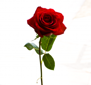
The rose, though not a main character, is one of the most important.  It is the Little Prince’s love for his rose that makes him want to explore as well as get back to his planet.

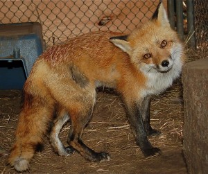
The fox is another important character in the book.  He is the one that teaches the Prince the most important lessons: responsibility, relationships, using your heart and understanding that the most important things in life aren’t visible or tangible.

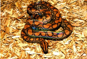
The snake is the most conniving character, but is the only one of the characters from Earth that offers the Prince a way home.

And finally the plane is meant to represent the narrator, an adult pilot that gets lost in the desert & befriends the Prince.  Both the Prince and the narrator learn from and teach each other.

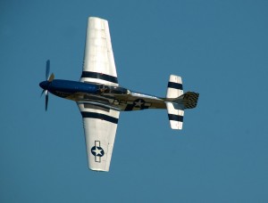
So here are the images that I’m going to work with for my poster:

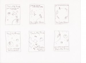
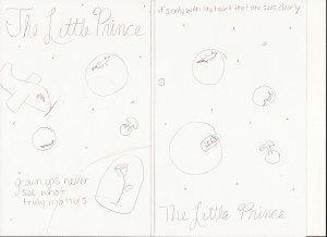
Here are the thumbnails that I’ve come up with:

VCT4600 In-Class Assignment 3

Tuesday, September 13th, 2011

Part 1

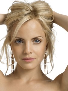
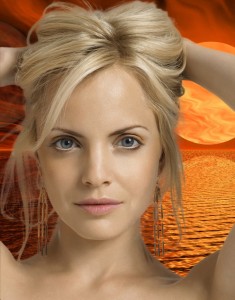
Original Images:

Composite Image:

The first thing I did for this part of the assignment was to make the image of the model a layer over the background layer.  Then I made a rough selection of the woman, & clicked the Refine Edge option at the top of the workspace.  I chose the On Layers option in order to view the selection over the new background.  Then I adjusted the radius slider to where I thought looked good, as well as checked the Smart Radius option.  I also smoothed the edge just a touch in order to make it look more natural, & finally I checked the Decontaminate Colors box and increased that slider.  Once I was satisfied with these settings, I hit OK then cropped the image down to size.

Part 2

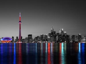
Adjusted Image:

For this part of the assignment I used adjustment masks to perform non-destructive adjustments to the given image.  I started by duplicating the original image.  I then created a channel mixer adjustment layer over the bottom layer & changed the settings to monochrome.  This made the bottom layer appear to be in grayscale.  I then created a layer mask over the top layer.  Using the polygonal lasso tool, I made a rough selection of the sky & buildings I wanted to make grayscale, then used the paint brush on the layer mask to paint out that part of the image.  I then went in with a smaller brush to touch up any places I wanted to look smoother.

Part 3

Panorama:

For this part, I simply went to File>Automate>Photomerge in Photoshop.  I then chose the 5 images to merge, & stuck with the automatic settings.  This created most of the panorama, but it left out 2 pieces on the right side of the image.  So I manually went in & added the last pieces to the panorama, & used the skew tool to adjust the perspective of the left out images to match that of the rest.  Finally I cropped down the image to make the image seen above.

VCT4600 In-Class Assignment 2

Tuesday, September 6th, 2011

Part 1

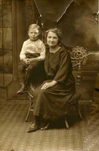
Original Image:

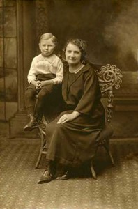
Corrected Image:

For this part of the assignment, I mainly used the clone stamp to get rid of the crease marks & tears.  I also used content-aware fill in areas where there were isolated tear marks.  I tried to use this feature to fix the bottom right corner of the image, but I couldn’t get it to give me a legitimate looking fix, so I once again used the clone stamp to correct the carpet & part of the wall.

Part 2

Original Image:

Corrected Image:

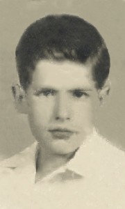
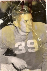
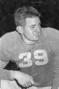
The main tool I used to correct this image was the content-aware fill.  I started by selecting and filling in small areas of his shirt, face, & background.  Then I could more around the image to get rid of some of the grain & damage.  I did use the clone stamp again in order to fill in the missing background of the image as well as the missing chunks of hair.  Finally, I used the spot healing brush to smooth out the image a little bit more & clean up any more significant spots that I could see.

Part 3

Original Image:

Corrected Image:

For this final part of the assignment, I first converted the whole image to grayscale in order to get rid of the yellow water damage.  From there I first used the spot healing tool to clean up the tear marks that I could, them I went back & forth between the clone stamp tool & content-aware fill to fix the rest of the marks on the image.


Skip to toolbar