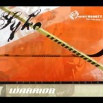
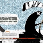
For the magazine spread I chose to advertise warrior a sports brand mainly for hockey and lacrosse. I found a couple of ads online here they are.
Images/Thumbs/Sketches


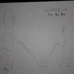
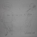
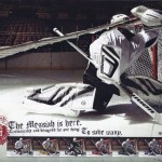

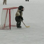

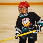
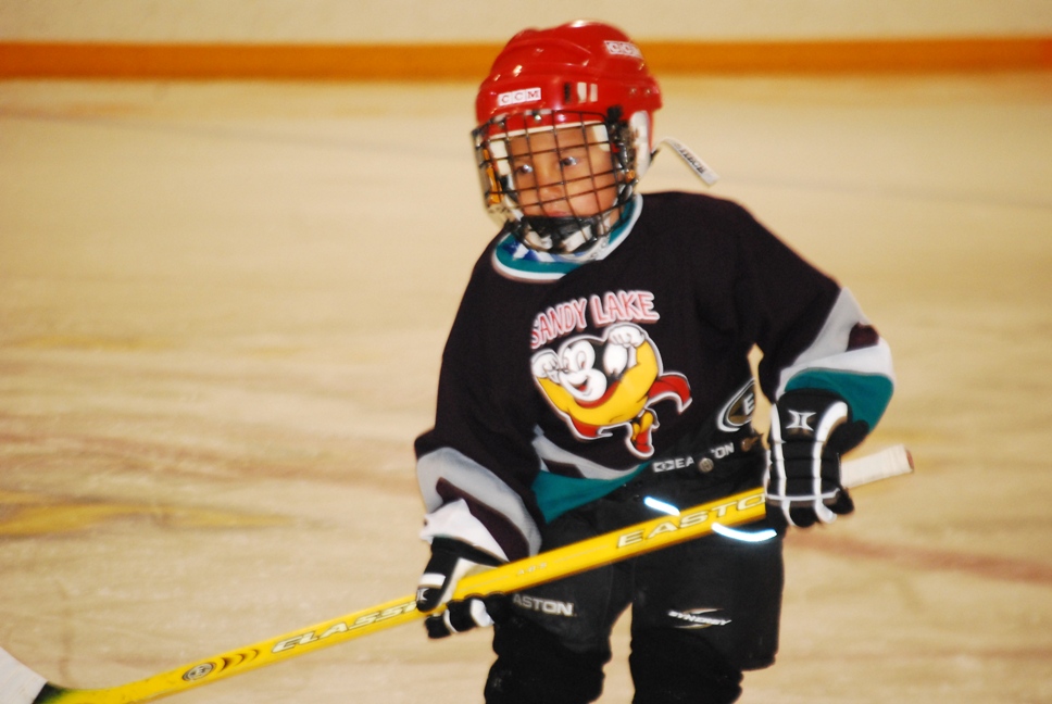
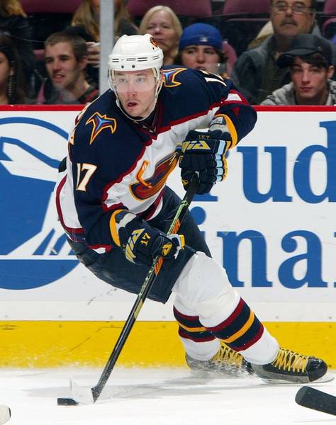
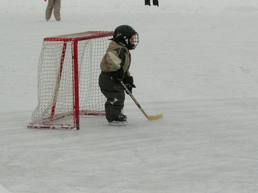
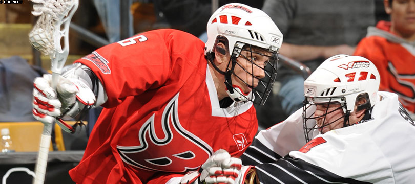
I wanted to try and incorporate both of the sports but if I don’t I will highlight just the one. My first idea was to just have a professional hockey and lacrosse player that use their gear and have them standing on the ice and on a lacrosse field with text saying “on the ice or field”. My second idea was to have an image of a professional hockey player and a little kid not using their brand and have text saying “made for the pros”. In many of their ads and even their website warrior tends to use a lot of illustrations which I may try and incorporate but I think the two concepts I have should be appealing and show the product well. As for colors warrior doesn’t really have a specific color they like to use they are pretty out their as far as what colors they do use after looking at their website they tend to use colors that grab your attention.
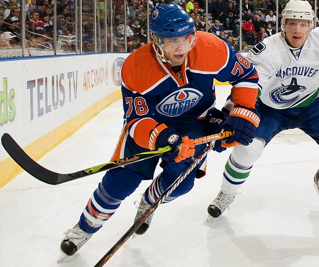
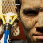
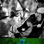
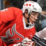
Here are some images I might use: