In Class Assignment 6

Part 1: Adjusting the white balance using Camera Raw


Part 2: Adjusting the exposure of an image using Camera Raw


Part 3: Adding impact to an image using Camera Raw


Part 4: Soften an image using Camera Raw


Part 4: Fix backlit images using Camera Raw


Part 5: Adding contrast to images using Camera Raw

Part 5: Cropping images using Camera Raw


Part 6: Straightening images using Camera Raw

Here are what the images look like after using Camera Raw to fix them.


Posted in VCT 4600 | Leave a comment

In Class Assignment 5

HDR

Before                                                                           After

For the HDR image I did on my own I basically followed the steps from the tutorial but I changed some of the values for instance I went a little brighter on the highlights then the shadows and I also didn’t go with as high for a value on the gaussian blur.  I think it brought out more detail in the tree itself.

Content Aware

Before                                                                       After

For the content aware part I took an image of beach volleyball players.  I took out the player just to the right of the guy about to spike the ball as well as the three people closer tot the water.  I also eliminated the person in the far background walking with the other women.

Before                                                                        After

For the make it sunny I again followed the steps similar to the tutorial.  I immediately brightened the image by using the curves tool.  I then quick selected the water and put a photo filter over it.  After that I quick selected the sky which was completely cloudy and used the same gradient from the tutorial.  I then put in some white fluffy clouds and copied them and flipped vertically to reflect in the water.  Overall I think it turned out pretty good this was the most difficult of the three but I’m happy with the results.

Posted in VCT 4600 | Leave a comment

Project 4 – Cd Insert

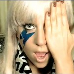
The song I decided to use for this project is Lady Gaga’s poker face.

Mum mum mum mah
Mum mum mum mah

I wanna hold em’ like they do in Texas please
Fold em’ let em’ hit me raise it baby stay with me (I love it)
Luck and intuition play the cards with Spades to start
And after he’s been hooked I’ll play the one that’s on his heart

Oh, oh, oh, oh, ohhhh, oh-oh-e-oh-oh-oh
I’ll get him hot, show him what I’ve got
Oh, oh, oh, oh, ohhhh, oh-oh-e-oh-oh-oh,
I’ll get him hot, show him what I’ve got

[Chorus:]
Can’t read my,
Can’t read my
No he can’t read my poker face
(she’s got to love nobody)
Can’t read my
Can’t read my
No he can’t read my poker face
(she’s got to love nobody)

P-p-p-poker face, p-p-poker face
(Mum mum mum mah)
P-p-p-poker face, p-p-poker face
(Mum mum mum mah)

I wanna roll with him a hard pair we will be
A little gambling is fun when you’re with me I love it)
Russian Roulette is not the same without a gun
And baby when it’s love if its not rough it isn’t fun, fun
Oh, oh, oh, oh, ohhhh, oh-oh-e-oh-oh-oh
I’ll get him hot, show him what I’ve got
Oh, oh, oh, oh, ohhhh, oh-oh-e-oh-oh-oh,
I’ll get him hot, show him what I’ve got

[Chorus]

P-p-p-poker face, p-p-poker face
(Mum mum mum mah)
P-p-p-poker face, p-p-poker face
(Mum mum mum mah)

I won’t tell you that I love you
Kiss or hug you
Cause I’m bluffin’ with my muffin
I’m not lying I’m just stunnin’ with my love-glue-gunning
Just like a chick in the casino
Take your bank before I pay you out
I promise this, promise this
Check this hand cause I’m marvelous

[Chorus x3]

[x3]
P-p-p-poker face, p-p-poker face
(Mum mum mum mah)
P-p-p-poker face, p-p-poker face
(Mum mum mum mah)

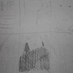
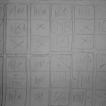
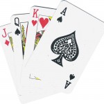
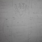
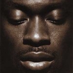
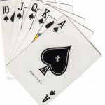
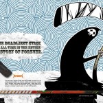
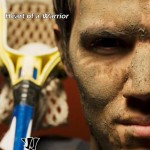
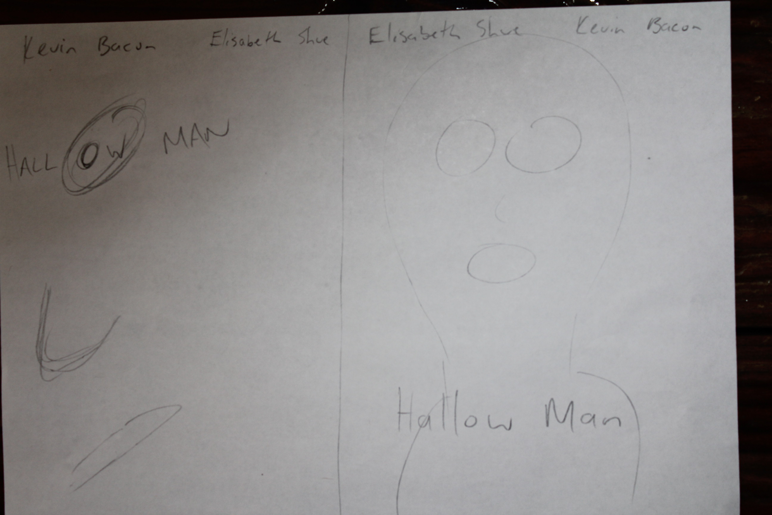
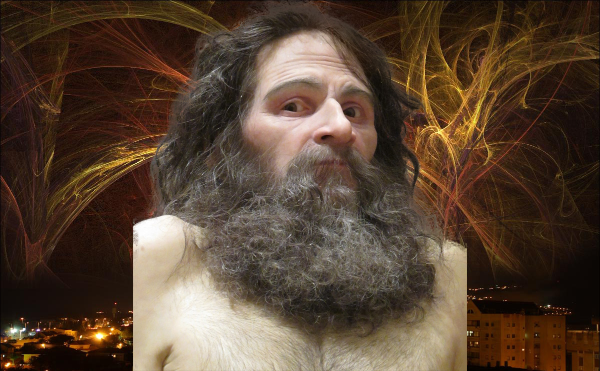
I did do some research on what lady gagas interpretation and meanings behind the song were and she had mentioned something about the guys she had had relationships with.  I want to take an approach of her playing people like they are a deck of cards.  My idea is to have a picture of her on the front cover and then scattered throughout the rest of the insert I will have images of guys with a card overlayed on their face and on the back have a pair of hands holding the cards with the faces on them instead of what is normally seen.  My second Idea is to tell a story of a girl being mysterious and not giving this guy a good read on her.

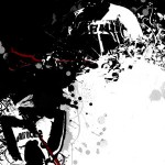
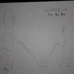
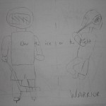
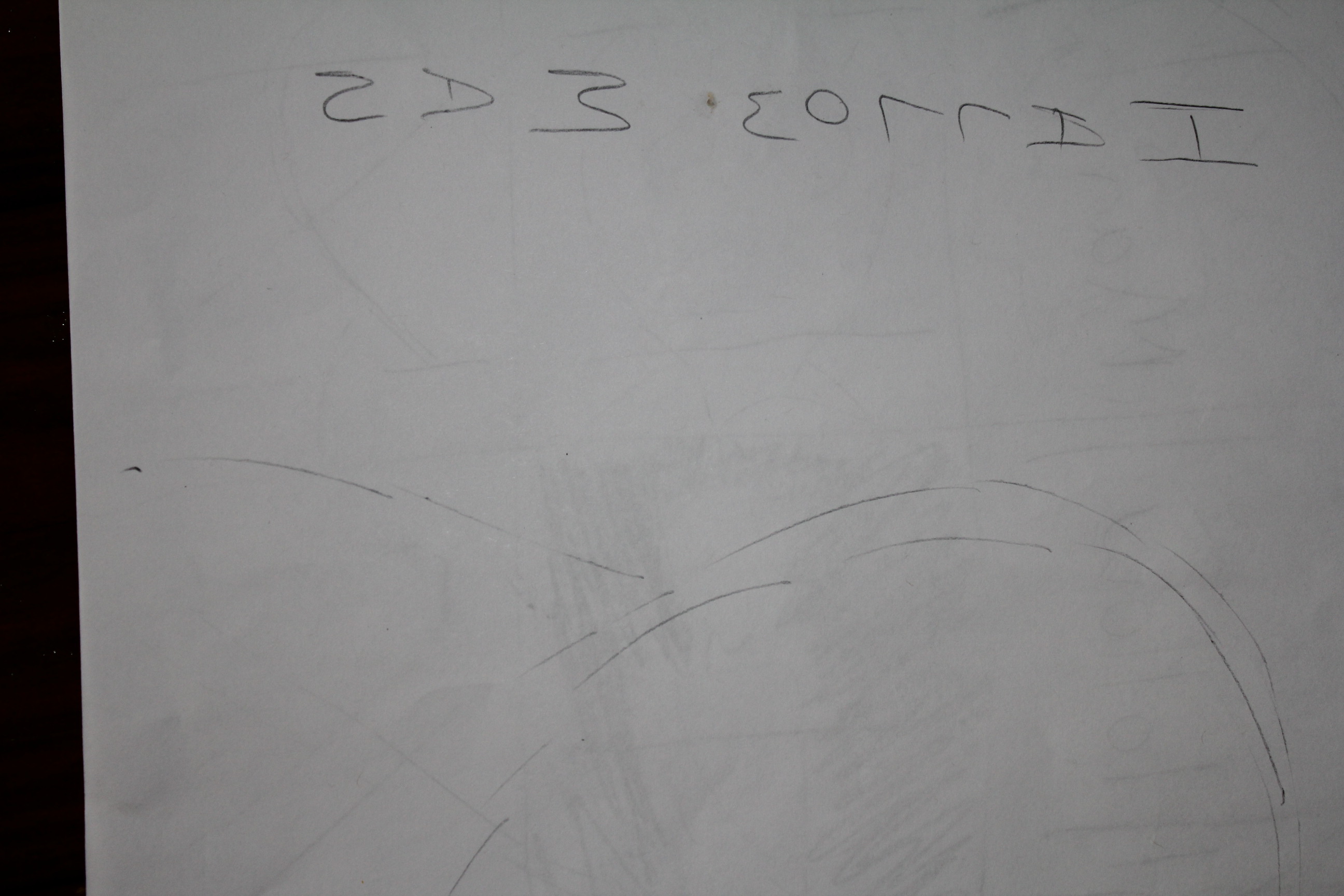
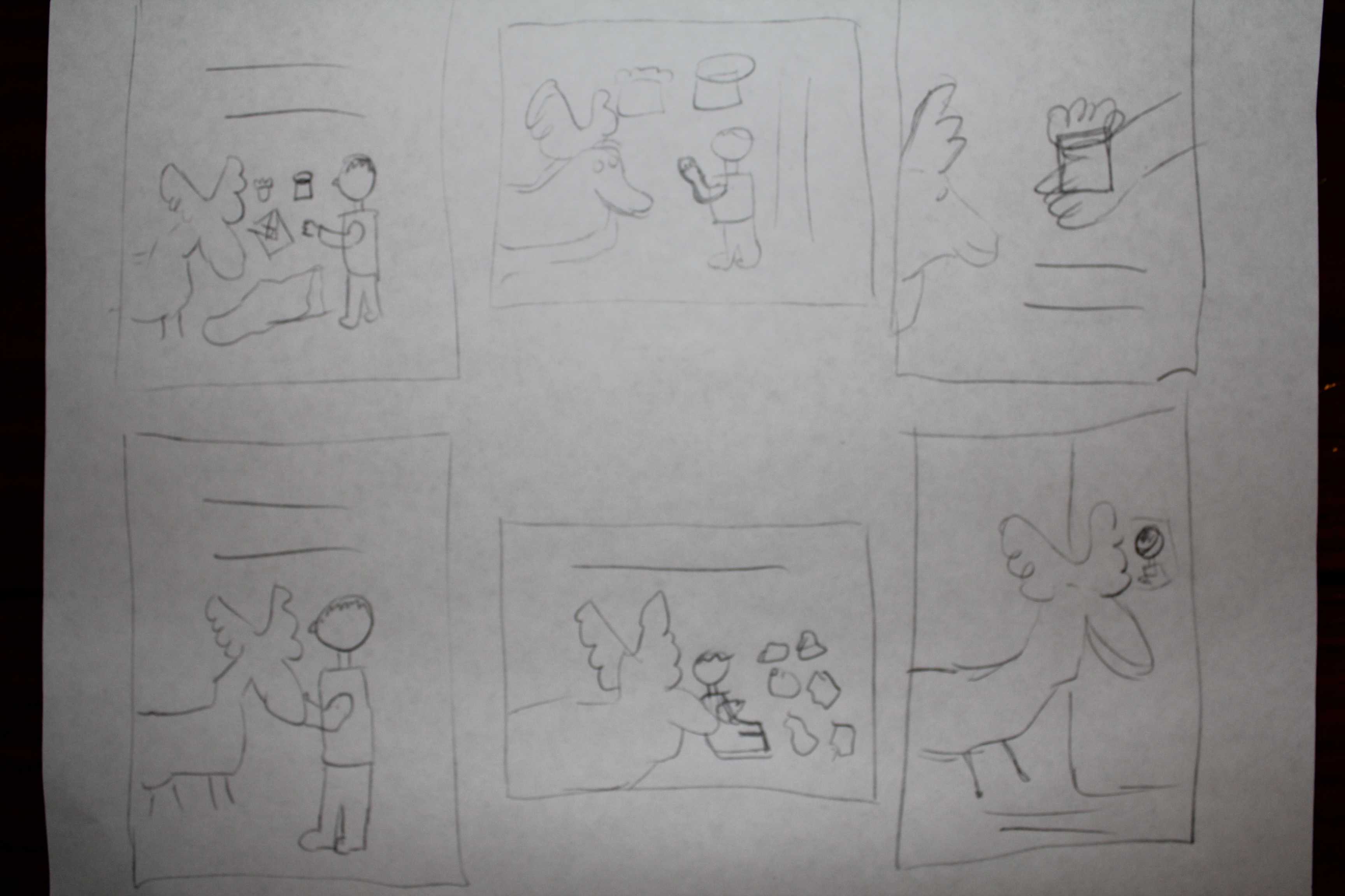
Here are my sketches and images I might use.


Posted in VCT 4600 | Leave a comment

Project 3 – Magazine Ad

For the magazine spread I chose to advertise warrior a sports brand mainly for hockey and lacrosse.  I found a couple of ads online here they are.

Images/Thumbs/Sketches

I wanted to try and incorporate both of the sports but if I don’t I will highlight just the one.  My first idea was to just have a professional hockey and lacrosse player that use their gear and have them standing on the ice and on a lacrosse field with text saying “on the ice or field”.  My second idea was to have an image of a professional hockey player and a little kid not using their brand and have text saying “made for the pros”.  In many of their ads and even their website warrior tends to use a lot of illustrations which I may try and incorporate but I think the two concepts I have should be appealing and show the product well.  As for colors warrior doesn’t really have a specific color they like to use they are pretty out their as far as what colors they do use after looking at their website they tend to use colors that grab your attention.

Here are some images I might use:

Posted in VCT 4600 | Leave a comment

In Class Assignment 4

For this assignment I took the cop car quick selected it rotated it vertically put it in a new layer in the first photo.  I then selected the red car using the quick selection tool changed it to black and white.  Took the eraser and went over the chrome to bring back the shine as well as inside the car to bring the green in the background as well as the interior color back.  I then selected the sheriff door and license plates rotated them and put them on the new cop car door.  The text was backwards so I went back to the original cop car selected the text so it was the proper way pasted it in the new cop car and used the skew tool to line text up properly where it should be.  I also took the light off the top of the original cop car and placed it on top of the new one using the quick selection tool.

Originals

Final Piece

Posted in VCT 4600 | Leave a comment

Project 2 – Movie Poster/DVD Cover

The movie I have chosen to do for my movie poster and DVD cover is “Hallow Man”.  It stars Kevin Bacon and Elisabeth Shue.  The basic overview of the movie is that there are a few scientists that believe they have found out how to make someone invisible.  One of the scientists played by Kevin Bacon turns himself invisible and starts to go crazy with his new powers and his colleagues try to intervene but this just makes him more angry and there is a battle between them.  The posters and covers for the movie that I have found are predominantly darker colored a lot of blacks and blues with white text.  I think these colors work well for this movie because it is a darker more suspenseful type of film.  I thought that this could be a cool movie to pick because I would be able to use a lot of the tools and elements in Photoshop to help create my final poster.  One of the movie covers I found has both Kevin Bacon and Elisabeth Shue on the front sort of facing off but most of the other things I found have just a single person who cannot be scene or for example on the one can be seen through the water running over his body.  My initial thoughts on what I would like to do are just have the single subject and try and create the invisible man.  I’m not sure if I’d like to have anything around his face or body showing that he is there or maybe just a silhouette of a person.  I want to keep the same feel that these other posters and DVD covers have because I think they best represent the feel of the movie as being mysterious and kind of creepy.  So I think I will stick to a darker color palette when I come up with my idea.

Research from:

http://www.imdb.com/title/tt0164052/

Images

Right now I just have this single image, most of my ideas revolve around one subject and I will use photoshop to put some effects in the background if needed.

Thumbs/Sketchs

Research

http://www.timefordvd.com/SR_HollowMan.html


Posted in VCT 4600 | Leave a comment

In Class Assignment #3

Part 1

For part one I used the quick selection tool to outline the man, then I went into the refine edge box and adjusted the radius to make sure it selected all of the hair.  I also selected the smart radius box.

Part 2

For part two I went into the adjustments tab selected black and white.  I then took the quick selection tool and marked out a mask.  Once I had the areas I wanted to bring the color back to I took the eraser tool and brought back color to the image.

Part 3

For part three I brought the images into bridge selected them and went to tools, photoshop, photomerge.  This put the images together although there was one out of place I took that image lined it up with the rest and used the spot healer to get the line out of the image.

Posted in VCT 4600 | Leave a comment

Project 1 – Children’s Story Poster

The book I chose to do for project one is called “If you Give a Moose a Muffin” by Laura Joffe Numeroff which is illustrated by Felicia Bond.  The story is about a young boy and a moose. It starts off by a boy giving a moose a muffin and then the moose wanting jam with his muffin.  After he is finished with the muffin he wants another and another until they are eventually all gone.  The moose wants more so the boy gets ready to go to the store to get more ingredients to make more muffins, this leads to the moose wanting different things throughout the book until it eventually ends up to him wanting a muffin again.

From these sources they say that the moral of the story is to “Keep plenty of muffin mix and blackberry jam in your cupboard. You never know who may drop by” and that children will be able to learn the concept of cause and effect.  I think I would have to agree with the cause and effect.  It shows that by the boy giving the moose everything he wanted he kept pushing for more and the boy continued to fulfill the moose’s requests.  I personally have two ways to look at this.  First I think that the moose was being a little greedy as he kept asking for more and more things but it is a children’s book so I don’t think they are trying to teach kids to be greedy like the moose so the other way I viewed this is that it is nice to share and help people out when they need something.

After looking at the information I found I think I’m going to take the approach and try and show that sharing and being nice can really go a long way.  I want to take all the aspects and things named in the book and try and portray this in a more realistic way so I’m not sure if I’m going to use a moose or maybe take two people and show it in a more realistic manner.

For the one idea I have I took the things that the boy gave the moose and found images of them online a jar of jam, white bed sheets, a moose, and a muffin.  I like these images because I think they will work well together because they go with the warm feeling that the book portrayed but the only thing is I’m going to have to do a lot of work with them to get the single object out that I want to use.  For my other idea i was thinking about just taking two people and showing one of them lending a hand like the boy did with the moose by giving him the things that he had asked for.  I think I could maybe be more creative with this idea and show the sharing in a different way then just with the exact things from the book.

Research

http://www.librarything.com/work/29258

http://www.carolhurst.com/titles/ifyougiveamoose.html

Thumbnails

Sketches

These are the two concepts I finally came up with the one is of a hand and a muffin reaching out to a moose.  For this idea I just wanted to take the three main characters/objects out of the book and put some text saying sharing is caring because I feel this is what it trying to portray among some other things.  The second idea I have is to have the boy and the moose at a table and to put in more of the things the moose asks for throughout the story and put text saying to be grateful for what you have because I think this is also the lesson that is trying to be taught in this children’s story.  I thought about it more and after looking through the illustrations of the book I think I’m going to try and give it a feel of a painting because that is how the illustrations are drawn.  I want to stick with the fall/warmer colors that are used in the book reds, greens, browns, yellows.

I ended up using a couple clip art photos I found on the Internet, I thought about using real images but I couldn’t find a photo of a moose that fit what I wanted to do.  I ended up taking the images into Photoshop and used the brush tool to paint the images to the colors I wanted.  There wasn’t a whole lot that needed to be done to the images besides a little resizing and addition of color.  I then took color samples from the books images and painted a brownish green background.  I also found an image of a blanket and used the pen tool to trace it out to give the look of the other clip art images.  I added the text be grateful for what you have because after reading over the book again I think that the moose in the book was always wanting more and more from the little boy instead of just being happy with the muffin that he had given him in the first place. I also added some drop shadow to the moose and child as well as the text.

KreloveChildrensPoster2­­

Posted in VCT 4600 | Leave a comment

Assignment 1 – Part 1

For the first part of the assignment I took the ruler tool and drew a line across where I thought the horizon should be leveling out the image and making the boat look flat in the water. I hit the straighten button and PS did the rest.

Original

Edited

Posted in VCT 4600 | 1 Comment

Assignment 1 – Part 4

In the final part of assignment 1 I adjusted a few things in camera raw.  The first was the exposure, the original seemed to be a little over exposed so I changed that a little.  I then went on and put the blacks up a bit as well as putting the vibrance up.  I then sharpened the image slightly.  I again used the quick selection and lasso tool to separate the dogs head from the background saved it as a smart object rotated it slightly and put it into a new background. 

Edited Image

Final Image

Posted in VCT 4600 | Leave a comment