Architectural Art

Posted in Art 1010, Summer 2011 on August 4th, 2011 by Tyler

Lighting Architecture


As a student studying architecture, there is a lot more to the major than just buildings. I have done more design work with architecture than I have in a lot of the art focused classes I have taken. I absolutely love art. For my theory class I looked into the art of architectural lighting design. For this assignment we were asked to make a video. And my video was all about lighting and how it is used as a visual aesthetic in everyday life. I related the pictures to a song I found by Deadmau5 called Strobe, I did a lot with how I related the elements I used in the video to each other. Everything relates back to lights in some way. I have the pictures moving fast to represent a strobe light, which is the name of the song I used. Creating a minute and a half long video was complicated with how many pictures I wanted to use in it. I had found photos using Google images and a video clip of the Eifel tower I recorded while I was visiting. I think the video represented the assignment and the subject very well.


Art at the Work Place

Posted in Art 1010, Summer 2011 on August 4th, 2011 by Tyler

When I started working this summer at an architecture firm, I was expecting to sit a computer all day drawing lines into the computer. I was wrong, I walked in and the first thing I heard was, “Does anyone know how to use PhotoShop,” my hand shot up, and before I knew it the words “I do” came out of my mouth. I soon found out that I should have kept it shut. I used PhotoShop everyday for six weeks, using it to manipulate existing condition photos and making them into proposed bids for this project. The end of the six weeks hit and I had photo shopped over 400 pictures of bank ATMs. In my eyes it was work, but as I look back at it now I realize I was making art, a different kind, but non the less, art. I was using what I had learned through my art background in the field of architecture. Even though architecture is the art of buildings and designs, its still hard for me to imagine ATMs as art.

My last art project for work was a flyer for my boss. I worked with him to get exactly what he was looking for. Every time he saw my progress he would laugh and say he loved it and that everyone on the committee for this event is going to love it. I honestly hope they do, because I worked hard on it. Using the tools in Illustrator I basically redrew the rollercoaster, the ferris wheel, and the pirate ship as solid objects with detail overlaid on top. I can honestly say that I have had a great time working for this architecture firm. The tasks are different every day I walk in the door. I’m sad to say that my last day is tomorrow.

Vibrant, Lines.

Posted in Art 1010, Summer 2011 on July 29th, 2011 by Tyler

The painting by Georgia O’Keeffe, Blue and Green Music, was painted in 1921. The painting was done in oils on canvas and represents her representation of music. The painting is very dark with vibrant blues and greens. The lighting in the painting is centered while the corners of the painting are shadowed and clean. The center of the painting is dynamically designed to hold the most interesting part of the painting while crating a focal point in the painting with its sharp lines and beautiful colors. There is a sharp dark line running through the painting from the top to the bottom separating the bright detail in the center. The organization in the painting is very unique to the straight lines mixed with the flowing, curving lines representing the musical flow that is represented in the painting.

Memory of Persistance

Posted in Art 1010, Summer 2011 on July 29th, 2011 by Tyler

The painting The Persistence of Memory was painted by Salvador Dali in 1931. The painting is painted with oils and the detail is very crisp and clear. The paintings represents the meaning of softness and hardness in the way the clocks in the painting are melting. Taking something that is hard in context and manipulating it into something that represents a different texture or feeling. The lines throughout the painting are a mixture of everything that is going on. There are straight lines creating the hard motions of surfaces, curved lines making up the clocks, wavy lines representing the melting of the clocks, and lines making up the scene. The lighting in the painting is very direct in what it is illuminating, whether it be the horizon or a detail that is needing to be addressed.

J.M.W. Turner (Joseph Mallord William Turner)

Posted in Art 1010, Summer 2011 on July 22nd, 2011 by Tyler

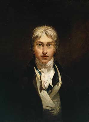
Joseph Mallord William Turner was an English romantic landscape painter from 1775 to 1851. He was a painter who painted in primarily oil and watercolor. Turner was knows as “the painter of light” and was one of the greatest masters of British watercolor landscape paintings. The movement of painting turner did was a romantic preface to impressionism and I believe it shows quite well in a number of his paintings.

Turner had an interesting early life, his father William Turner, was a barber and wig maker. His mother, Mary Marshall, was becoming increasingly mentally unstable, due to the early death of her youngest daughter Mary Ann Turner. When Joseph was 10 he went to stay with an uncle where he then expressed his interest in art. Then at the age of 14 he entered the Royal Academy of Art School and started his studies. Turner showed a keen interest in architecture, but was advised by Architect, Thomas Hardwick to continue with painting. At the age of 15 his first watercolor painting was accepted for the summer 1790 exhibition after only a year studying at the Royal Academy. Six years later, at the age of 21 he exhibited his first oil painting Fishermen at Sea and there after exhibited at the Academy every year for the rest of his life.

Turner was not famous at all during his time, because he did not paint the modern paintings of his time. Usually people painted the super realistic paintings of men or woman. So when people saw his chicken scratch looking paintings, they didn’t consider it art. Turner’s paintings didn’t become famous until the 20th century.

Turner had a unique style to his paintings; his paintings are very calm while presenting an eerie feeling to its observer. His paintings make you feel like he was painting a struggle of some kind, presenting a hardship for its objects within.


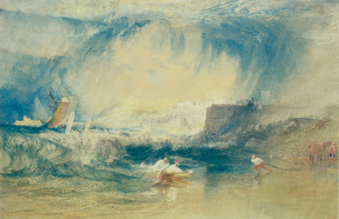
The painting I chose is called Lyme-Regis, Dorsetshire, England. The painting was painted with watercolor and for darker accents an ink pen. The painting displays a scene that to me looks like a very large storm or waves about to engulf a village of people who seem to be working on the beach, not running or concerned. As I examine it closer I guess what looks like a storm or wave could just be dark clouds not proposing a threat.

The painting influenced me in a more artistic way, being consumed by the lines curving throughout the entire painting. The colors being muted and running together create a messier look while at the same time very neat and sophisticated. The painting as a whole, though being hard to see clearly, presents the life of that time and how people lived their lives making this painting inspirational in the way the world and its people have changed.


The Critiques

Posted in Art 1010, Summer 2011 on July 22nd, 2011 by Tyler

Critiques on SecondLife are something to get use to, but more interesting than anything else. I was actually impressed with how easy it was to have the pictures of our work uploaded into the class art gallery. I haven’t explored enough through second life to know how do to 1/4th of what it is capable of.

I really enjoyed seeing everyone’s work, getting to view other styles, colors and how other people view art is something I really enjoy doing. With the many different options of artists to choose from I believe we all chose a work of art that meant something to us, whether reflecting something we enjoy doing or something reflecting our family and friends. Everyone did an amazing job reflecting their work back to the masterpieces they had chosen. Doing this by using colors, figures, or scenes from the original paintings and making it our own creation. Great job guys!

The critique process, like ever other critique I have been a part of, always freak me out. Anxiety always gets me for some reason. I figured since I wasn’t technically there speaking it would be different, but it still plays its toll. Being asked questions while typing and reading another question stresses me out to the where I’m misspelling words and forgetting thoughts, haha it’s a nightmare. I’m trying my best to get through it, I mean I should be use to speaking in front of people, but every time I start talking it feels like the first time. SecondLife is just another hurdle I have to jump over.

Over all I fell like I will be more prepared for the final critique and won’t be dreading it so bad. SecondLife has opened up an entirely new way for people to communicate and interact.


Water Lilies

Posted in Art 1010, Summer 2011 on July 15th, 2011 by Tyler

Monet’s painting, Water Lily Pond was one of the last he
ever painted, due to health issues he was having. This painting was finished in
1926 and is one of 12. This painting is unique by the way it is painted, the
colors, the lighting, and the technique he used to paint it. While looking at
this painting you can’t help but notice the figure of bold colors in the center
of the painting. The dynamic center plays complements to the water lilies in
the painting to the right of center. Observing more closely I realize that Monet
is painting just on the edge of the water, noticing the emphasis of a grassy
line at the bottoms edge across the painting. There is a strong focal point in
this painting, the water lilies that Monet has painted are the only part of the
painting that is in focus. The surprising elements of this painting are that of
the thick brush strokes of oil paints on this over sized canvas. This painting
has a very strong sense of rhythm of color and of the entire scene.

Claude Monet

Posted in Art 1010, Summer 2011 on July 15th, 2011 by Tyler

Claude Monet, born Claude Oscar Monet on November 14, 1840 in Paris France to his parents Claude—Adolphe and Louise—Justine Aubree. Monet’s father was a grocery store owner and his mother was a singer. Monet was the younger of two sons; therefore his father hoped that he would continue the family grocer business. Monet declared his love of art and his hopes of living life as an artist and his father allowed his wishes.

Monet began studying at the age of eleven at the Le Havre school of the arts and began selling charcoal paintings to the locals in the area. After a few years Monet met Eugene Boudin, who taught him how to master oil paints and how to use various techniques in his paintings.

Monet was never one to follow trends, while young painters were copying the works of old great artists; Monet was over by a window painting the view he saw. This caused Monet to stand out to other painters, bringing him closer to him and many becoming friends.

Being the founder of the Impressionist Movement in France, Monet consistently painted in that style. Impression: Sunrise was the painting Monet used to start the movement and what the movement was named after. His more famous works of art are including Impression: Sunrise are, his Water lilies series which he completed before his death and his Japanese Bridge paintings that he painted various views of.


Jan van Eyck: The Arnolfini Marriage

Posted in Art 1010, Summer 2011 on July 8th, 2011 by Tyler

Jan van Eyck’s painting The Arnolfini Marriage is interesting the way that the the elements of the painting such as the husband and his wife along with the dog on the floor represent the unity in the painting. Other elements such as the prayer bench in the back of the room and the bed to the right are also representing unity as a whole. The mirror on the back wall is represents visual weight in the way it is centered in the painting. If you take a closer look into the mirror you will notice that the husband and his wife’s reflections are visible in it.


http://www.artcyclopedia.com/artists/eyck_jan_van.html

Sistine Chapel

Posted in Art 1010, Summer 2011 on July 8th, 2011 by Tyler

The way the lighting in this painting is all depicted towards the middle, creating the focal point of first glance to the valley below. At second glance your eyes start to move out ward showing the struggle that seems to be happening. There is a lot of gradation in the colors that also draw your eye to the center. When you see the corners you notice asymmetrical balance in the way the table and the dynamic groups of people are placed and the events of what they are doing.

Hello world!

Posted in Art 1010, Summer 2011 on June 29th, 2011 by Tyler

Welcome to blogs.bgsu.edu by COBL. This is your first post. Edit or delete it, then start blogging!

Skip to toolbar