Arts Extravaganza was an incredible event. I would rate it a 10 out of 10. It was an amazing mix of every single media offered at the school all in the same building. You could buy art get your picture taken, dance, or create your own personal one of a kind shirt for $15, which I ended up doing. There were jugglers and glass blowing demonstrations. It was amazing to see how what you were buying was made. They even had gift-wrapping for people who were buying holiday gifts for family and friends. There was an endless amount of stuff to do with the galleries full as well as the rest of the building. I just wish that it had been a longer event.
ArtsXpose #3
Albert Hearing was an opera about a boy who is awarded for being genuine and pure. He lives by his mother’s rules and works his youth away for her in the family owned market. He is insulted by the award, saying it made him realize how he was wasting away the best years of his life doing nothing but working. It was a good opera and the story line was easy for everyone to relate to. At the same time though it was very hard to understand the story because of the entirety of it being sung. Overall I would rate it a 4, mainly because it was hard to understand and follow. It wasn’t very stimulating to watch in the second scene, it was long dragged out. The ending was spectacular though.
ArtsXpose #2
The Film festival showed several different short independent films. The first one was a behind the scenes of Willie Wanka and the Chocolate Factory, it was the oompa loompas. The one that stood out the most though was one where a guy paid another guy to shoot him so that he would have a scar. He grew up in the suburbs with a good life and kept talking about how people oppress him because of his scars and that he feels like the world puts him down. It was interesting but at the same time the videos kept going. I really just found myself wanting the festival to end. The shorts were not very interesting to me and while some had a profound meaning, they weren’t able to catch my attention effectively enough to have me really be interested. I would rate the film festival a 5 out of 10. Some of the videos were very compelling but many weren’t effective in what they were trying to relay.
ArtsXpose #1
Raised in Captivity was a play based around a man and everyone around him was very mentally… not all there. Sebastian the main character, and his sister, Bernadette, and brother in law, Kip, are the main characters. There is also a man in jail that Sebastian has fallen for but never met. They are constantly writing each other back and forth until the day he tells Sebastian he will never write him back again for his sake. He says that Sebastian shouldn’t love him and that it’s for his own good. Bernadette starts out as a very emotionally unstable woman who can’t take the death of her mother but at the same time is “happy” about it. She is very uncomfortable with her weight and is always complaining. Kip in unhappy with his job of dental hygiene. He can’t stand the way his life is going, and over night decides he wants to paint. Yet he only paints with white paint.
I loved this event, the acting was spectacular the drama was so real and the selections of attire and props were fitting to the situations as they progressed. The emotions were so real I felt as though I was in the play. The story line was drama in humor form, and incredibly well written. What most impressed me was the acting done. Overall I would rate this event a 10. The play was incredibly moving and well thought out to the smallest detail.
Image essay #10
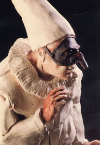
Tony Parillo’s sculpture Theatrics is a man in a pure white jester outfit with a black mask with a long nose and a white dunce hat. It is interesting considering jesters normally wear a lot of colors. The white contradicts the black mask with a long nose that to me represents lies and hiding behind them. The white outfit shows innocence and humor, but no humor is entirely innocent. All good comedians are smart and use their comedy to more easily speak the truth to people in a way they will accept it.
Image essay #9
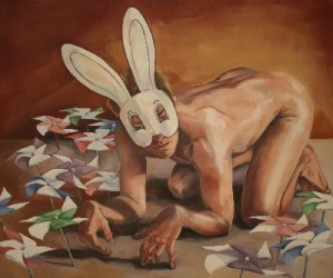
Bunny Boy by David Folk makes me very uncomfortable. The man naked bending over looking at me makes me feel as though I just walked in on something I really wasn’t supposed to see. Him in his bunny mask surrounded by pinwheels, and it makes me think of an awkward Easter. I feel as though he should be on the grass outside though, the fact that he looks as though he is inside makes me feel even more like I shouldn’t be seeing what is going on. It is like some foreign taboo of seduction, involving animals and people as one.
Image essay #8
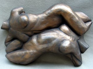
Complementary by Michael Alfano shows two woman figures intertwined and fitting together perfectly. I have always felt as though peoples body’s as well as their personalities should fit together like a couple of puzzle pieces. In this case it is two woman, but love comes in all forms. The most compatible relationships that I have seen have been complimentary. Looking around I feel as though everything is collaged, overlapping, and placed in certain places for a reason like puzzle pieces. Everything happens for a reason we are all made to compliment each other and to be different. Just like plants were made to create oxygen for people and people were made to create carbon dioxide for plants.
Image essay #7
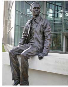
The Neil Armstrong sculpture by Chas Fagan is in his old school Purdue along with moon shoe prints, symbolic of his accomplishments. It shows him in his old uniform at the age he was while attending the school. His right hand is on a stack of books and looks as though he is ready to jump of the ledge and head to class. The detail in the face and clothes is incredible as well as his expression. It is a wonderful addition to the campus in honor of it’s alumni who just happened to be the first man to land on the moon.
Image essay #6
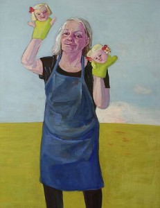
Lena Cronqvist’s self portrait with hand puppets and cloud is a very strange painting. There is little color, though the colors that there are in the painting are vibrant. The detail on the face and expression are phenomenal. I don’t think that the painting is as good as it can be though. The juxtaposition of the figure in the center could be more interesting as well as the background. The background just to me doesn’t show the skill of the artist, as if she rushed to finish the painting.
Blog Assignment #3
1. I believe that place defines us. Depending on where we are we act differently. Such as if we are in a gallery, or at a movie theater, we are more quiet. If we are at a football game, or some other sports event, we get very loud.
2. Richard Serra, was inspired by old boats and docks, man made. Sally Mann, was inspired by the out doors and the south, forests and nature. Margaret Kilgallen and Barry McGee, were both inspired by the city and things found on the streets.
3. I feel most connected to Sally Mann, while she is a photographer and my major is 3D i still find the human figure to be captivating in real life. I never found poses as pleasing aesthetically as people in real life.
4. When i was younger i would make tents in my bedroom out of pillows, chairs, and my baby blanket. It made the light shine through dimmed and patterned. I felt safe there.
In my Aunt and Uncle’s house I had to sleep on the floor in the living room. I always felt so scared there. Above the door was a fake spider in a wed made of metal, and on the wall there was a picture of this 80’s musician with all his makeup and big hair.
In my brothers bedroom I felt gross. He never cleaned his room and would eat in there and it always smelled either really bad, or like way too much axe.
In my nanny’s room i always felt safe. The sheets always smelled like her hair and her bed was the perfect height where i could hide under it when we played hide and seek. The problem was she always knew where to find me.
I used to hide out in my closet when I was upset or when my parents and my brother were fighting. I felt safe, like nothing could sneak up on me and I was safe.
5. Under my blanket tent the light would shine through it and it would turn the whole inside of the tent pink. It was always so soft and had a waffle pattern so the light took on the same pattern. I would hide inside my tent with my stuffed animals and I would play house with them. While the light wasn’t bright it was happy and warm.
—
1. I feel like stories change over time, like in the game telephone. But one story that I believe would get passed down from generation to generation is the story of Obama becoming president, and hopefully the turn around he may create for us.
2. The stories that are told over time are usually the stories of rare occurrences. Stories that give people hope or teach some lesson that is important for kids to learn when they are little. Stories that change the world or even just a persons mind on something. But stories that are something that everyone has to go through.
3. A journal or a sketchbook to me is a collaboration of a bunch of one persons ideas.I would definitely think that it is a work of art, because a work of art isn’t just the final piece, it’s the whole process. It’s the idea and then making that idea a reality.
4. I wish we had a dog. Every time I ask my mom for any kind of pet she gets really angry with me. My dad says she doesn’t but I can tell. She has this terrified look in her eyes at first, then it turns to mad and her eyebrows squish together.
When I was younger I always wanted a dog, or any pet really. My mom had never had pets before so every time I asked her she would look scared because she would think about the worst possible sinario and get mad and say, “NO!” but maybe it’s because i asked at least 3 times a week.
Image essay #5
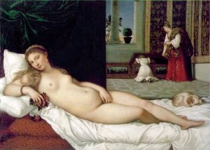
Titians The Venus of Urbino is light in the front with a dark background. There is a woman and a child standing in a back ground that draw you in. You wonder what they are doing, the woman looks ashamed and the girl looks as though she is vomiting. Yet the woman in the front looks calm and relaxed. The woman in the background looks like a very important person. And there is a lot of texture in the cloth hanging behind the main woman that has a very light but defined texture. Venus is the name of the goddess of love, which is why I believe this woman looks erotic in a gentle way. It’s as though the painting is a taboo narrative on sex and the then taboo view of sex before marriage.
Blog entry assignment #2
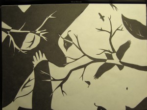
I am very happy with the end result. There was a lot of confusion on my Part III due to me making the leaves be maple leaves. Everyone saw the maple leaves and thought that it has something to do with Canada. When in fact it had nothing to do with Canada, it was just a leaf. I think that changing it to a leaf shape that isn’t recognizable to the public was a good choice. It made it more how I wanted it to look. As if the viewer was laying on the ground looking up at the sky with leaves falling all around. The smaller shapes pull the viewer in by making them look farther in the distance. And it makes sure that there is something going o in every space, but not so much that it would distract the viewer from the rest of the piece. I also didn’t have the tree branches in the Part III version. It added a lot of interest into it. Even though it was very hard to cut out the pieces like that. In the end the extra time and effort I put into it turned out a lot better.
Image essay #4
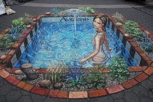
Julian Beever’s sidewalk art is incredible. Mainly that it is all done on a 2D surface that you can walk around. Only at one angle can you see the image as 3D though. His shading is very precise, and so are the measurements of every angle and every line, so that it is exactly in proportion to what he is drawing. This particular piece that he did as an advertisement for Aveeno. The circles going out of where the droplets hit the water are so precise. Every tile is at just the right angle. And all the plants look like they are blowing in the wind.
Image essay #3
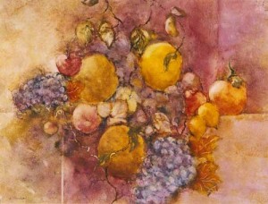
Silicon fruit by Leslie Rankin, is a fruit still life. There is repletion of the fruits throughout the piece, as well as a smooth visual texture, simultaneously with the texture of the surface that it is painted on. There is unity in that they are all fruits. And there is little containment considering the veins that go through the fruit and off the page. The color pattern is mostly yellows and purples that are contrasting colors. That causes the painting to have a very warm feeling. I think it is amazing how there is such incredible shading without the use of black in the pallet. The fruit especially stands out since the background is very plane in line.
Image essay #2
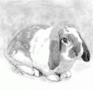
Mini Lop by Jennifer Hoover is a pencil drawing that looks like a picture. The strokes of the pencil show the texture of the rabbits fur. The picture is very contained and the composition is not very good, but the detail is incredible. The lighting is very low value contrast, there are mostly just mid toned greys and white. There is very little tension. Causing the piece to be boring to look at. There is no action or excitement. There is though, a high amount of detail that as an artist I can appreciate the effort gone into it. I just wish the picture or the background had a high contrasting tone. That way it would “pop” and stand out more.

