Final project
April 30, 2017
Motion graphics
April 30, 2017
Still image post
April 30, 2017
Blog reflection
April 27, 2017
Through the course there are many things I have learned as a filmmaker, photographer, and storyteller. As a filmmaker I pay more attention to the setting and feel for the colors and the mood those colors are associated as this makes it important for telling a story. I enjoyed the small photo and video projects based on the book because it solidify my understanding of the book and applied to my final project. My challenge though was grasping more abstract concepts and that made me doubt my images but I still wanted to try the image. I don’t truly believe in that manifest anymore, I think film-making can be an art and powerful but there’s more to it such as keeping in mind of elements outside your art such as the time your are living in and also keep in mind of how settings play. I did not assume anything because my knowledge of photography and film was limited in regards of art based and more knowledgeable on event filming.
Final Project update
April 25, 2017
The final project is doing well currently at editing. There was some action parts, there was use of shadows showing the character taking out a person to continue on. There are hallway scenes but the action is not shown on camera only through sounds. The fight scene has action. Stills from the film. There were some problems that did arise, the tripod used was made off balance and was caught very late but it was solved later in the film. The parts were luckily salvageable because of us taking the same scene twice. The scenes were made with one exposure meter down to keep to the mood we wanted wish was anticipation and suspense. The attention to tone and color was important in filming and locations were selected for that in mind.


Analysis of thelma and louise by Ridley Scott
April 20, 2017
The movie Thelma and Louise made in 1991 did have many examples from Block such as color that relates to mood and intensity of the colors. The colors in the film did have a pattern in the film. Much of the film had very little intensity of colors being more dull and natural such as the following image. 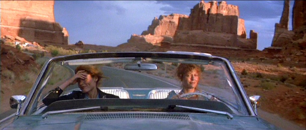 This setting was used periodically throughout the film as the stark landscape was very natural and not visually intense this shows Block’s concept of affinity in color. Much of the color in the background are varying shades of reds that being monochromatic. The scenes do have split color schemes such as this one due to the the car not being a shade of red and this brings a contrast that guides to the audience eyes right to Thelma and Louise. This reoccurring pattern of stark backgrounds does have an importance to the film for it furthers the plot and the characters and through the backgrounds being more aligned to affinity than contrast then audience does not get lost in the background.
The film had a variety of contrast of shapes and affinity of shapes.
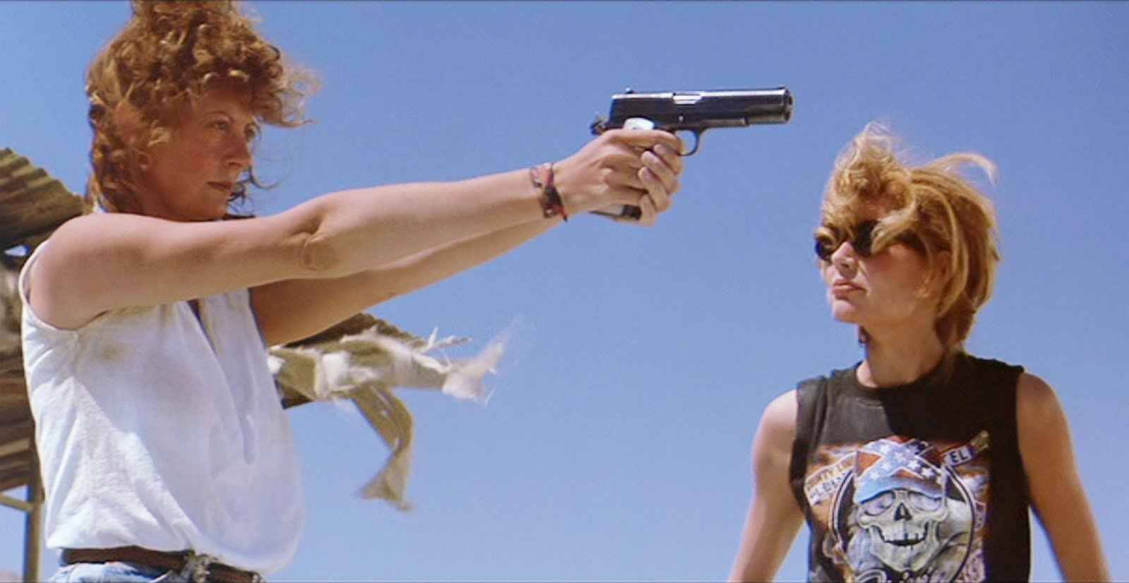 This one being a contrast of shapes for there are horizontal lines being the arm and gun and vertical lines interesting that being the bodies of Thelma and Louise. This can be noticed when the viewer sees the shapes in stills and this shows there are multiple lines and shapes intersecting. This along with the camera position creates a tense mood and with the two horizontal lines the vertical shape in this case is the gun and creates a mood of tensity. This image is also pretty high in visual intensity due to the contrasts and split color scheme in the scene. The gun being black contrasts with the blue sky and draws the eye, the shirts both white and black contrasts not just with the sky but also with each other adding more intensity to the image.
This one being an affinity to shape because the shapes all follow a more horizontal pattern and there are no vertical lines intersecting within the scene. With a movie there needs to be scenes of contrast and affinity of shapes this because the contrast of shapes creates a tense mood and affinity creates a more harmonious mood. The image has a more harmonious mood because of the affinity and not having much sticking out in terms of shape. This scene also has low visual intensity due to much of the colors being dull and none of the colors are vibrant leading to low visual intensity and color of affinity.
The movie is an excellent example of using the techniques and lessons of Block’s book because the use of color and shapes play into the mood and the visual narrative as these images show. The scenes have backgrounds that are very monochrome and this makes the contrasts of the characters all the more noticeable. The use of shapes play into an importance because with shapes being contrasting in a scene along with the camera the scene becomes more intense and memorable and with affinity in the movie the scenes with contrast become more important to the visual narrative.
Final Project idea.
April 13, 2017
A team has been formed it will be including me, Eric, and Ezra for we have similar ideas and an interest in sound along with telling a story. The roles are, Ezra the main editor but Eric and I will also be there for the editing, Eric the actor and the director, and I will be the camera operator and the one who listens to their ideas and find a way to fit in our film along with guidelines. It will be a fanmade film based on a game called “Miami Hotline” that uses influences based on 1980s action movies and the 1980s color schemes such as neon colors along with fast pace music. It will include action but majority of it will not be on scene only applied through use of color on costumes that we will buy. Being influenced by games also we will include the final fight scene being more Street Fighter influenced and that will be done through a camera set as long take. The techniques we will be using is recording and mostly rapid action through long takes to keep close to the rapid music that will be played this means the use of color within our locations are desired. Dialogue will be limited and the use of post production color correction will be heavily used for our idea of the color scheme. This will be the challenge to make sure that there will be enough time to edit and have our neon color and fast pace music to fit our scenes. This will showcase our use of framing our scenes so that the area can provide the mood we wish to show and through already own equipment such as lights and a camera we can start scoping for sights to think about filming. We believe our film should be around 3 minutes as it will be quick and if it lasts longer than that time then it will be too long and not very enjoyable.
Chapter 6, color
April 10, 2017
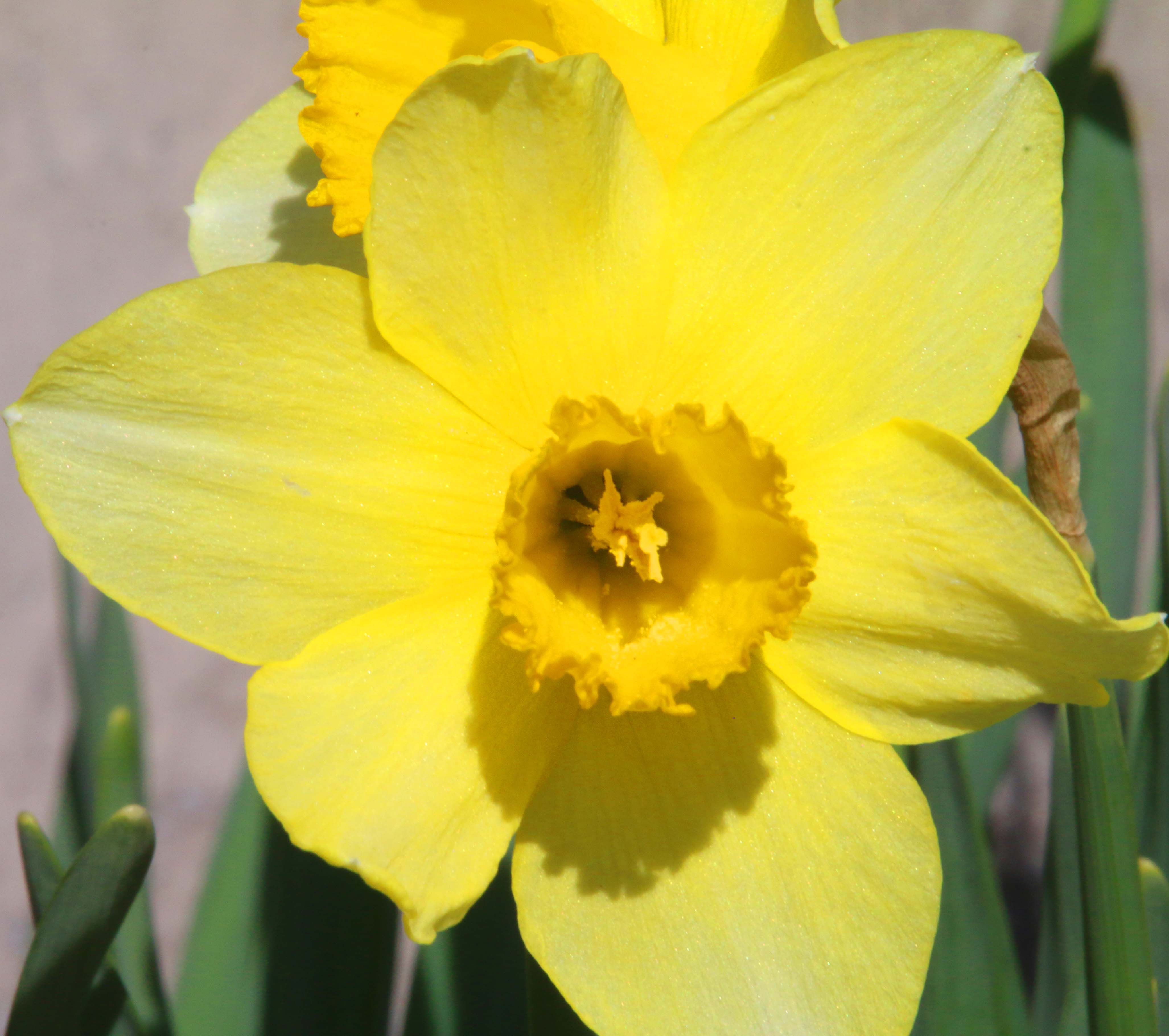
The color is monochrome for the image shows a yellow color throughout the plant pass the green stems. With the focus being the flower it shows that the yellows are present and the black is just shadow.
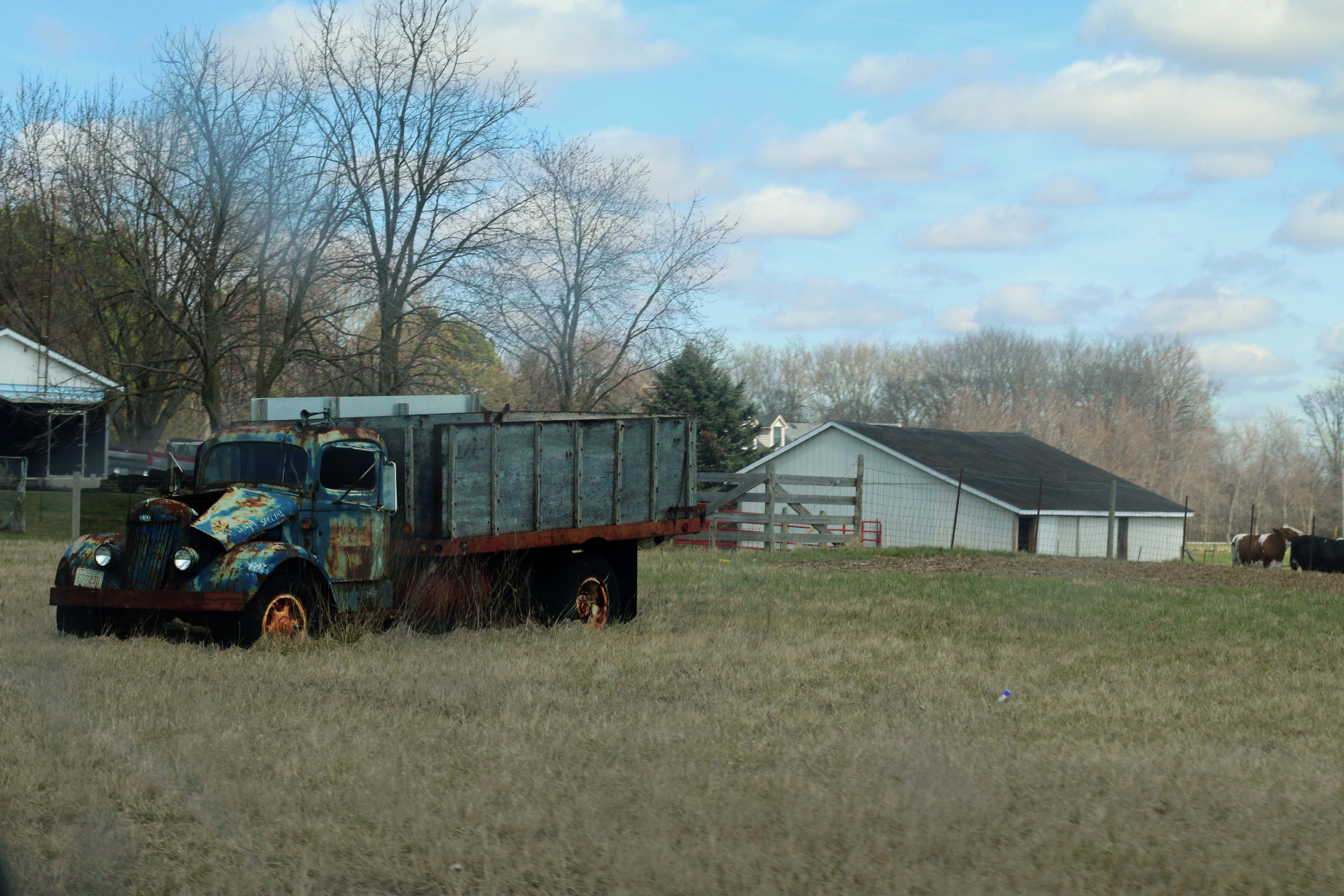
The color is split because the red of the rust contrasts with the blue of the truck and that both contrasts with the old whitewashed wooden bed of the truck. The orange rusted tire well also contrasts with the black tire and blue body.
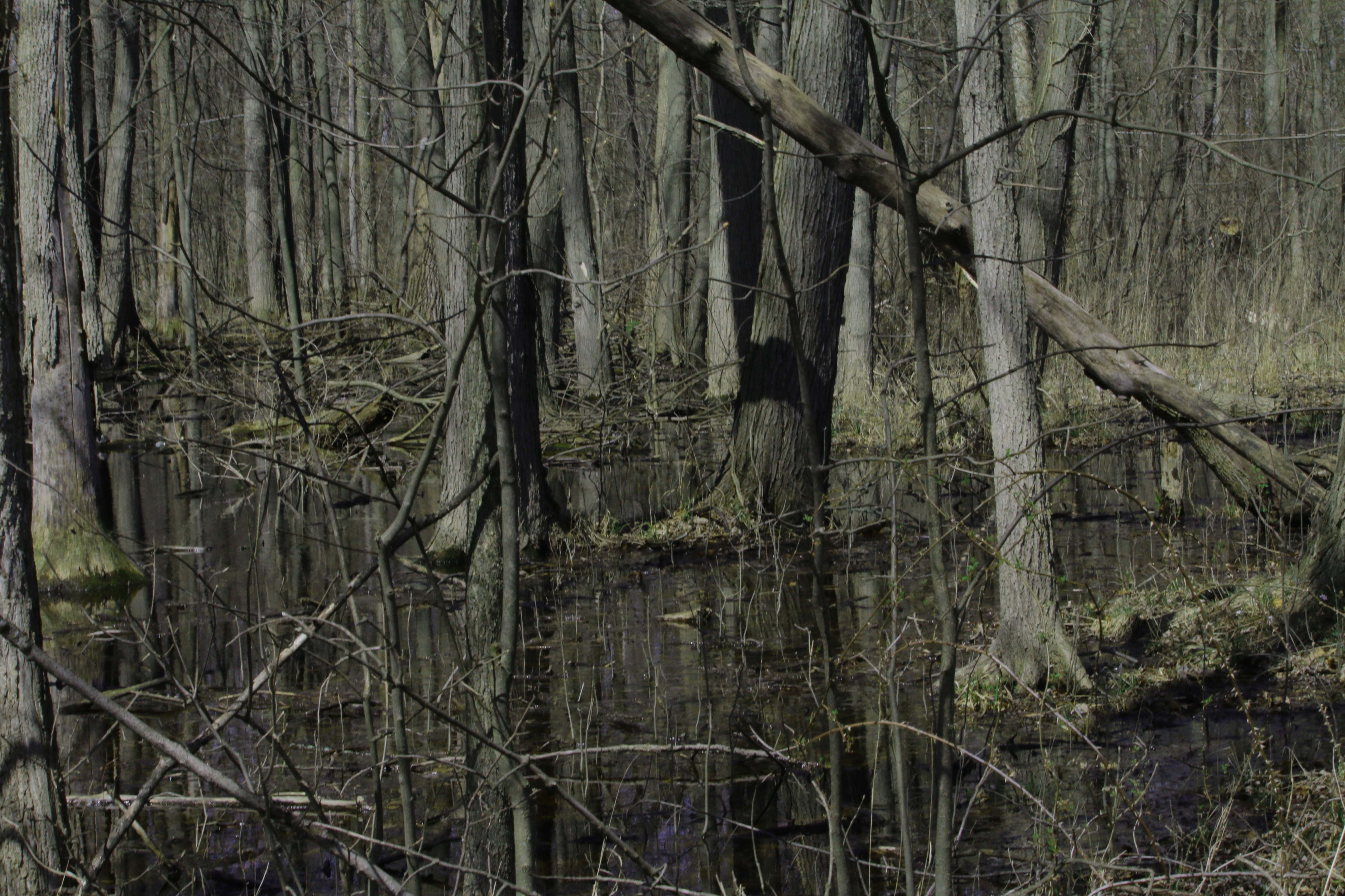
This is neutral for the wood is predominantly grey and the only color is green moss from the swamp. The shadow creates more black and grey shadows to the wood within the swamp.
Activity 5
March 29, 2017
The opening was an attention to detail of the tennis ball. The camera panning and zooming out was to highlight 2 and 3 d movement of the camera. The dog’s tongue was show object motion. The relative motion was the dog’s tongue and mouth moving along with his body stepping back this also produced secondary motion as the dog moved forward and backward a few steps. The rhythm was pretty balanced as the dog’s tongue and mouth was rhythmic and the rest of the setting was flat.
After Effects basics.
March 23, 2017
DSLR video
March 14, 2017
Tone
March 2, 2017
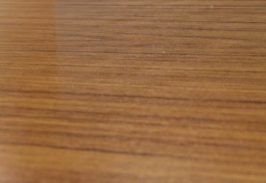
 Affinity of tone, the grey tones are all close to each other and does not vary greatly, especially the grains are all close to the middle of the grey skill.
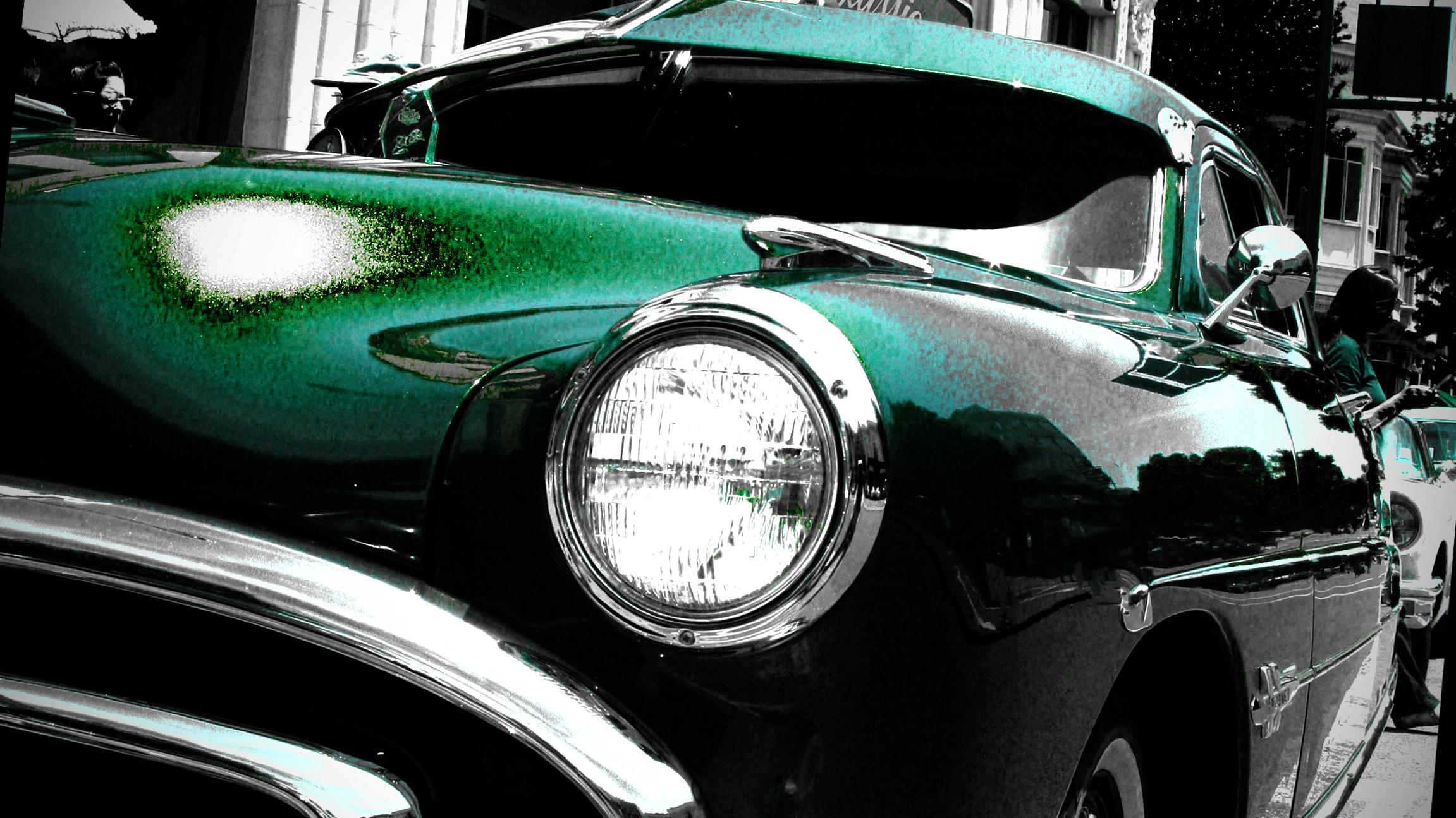
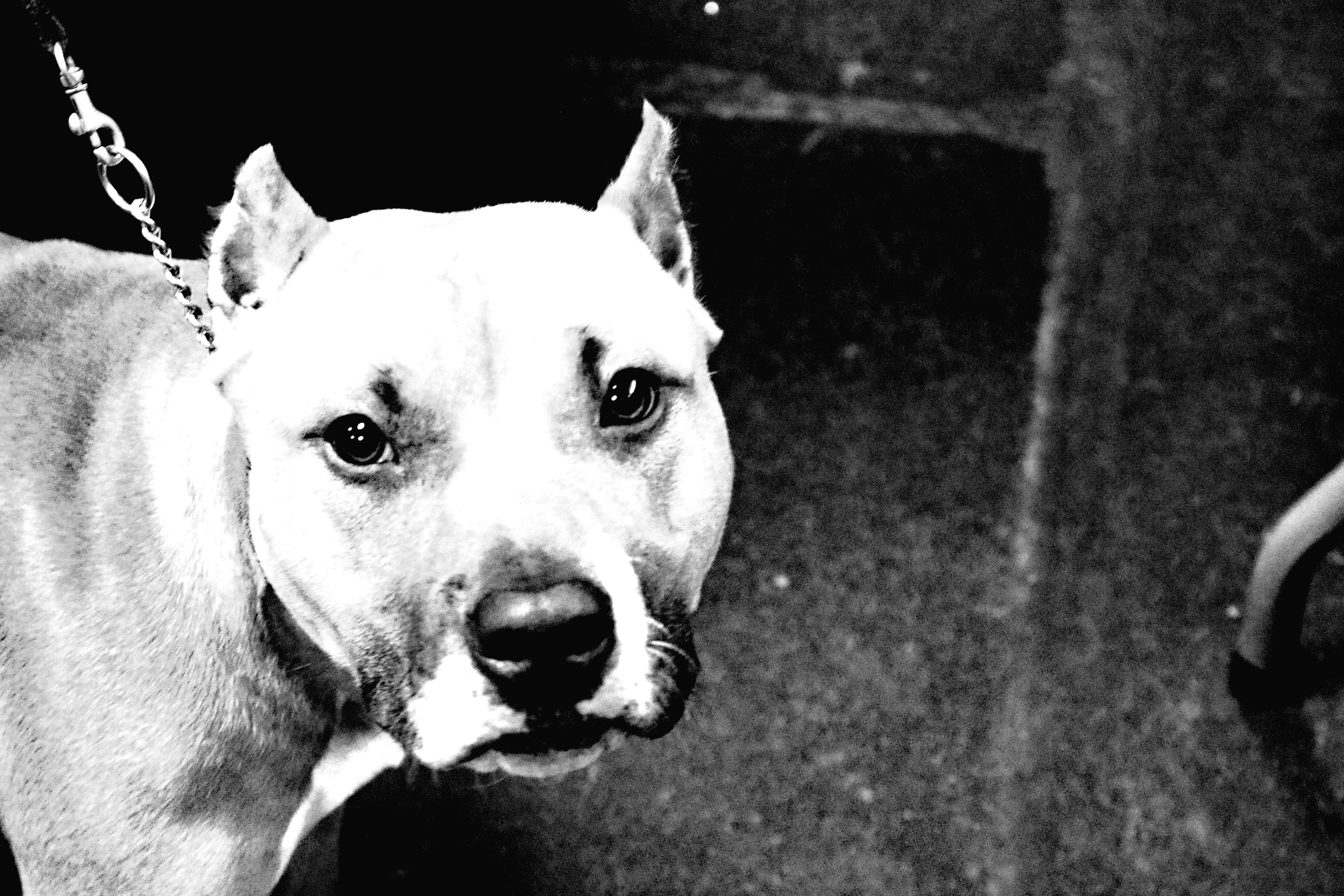 Contrast for the white dog contrasts greatly with the black background, the body also has grey to black lines and this contrasts with the white face of the subject and the mouth that contrasts greatly with the nose.
ntrast to the black bars, which also contrast to the white boards that are ahead of the black bars
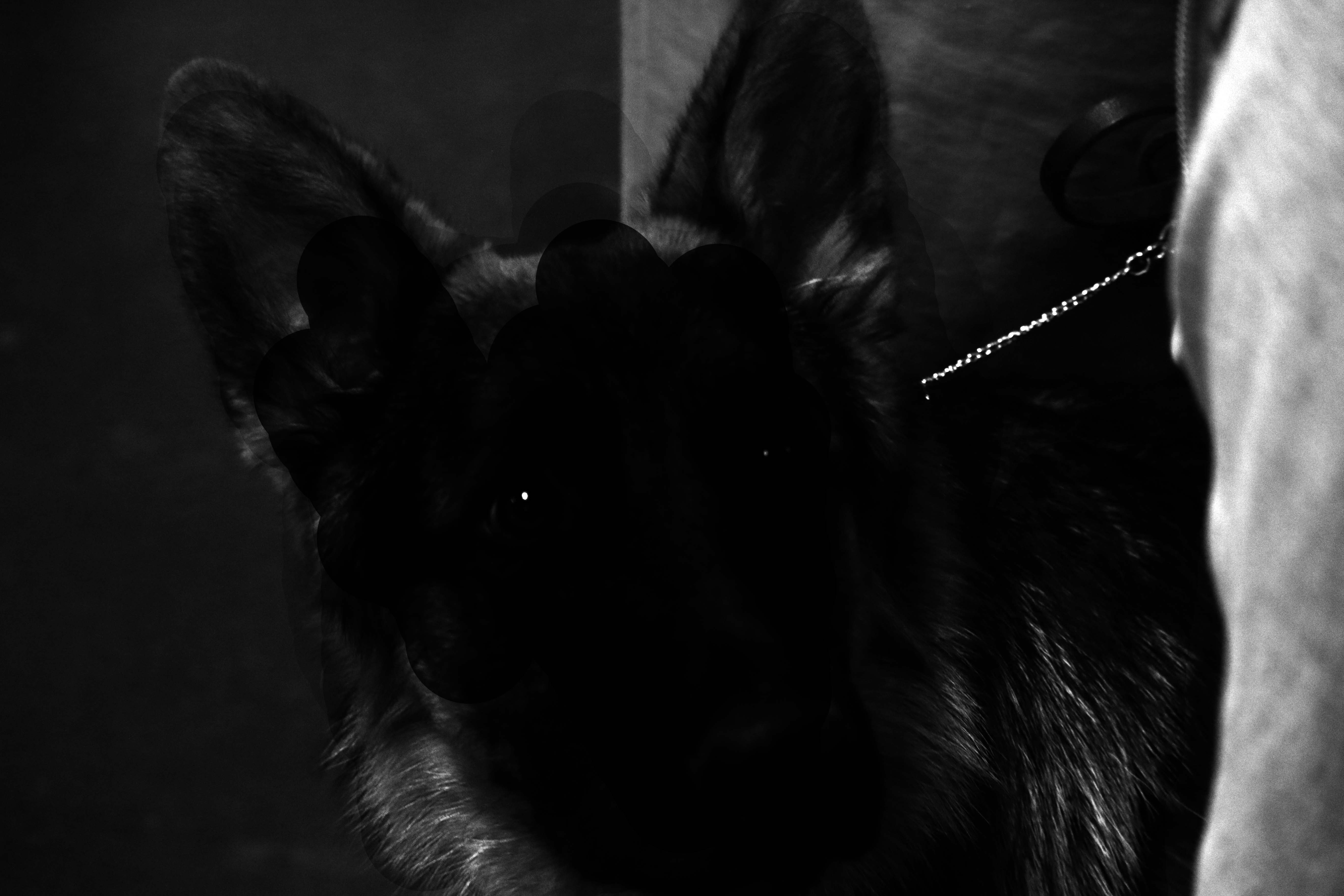 Non-coincidence for the face is not easily seen as the subject is the face of the dog, and you cannot see the face easily and that is what non-coincidence is.
Reading activity #3
February 16, 2017
 Vertical linear motif.
 Horizontal linear motif
 Diagonal linear motif
 Affinity of shape
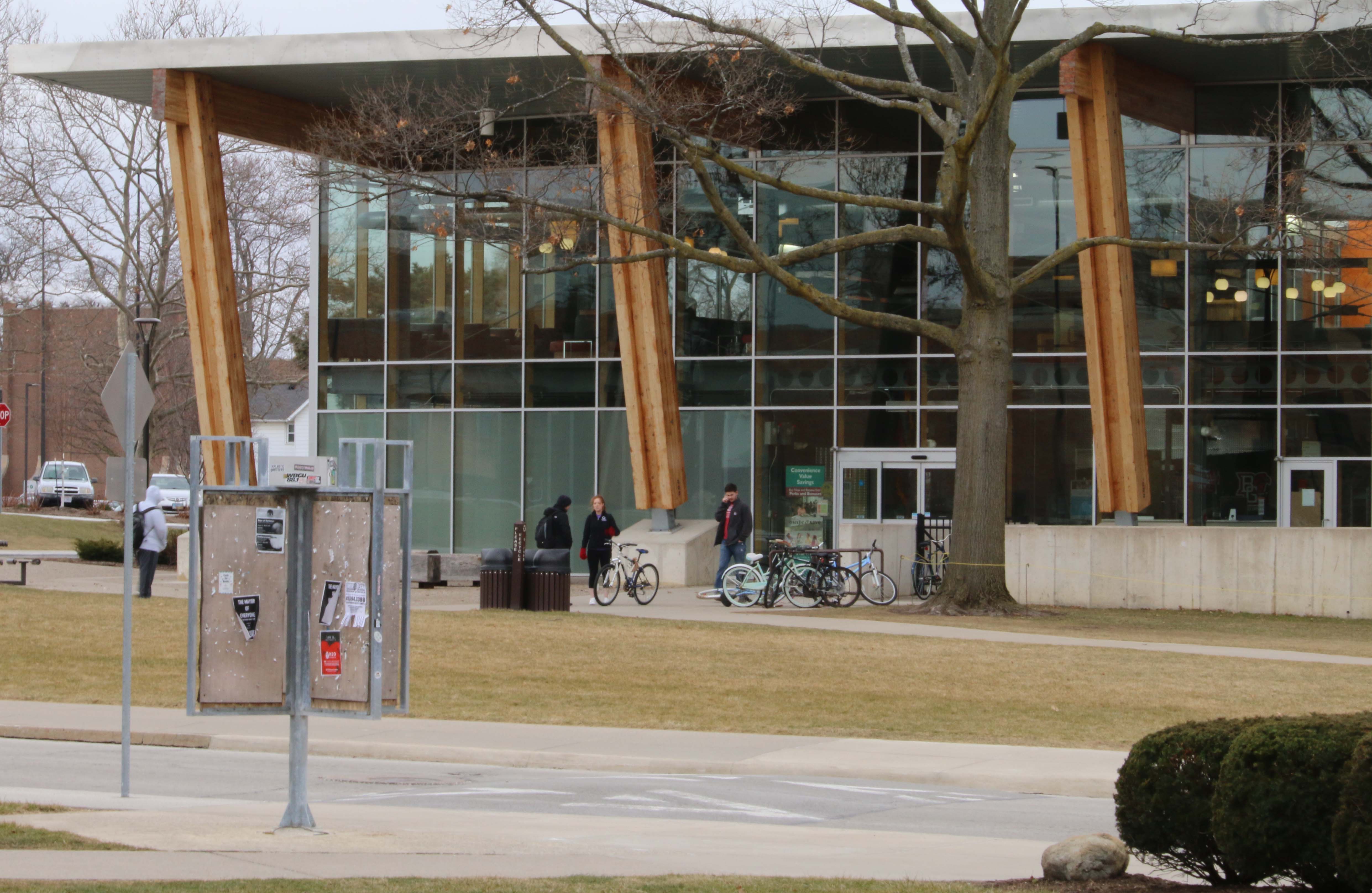 Contrast of shape
Basic editing video
February 9, 2017
Photo portfolio (space).
February 2, 2017
Deep space 
Flat space 
Limited space 
Ambiguous space 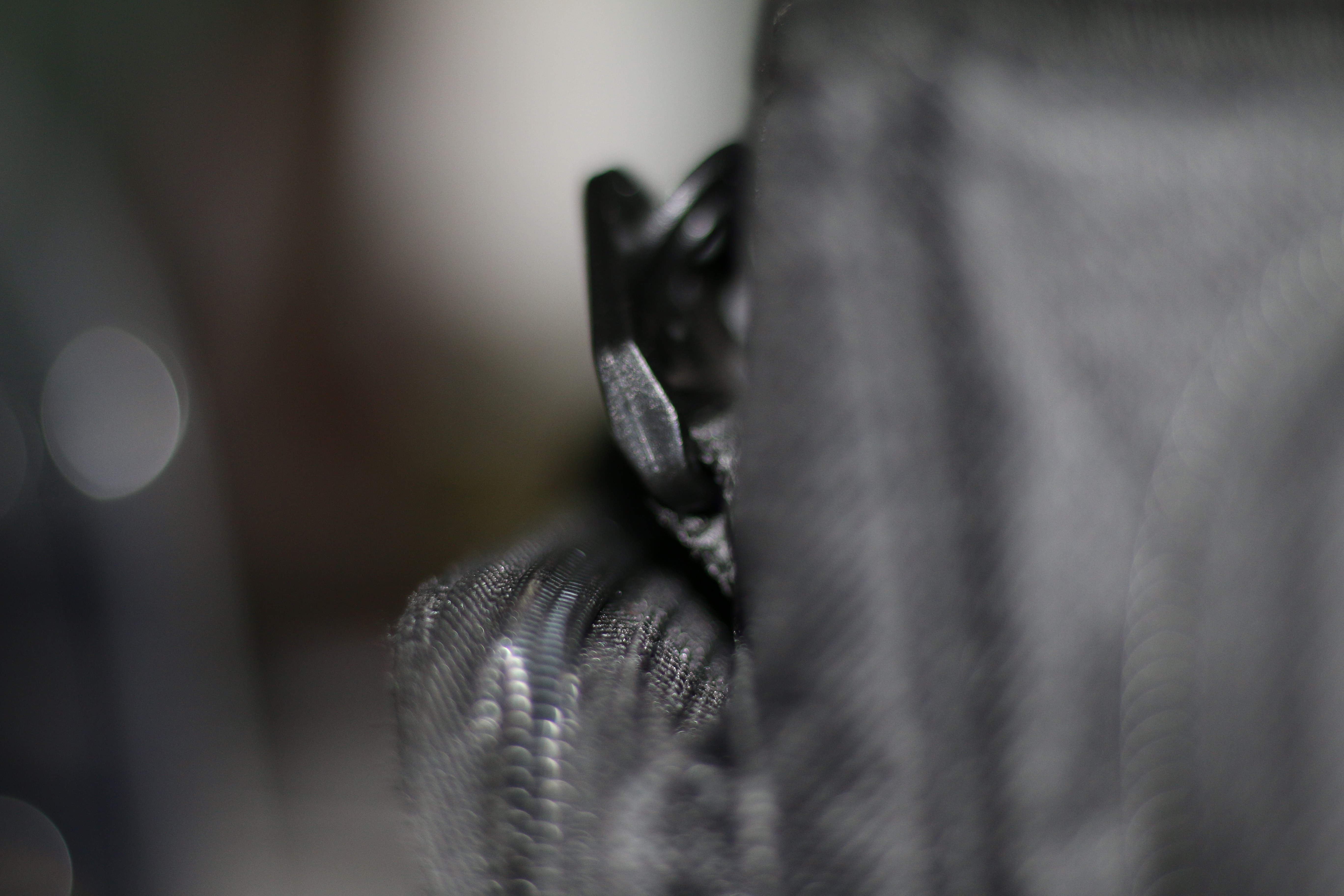
Surface divisions 
Fast shutter 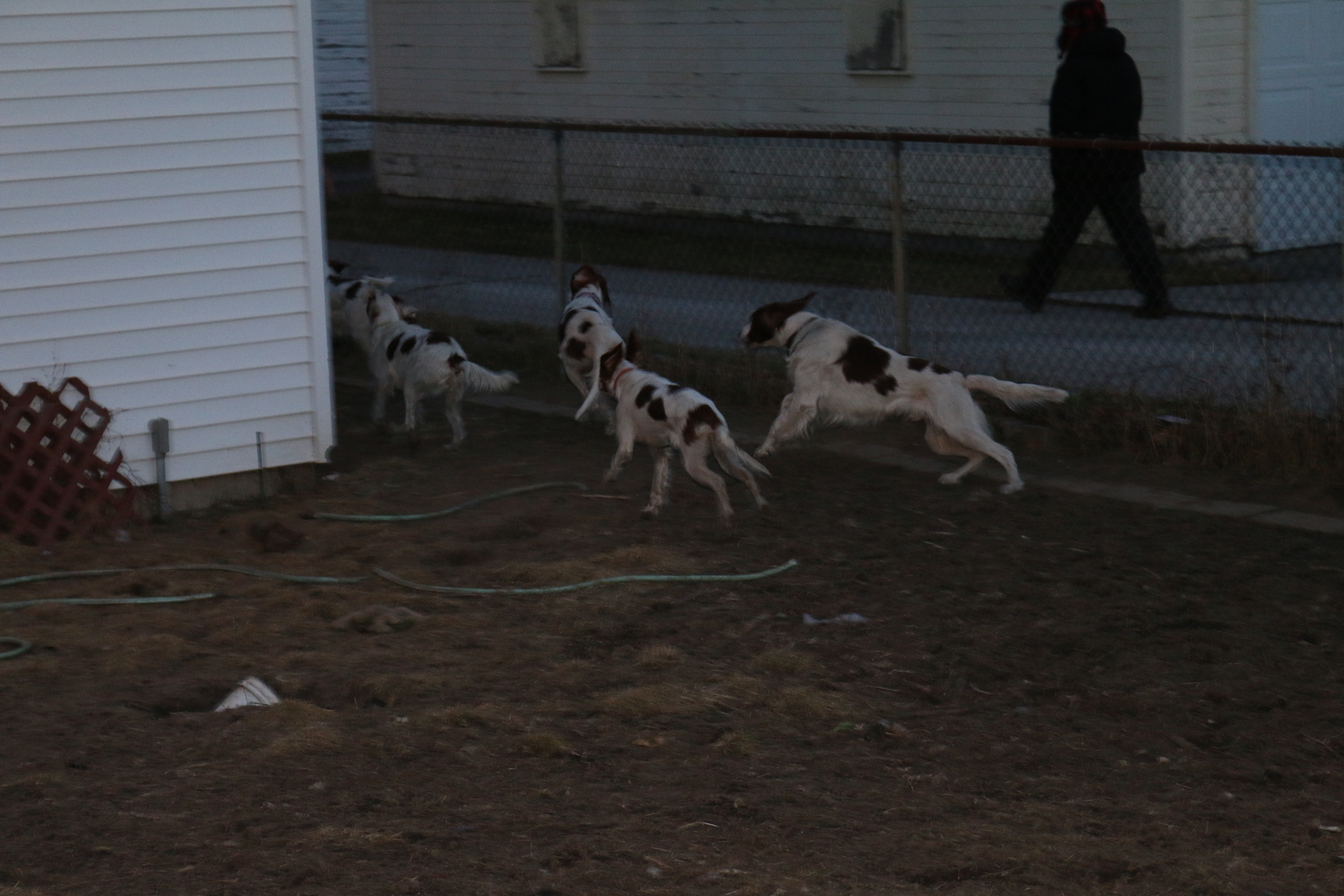
Shallow depth of field 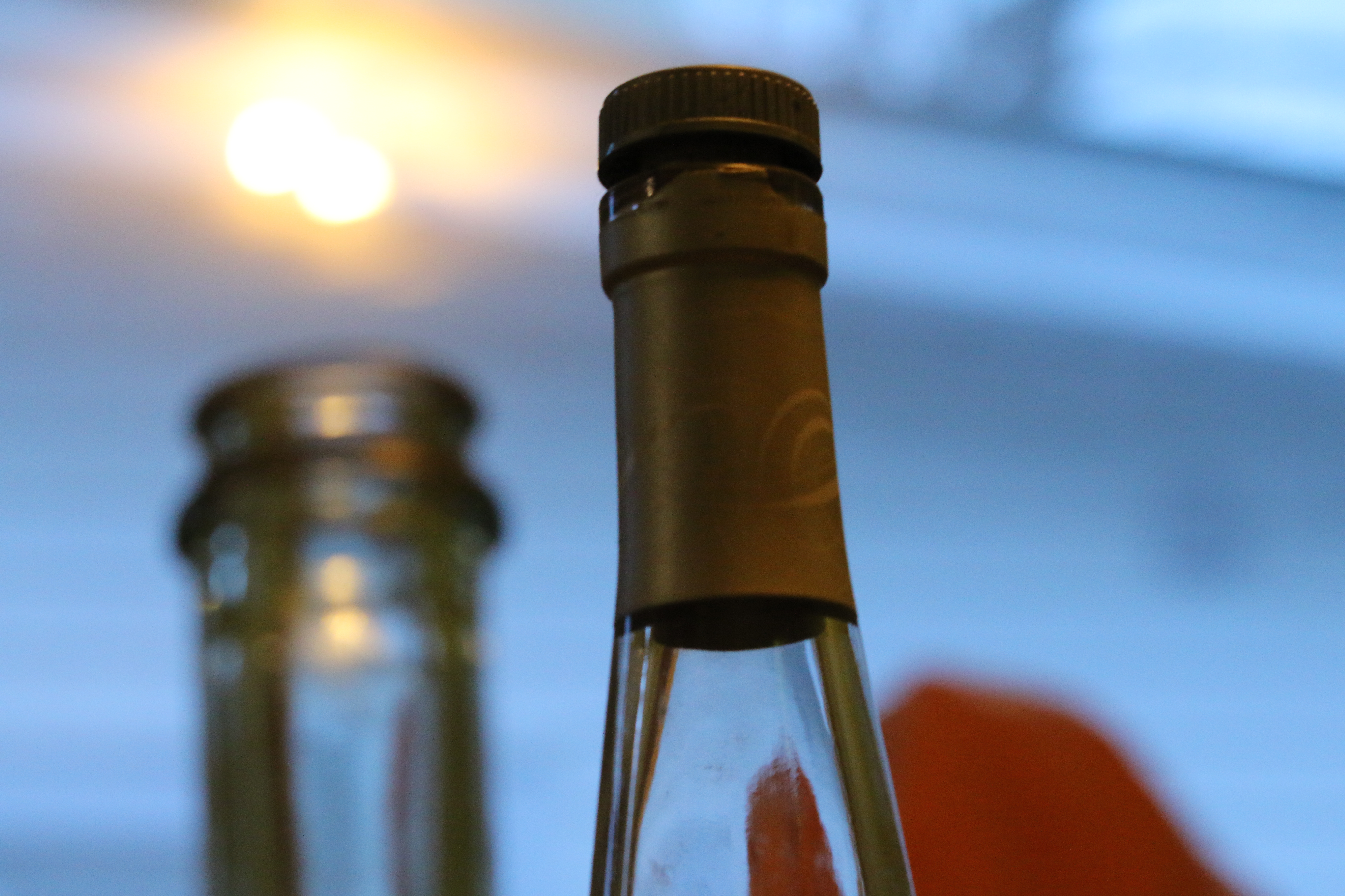
Deep depth of field 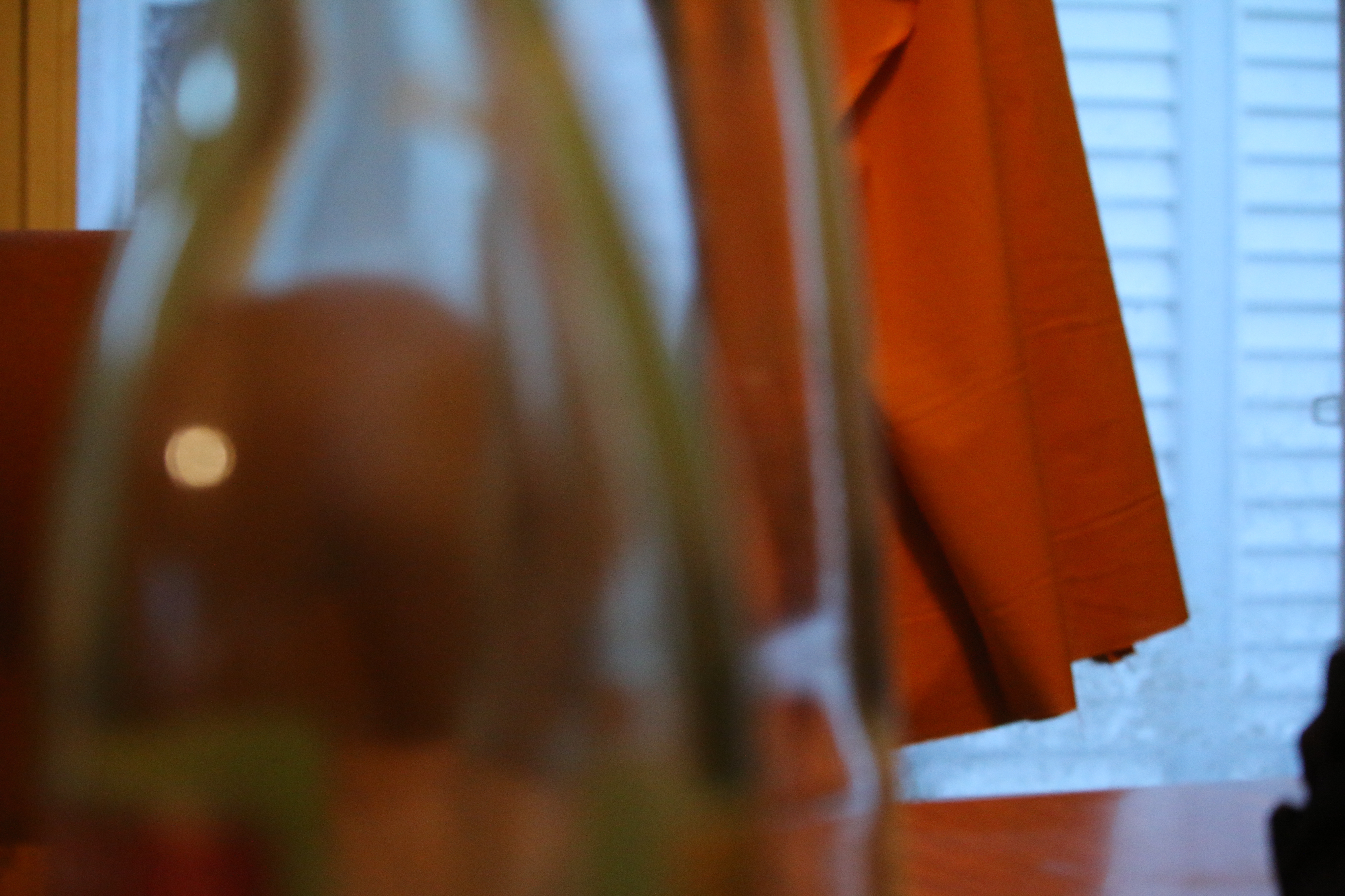
Symmetric composition 
canted angle also known as dutch angle 
Embedded video of a fire.
January 31, 2017
Photoshop for filmmakers
January 31, 2017
Film Manifesto.
January 26, 2017
For film creation every project should come from the soul, even though in the end you will hate your creation and cast it off. To create film you can use anything you have available and experiment with your project to find results you find appealing. Even when a project goes down and you feel the burning sensation of hate, learn from it, for you can then make adjustments to other films you will create. As long as you get your message or thought to the audience then it worked, create the feelings you want. Film is art and the camera is a pencil, the screen is a canvas, and while you create art, you will at times throw your pencil at the canvas, and your camera might break.
Digital camera photo.
January 24, 2017
The photo we went for was to take a common object and make it strange. It was a extreme close up with the bottom upside down, we adjusted the settings to make this upside down bottle to appear strange. 
Reading activity 1
January 19, 2017
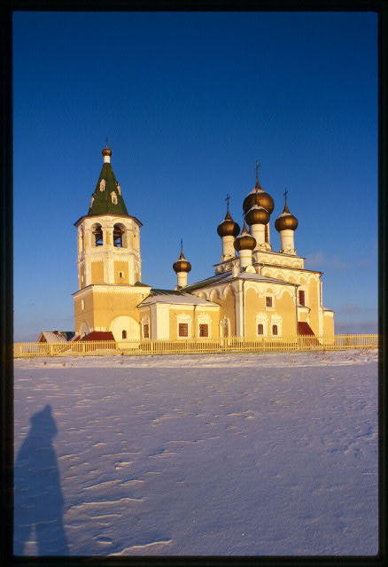 This image is a high visual intensity for the building’s contrast against the snow covered plain. The white colors of the buildings has also contrasted against the round tops which are darker colors. The sky shows a intensity with the lighter colors starting from the horizon to darker colors higher up in the sky. The felling I get from this picture is isolation based upon that this church sits in the middle of a snow covered plain in Russia. The eye captures this building in the middle of nowhere and draws attention. The shadow of the photographer also creates depth with shadow forming fore and mid ground and the building creates the background. Photographer is William Craft Brumfield. http://www.loc.gov/pictures/collection/brum/item/bru2000000054/
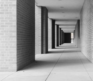
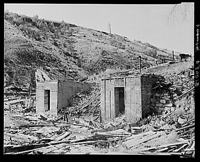 Low visual intensity for the reason on the dull colors and the lack of contrast which creates a same, repetitive pattern within the image. The feeling I get from this image is that it is setting making it simple and the depth of field is present but it is simple and repetitive. http://www.loc.gov/pictures/resource/fsa.8c52635/. Photographer: Lee Russel.