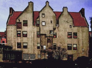
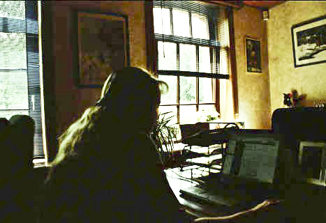
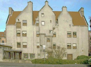
Week 8

This week as flown by! I can’t believe that this class is over, the project is over, and I just finished my last day at American Greetings. I am sad about it. I will miss everyone and that place in general, but I am hoping that this is only a temporary thing and that I will be back there in a few months. I met with the HR head hunter on Wednesday and we talked about my portfolio and gave me suggestions. I think this meeting was great and so helpful. My boss has recommended that they should hire me in the future so I feel like things will work out and I will hopefully be back there again someday. Good luck to everyone with whatever you are moving on to!

Posted in VCT 4670 | Leave a comment

In Class assignment #6

White Balance

I opened the image up as a camera raw image. I changed the white balance drop dow menu to auto. THen I when into the temp. slider and typed in 2959 and added +2 to the tint. I then took the white balance tool and clicked on the doors. Below is the final image.

Exposure

For the first image I used the “clipping” triangle to point out the problem areas. I held the option key and moved the exposure slider get see more about it. I dragged the exposure slider to -.o5 and the recovery slider to the right until all the red warning was gone.

For the second image it I used the black slider to fix the shadow areas and to add more color and depth of field so the image was not too washed out.
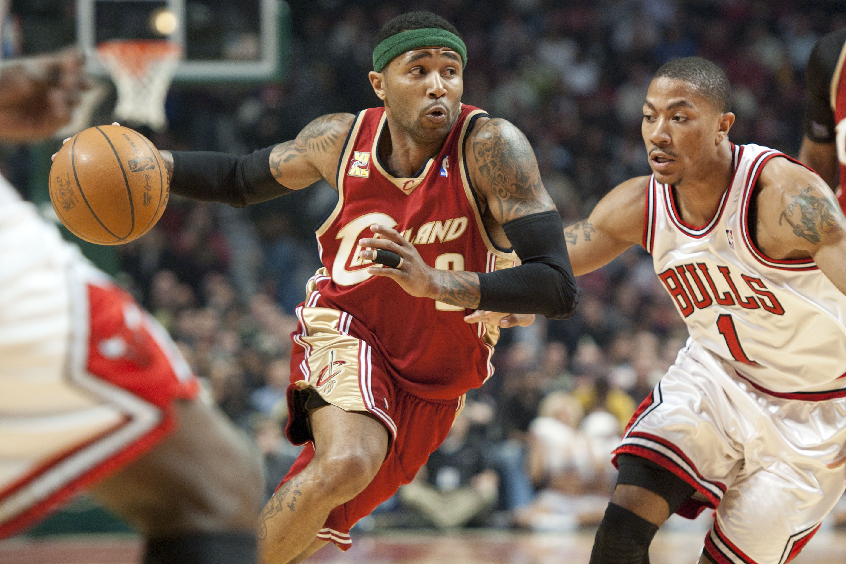
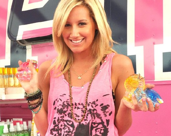
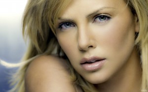
Adding impact

For this image all I had to do was adjust the clarity slider up to +75.
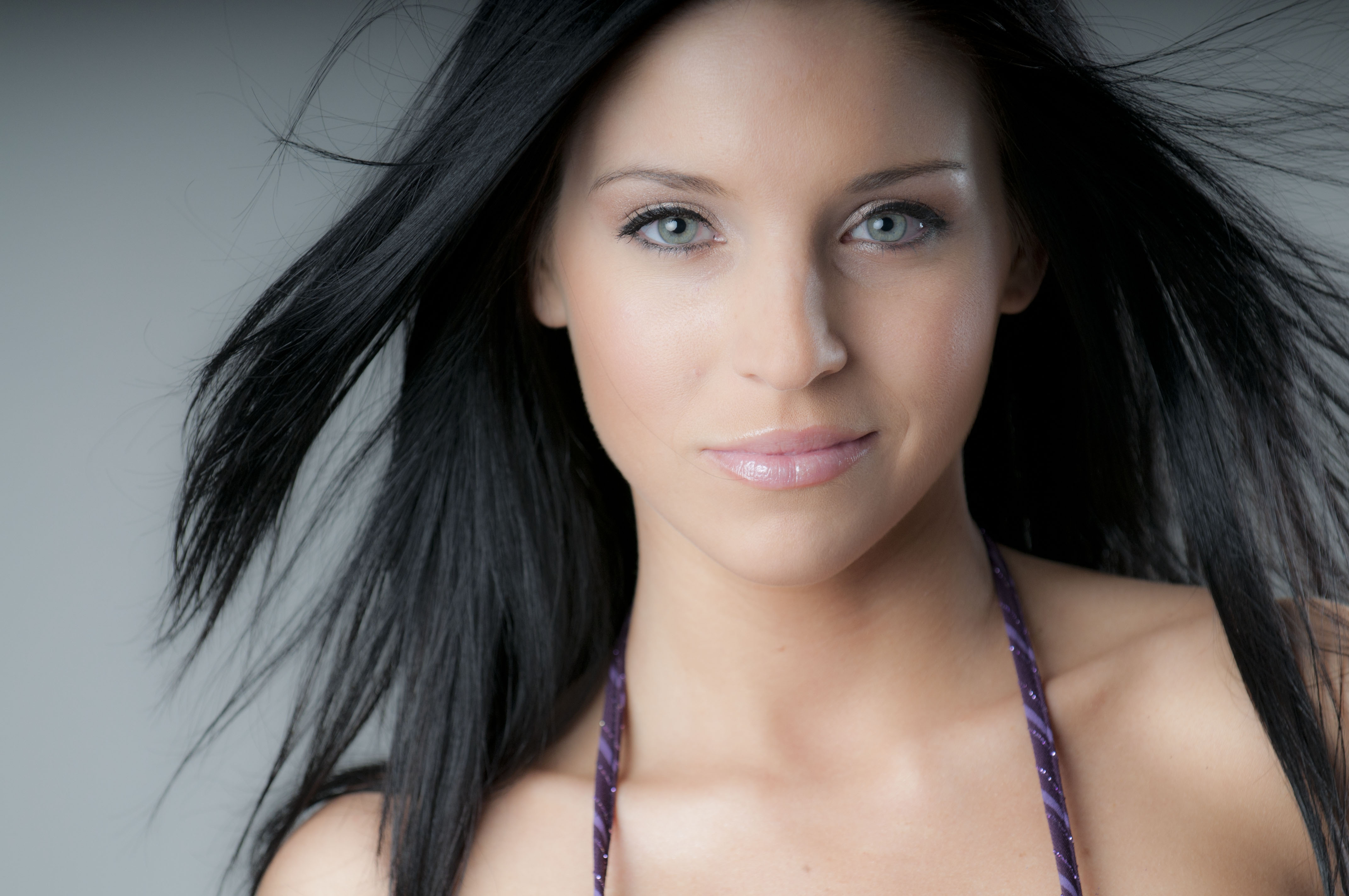
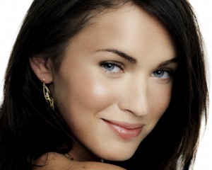
Soften image

For this image I just adjusted the clarity slider to -50 to soften the look of the skin.
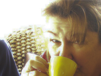
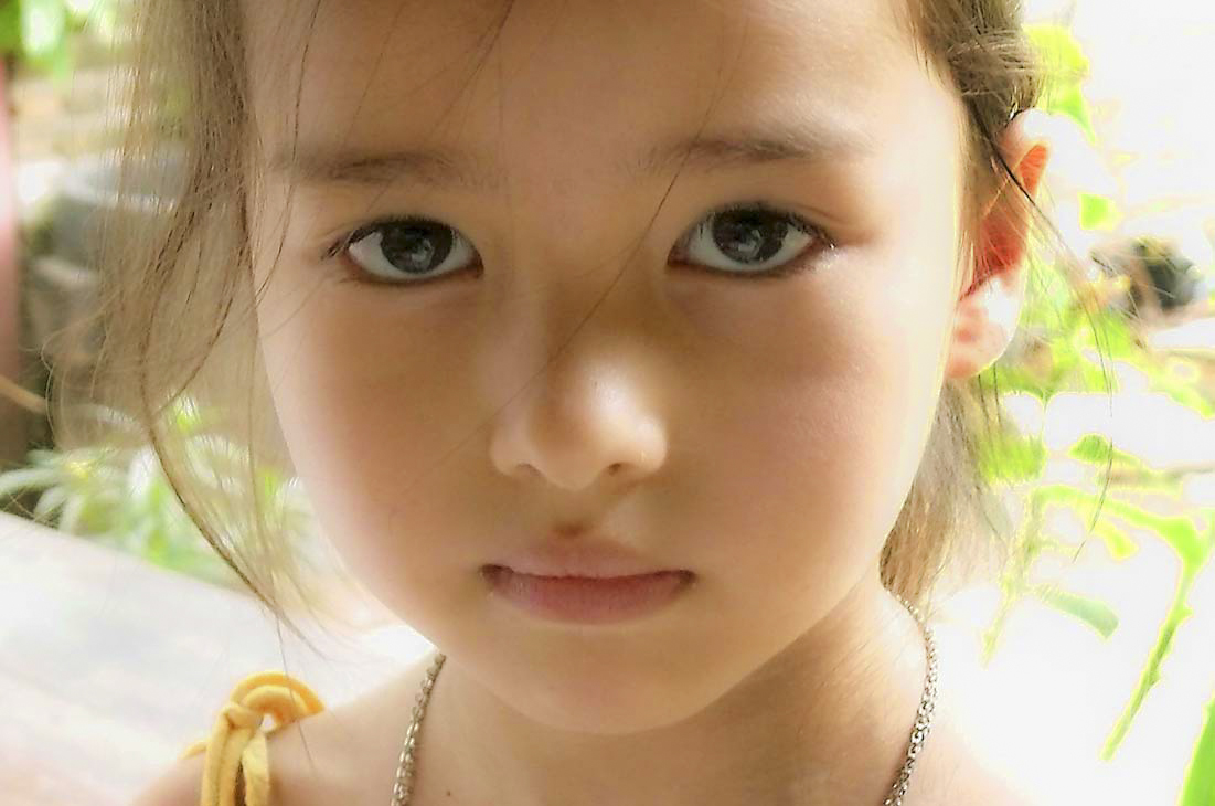
Backlighting

For this image I just moved the fill light slider to the right to 54 to fix the dark shadowing.

Adding contrast

For the first image I opened up the Tone Curve bar and went to the Point Curve. In the drop down menu I clicked on Strong Contrast.

For the second image I opened up the Parametric Curve and adjusted the highlights and lights sliders to the right, and and darks and shadows to the left.

Cropping

For this image I clicked on the crop tool and adjusted the crop until I liked it.
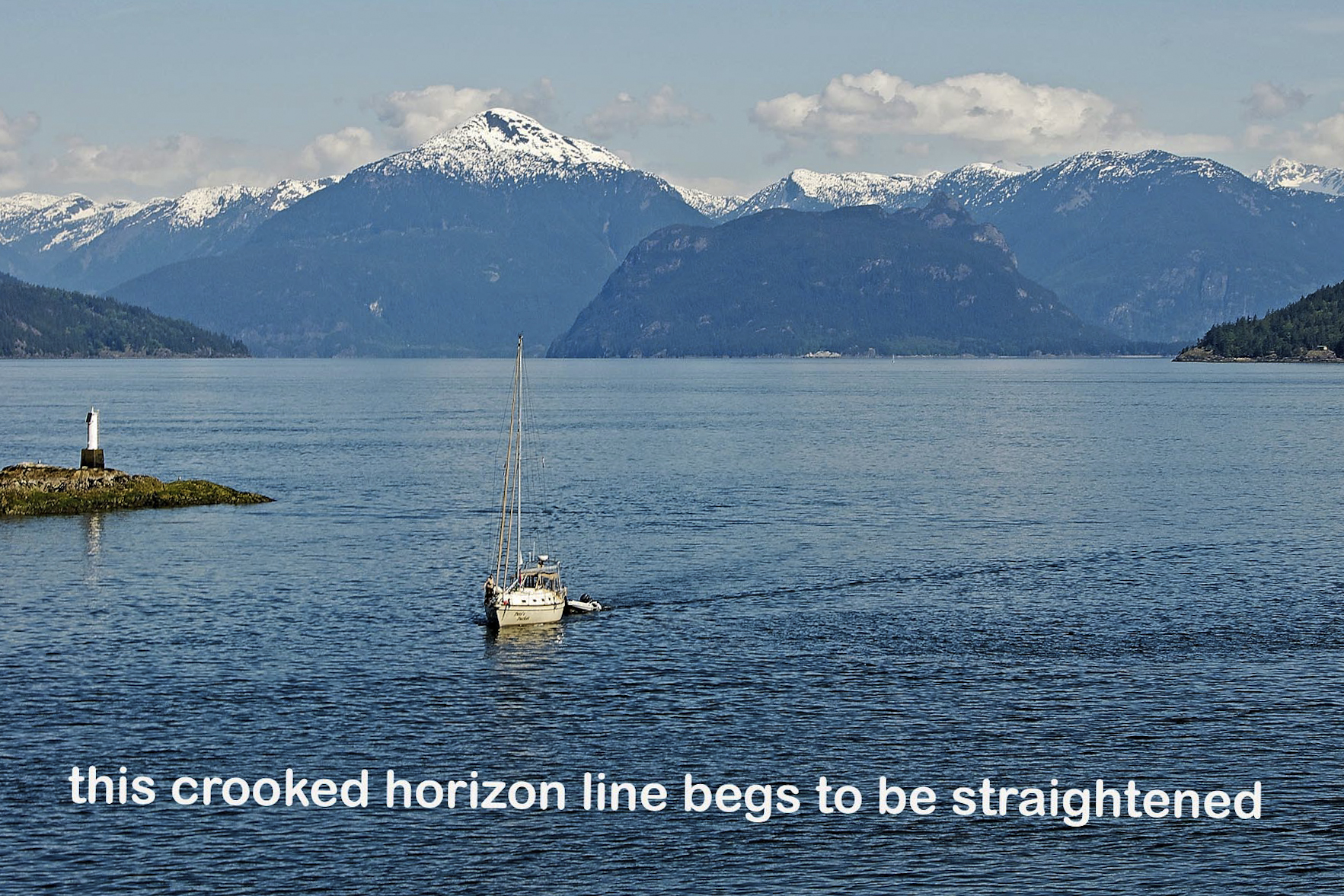
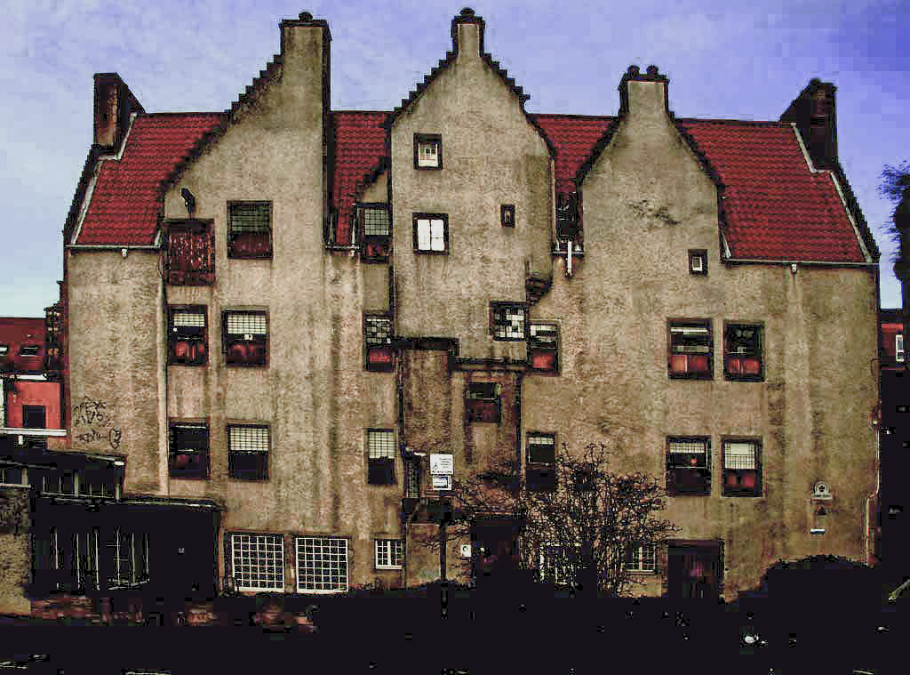
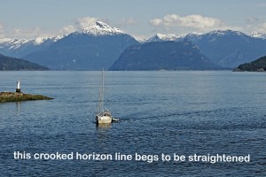
Straighten image

For this image I took the straighten tool and I dragged in it along the horizon and hit enter.

Overexposed images

For the first image I tried to find a happy medium between the exposure and the brightness slider.

This next image is very very hard to adjust. I worked on it for a while, but there was just no way to completely fix it. I adjusted the brightness, exposure, I added a little bit of black, and I added some saturation to the image. Then I used the white balance tool to adjust the white balance the best I could.

For this next image I adjusted the exposure, brightness, recovery, and contrast sliders. I then brought down the clarity a bit to soften the skin. I took the white balance tool and used it in her eye to help correct the coloring.

For the next image I brought down the exposure and brightness just a little. I added a little bit of vibrance and saturation to the image. I also straightened the image a bit.
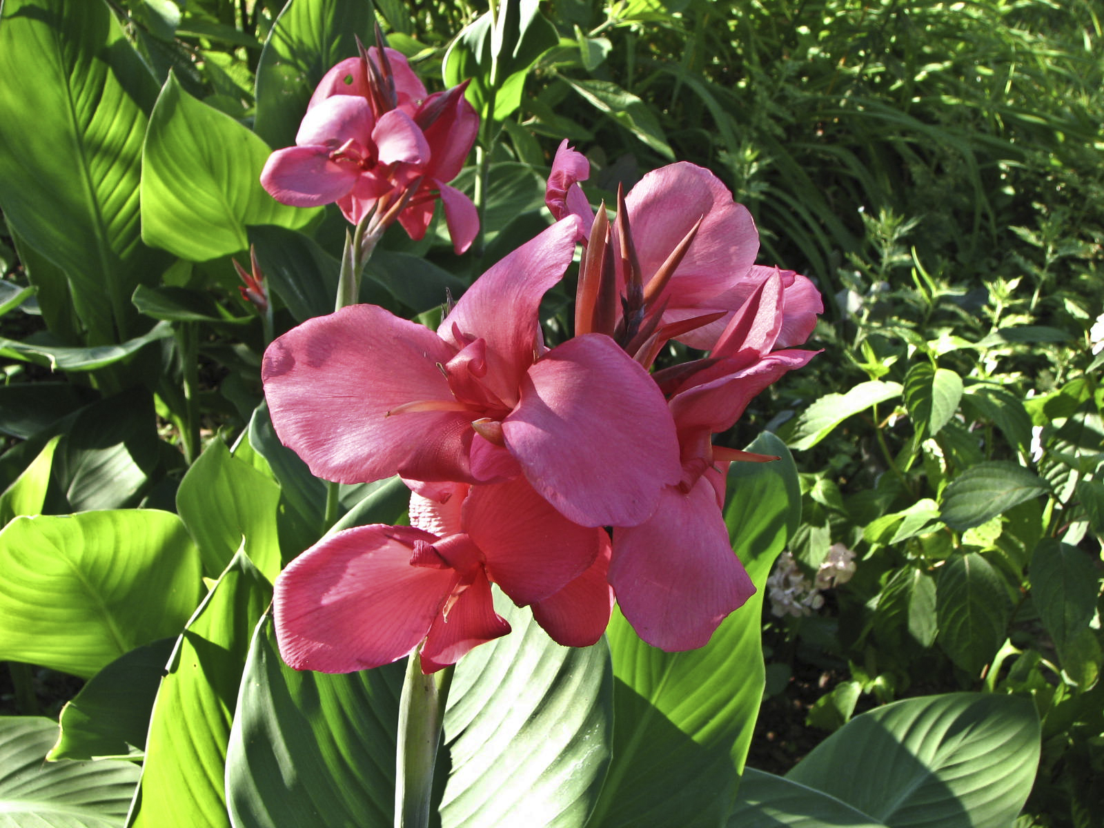
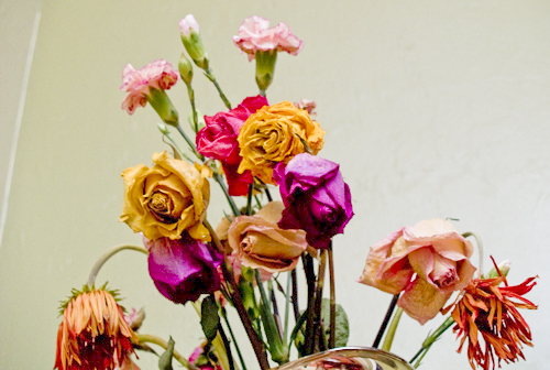
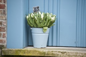
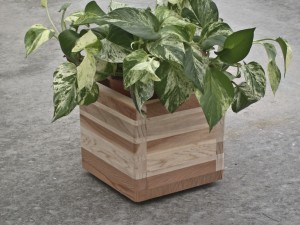
Potted Plants

For this first image I added a lot of clarity to the image.

For this next image I added clarity and brought down the exposure a bit.

For this next image I brought down the exposure some and added the clarity.
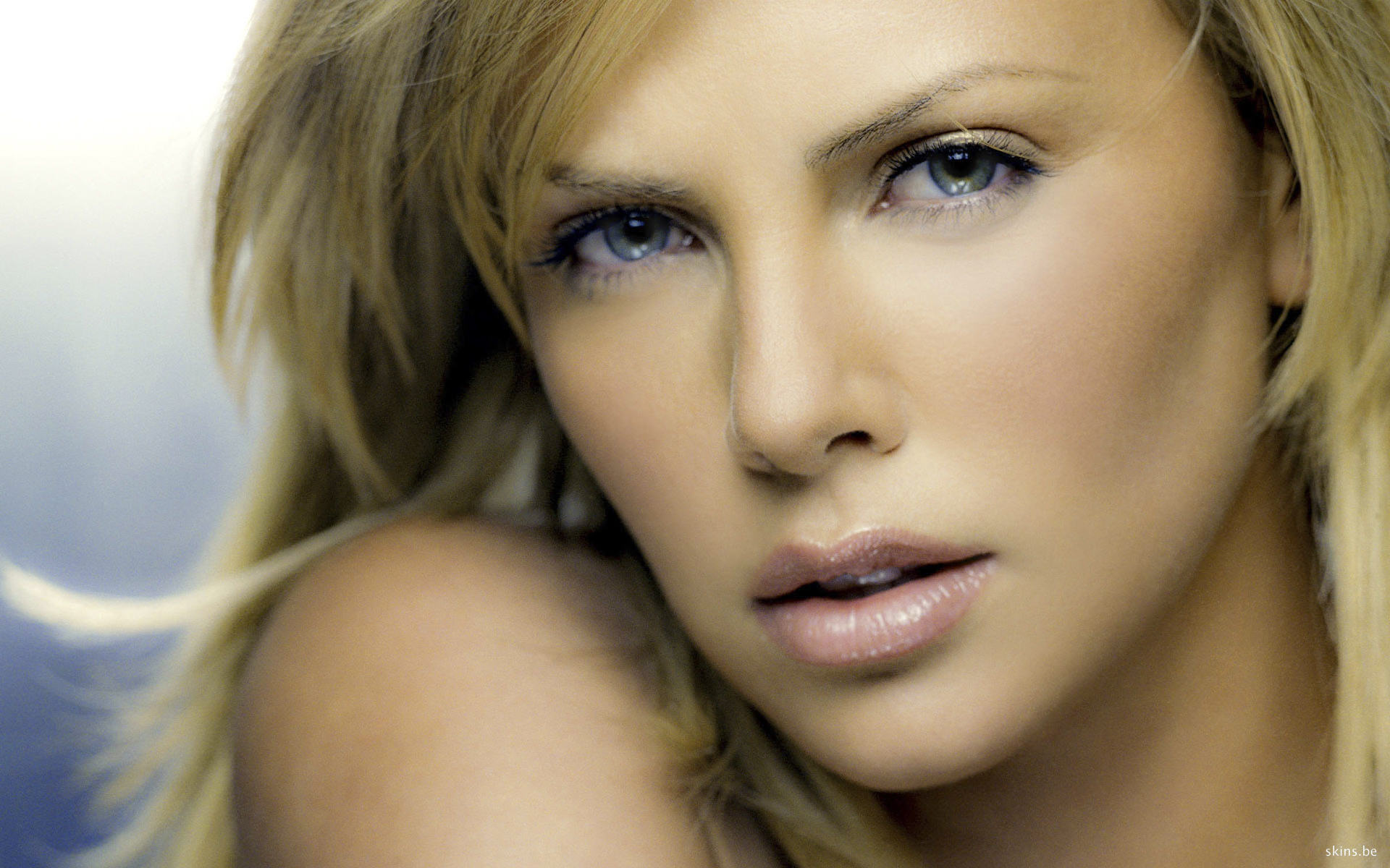
Soft Portraits

For this first image I brought down the clarity and added some contrast.

For the next image I brought down the exposure just a little and I brought down the clarity. I added just a bit of contrast.

For the next image I brought down the clarity a lot. I adjusted the exposure just a bit. I added a little contrast and vibrance to the image.
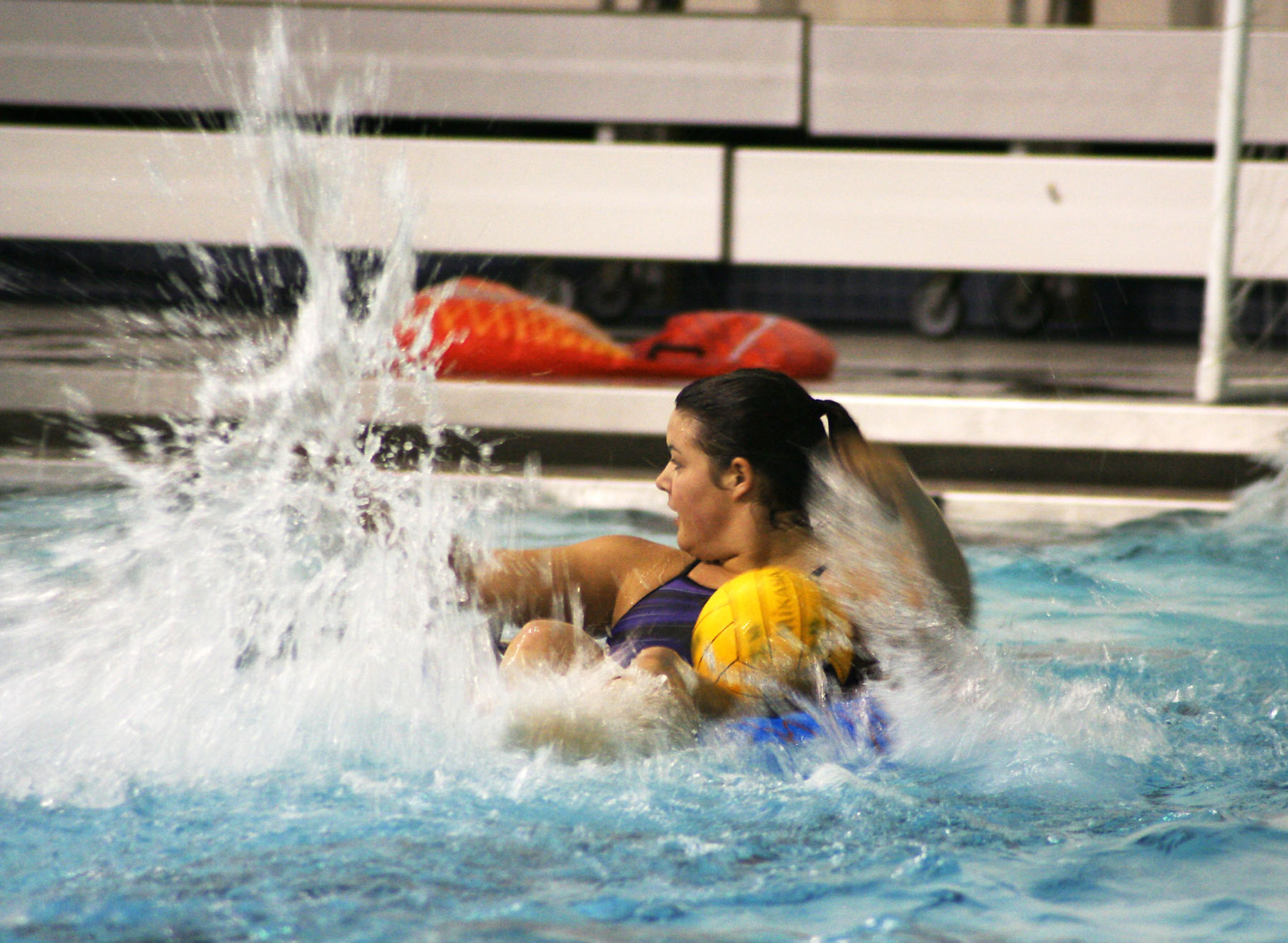
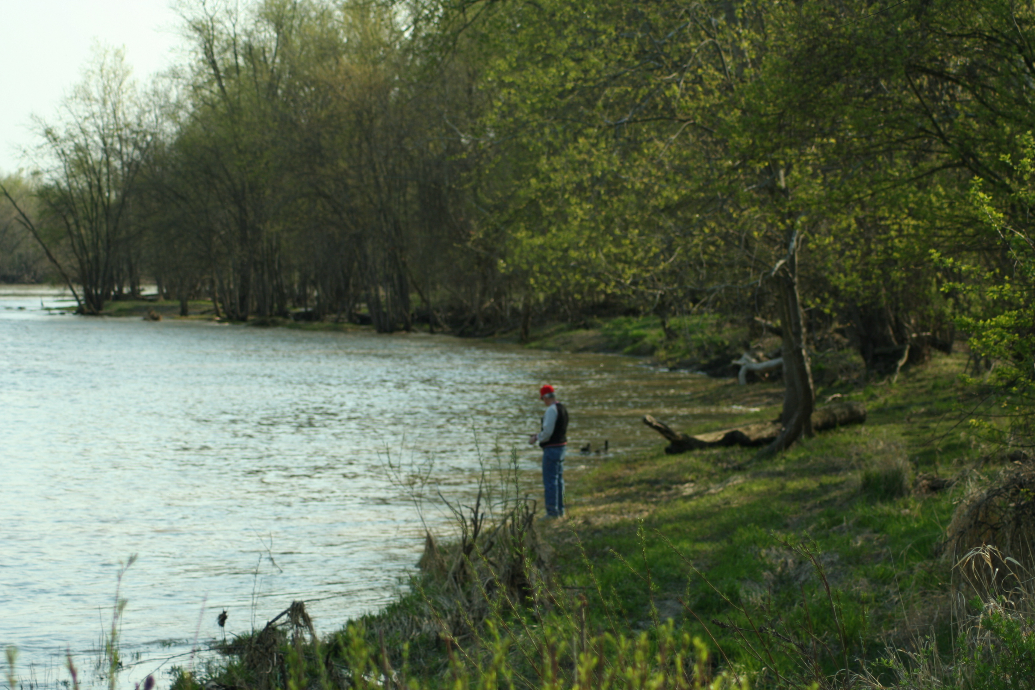
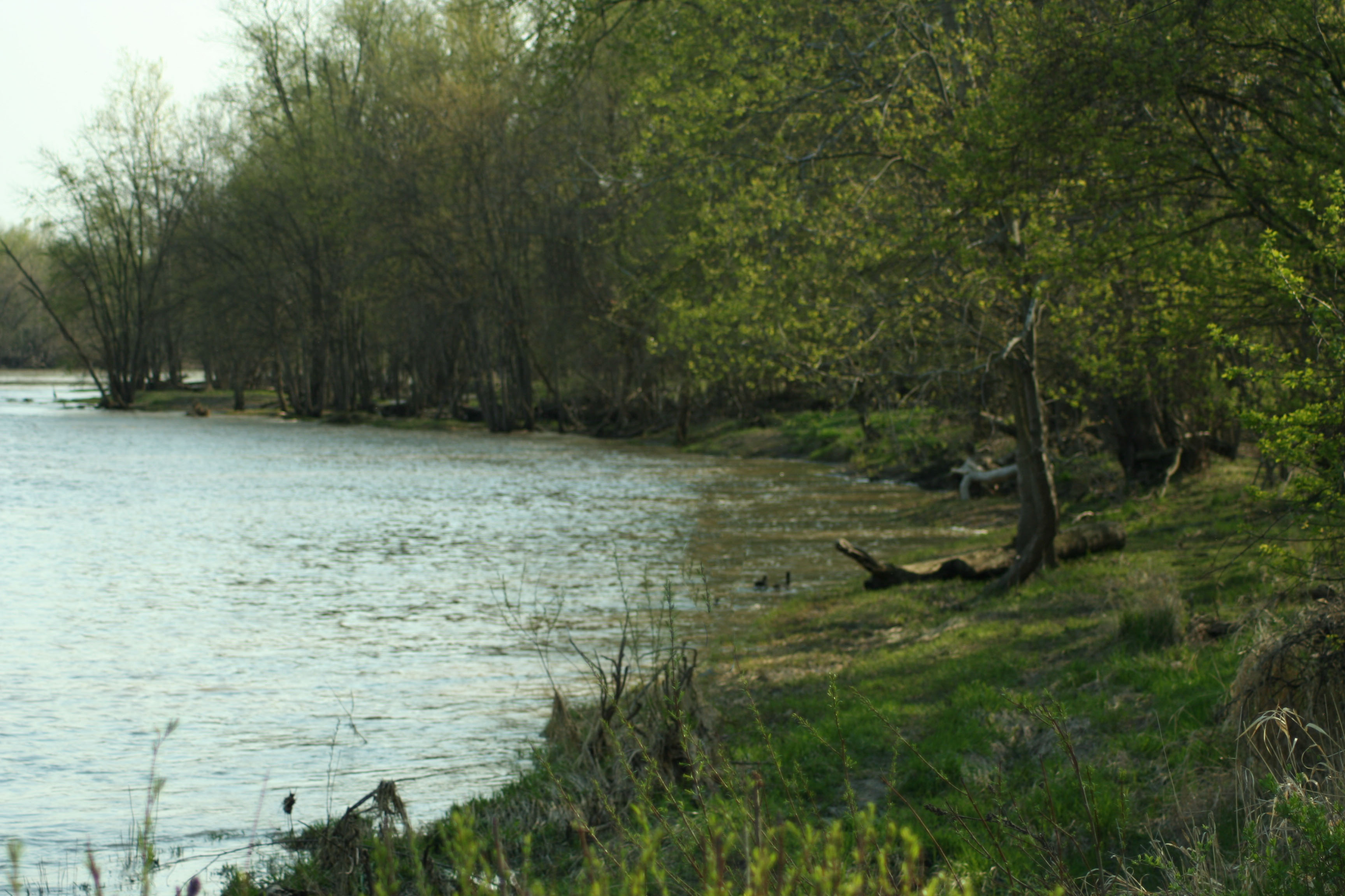
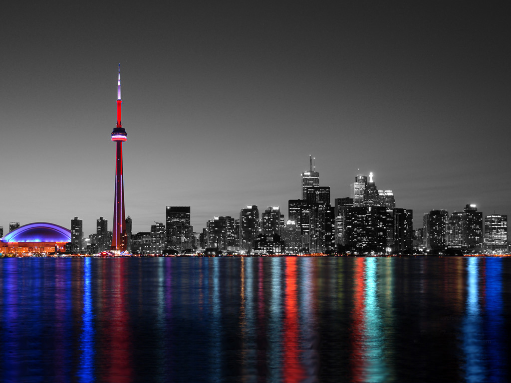
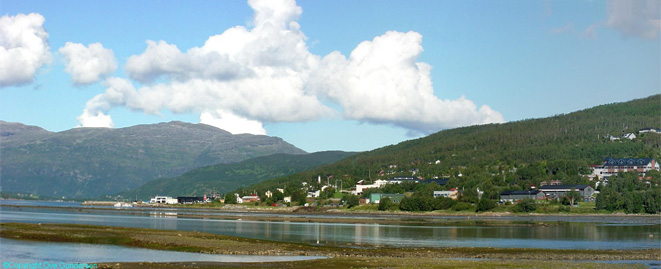
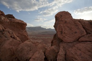
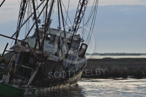
Straighten Image

For the first image I straightened the image. I brought down the exposure just a bit. I added some clarity to the image as well.

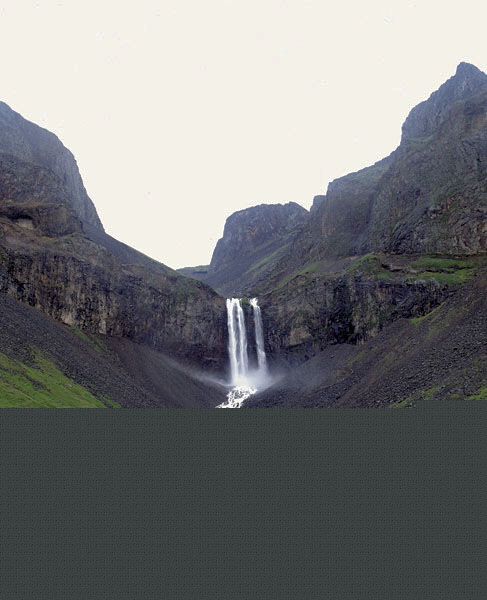
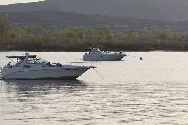
For the next image I straightened it, brought down the exposure some. I brought up the clarity a lot to show details in the water.

For the next image I straightened it and brought up the exposure and brightness some.

Underexposed

For this first image I brought up the exposure and brightness some. I added some contrast and I brought up the clarity and vibrance.

For this next image I brought up the exposure, brightness, and clarity. I took the contrast down some and added a bit of fill light.

For this next image I brought up the exposure, brightness, and the fill light. I added a little vibrance to it as well.

For the next image I brought up the exposure, fill light, and the brightness.

For the next image I brought up the exposure, fill light, and brightness. I took the vibrance and saturation down some.

Posted in VCT 4600 | Leave a comment

Research, thumbnails, and sketches for Project 3

Research

The product I decided to do was the Quaker Oats Chewy Bars. I am doing the packaging for the box, the wrapper, and for the new rip-n-go packaging they created. The one thing I noticed about these packagings is that there is way too much text on everything. Too much text usually overwhelms the consumer and then they will not even read anything that is on the package. Sometimes text heavy packaging can also create the buyer to get something different and not so overwhelming. The one thing I would like to change is how much text and information they are giving on these packages. I also noticed that the design needs a little updating. It looks a little old and a new design can bring in new consumers and excite the old consumers with the new change. I also think they are using too many different colors. They do not go well together. If they limited the color chooses to the same blues instead of having 2 different blues, having yellow and orange together and changing that to a single color, and etc. These little improvements will help the packaging look better. I am attaching images of the packaging and you can see the problems I am talking about.

Thumbnails and Sketches

thumb1 thumb2 thumb3 thumb4 sketch1 sketch2

Posted in VCT 4600 | 2 Comments

Assignment 5

Part 1: HDR Effect

To create the effect I followed the instructions in the tutorial. First we enhanced the shadows and highlights. Then I desaturated the image and made it hard light. Then I added a Gaussian Blur and put it at Soft light.  After that I flattened the image and it is complete.

I did the same exact thing to the next image to create the HDR effect.

Part 2:Erasing Objects

In order to cut out the man, I first needed to make a selection around him with the pen tool. I then made it a selection and then went to edit and fill. I had do this a few times because it kept taking parts of the girls arm, no matter how close the selection was to the guy.

I did the same thing with cutting out the man fishing.

Part 4:Making it Sunny

For this image I first adjusted the curves to add some sunny effects. I then added a cloud effect in the sky by selecting it and rendering clouds with a filter. I then selected the water and made it look like it was reflecting the sun a little by using a photo filter. I then adjusted the exposure up a little, did some replacement color for the plants, and adjusted the color balance.  Next I blurred the forrest edge by refining the edges, adding contract, and feathering the forrest.

For the next image I did about the same thing, minus anything with water.

Part 3:Water Effect

I tried to do what I could, but I really did not understand what was going on. This is really as far as I got because the directions were so unclear.

Posted in VCT 4600 | Leave a comment

Assignment 4

In order for the car to be hanged into black I created an adjustment layer of black and white. I then took out a lot of red in it to the car would look more black than gray. I then took the paint brush and added the color back into everything else in the picture. Next, I had many issues with copying the light and door. Every time I would do a quick mask or selection of any sort the image would transfer over as transparent. I am not sure why that happened, you even tried to help but we could not figure it out. So we had to paste the image on to a black back ground, flatten it, and then copy it from there so it was not so transparent. I transformed the figure for the door so it would fit the car as best as I could. I think it could use a little work but that is the first time I tried that and I redid it a few times.

Posted in VCT 4600 | Leave a comment

Project 2-Research, Thumbnails, and Sketches

Research and Thoughts

The product I am choosing to do are the Victoria Secret scents. I was thinking about creating an advertisement to market the new small bottles that can be taken on flights, but I could not even find the bottles online. I have only seen them in the stores so I might change that concept to just a fragrance line that they offer. The one thing I notice when I was researching for fragrance magazine spreads is that many of the advertisements are images of a women either holding the bottle and looking seductive and flirtatious. But for some of the Victoria Secret ads it was slightly opposite, which I thought would not be the case. They have women in some of the ads, but they are just looking happy and playful. Or they have the fragrances on set up on a white background by themselves and only including some text with the advertisement.

Also something else I notice in fragrance advertisements is that they use a lot of color. Most of them use darker colors or colors that would give it a more seductive feel to it, but with most of the Victoria’s Secret ads the use very bright and flirty colors. I liked the advertisements Victoria’s Secret offers because they have a slightly different feel to the scent. Another thing I noticed about the more seductive ads include a celebrity. Not all of them do, but a lot of them do. More and more celebrities are creating there own scents. They are so concerned about making it feel seductive and sexy that I think they forget about people that are looking for scents that are just fun and flirty. Most of the fragrances give a night time only feel to them as well. While most Victoria’s Secret fragrances have a more day time feel, unless they are the more expensive kinds and not marketed as a body splash.

Below are just some of the images I found:

The product I am going to use is the peace, heart, and flower shaped bottles. I want to go with the hippie theme, like they used for there advertisements of this product. I want to use fun, bright colors and make it as simple as possible. I think simplicity works well with this product. The bottles are already fun shapes so they speak for themselves really. I think I am going to try and use the colors to match the bottles. Also, for this project I am going to try and use my own images to create the advertisement. I actually have the perfect people in mind to use for the pictures so I would like to create my own images. I also feel like I would be more willing to manipulate and change around things on the image if I use my own and I believe for this advertisement manipulation is going to play a big part in the whole process.

Thumbnails and sketches

thumbnails sketch1 sketch2

Posted in VCT 4600 | Leave a comment

In Class Assignment 3

Part 1

The first thing I did was select the quick mask to create a quick outline. I then tried it into a selection and went back and forth until I thought it was a good balance in the image and the selection. I then redefined the edges and added some feathering and smoothed out the edges so that it would add detail to the guy and blend it well with the background. After that I placed the guy on the background and the image was created.

Part 2

I opened the image of Toronto and went right to the adjustment layers. I changed the whole image to black and white. I then took the paint brush and brushed the color back into the water and some buildings.

Part 3

I opened bridge and selected the 5 images. I went to tools, photoshop, and selected photo merge. It processed and then all I had to do was crop it.

Posted in VCT 4600 | Leave a comment

Assignment one-research, thumbnails, and sketches

Movie: The Step Brothers

One major theme I noticed for this movie is the concept of family pictures. They used the idea of making a picture perfect family with a twist. Some pictures were perfectly normal family, except for the fact that the sons are in there 40s and how much they liked each other or looked like a family. In other pictures they went with the idea of how much the sons disliked each other and controversy they caused within the family.

One major theme I noticed for most, if not all, comedy movie posters/marketing images is that they use images of the main characters for the advertisement. It seems to be a huge theme for comedy movies. The movies seem to typically have two main characters, which they play the advertising off of. The advertisements are simply images with a little taste of the movie in the image.

The images always have the title on it somewhere. It is typically at the very top or very bottom of the image.  They include the names of the people who play the 2 main characters (an other movies they are famous for), a quote from a review, and a small phrase line. I personally believe that it can be too much wording for a consumer to comprehend if they are just glancing by. I think with my poster/dvd cover I will try to limit the wording so that is simple to understand and be interesting for someone to get interesting in. Often too much information can turn people off, but in the same aspect too little information can do the same. My goal for this assignment is find a perfect medium of both ideas.

The most common color schemes I saw throughout the comedy genres is a mix between the colors of yellow, blue, and red. I am not too sure why this is, but it is not an except for Step Brothers. They use the combination of blue and red with in all the marketing and advertisements. I think for this movie that color scheme works perfectly because I believe the movie is playing off the idea of the “perfect American family”, therefore the colors ties in the Americana feel to it.

Images

Thumbnails and Sketches

I attached  the thumbnails and the sketches as pdf’s. They are a scanned image of each.

posterthumbs dvdthumbs

poster1 poster2

dvd1 dvd2

Posted in VCT 4600 | Leave a comment

Assignment 2-Sept. 7, 2010

Part 1

I used the clone stamp and the healing tools to get rid of all  the creasing on the image. I used the patch tool to fix the corner of the image so it matched the rest of the image.

Part 2

I really struggled with this image. I think I had a hard time ignoring how pixelated the image is. I first used the healing brush on the face to fix the spots. I then did the same for the hair and the shirt. I then went in and used the lasso tool to select the background and shirt and feather the effects. I choose a filter and selected dust and scratch to fix the background.

part3

For this image, in order to get rid of the discoloration I changed it to a black and white image. I then went in with the clone stamp and got rid of all the creases in the image.

Posted in VCT 4600 | Leave a comment

Assignment 1-Aug. 31, 2010

Part 1

I went over to the eye dropper tool and pulled down the drop menu. Then, I selected the ruler tool. I took the ruler tool and drew a line along the horizon. I went up to the top of the menu bar and clicked straighten.

Part 2

I selected the crop tool. Next, I drew a crop box around the photo. I went up to the top and selected perspective. I could then move each corner individual until it was lined to how I like it and hit return.

Part 3

I used the pen tool to cut the cars. I then made it a selection and dragged it over to the background layer. I resized the cars until the fit and were a good size. I fixed the vibrance and exposure a bit.

Part 4

I first adjected the brightness and vibrance of the dog picture in raw. I then cut the dog out using the pen tool and then making a selction. I dragged the dog until the background image and resized it.

Posted in VCT 4600 | Leave a comment