VCT 4600
Another amazing bgsu blog

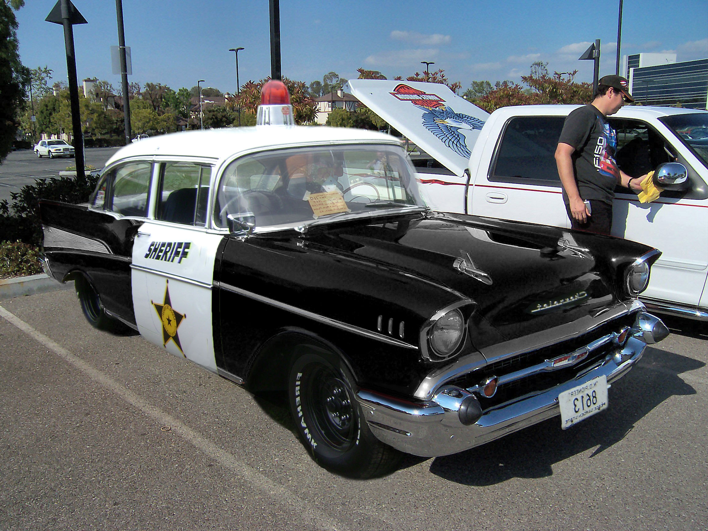
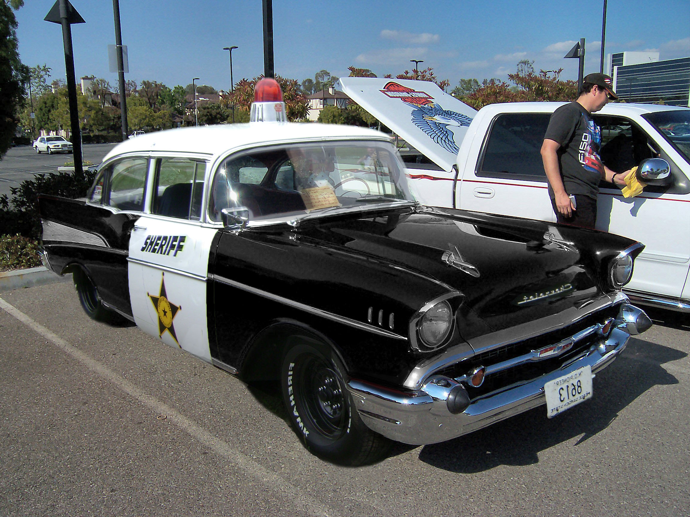
In-Class Assignment #6

March 29th, 2011 by hkrista

For this I used the white balance tool.  I changed the temperature and then selected a light gray area to change the white balance.


For this I underexposed the image by dragging the exposure slider to the left.  I also used the recovery slider to make the warning triangle turn black.


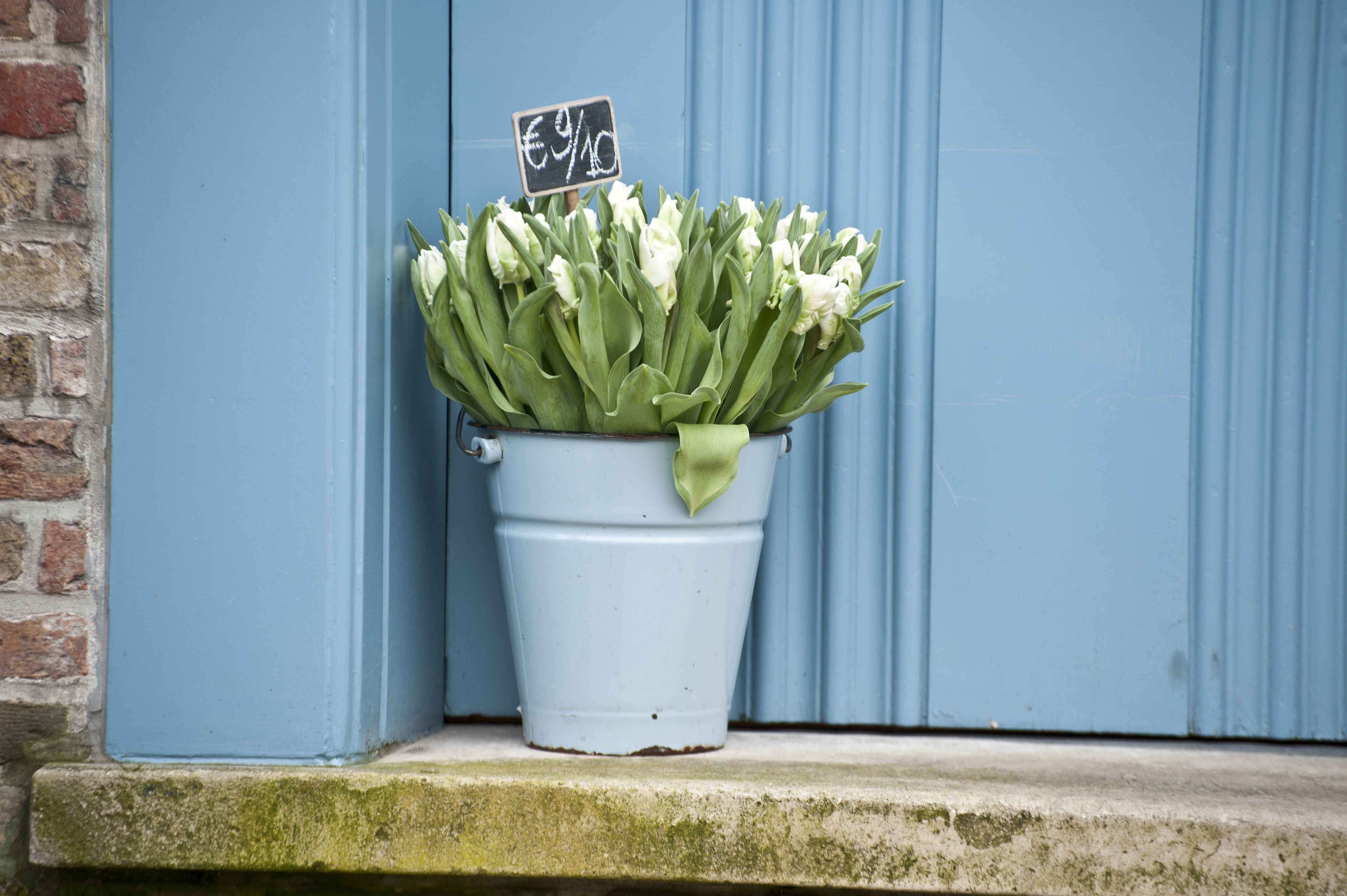
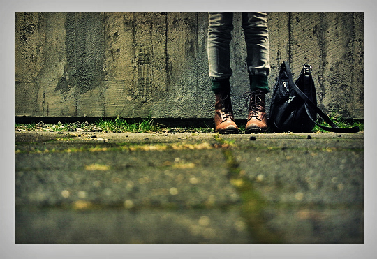
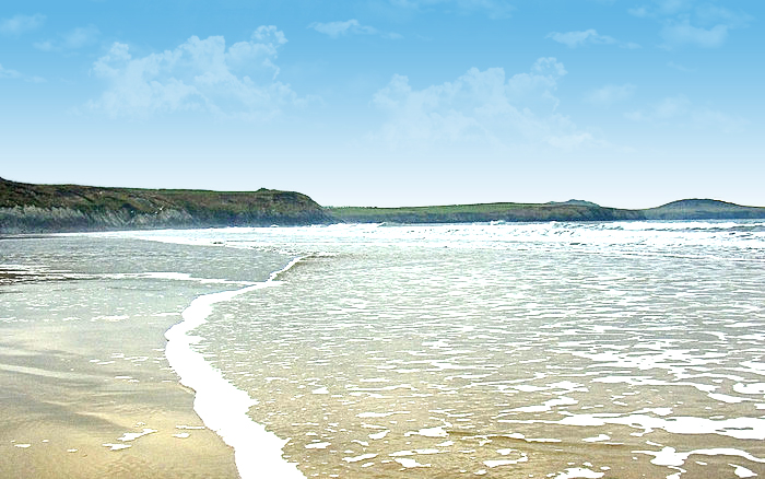
For this image I used the black slider and went to the left which made the image lighter in the shadow areas.


For this image I used the clarity slider and increased the midtone contrast.


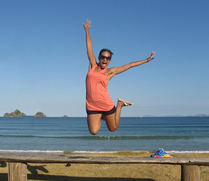
This image I used the clarity slider to soften the look of the models face.  I slid the clarity slider to the left which decreased the amount of midtone contract in the image, giving it a softer look to the skin.


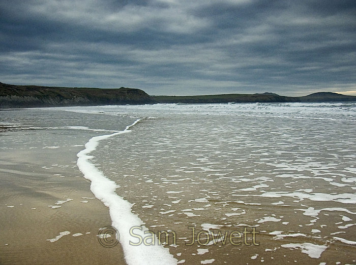
I used the fill light slider to brighten and fill in the shadows.  It opened up the lower mid-sharow areas.  I used the black slider and slid to the right to bring some of the contrast and richness to the photo.


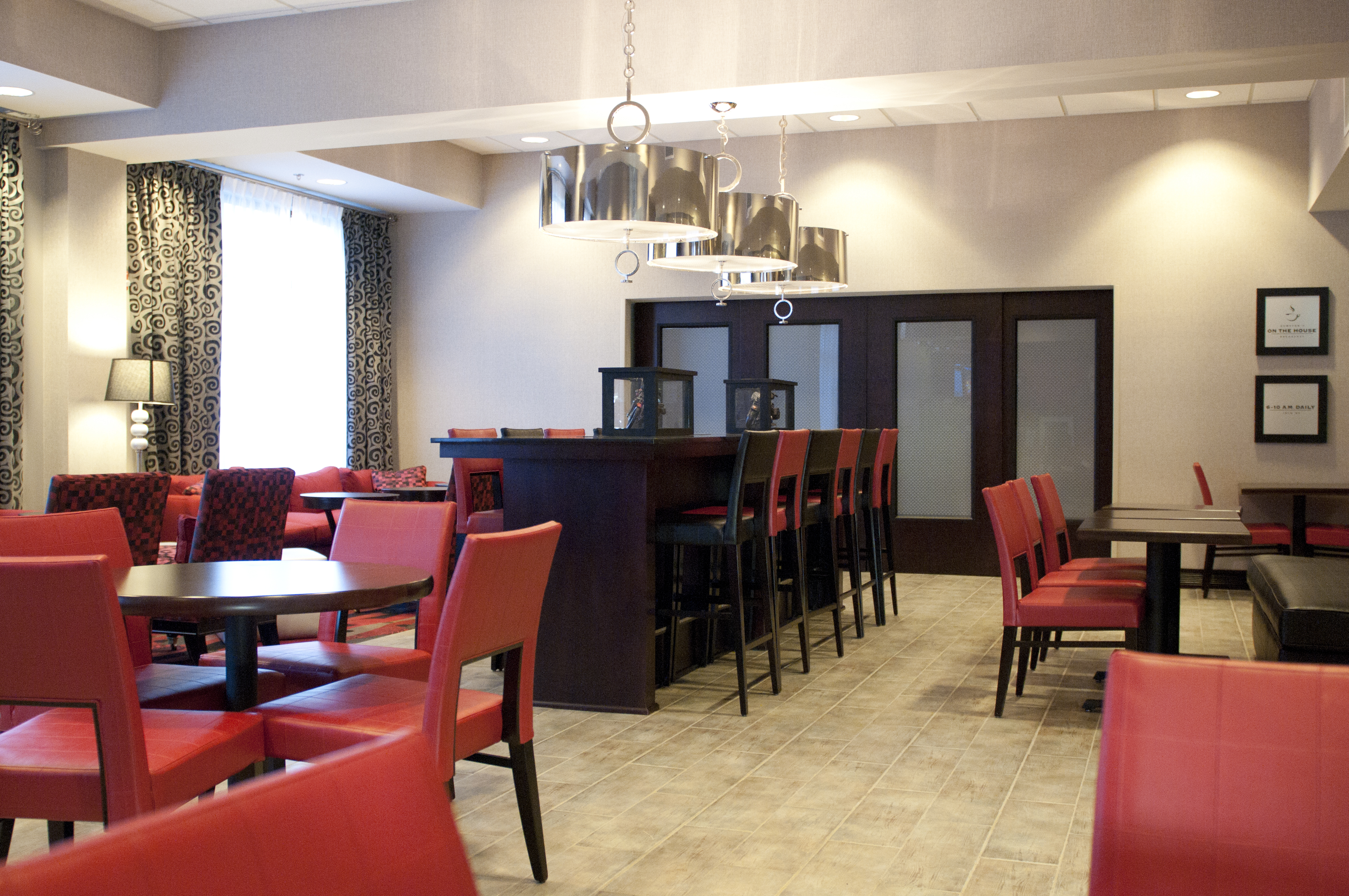
I used the tone curve tool and the point curve tool to add more contrast and make the photo pop.  I created contrast by using the highlights and lights sliders.


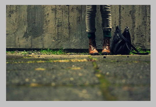
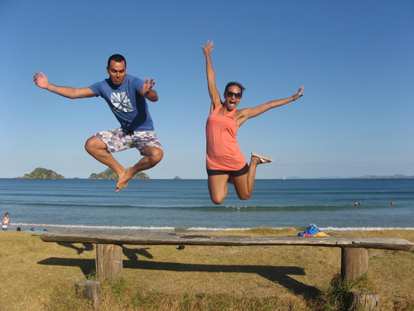
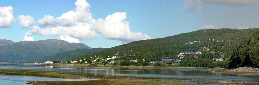
I used the crop tool and picked my ratio 2 to 3 ratio.  I stretched the crop box with the arrows to change the perspective.


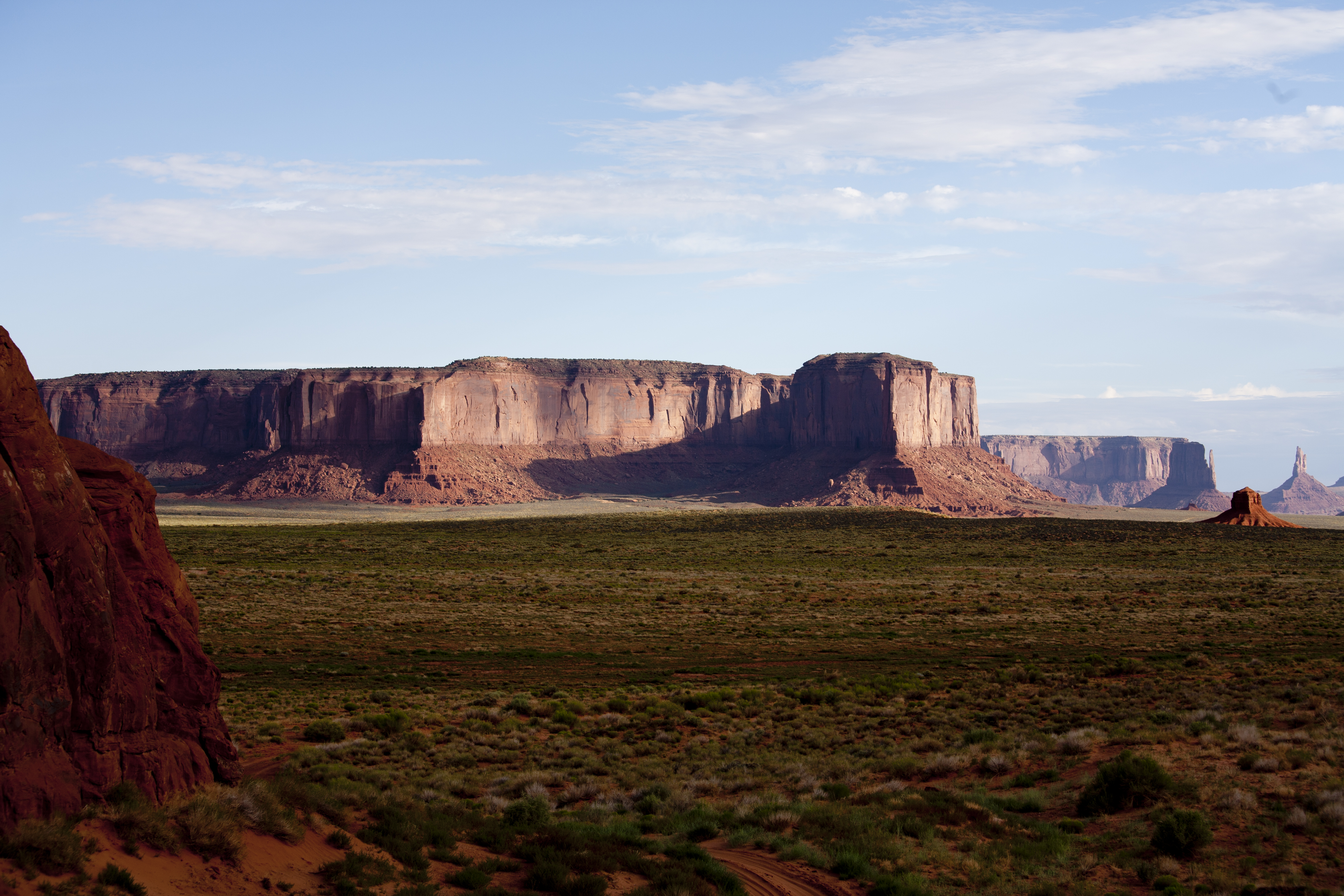
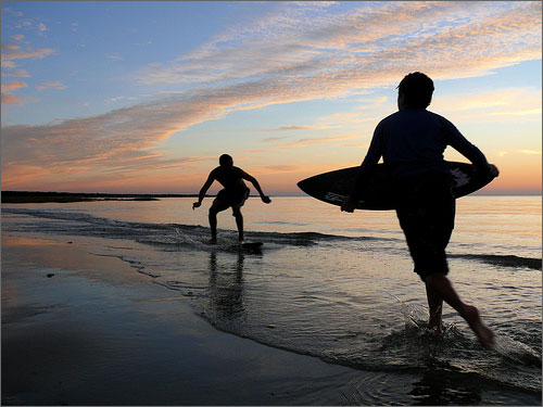
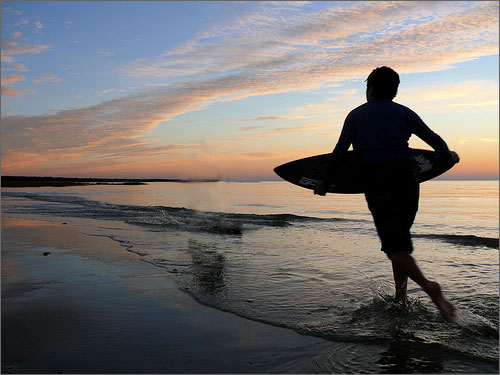
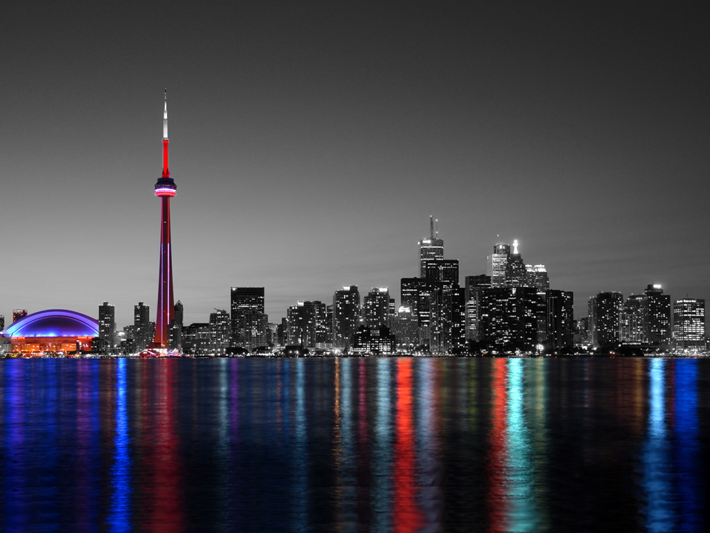
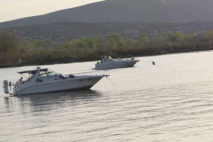
For this image I used the straighten tool.  I clicked and dragged the tool over the horizon that was not straight.

Posted in VCT4600 | No Comments »

In-class Assignment #5

March 22nd, 2011 by hkrista

Original

HDR

Original

HDR

To make the images into HDR  I increased the amount of shadows and highlights to about 40%.  I then desaturated a duplicate image of the original with hard light to print out some shadows and darker tones. I finally used blurring to give depth from the foreground and background.  This made the image show all of the highlights, lowlights, and mid-tones.


BEFORE

AFTER

BEFORE

AFTER

To remove a person in a photo I used the selection tool to select the person but I also added in a little bit of the background to make sure I got the whole person selected that I want removed. I then did a content aware fill which selected the content around the area to fill in the selection. On my second photo it needed some extra editing so I used the healing brush to get some of the spots I missed.


BEFORE

AFTER

BEFORE

AFTER

To make a gloomy dark photo nice and sunny I used the curves tool and vibrance tool to make the image brighter. I then selected the sky and put a nice sky blue gradient over top.  Using the cloud brush I downloaded I made clouds in the sky to make it even sunnier.  In the second photo I selected the mountains and used the brighten/contrast tool to brighten the dark mountains.


Posted in VCT4600 | No Comments »

Project 4 – CD Insert

March 22nd, 2011 by hkrista

I couldn’t figure out what song to use so I picked 3 different songs to draw my thumbnails.

FIREWORKS by Katie Perry

Do you ever feel like a plastic bag
Drifting throught the wind
Wanting to start again

Do you ever feel, feel so paper thin
Like a house of cards
One blow from caving in

Do you ever feel already buried deep
Six feet under scream
But no one seems to hear a thing

Do you know that there’s still a chance for you
Cause there’s a spark in you

You just gotta ignite the light
And let it shine
Just own the night
Like the Fourth of July

Cause baby you’re a firework
Come on show ’em what you’re worth
Make ’em go “Oh, oh, oh!”
As you shoot across the sky-y-y

Baby you’re a firework
Come on let your colors burst
Make ’em go “Oh, oh, oh!”
You’re gunna leave ’em fallin’ down-own-own

You don’t have to feel like a waste of space
You’re original, cannot be replaced
If you only knew what the future holds
After a hurricane comes a rainbow

Maybe you’re reason why all the doors are closed
So you could open one that leads you to the perfect road

Like a lightning bolt, your heart will blow
And when it’s time, you’ll know

You just gotta ignite the light
And let it shine
Just own the night
Like the Fourth of July

Cause baby you’re a firework
Come on show ’em what you’re worth
Make ’em go “Oh, oh, oh!”
As you shoot across the sky-y-y

Baby you’re a firework
Come on let your colors burst
Make ’em go “Oh, oh, oh!”
You’re gonna leave ’em all in awe-awe-awe”

Boom, boom, boom
Even brighter than the moon, moon, moon
It’s always been inside of you, you, you
And now it’s time to let it through

Cause baby you’re a firework
Come on show ’em what your worth
Make ’em go “Oh, oh, oh!”
As you shoot across the sky-y-y

Baby you’re a firework
Come on slet your colors burst
Make ’em go “Oh, oh, oh!”
You’re gonna leave ’em all in awe-awe-awe

Boom, boom, boom
Even brighter than the moon, moon, moon
Boom, boom, boom
Even brighter than the moon, moon, moon

Read the rest of this entry »

Posted in VCT4600 | No Comments »

Project 3 – Magazine Spread

March 1st, 2011 by hkrista

For this project I am going to use my own photos. I did some research online and I love the edgy but simplistic white spreads:


I like how the text really pops and but the images all help speak for the spread. Below are my sketches:


Here are the two main photos I took that  I tried to draw in my sketches:

Posted in VCT4600 | No Comments »

Project 2 – DVD Poster

February 22nd, 2011 by hkrista

I am doing the movie Confessions of a Shopaholic. This is a very pink movie with some touches of color.

The above images are from the movie either a movie poster or what she wore. The tutu dress is iconic in the movie so I wanted to make a design like that.

I did not have a scanner so I took pictures of my thumbs and sketches:

My thumbnails.

This shows the shopping aspect of the movie.

This is suppose to be the tutu dress in all the different colors.

Posted in VCT4600 | No Comments »

In Class Assignment 4

February 15th, 2011 by hkrista

For this assignment, I started out by selecting the police car with the quick selection tool and then duplicated the layer to the first photo.  I then took the police car and transformed it reflecting it horizontally.  While the police car layer was off I selected the red car using the quick selection and then using the refine edge dialogue box to feather out the edges.  After getting the car selected, I copied to new layer and changed that layer to black and white which made the car black.  I selected pieces of the cop car, like the top and side door, and the tire and license plate.  I placed them into the positions on the car to make it look like a cop car.

The above picture was from last class editing.

I reworded the picture above in class today to get the 2nd steering wheel off the wrong side. I took the windshield from the original red car and placed it overtop on the right half and blended it in and changed the opacity. Here is my final picture:

Posted in VCT4600 | No Comments »

Assignment 3 – Feb 8th

February 8th, 2011 by hkrista

For this photo I used the quick selection tool to outline the man.  After that I clicked on refine edge. I changed my view to over layer which showed the sunset background.  I changed the shift edge slider to a negative percentage to show more hair. I also drew around spots using the refine radius tool.  After closing the refine edge dialogue box, I used a white and black paint brush to add and subtract around the hair.

This was an easy image to manipulate. I used the quick selection tool and selected the water and the tower.  I copied it into a new layer.  I then changed the old background layer in the adjustments panel to black and white.  I used the white and black paint brush to add an subtract the color.

For this image I used photomerge and selected the images I was going to merge together. I changed my layout to reposition.  Photoshop pieced together all of the photos except for one. I selected the one photo and moved it down to connect with the other photos. It had a line down where the photos met so I used the spot healing brush to take out the connecting line.

Posted in VCT4600 | No Comments »

Project 1 – Children’s Story Poster

January 25th, 2011 by hkrista

If you give a mouse a cookie by Laura Numeroff

The story is about a boy & a mouse. The boy gives the mouse a cookie and the mouse keeps asking for more and more things. There is no speaking/dialogging in the book just a narration of what is going on.

The theme from my point of view in the book is that every action has a reaction or consequence. No matter how much you give someone they will always want more and take advantage of it.

For pictures I was looking at mouses and cookies such as these links:

The book cover has a good contrast in colors. The main colors are green and red.

The pages within the book are very simple with lots of white space. The text is always placed at the top of the page with an illustration in the middle of the page.

I decided to pick the aspect that there are consequences to your actions theme, that if you give once they will keep wanting more. I chose to do designs that reflect the simplicity of the book and pages. I wanted to include in some of the designs all of the t

Posted in VCT4600 | No Comments »

Assignment 1

January 18th, 2011 by hkrista

Part 1 – Straighten a crooked image:

Before

After

To straighten the image to make the boats look like they are more horizontal I used the ruler tool. With the ruler tool you click on the point on the horizon and then drag to the end of the horizon. Then you have to click straighten and photoshop will make the horizon that you selected straight.

Part 2 – Correcting Perspective:

Before

After

Before

After

Before

After

For these images you have to start out using the crop tool. With the crop tool start in one corner and just drag towards the opposite corner. Then I checked the perspective box so that I could move the corners to the correct corners of the image. I hit enter and it gave me the new perspective.

Part 3 – Creating a composite:

Cars

For this image I used the lasso tool to start with and then switched to the Quick Selection tool because I am more comfortable using this tool to grab objects. I selected the cars and then I right clicked and said copy to new layer. I used the easier tool to take out any background that was still viewable. I then duplicated the layer to the background image. I used the perspective tool in the command T (transform) selection to make the red car appear more natural in the scene. I used the reflection tool in the transform selection to reflect it so it was going the same way as the red car.

Part 4 – Using Camera Raw:

Dog

For this picture I used the different features in RAW to get the dog to look more richer and more natural colored. I increased the black to make his coat darker and increased the fill light to fill in any of the dark shadowed areas. I also increased the clarity, vibrance, and saturation to make the background match the other image.

Posted in VCT4600 | No Comments »